R for Plotting
Overview
Teaching: 120 min
Exercises: 30 minQuestions
What are R and R Studio?
How do I read data into R?
What are geometries and aesthetics?
How can I use R to create and save professional data visualizations?
Objectives
To become oriented with R and R Studio.
To be able to read in data from csv files.
To create plots with both discrete and continuous variables.
To understand mapping and layering using
ggplot2.To be able to modify a plot’s color, theme, and axis labels.
To be able to save plots to a local directory.
Contents
- Introduction to R and RStudio
- Loading and reviewing data
- Understanding commands
- Creating our first plot
- Plotting for data exploration
- Bonus
- Glossary of terms
Bonus: why learn to program?
Share why you’re interested in learning how to code.
Solution:
There are lots of different reasons, including to perform data analysis and generate figures. I’m sure you have morespecific reasons for why you’d like to learn!
Introduction to R and RStudio
In this session we will be testing the hypothesis that a country’s life expectancy is related to the total value of its finished goods and services, also known as the Gross Domestic Product (GDP). To test this hypothesis, we’ll need two things: data and a platform to analyze the data.
You already downloaded the data. But what platform will we use to analyze the data? We have many options!
We could try to use a spreadsheet program like Microsoft Excel or Google sheets that have limited access, less flexibility, and don’t easily allow for things that are critical to “reproducible” research, like easily sharing the steps used to explore and make changes to the original data.
Instead, we’ll use a programming language to test our hypothesis. Today we will use R, but we could have also used Python for the same reasons we chose R (and we teach workshops for both languages). Both R and Python are freely available, the instructions you use to do the analysis are easily shared, and by using reproducible practices, it’s straightforward to add more data or to change settings like colors or the size of a plotting symbol.
But why R and not Python?
There’s no great reason. Although there are subtle differences between the languages, it’s ultimately a matter of personal preference. Both are powerful and popular languages that have very well developed and welcoming communities of scientists that use them. As you learn more about R, you may find things that are annoying in R that aren’t so annoying in Python; the same could be said of learning Python. If the community you work in uses R, then you’re in the right place.
To run R, all you really need is the R program, which is available for computers running the Windows, Mac OS X, or Linux operating systems. You downloaded R while getting set up for this workshop.
To make your life in R easier, there is a great (and free!) program called RStudio that you also downloaded and used during set up. As we work today, we’ll use features that are available in RStudio for writing and running code, managing projects, installing packages, getting help, and much more. It is important to remember that R and RStudio are different, but complementary programs. You need R to use RStudio.
Bonus Exercise: Can you think of a reason you might not want to use RStudio?
Solution:
On some high-performance computer systems (e.g. Amazon Web Services) you typically can’t get a display like RStudio to open. If you’re at the University of Michigan and have access to Great Lakes, then you might want to learn more about resources to run RStudio on Great Lakes.
The tidyverse vs Base R
If you’ve used R before, you may have learned commands that are different than the ones we will be using during this workshop. We will be focusing on functions from the tidyverse. The “tidyverse” is a collection of R packages that have been designed to work well together and offer many convenient features that do not come with a fresh install of R (aka “base R”). These packages are very popular and have a lot of developer support including many staff members from RStudio. These functions generally help you to write code that is easier to read and maintain. We believe learning these tools will help you become more productive more quickly.
To get started, we’ll spend a little time getting familiar with the RStudio environment and setting it up to suit your tastes. When you start RStudio, you’ll have three panels.
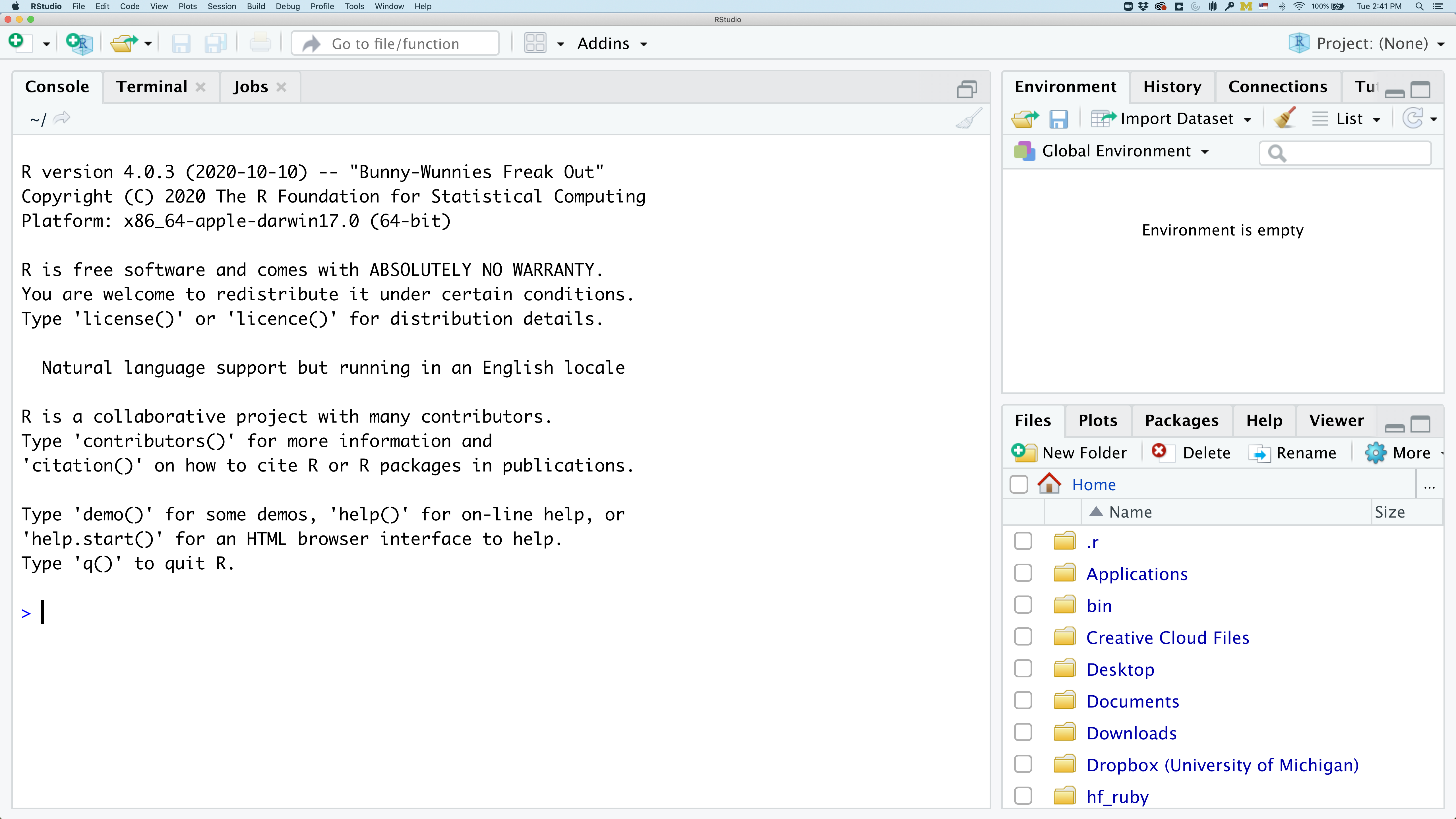
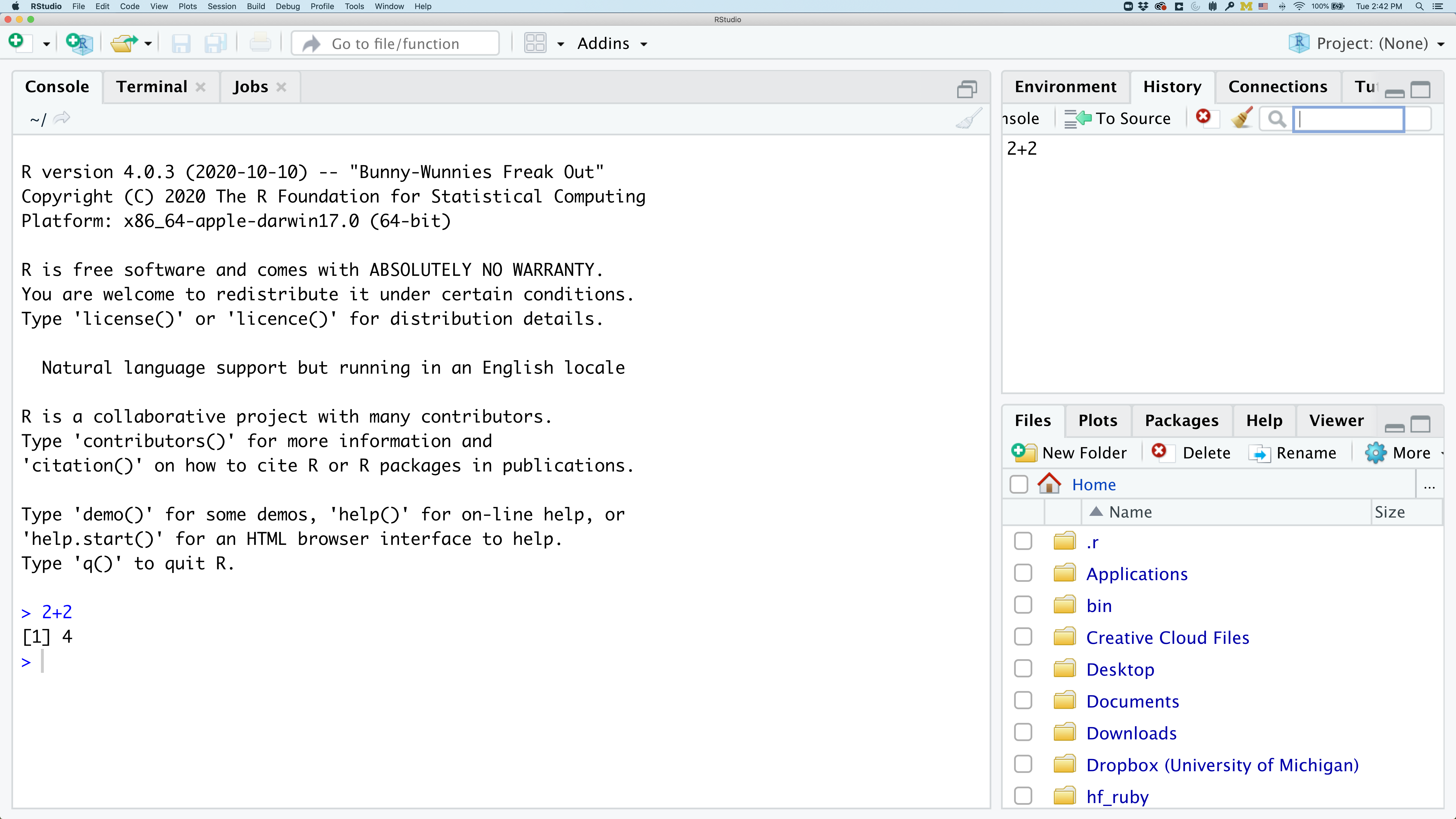
On the left you’ll have a panel with three tabs - Console, Terminal, and Jobs. The Console tab is what running R from the command line looks like. This is where you can enter R code. Try typing in 2+2 at the prompt (>). In the upper right panel are tabs indicating the Environment, History, and a few other things. If you click on the History tab, you’ll see the command you ran at the R prompt.
In the lower right panel are tabs for Files, Plots, Packages, Help, and Viewer. You used the Packages tab to install tidyverse.
We’ll spend more time in each of these tabs as we go through the workshop, so we won’t spend a lot of time discussing them now.
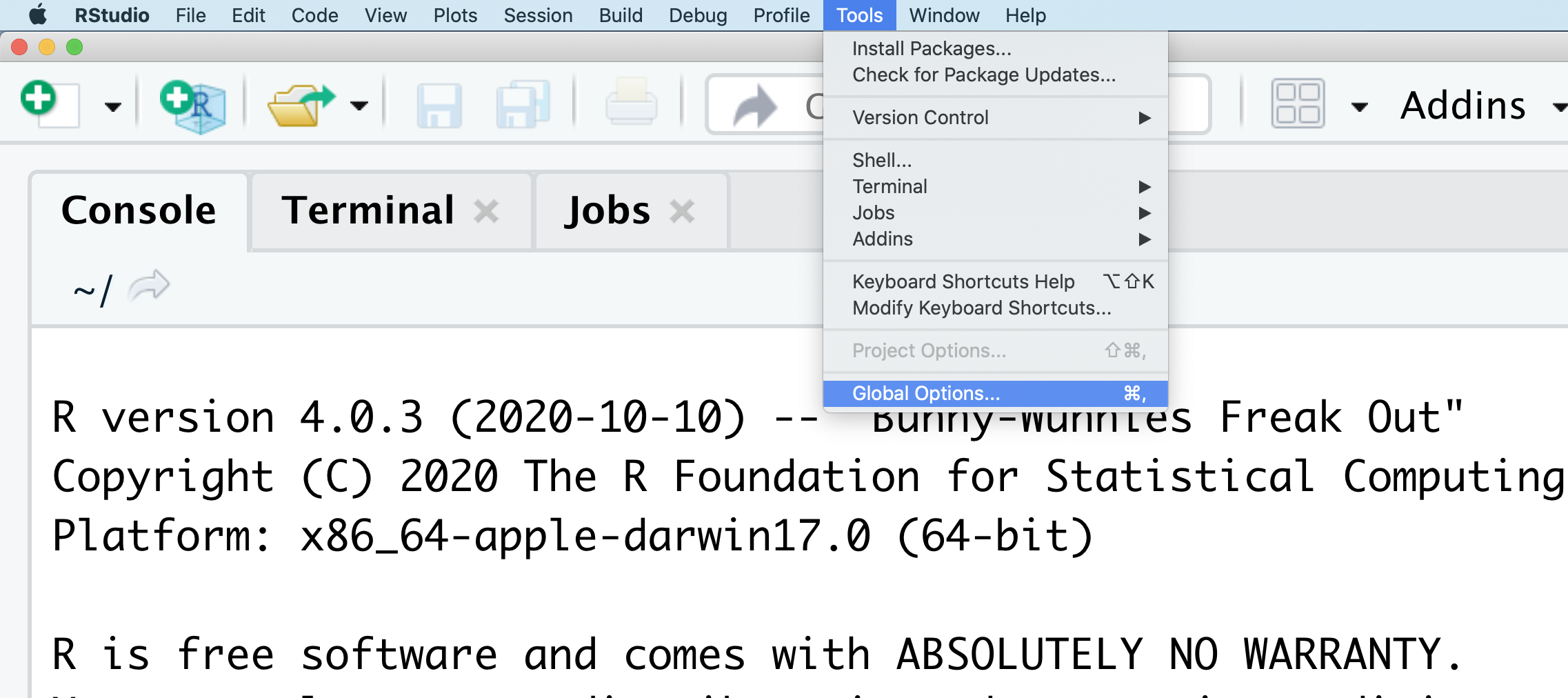
You might want to alter the appearance of your RStudio window. The default appearance has a white background with black text. If you go to the Tools menu at the top of your screen, you’ll see a “Global options” menu at the bottom of the drop down; select that.
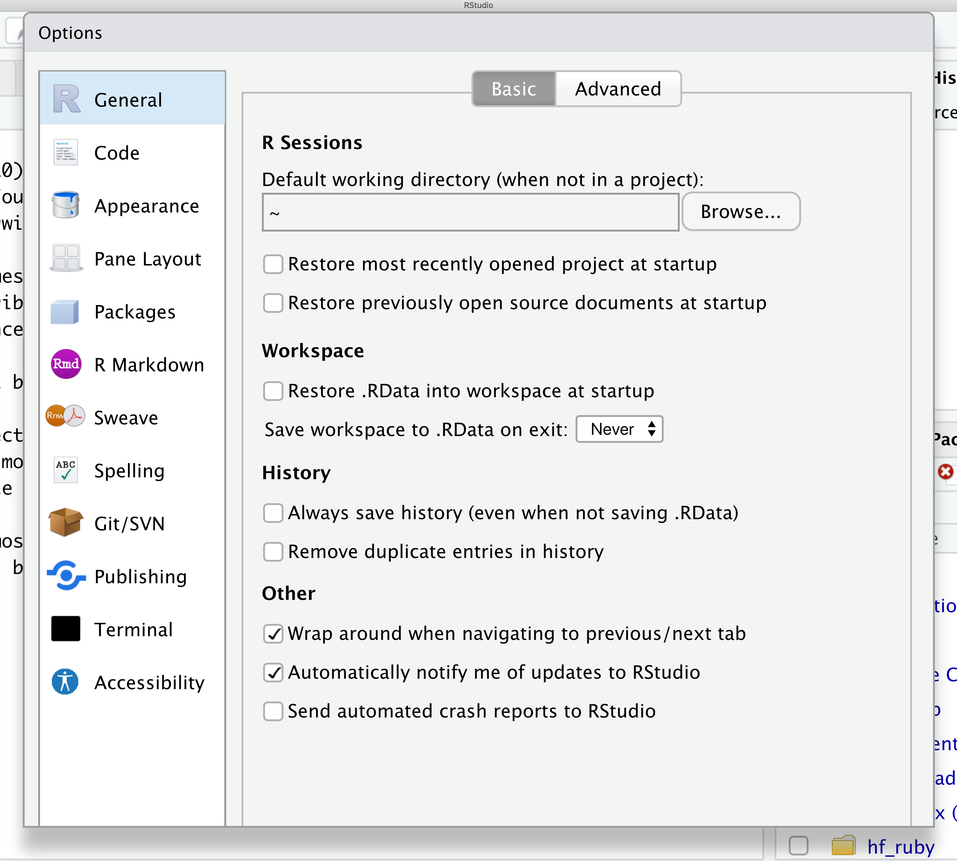
From there you will see the ability to alter numerous things about RStudio. Under the Appearances tab you can select the theme you like most. As you can see there’s a lot in Global options that you can set to improve your experience in RStudio. Most of these settings are a matter of personal preference.
However, you can update settings to help you to insure the reproducibility of your code. In the General tab, none of the selectors in the R Sessions, Workspace, and History should be selected. In addition, the toggle next to “Save workspace to .RData on exit” should be set to never. These setting will help ensure that things you worked on previously don’t carry over between sessions.
Let’s get going on our analysis!
One of the helpful features in RStudio is the ability to create a project. A project is a special directory that contains all of the code and data that you will need to run an analysis.
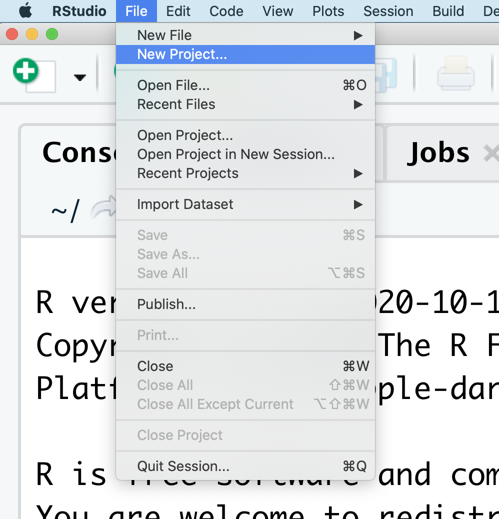
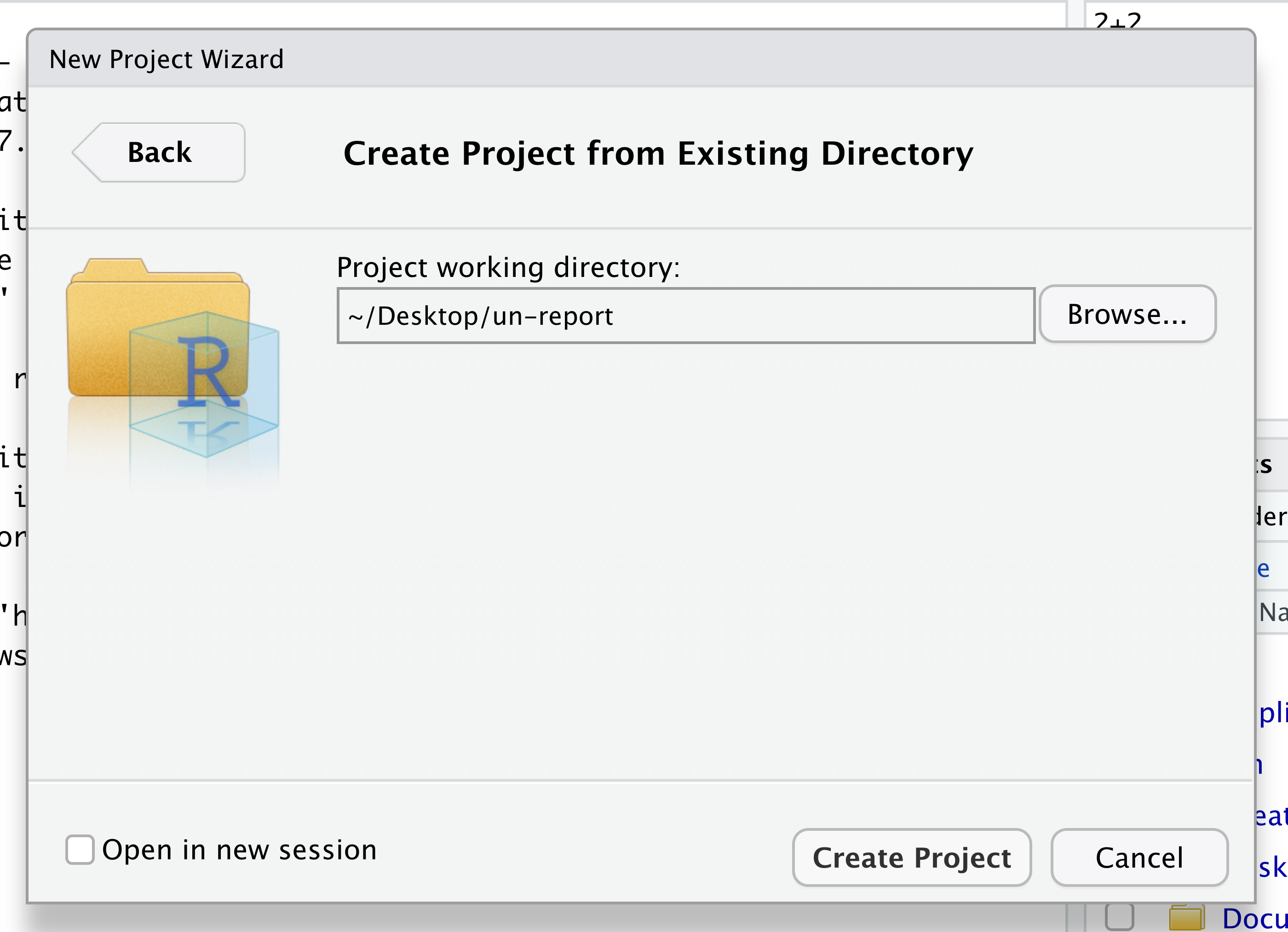
At the top of your screen you’ll see the “File” menu. Select that menu and then the menu for “New Project…”.
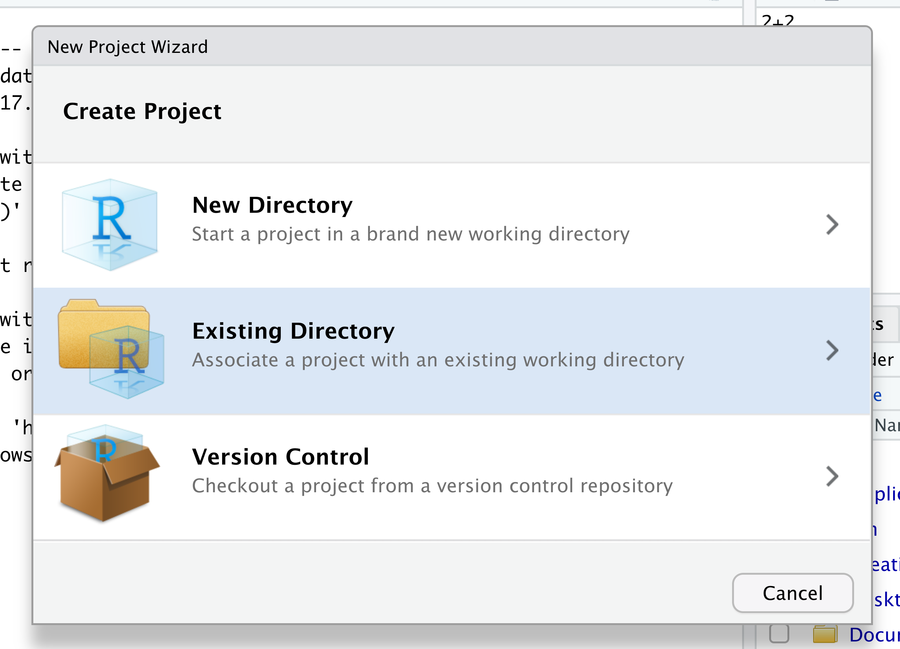
When the smaller window opens, select “Existing Directory” and then the “Browse” button in the next window.
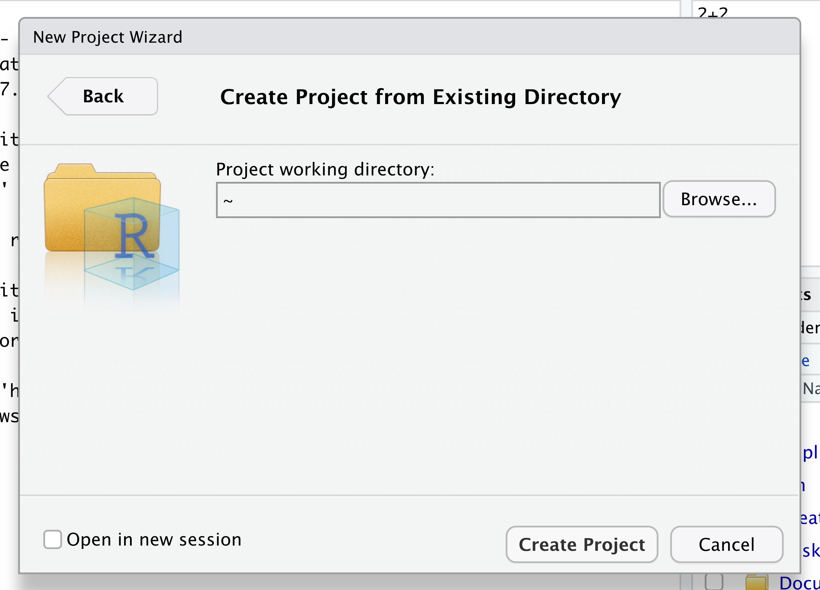
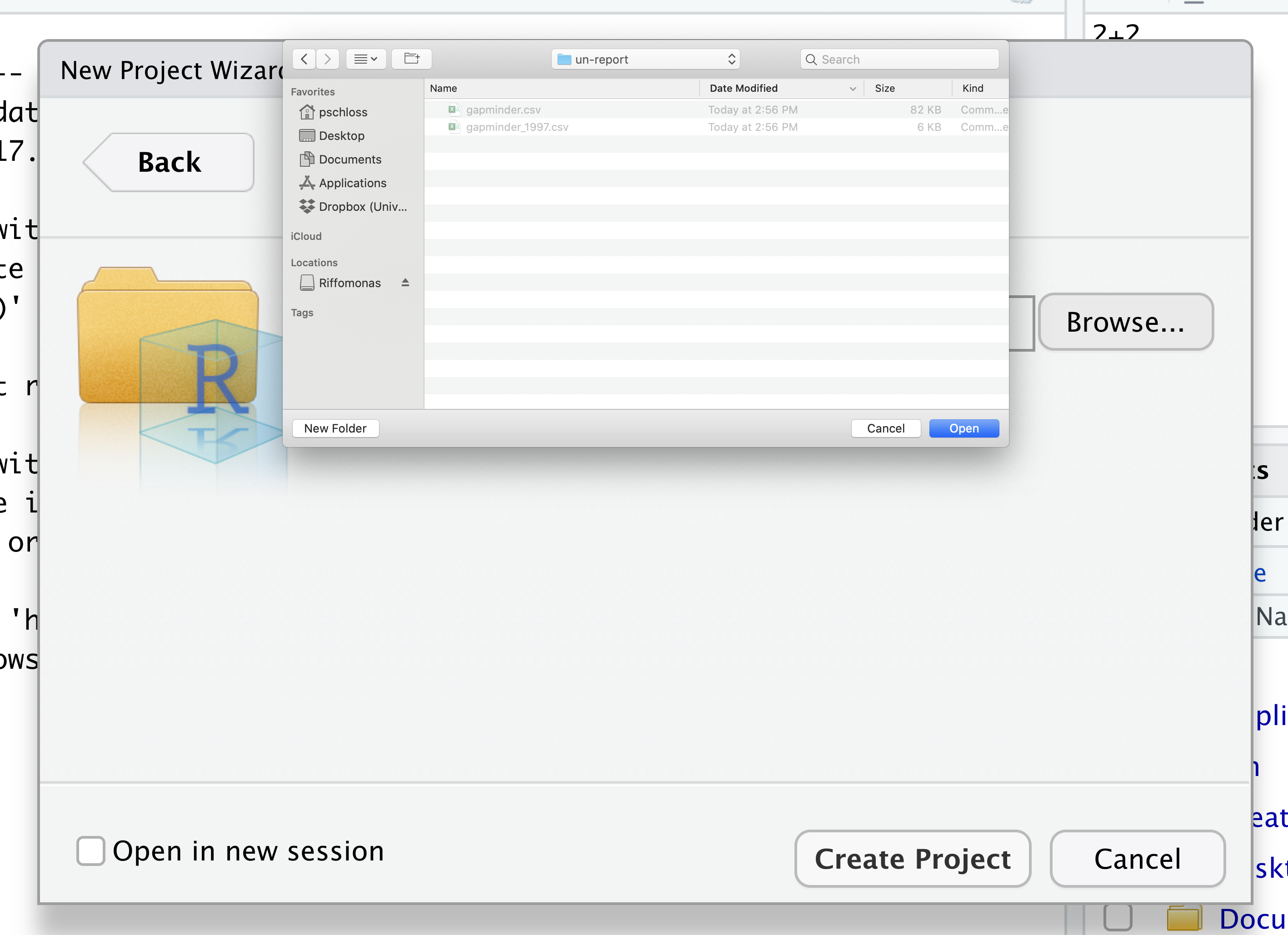
Navigate to the directory that contains your code and data from the setup instructions and click the “Open” button.
Then click the “Create Project” button.
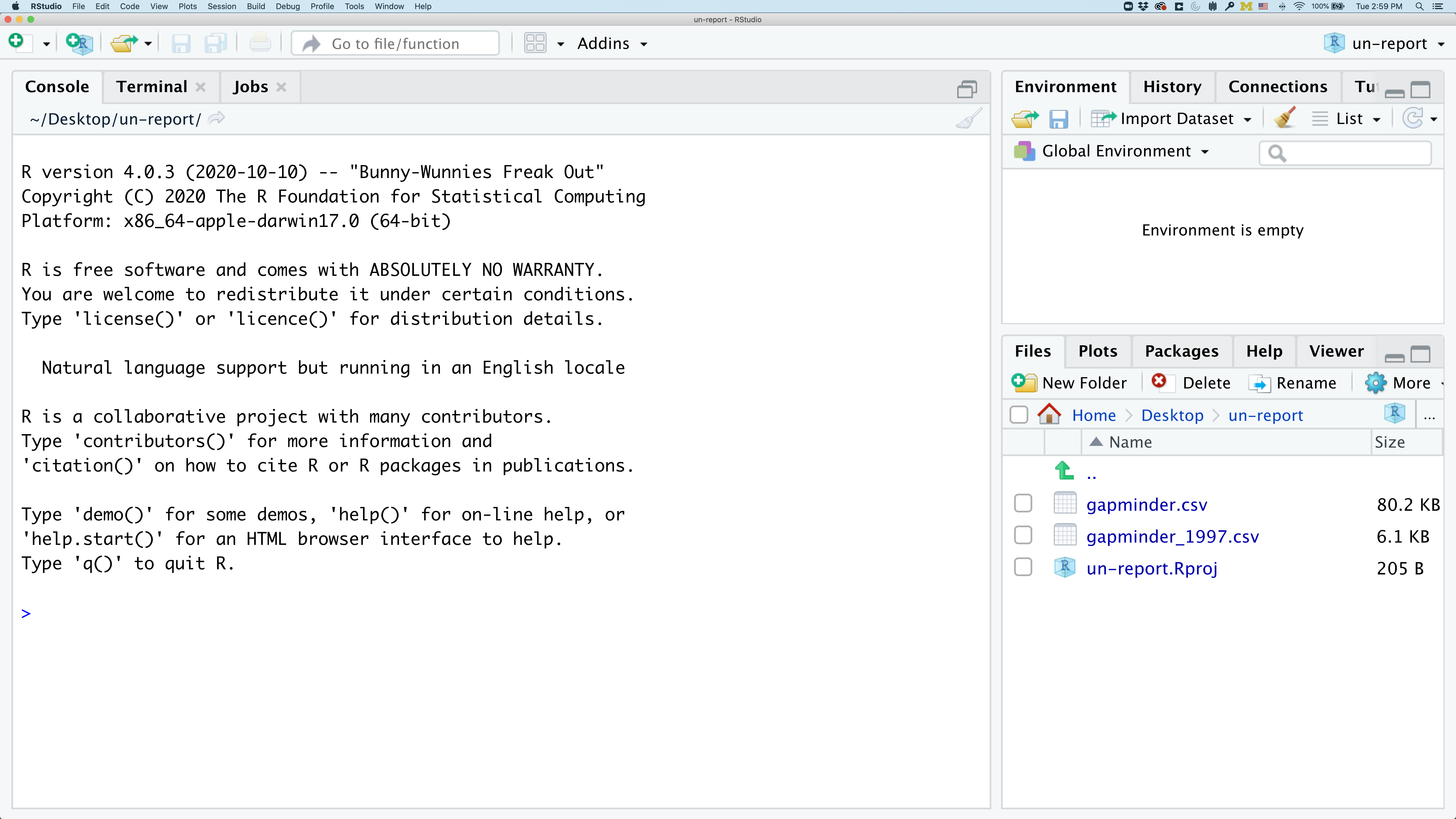
Did you notice anything change?
In the lower right corner of your RStudio session, you should notice that your Files tab is now your project directory. You’ll also see a file called un-report.Rproj in that directory.
From now on, you should start RStudio by double clicking on that file. This will make sure you are in the correct directory when you run your analysis.
We’d like to create a file where we can keep track of our R code.
Back in the “File” menu, you’ll see the first option is “New File”. Selecting “New File” opens another menu to the right and the first option is “R Script”. Select “R Script”.
Now we have a fourth panel in the upper left corner of RStudio that includes an Editor tab with an untitled R Script. Let’s save this file as gdp_population.R in our project directory.
We will be entering R code into the Editor tab to run in our Console panel.
On line 1 of gdp_population.R, type 2+2.
With your cursor on the line with the 2+2, click the button that says Run. You should be able to see that 2+2 was run in the Console.
As you write more code, you can highlight multiple lines and then click Run to run all of the lines you have selected.
Let’s delete the line with 2+2 and replace it with library(tidyverse).
Go ahead and run that line in the Console by clicking the Run button on the top right of the Editor tab and choosing Run Selected Lines. This loads a set of useful functions and sample data that makes it easier for us to do complex analyses and create professional visualizations in R.
library(tidyverse)
── Attaching packages ──────────────────────────────────────────────────────────────── tidyverse 1.3.1 ──
✔ ggplot2 3.3.5     ✔ purrr   0.3.4
✔ tibble  3.1.6     ✔ dplyr   1.0.7
✔ tidyr   1.1.4     ✔ stringr 1.4.0
✔ readr   2.1.1     ✔ forcats 0.5.1
── Conflicts ─────────────────────────────────────────────────────────────────── tidyverse_conflicts() ──
✖ dplyr::filter() masks stats::filter()
✖ dplyr::lag()    masks stats::lag()
What’s with all those messages???
When you loaded the
tidyversepackage, you probably got a message like the one we got above. Don’t panic! These messages are just giving you more information about what happened when you loadedtidyverse. Thetidyverseis actually a collection of several different packages, so the first section of the message tells us what packages were installed when we loadedtidyverse(these includeggplot2, which we’ll be using a lot in this lesson, anddyplr, which you’ll be introduced to tomorrow in the R for Data Analysis lesson).The second section of messages gives a list of “conflicts.” Sometimes, the same function name will be used in two different packages, and R has to decide which function to use. For example, our message says that:
dplyr::filter() masks stats::filter()This means that two different packages (
dyplrfromtidyverseandstatsfrom base R) have a function namedfilter(). By default, R uses the function that was most recently loaded, so if we try using thefilter()function after loadingtidyverse, we will be using thefilter()function > fromdplyr().
Pro-tip
Those of us that use R on a daily basis use cheat sheets to help us remember how to use various R functions. If you haven’t already, print out the PDF versions of the cheat sheets that were in the setup instructions.
You can also find them in RStudio by going to the “Help” menu and selecting “Cheat Sheets”. The two that will be most helpful in this workshop are “Data Visualization with ggplot2”, “Data Transformation with dplyr”, “R Markdown Cheat Sheet”, and “R Markdown Reference Guide”.
For things that aren’t on the cheat sheets, Google is your best friend. Even expert coders use Google when they’re stuck or trying something new!
Loading and reviewing data
We will import a subsetted file from the gapminder dataset called gapminder_1997.csv. There are many ways to import data into R but for your first plot we will use RStudio’s file menu to import and display this data. As we move through this process, RStudio will translate these point and click commands into code for us.
In RStudio select “File” > “Import Dataset” > “From Text (readr)”.
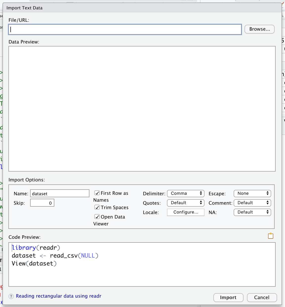
The file is located in the main directory, click the “Browse” button and select the file named gapminder_1997.csv. A preview of the data will appear in the window. You can see there are a lot of Import Options listed, but R has chosen the correct defaults for this particular file.
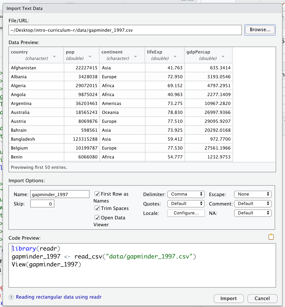
We can see in that box that our data will be imported with the Name: “gapminder_1997”. Also note that this screen will show you all the code that will be run when you import your data in the lower right “Code Preview”. Since everything looks good, click the “Import” button to bring your data into R.
After you’ve imported your data, a table will open in a new tab in the top left corner of RStudio. This is a quick way to browse your data to make sure everything looks like it has been imported correctly. To review the data, click on the new tab.
We see that our data has 5 columns (variables).
Each row contains life expectancy (“lifeExp”), the total population (“pop”), and the per capita gross domestic product (“gdpPercap”) for a given country (“country”).
There is also a column that says which continent each country is in (“continent”). Note that both North America and South America are combined into one category called “Americas”.
After we’ve reviewed the data, you’ll want to make sure to click the tab in the upper left to return to your gdp_population.R file so we can start writing some code.
Now look in the Environment tab in the upper right corner of RStudio. Here you will see a list of all the objects you’ve created or imported during your R session. You will now see gapminder_1997 listed here as well.
Finally, take a look at the Console at the bottom left part of the RStudio screen. Here you will see the commands that were run for you to import your data in addition to associated metadata and warnings.
Data objects
There are many different ways to store data in R. Most objects have a table-like structure with rows and columns. We will refer to these objects generally as “data objects”. If you’ve used R before, you many be used to calling them “data.frames”. Functions from the “tidyverse” such as
read_csvwork with objects called “tibbles”, which are a specialized kind of “data.frame.” Another common way to store data is a “data.table”. All of these types of data objects (tibbles, data.frames, and data.tables) can be used with the commands we will learn in this lesson to make plots. We may sometimes use these terms interchangeably.
Understanding commands
Let’s start by looking at the code RStudio ran for us by copying and pasting the first line from the console into our gdp_population.R file that is open in the Editor window.
gapminder_1997 <- read_csv("gapminder_1997.csv")
Rows: 142 Columns: 5
── Column specification ─────────────────────────────────────────────────────────────────────────────────
Delimiter: ","
chr (2): country, continent
dbl (3): pop, lifeExp, gdpPercap
ℹ Use `spec()` to retrieve the full column specification for this data.
ℹ Specify the column types or set `show_col_types = FALSE` to quiet this message.
You should now have a line of text in your code file that started with gapminder and ends with a ) symbol.
What if we want to run this command from our code file?
In order to run code that you’ve typed in the editor, you have a few options. We can click Run again from the right side of the Editor tab but the quickest way to run the code is by pressing Ctrl+Enter on your keyboard (Ctrl+Enter on Mac).
This will run the line of code that currently contains your cursor and will move your cursor to the next line. Note that when Rstudio runs your code, it basically just copies your code from the Editor window to the Console window, just like what happened when we selected Run Selected Line(s).
Let’s take a closer look at the parts of this command.
Starting from the left, the first thing we see is gapminder_1997. We viewed the contents of this file after it was imported so we know that gapminder_1997 acts as a placeholder for our data.
If we highlight just gapminder_1997 within our code file and press Ctrl+Enter on our keyboard, what do we see?
We should see a data table outputted, similar to what we saw in the Viewer tab.
In R terms, gapminder_1997 is a named object that references or stores something. In this case, gapminder_1997 stores a specific table of data.
Looking back at the command in our code file, the second thing we see is a <- symbol, which is the assignment operator. It assigns values generated or typed on the right to objects on the left. An alternative symbol that you might see used as an assignment operator is the = but it is clearer to only use <- for assignment. We use this symbol so often that RStudio has a keyboard short cut for it: Alt+- on Windows, and Option+- on Mac.
Assigning values to objects
Try to assign values to some objects and observe each object after you have assigned a new value. What do you notice?
name <- "Ben"
name
age <- 26
age
name <- "Harry Potter"
name
Solution
When we assign a value to an object, the object stores that value so we can access it later. However, if we store a new value in an object we have already created (like when we stored “Harry Potter” in the
nameobject), it replaces the old value. Theageobject does not change, because we never assign it a new value.
Guidelines on naming objects
- You want your object names to be explicit and not too long.
- They cannot start with a number (2x is not valid, but x2 is).
- R is case sensitive, so for example, weight_kg is different from Weight_kg.
- You cannot use spaces in the name.
- There are some names that cannot be used because they are the names of fundamental functions in R (e.g., if, else, for; see here for a complete list). If in doubt, check the help to see if the name is already in use (
?function_name).- It’s best to avoid dots (.) within names. Many function names in R itself have them and dots also have a special meaning (methods) in R and other programming languages.
- It is recommended to use nouns for object names and verbs for function names.
- Be consistent in the styling of your code, such as where you put spaces, how you name objects, etc. Using a consistent coding style makes your code clearer to read for your future self and your collaborators. One popular style guide can be found through the tidyverse.
Bonus Exercise: Bad names for objects
Try to assign values to some new objects. What do you notice? After running all four lines of code bellow, what value do you think the object
Flowerholds?1number <- 3 Flower <- "marigold" flower <- "rose" favorite number <- 12Solution
Notice that we get an error when we try to assign values to
1numberandfavorite number. This is because we cannot start an object name with a numeral and we cannot have spaces in object names. The objectFlowerstill holds “marigold.” This is because R is case-sensitive, so runningflower <- "rose"does NOT change theFlowerobject. This can get confusing, and is why we generally avoid having objects with the same name and different capitalization.
The next part of the command is read_csv("gapminder_1997.csv"). This has a few different key parts. The first part is the read_csv function. You call a function in R by typing it’s name followed by opening then closing parenthesis. Each function has a purpose, which is often hinted at by the name of the function. Let’s try to run the function without anything inside the parenthesis.
read_csv()
Error in vroom::vroom(file, delim = ",", col_names = col_names, col_types = col_types, : argument "file" is missing, with no default
We get an error message. Don’t panic! Error messages pop up all the time, and can be super helpful in debugging code.
In this case, the message tells us “argument “file” is missing, with no default.” Many functions, including read_csv, require additional pieces of information to do their job. We call these additional values “arguments” or “parameters.” You pass arguments to a function by placing values in between the parenthesis. A function takes in these arguments and does a bunch of “magic” behind the scenes to output something we’re interested in.
For example, when we loaded in our data, the command contained "gapminder_1997.csv" inside the read_csv() function. This is the value we assigned to the file argument. But we didn’t say that that was the file. How does that work?
Pro-tip
Each function has a help page that documents what arguments the function expects and what value it will return. You can bring up the help page a few different ways. If you have typed the function name in the Editor windows, you can put your cursor on the function name and press F1 to open help page in the Help viewer in the lower right corner of RStudio. You can also type
?followed by the function name in the console.For example, try running
?read_csv. A help page should pop up with information about what the function is used for and how to use it, as well as useful examples of the function in action. As you can see, the first argument ofread_csvis the file path.
The read_csv() function took the file path we provided, did who-knows-what behind the scenes, and then outputted an R object with the data stored in that csv file. All that, with one short line of code!
Do all functions need arguments? Let’s test some other functions:
Sys.Date()
[1] "2021-12-16"
getwd()
[1] "/Users/kelly/projects/carpentries/mrflick-curriculum/_episodes_rmd"
While some functions, like those above, don’t need any arguments, in other
functions we may want to use multiple arguments. When we’re using multiple
arguments, we separate the arguments with commas. For example, we can use the
sum() function to add numbers together:
sum(5, 6)
[1] 11
Learning more about functions
Look up the function
round. What does it do? What will you get as output for the following lines of code?round(3.1415) round(3.1415,3)Solution
roundrounds a number. By default, it rounds it to zero digits (in our example above, to 3). If you give it a second number, it rounds it to that number of digits (in our example above, to 3.142)
Notice how in this example, we didn’t include any argument names. But you can use argument names if you want:
read_csv(file = 'gapminder_1997.csv')
Rows: 142 Columns: 5
── Column specification ─────────────────────────────────────────────────────────────────────────────────
Delimiter: ","
chr (2): country, continent
dbl (3): pop, lifeExp, gdpPercap
ℹ Use `spec()` to retrieve the full column specification for this data.
ℹ Specify the column types or set `show_col_types = FALSE` to quiet this message.
# A tibble: 142 × 5
   country           pop continent lifeExp gdpPercap
   <chr>           <dbl> <chr>       <dbl>     <dbl>
 1 Afghanistan  22227415 Asia         41.8      635.
 2 Albania       3428038 Europe       73.0     3193.
 3 Algeria      29072015 Africa       69.2     4797.
 4 Angola        9875024 Africa       41.0     2277.
 5 Argentina    36203463 Americas     73.3    10967.
 6 Australia    18565243 Oceania      78.8    26998.
 7 Austria       8069876 Europe       77.5    29096.
 8 Bahrain        598561 Asia         73.9    20292.
 9 Bangladesh  123315288 Asia         59.4      973.
10 Belgium      10199787 Europe       77.5    27561.
# … with 132 more rows
Position of the arguments in functions
Which of the following lines of code will give you an output of 3.14? For the one(s) that don’t give you 3.14, what do they give you?
round(x = 3.1415)
round(x = 3.1415, digits = 2)
round(digits = 2, x = 3.1415)
round(2, 3.1415)
Solution
The 2nd and 3rd lines will give you the right answer because the arguments are named, and when you use names the order doesn’t matter. The 1st line will give you 3 because the default number of digits is 0. Then 4th line will give you 2 because, since you didn’t name the arguments, x=2 and digits=3.1415.
Sometimes it is helpful - or even necessary - to include the argument name, but often we can skip the argument name, if the argument values are passed in a certain order. If all this function stuff sounds confusing, don’t worry! We’ll see a bunch of examples as we go that will make things clearer.
Reading in an excel file
Say you have an excel file and not a csv - how would you read that in? Hint: Use the Internet to help you figure it out!
Solution
One way is using the
read_excelfunction in thereadxlpackage. There are other ways, but this is our preferred method because the output will be the same as the output ofread_csv.
Comments
Sometimes you may want to write comments in your code to help you remember what your code is doing, but you don’t want R to think these comments are a part of the code you want to evaluate. That’s where comments come in! Anything after a
#symbol in your code will be ignored by R. For example, let’s say we wanted to make a note of what each of the functions we just used do:Sys.Date() # outputs the current date[1] "2021-12-16"getwd() # outputs our current working directory (folder)[1] "/Users/kelly/projects/carpentries/mrflick-curriculum/_episodes_rmd"sum(5, 6) # adds numbers[1] 11read_csv(file = 'gapminder_1997.csv') # reads in csv fileError: 'gapminder_1997.csv' does not exist in current working directory ('/Users/kelly/projects/carpentries/mrflick-curriculum/_episodes_rmd').
Creating our first plot
We will be using the ggplot2 package today to make our plots. This is a very
powerful package that creates professional looking plots and is one of the
reasons people like using R so much. All plots made using the ggplot2 package
start by calling the ggplot() function. So in the tab you created for the
gdp_population.R file, type the following:
ggplot(data=gapminder_1997)

To run code that you’ve typed in the editor, you have a few options. Remember that the quickest way to run the code is by pressing Ctrl+Enter on your keyboard. This will run the line of code that currently contains your cursor or any highlighted code.
When we run this code, the Plots tab will pop to the front in the lower right corner of the RStudio screen. Right now, we just see a big grey rectangle.
What we’ve done is created a ggplot object and told it we will be using the data
from the gapminder_1997 object that we’ve loaded into R. We’ve done this by
calling the ggplot() function with gapminder_1997 as the data argument.
So we’ve made a plot object, now we need to start telling it what we actually
want to draw in this plot. The elements of a plot have a bunch of properties
like an x and y position, a size, a color, etc. These properties are called
aesthetics. When creating a data visualization, we map a variable in our
dataset to an aesthetic in our plot. In ggplot, we can do this by creating an
“aesthetic mapping”, which we do with the aes() function.
To create our plot, we need to map variables from our gapminder_1997 object to
ggplot aesthetics using the aes() function. Since we have already told
ggplot that we are using the data in the gapminder_1997 object, we can
access the columns of gapminder_1997 using the object’s column names.
(Remember, R is case-sensitive, so we have to be careful to match the column
names exactly!)
We are interested in whether there is a relationship between GDP and life
expectancy, so let’s start by telling our plot object that we want to map our
GDP values to the x axis of our plot. We do this by adding (+) information to
our plot object. Add this new line to your code and run both lines by
highlighting them and pressing Ctrl+Enter on your
keyboard:
ggplot(data = gapminder_1997) +
  aes(x = gdpPercap)

Note that we’ve added this new function call to a second line just to make it
easier to read. To do this we make sure that the + is at the end of the first
line otherwise R will assume your command ends when it starts the next row. The
+ sign indicates not only that we are adding information, but to continue on
to the next line of code.
Observe that our Plot window is no longer a grey square. We now see that
we’ve mapped the gdpPercap column to the x axis of our plot. Note that that
column name isn’t very pretty as an x-axis label, so let’s add the labs()
function to make a nicer label for the x axis
ggplot(data = gapminder_1997) +
  aes(x = gdpPercap) +
  labs(x = "GDP Per Capita")

OK. That looks better.
Quotes vs No Quotes
Notice that when we added the label value we did so by placing the values inside quotes. This is because we are not using a value from inside our data object - we are providing the name directly. When you need to include actual text values in R, they will be placed inside quotes to tell them apart from other object or variable names.
The general rule is that if you want to use values from the columns of your data object, then you supply the name of the column without quotes, but if you want to specify a value that does not come from your data, then use quotes.
Mapping life expectancy to the y axis
Map our
lifeExpvalues to the y axis and give them a nice label.Solution
ggplot(data = gapminder_1997) +
  aes(x = gdpPercap) +
  labs(x = "GDP Per Capita") +
  aes(y = lifeExp) +
  labs(y = "Life Expectancy")

Excellent. We’ve now told our plot object where the x and y values are coming
from and what they stand for. But we haven’t told our object how we want it to
draw the data. There are many different plot types (bar charts, scatter plots,
histograms, etc). We tell our plot object what to draw by adding a “geometry”
(“geom” for short) to our object. We will talk about many different geometries
today, but for our first plot, let’s draw our data using the “points” geometry
for each value in the data set. To do this, we add geom_point() to our plot
object:
ggplot(data = gapminder_1997) +
  aes(x = gdpPercap) +
  labs(x = "GDP Per Capita") +
  aes(y = lifeExp) +
  labs(y = "Life Expectancy") +
  geom_point()

Now we’re really getting somewhere. It finally looks like a proper plot! We can
now see a trend in the data. It looks like countries with a larger GDP tend to
have a higher life expectancy. Let’s add a title to our plot to make that
clearer. Again, we will use the labs() function, but this time we will use the
title = argument.
ggplot(data = gapminder_1997) +
  aes(x = gdpPercap) +
  labs(x = "GDP Per Capita") +
  aes(y = lifeExp) +
  labs(y = "Life Expectancy") +
  geom_point() +
  labs(title = "Do people in wealthy countries live longer?")

No one can deny we’ve made a very handsome plot! But now looking at the data, we
might be curious about learning more about the points that are the extremes of
the data. We know that we have two more pieces of data in the gapminder_1997
object that we haven’t used yet. Maybe we are curious if the different
continents show different patterns in GDP and life expectancy. One thing we
could do is use a different color for each of the continents. To map the
continent of each point to a color, we will again use the aes() function:
ggplot(data = gapminder_1997) +
  aes(x = gdpPercap) +
  labs(x = "GDP Per Capita") +
  aes(y = lifeExp) +
  labs(y = "Life Expectancy") +
  geom_point() +
  labs(title = "Do people in wealthy countries live longer?") +
  aes(color = continent)

Here we can see that in 1997 the African countries had much lower life
expectancy than many other continents. Notice that when we add a mapping for
color, ggplot automatically provided a legend for us. It took care of assigning
different colors to each of our unique values of the continent variable. (Note
that when we mapped the x and y values, those drew the actual axis labels, so in
a way the axes are like the legends for the x and y values). The colors that
ggplot uses are determined by the color “scale”. Each aesthetic value we can
supply (x, y, color, etc) has a corresponding scale. Let’s change the colors to
make them a bit prettier.
ggplot(data = gapminder_1997) +
  aes(x = gdpPercap) +
  labs(x = "GDP Per Capita") +
  aes(y = lifeExp) +
  labs(y = "Life Expectancy") +
  geom_point() +
  labs(title = "Do people in wealthy countries live longer?") +
  aes(color = continent) +
  scale_color_brewer(palette = "Set1")

The scale_color_brewer() function is just one of many you can use to change
colors. There are bunch of “palettes” that are build in. You can view them all
by running RColorBrewer::display.brewer.all() or check out the Color Brewer
website for more info about choosing plot colors.
There are also lots of other fun options:
Bonus Exercise: Changing colors
Play around with different color palettes. Feel free to install another package and choose one of those if you want. Pick your favorite!
Solution
You can use RColorBrewer::display.brewer.all() to pick a color palette. As a bonus, you can also use one of the packages listed above. Here’s an example:
#install.packages("wesanderson") # install package from GitHub
library(wesanderson)
Error in library(wesanderson): there is no package called 'wesanderson'ggplot(data = gapminder_1997) + aes(x = gdpPercap) + labs(x = "GDP Per Capita") + aes(y = lifeExp) + labs(y = "Life Expectancy") + geom_point() + labs(title = "Do people in wealthy countries live longer?") + aes(color = continent) + scale_color_manual(values = wes_palette('Cavalcanti1'))Error in wes_palette("Cavalcanti1"): could not find function "wes_palette"
Since we have the data for the population of each country, we might be curious what effect population might have on life expectancy and GDP per capita. Do you think larger countries will have a longer or shorter life expectancy? Let’s find out by mapping the population of each country to the size of our points.
ggplot(data = gapminder_1997) +
  aes(x = gdpPercap) +
  labs(x = "GDP Per Capita") +
  aes(y = lifeExp) +
  labs(y = "Life Expectancy") +
  geom_point() +
  labs(title = "Do people in wealthy countries live longer?") +
  aes(color = continent) +
  scale_color_brewer(palette = "Set1") +
  aes(size = pop)

There doesn’t seem to be a very strong association with population size. We can see two very large countries with relatively low GDP per capita (but since the per capita value is already divided by the total population, there is some problems with separating those two values). We got another legend here for size which is nice, but the values look a bit ugly in scientific notation. Let’s divide all the values by 1,000,000 and label our legend “Population (in millions)”
ggplot(data = gapminder_1997) +
  aes(x = gdpPercap) +
  labs(x = "GDP Per Capita") +
  aes(y = lifeExp) +
  labs(y = "Life Expectancy") +
  geom_point() +
  labs(title = "Do people in wealthy countries live longer?") +
  aes(color = continent) +
  scale_color_brewer(palette = "Set1") +
  aes(size = pop/1000000) +
  labs(size = "Population (in millions)")

This works because you can treat the columns in the aesthetic mappings just like any other variables and can use functions to transform or change them at plot time rather than having to transform your data first.
Good work! Take a moment to appreciate what a cool plot you made with a few lines of code. In order to fully view its beauty you can click the “Zoom” button in the Plots tab - it will break free from the lower right corner and open the plot in its own window.
Changing shapes
Instead of (or in addition to) color, change the shape of the points so each continent has a different shape. (I’m not saying this is a great thing to do - it’s just for practice!) HINT: Is size an aesthetic or a geometry? If you’re stuck, feel free to Google it, or look at the help menu.
Solution
You’ll want to use the
aesaesthetic function to change the shape:ggplot(data = gapminder_1997) + aes(x = gdpPercap) + labs(x = "GDP Per Capita") + aes(y = lifeExp) + labs(y = "Life Expectancy") + geom_point() + labs(title = "Do people in wealthy countries live longer?") + aes(color = continent) + scale_color_brewer(palette = "Set1") + aes(size = pop/1000000) + labs(size = "Population (in millions)") + aes(shape = continent)

For our first plot we added each line of code one at a time so you could see the
exact affect it had on the output. But when you start to make a bunch of plots,
we can actually combine many of these steps so you don’t have to type as much.
For example, you can collect all the aes() statements and all the labs()
together. A more condensed version of the exact same plot would look like this:
ggplot(data = gapminder_1997) +
  aes(x = gdpPercap, y = lifeExp, color = continent, size = pop/1000000) +
  geom_point() +
  scale_color_brewer(palette = "Set1") +
  labs(x = "GDP Per Capita", y = "Life Expectancy",
    title = "Do people in wealthy countries live longer?", size = "Population (in millions)")

Plotting for data exploration
Many datasets are much more complex than the example we used for the first plot. How can we find meaningful patterns in complex data and create visualizations to convey those patterns?
Importing datasets
In the first plot, we looked at a smaller slice of a large dataset. To gain a better understanding of the kinds of patterns we might observe in our own data, we will now use the full dataset, which is stored in a file called “gapminder_data.csv”.
To start, we will read in the data without using the interactive RStudio file navigation.
Rows: 1704 Columns: 6
── Column specification ─────────────────────────────────────────────────────────────────────────────────
Delimiter: ","
chr (2): country, continent
dbl (4): year, pop, lifeExp, gdpPercap
ℹ Use `spec()` to retrieve the full column specification for this data.
ℹ Specify the column types or set `show_col_types = FALSE` to quiet this message.
Read in your own data
What argument should be provided in the below code to read in the full dataset?
gapminder_data <- read_csv()Solution
gapminder_data <- read_csv("gapminder_data.csv")
Let’s take a look at the full dataset. We could use View(), the way we did for the smaller dataset, but if your data is too big, it might take too long to load. Luckily, R offers a way to look at parts of the data to get an idea of what your dataset looks like, without having to examine the whole thing. Here are some commands that allow us to get the dimensions of our data and look at a snapshot of the data. Try them out!
dim(gapminder_data)
head(gapminder_data)
Notice that this dataset has an additional column year compared to the smaller dataset we started with.
Predicting
ggplotoutputsNow that we have the full dataset read into our R session, let’s plot the data placing our new
yearvariable on the x axis and life expectancy on the y axis. We’ve provided the code below. Notice that we’ve collapsed the plotting function options and left off some of the labels so there’s not as much code to work with. Before running the code, read through it and see if you can predict what the plot output will look like. Then run the code and check to see if you were right!ggplot(data = gapminder_data) + aes(x=year, y=lifeExp, color=continent) + geom_point()

Hmm, the plot we created in the last exercise isn’t very clear. What’s going on? Since the dataset is more complex, the plotting options we used for the smaller dataset aren’t as useful for interpreting these data. Luckily, we can add additional attributes to our plots that will make patterns more apparent. For example, we can generate a different type of plot - perhaps a line plot - and assign attributes for columns where we might expect to see patterns.
Let’s review the columns and the types of data stored in our dataset to decide how we should group things together. To get an overview of our data object, we can look at the structure of gapminder_data using the str() function.
str(gapminder_data)
(You can also review the structure of your data in the Environment tab by clicking on the blue circle with the arrow in it next to your data object name.)
So, what do we see? The column names are listed after a $ symbol, and then we have a : followed by a text label. These labels correspond to the type of data stored in each column.
What kind of data do we see?
- “int”= Integer (or whole number)
- “num” = Numeric (or non-whole number)
- “chr” = Character (categorical data)
Note In anything before R 4.0, categorical variables used to be read in as factors, which are a special data object that are used to store categorical data and have limited numbers of unique values. The unique values of a factor are tracked via the “levels” of a factor. A factor will always remember all of its levels even if the values don’t actually appear in your data. The factor will also remember the order of the levels and will always print values out in the same order (by default this order is alphabetical).
If your columns are stored as character values but you need factors for plotting, ggplot will convert them to factors for you as needed.
Our plot has a lot of points in columns which makes it hard to see trends over time. A better way to view the data showing changes over time is to use a line plot. Let’s try changing the geom to a line and see what happens.
  ggplot(data = gapminder_data) +
  aes(x = year, y = lifeExp, color = continent) +
    geom_line()

Hmm. This doesn’t look right. By setting the color value, we got a line for each continent, but we really wanted a line for each country. We need to tell ggplot that we want to connect the values for each country value instead. To do this, we need to use the group= aesthetic.
  ggplot(data = gapminder_data) +
  aes(x = year, y = lifeExp, group = country, color = continent) +
    geom_line()

Sometimes plots like this are called “spaghetti plots” because all the lines look like a bunch of wet noodles.
Bonus Exercise: More line plots
Now create your own line plot comparing population and life expectancy! Looking at your plot, can you guess which two countries have experienced massive change in population from 1952-2007?
Solution
ggplot(data = gapminder_data) +
 aes(x = pop, y = lifeExp, group = country, color = continent) +
 geom_line()
(China and India are the two Asian countries that have experienced massive population growth from 1952-2007.)
Discrete Plots
So far we’ve looked at two plot types (geom_point and geom_line) which work when both the x and y values are numeric. But sometimes you may have one of your values be discrete (a factor or character).
We’ve previously used the discrete values of the continent column to color in our points and lines. But now let’s try moving that variable to the x axis. Let’s say we are curious about comparing the distribution of the life expectancy values for each of the different continents for the gapminder_1997 data. We can do so using a box plot. Try this out yourself in the exercise below!
Box plots
Using the
gapminder_1997data, use ggplot to create a box plot with continent on the x axis and life expectancy on the y axis. You can use the examples from earlier in the lesson as a template to remember how to pass ggplot data and map aesthetics and geometries onto the plot. If you’re really stuck, feel free to use the internet as well!Solution
ggplot(data = gapminder_1997) +
 aes(x = continent, y = lifeExp) +
 geom_boxplot()

This type of visualization makes it easy to compare the range and spread of values across groups. The “middle” 50% of the data is located inside the box and outliers that are far away from the central mass of the data are drawn as points.
Bonus Exercise: Other discrete geoms
Take a look a the ggplot cheat sheet. Find all the geoms listed under “Discrete X, Continuous Y”. Try replacing
geom_boxplotwith one of these other functions.Example solution
ggplot(data = gapminder_1997) +
  aes(x = continent, y = lifeExp) +
  geom_violin()

Layers
So far we’ve only been adding one geom to each plot, but each plot object can actually contain multiple layers and each layer has it’s own geom. Let’s start with a basic violin plot:
ggplot(data = gapminder_1997) +
  aes(x = continent, y = lifeExp) +
  geom_violin()

Violin plots are similar to box plots, but they show the range and spread of values with curves rather than boxes (wider curves = more observations) and they do not include outliers. Also note you need a minimum number of points so they can be drawn - because Oceania only has two values, it doesn’t get a curve. We can include the Oceania data by adding a layer of points on top that will show us the “raw” data:
ggplot(data = gapminder_1997) +
  aes(x = continent, y = lifeExp) +
  geom_violin() +
  geom_point()

OK, we’ve drawn the points but most of them stack up on top of each other. One way to make it easier to see all the data is to “jitter” the points, or move them around randomly so they don’t stack up on top of each other. To do this, we use geom_jitter rather than geom_point
ggplot(data = gapminder_1997) +
  aes(x = continent, y = lifeExp) +
  geom_violin() +
  geom_jitter()

Be aware that these movements are random so your plot will look a bit different each time you run it!
Now let’s try switching the order of geom_violin and geom_jitter. What happens? Why?
ggplot(data = gapminder_1997) +
  aes(x = continent, y = lifeExp) +
  geom_jitter() +
  geom_violin()

Since we plot the geom_jitter layer first, the violin plot layer is placed on top of the geom_jitter layer, so we cannot see most of the points.
Note that each layer can have it’s own set of aesthetic mappings. So far we’ve been using aes() outside of the other functions. When we do this, we are setting the “default” aesthetic mappings for the plot. We could do the same thing by passing the values to the ggplot() function call as is sometimes more common:
ggplot(data = gapminder_1997, mapping = aes(x = continent, y = lifeExp)) +
  geom_violin() +
  geom_jitter()

However, we can also use aesthetic values for only one layer of our plot. To do that, you an place an additional aes() inside of that layer. For example, what if we want to change the size for the points so they are scaled by population, but we don’t want to change the violin plot? We can do:
ggplot(data = gapminder_1997) +
  aes(x = continent, y = lifeExp) +
  geom_violin() +
  geom_jitter(aes(size = pop))

Both geom_violin and geom_jitter will inherit the default values of aes(continent, lifeExp) but only geom_jitter will also use aes(size = pop).
Functions within functions
In the two examples above, we placed the
aes()function inside another function - see how in the line of codegeom_jitter(aes(size = pop)),aes()is nested insidegeom_jitter()? When this happens, R evaluates the inner function first, then passes the output of that function as an argument to the outer function.Take a look at this simpler example. Suppose we have:
sum(2, max(6,8))First R calculates the maximum of the numbers 6 and 8 and returns the value 8. It passes the output 8 into the sum function and evaluates:
sum(2, 8)[1] 10
Color vs. Fill
Let’s say we want to spice up our plot a bit by adding some color. Maybe we want our violin color to a fancy color like “darkolivegreen.” We can do this by explicitly setting the color aesthetic inside the geom_violin function. Note that because we are assigning a color directly and not using any values from our data to do so, we do not need to use the aes() mapping function. Let’s try it out:
ggplot(data = gapminder_1997) +
  aes(x = continent, y = lifeExp) +
  geom_violin(color="pink")
 Well, that didn’t get all that colorful. That’s because objects like these violins have two different parts that have a color: the shape outline, and the inner part of the shape. For geoms that have an inner part, you change the fill color with
 fill= rather than color=, so let’s try that instead
ggplot(data = gapminder_1997) +
  aes(x = continent, y = lifeExp) +
  geom_violin(fill="pink")

That’s some plot now isn’t it! Compare this to what you see when you map the fill property to your data rather than setting a specific value.
ggplot(data = gapminder_1997) +
  aes(x = continent, y = lifeExp) +
  geom_violin(aes(fill=continent))

So “darkolivegreen” maybe wasn’t the prettiest color. R knows lots of color names. You can see the full list if you run colors() in the console. Since there are so many, you can randomly choose 10 if you run sample(colors(), size = 10).
choosing a color
Use
sample(colors(), size = 10)a few times until you get an interesting sounding color name and swap that out for “darkolivegreen” in the violin plot example.
Bonus Exercise: Transparency
Another aesthetic that can be changed is how transparent our colors/fills are. The
alphaparameter decides how transparent to make the colors. By default,alpha = 1, and our colors are completely opaque. Decreasingalphaincreases the transparency of our colors/fills. Try changing the transparency of our violin plot. (Hint: Should alpha be inside or outsideaes()?)Solution
ggplot(data = gapminder_1997) +
  aes(x = continent, y = lifeExp) +
  geom_violin(fill="darkblue", alpha = 0.5)

Changing colors
What happens if you run:
 ggplot(data = gapminder_1997) +
 aes(x = continent, y = lifeExp) +
 geom_violin(aes(fill = "springgreen"))
Why doesn’t this work? How can you fix it? Where does that color come from?
Solution
In this example, you placed the fill inside the
aes()function. Because you are using an aesthetic mapping, the “scale” for the fill will assign colors to values - in this case, you only have one value: the word “springgreen.” Instead, trygeom_violin(fill = "springgreen").
Univariate Plots
We jumped right into make plots with multiple columns. But what if we wanted to take a look at just one column? In that case, we only need to specify a mapping for x and choose an appropriate geom. Let’s start with a histogram to see the range and spread of the life expectancy values
ggplot(gapminder_1997) +
  aes(x = lifeExp) +
  geom_histogram()
`stat_bin()` using `bins = 30`. Pick better value with `binwidth`.

You should not only see the plot in the plot window, but also a message telling you to choose a better bin value. Histograms can look very different depending on the number of bars you decide to draw. The default is 30. Let’s try setting a different value by explicitly passing a bin= argument to the geom_histogram later.
ggplot(gapminder_1997) +
  aes(x = lifeExp) +
  geom_histogram(bins=20)

Try different values like 5 or 50 to see how the plot changes.
Bonus Exercise: One variable plots
Rather than a histogram, choose one of the other geometries listed under “One Variable” plots on the ggplot cheat sheet. Note that we used
lifeExphere which has continuous values. If you want to try the discrete options, try mappingcontinentto x instead.Example solution
ggplot(gapminder_1997) +
  aes(x = lifeExp) +
  geom_density()

Plot Themes
Our plots are looking pretty nice, but what’s with that grey background? While you can change various elements of a ggplot object manually (background color, grid lines, etc.) the ggplot package also has a bunch of nice built-in themes to change the look of your graph. For example, let’s try adding theme_classic() to our histogram:
ggplot(gapminder_1997) +
  aes(x = lifeExp) +
  geom_histogram(bins = 20) +
  theme_classic()

Try out a few other themes, to see which you like: theme_bw(), theme_linedraw(), theme_minimal().
Rotating x axis labels
Often, you’ll want to change something about the theme that you don’t know how to do off the top of your head. When this happens, you can do an Internet search to help find what you’re looking for. To practice this, search the Internet to figure out how to rotate the x axis labels 90 degrees. Then try it out using the histogram plot we made above.
Solution
ggplot(gapminder_1997) +
  aes(x = lifeExp) +
  geom_histogram(bins = 20) +
  theme(axis.text.x = element_text(angle = 90, vjust = 0.5, hjust=1))

Facets
If you have a lot of different columns to try to plot or have distinguishable subgroups in your data, a powerful plotting technique called faceting might come in handy. When you facet your plot, you basically make a bunch of smaller plots and combine them together into a single image. Luckily, ggplot makes this very easy. Let’s start with a simplified version of our first plot
ggplot(gapminder_1997) +
  aes(x = gdpPercap, y = lifeExp) +
  geom_point()

The first time we made this plot, we colored the points differently for each of the continents. This time let’s actually draw a separate box for each continent. We can do this with facet_wrap()
ggplot(gapminder_1997) +
  aes(x = gdpPercap, y = lifeExp) +
  geom_point() +
  facet_wrap(vars(continent))
 Note that
 facet_wrap requires this extra helper function called vars() in order to pass in the column names. It’s a lot like the aes() function, but it doesn’t require an aesthetic name. We can see in this output that we get a separate box with a label for each continent so that only the points for that continent are in that box.
The other faceting function ggplot provides is facet_grid(). The main difference is that facet_grid() will make sure all of your smaller boxes share a common axis. In this example, we will stack all the boxes on top of each other into rows so that their x axes all line up.
ggplot(gapminder_1997) +
  aes(x = gdpPercap, y = lifeExp) +
  geom_point() +
  facet_grid(rows = vars(continent))

Unlike the facet_wrap output where each box got its own x and y axis, with facet_grid(), there is only one x axis along the bottom.
Saving plots
We’ve made a bunch of plots today, but we never talked about how to share them with your friends who aren’t running R! It’s wise to keep all the code you used to draw the plot, but sometimes you need to make a PNG or PDF version of the plot so you can share it with your PI or post it to your Instagram story.
One that’s easy if you are working in RStudio interactively is to use “Export” menu on the Plots tab. Clicking that button gives you three options “Save as Image”, “Save as PDF”, and “Copy To Clipboard”. These options will bring up a window that will let you resize and name the plot however you like.
A better option if you will be running your code as a script from the command line or just need your code to be more reproducible is to use the ggsave() function. When you call this function, it will write the last plot printed to a file in your local directory. It will determine the file type based on the name you provide. So if you call ggsave("plot.png") you’ll get a PNG file or if you call ggsave("plot.pdf") you’ll get a PDF file. By default the size will match the size of the Plots tab. To change that you can also supply width= and height= arguments. By default these values are interpreted as inches. So if you want a wide 4x6 image you could do something like:
ggsave("awesome_plot.jpg", width=6, height=4)
Saving a plot
Try rerunning one of your plots and then saving it using
ggsave(). Find and open the plot to see if it worked!Example solution
ggplot(gapminder_1997) +
  aes(x = lifeExp) +
  geom_histogram(bins = 20)+
  theme_classic()
ggsave("awesome_histogram.jpg", width=6, height=4)Check your current working directory to find the plot!

You also might want to just temporarily save a plot while you’re using R, so that you can come back to it later. Luckily, a plot is just an object, like any other object we’ve been working with! Let’s try storing our violin plot from earlier in an object called violin_plot:
violin_plot <- ggplot(data = gapminder_1997) +
                  aes(x = continent, y = lifeExp) +
                  geom_violin(aes(fill=continent))
Now if we want to see our plot again, we can just run:
violin_plot

We can also add changes to the plot. Let’s say we want our violin plot to have the black-and-white theme:
violin_plot + theme_bw()

Watch out! Adding the theme does not change the violin_plot object! If we want to change the object, we need to store our changes:
violin_plot <- violin_plot + theme_bw()
We can also save any plot object we have named, even if they were not the plot that we ran most recently. We just have to tell ggsave() which plot we want to save:
ggsave("awesome_violin_plot.jpg", plot = violin_plot, width=6, height=4)
Bonus Exercise: Create and save a plot
Now try it yourself! Create your own plot using
ggplot(), store it in an object namedmy_plot, and save the plot usingggsave().Example solution
my_plot <- ggplot(data = gapminder_1997)+
  aes(x = continent, y = gdpPercap)+
  geom_boxplot(fill = "orange")+
  theme_bw()+
  labs(x = "Continent", y = "GDP Per Capita")

ggsave("my_awesome_plot.jpg", plot = my_plot, width=6, height=4)
Bonus
Creating complex plots
Animated plots
Sometimes it can be cool (and useful) to create animated graphs, like this famous one by Hans Rosling using the Gapminder dataset that plots GDP vs. Life Expectancy over time. Let’s try to recreate this plot!
First, we need to install and load the gganimate package, which allows us to
use ggplot to create animated visuals:
install.packages(c("gganimate", "gifski"))
library(gganimate)
library(gifski)
Reviewing how to create a scatter plot
Part 1: Let’s start by creating a static plot using
ggplot(), as we’ve been doing so far. This time, lets putlog(gdpPercap)on the x-axis, to help spread out our data points, and life expectancy on our y-axis. Also map the point size to the population of the country, and the color of the points to the continent.Solution
ggplot(data = gapminder_data)+
 aes(x = log(gdpPercap), y = lifeExp, size = pop, color = continent)+
 geom_point()

Part 2: Before we start to animate our plot, let’s make sure it looks pretty. Add some better axis and legend labels, change the plot theme, and otherwise fix up the plot so it looks nice. Then save the plot into an object called
staticHansPlot. When you’re ready, check out how we’ve edited our plot, below.A pretty plot (yours may look different)
staticHansPlot <- ggplot(data = gapminder_data)+
 aes(x = log(gdpPercap), y = lifeExp, size = pop/1000000, color = continent)+
 geom_point(alpha = 0.5) + # we made our points slightly transparent, because it makes it easier to see overlapping points
 scale_color_brewer(palette = "Set1") +
 labs(x = "GDP Per Capita", y = "Life Expectancy", color= "Continent", size="Population (in millions)")+
theme_classic()

staticHansPlot

 staticHansPlot <- ggplot(data = gapminder_data)+
  aes(x = log(gdpPercap), y = lifeExp, size = pop/1000000, color = continent)+
  geom_point(alpha = 0.5) + # we made our points slightly transparent, because it makes it easier to see overlapping points
  scale_color_brewer(palette = "Set1") +
  labs(x = "GDP Per Capita", y = "Life Expectancy", color= "Continent", size="Population (in millions)")+
 theme_classic()

 staticHansPlot

Ok, now we’re getting somewhere! But right now we’re plotting all of the years
of our dataset on one plot - now we want to animate the plot so each year shows
up on its own. This is where gganimate comes in! We want to add the
transition_states() function to our plot. (Note that this might not show up as
animated here on the website.)
animatedHansPlot <- staticHansPlot +
  transition_states(year,  transition_length = 1, state_length = 1)+
  ggtitle("{closest_state}")

animatedHansPlot
Rendering [--------------------------------------------] at 1.2 fps ~ eta: 1m
Rendering [>-------------------------------------------] at 1.1 fps ~ eta: 1m
Rendering [=>------------------------------------------] at 1.1 fps ~ eta: 1m
Rendering [==>-----------------------------------------] at 1.1 fps ~ eta: 1m
Rendering [===>----------------------------------------] at 1.1 fps ~ eta: 1m
Rendering [====>-----------------------------------------] at 1 fps ~ eta: 1m
Rendering [====>--------------------------------------] at 0.98 fps ~ eta: 2m
Rendering [====>--------------------------------------] at 0.98 fps ~ eta: 1m
Rendering [=====>-------------------------------------] at 0.97 fps ~ eta: 2m
Rendering [=====>-------------------------------------] at 0.93 fps ~ eta: 2m
Rendering [=====>-------------------------------------] at 0.94 fps ~ eta: 2m
Rendering [======>------------------------------------] at 0.89 fps ~ eta: 2m
Rendering [======>------------------------------------] at 0.85 fps ~ eta: 2m
Rendering [=======>-----------------------------------] at 0.82 fps ~ eta: 2m
Rendering [========>----------------------------------] at 0.82 fps ~ eta: 2m
Rendering [=========>---------------------------------] at 0.82 fps ~ eta: 2m
Rendering [=========>---------------------------------] at 0.83 fps ~ eta: 2m
Rendering [==========>--------------------------------] at 0.83 fps ~ eta: 2m
Rendering [==========>--------------------------------] at 0.84 fps ~ eta: 1m
Rendering [===========>-------------------------------] at 0.84 fps ~ eta: 1m
Rendering [===========>-------------------------------] at 0.85 fps ~ eta: 1m
Rendering [============>------------------------------] at 0.86 fps ~ eta: 1m
Rendering [=============>-----------------------------] at 0.86 fps ~ eta: 1m
Rendering [==============>----------------------------] at 0.87 fps ~ eta: 1m
Rendering [==============>----------------------------] at 0.86 fps ~ eta: 1m
Rendering [===============>---------------------------] at 0.85 fps ~ eta: 1m
Rendering [================>--------------------------] at 0.86 fps ~ eta: 1m
Rendering [=================>-------------------------] at 0.86 fps ~ eta: 1m
Rendering [==================>------------------------] at 0.84 fps ~ eta: 1m
Rendering [==================>------------------------] at 0.85 fps ~ eta: 1m
Rendering [===================>-----------------------] at 0.85 fps ~ eta: 1m
Rendering [====================>----------------------] at 0.85 fps ~ eta: 1m
Rendering [=====================>---------------------] at 0.85 fps ~ eta: 1m
Rendering [=====================>---------------------] at 0.86 fps ~ eta: 1m
Rendering [======================>--------------------] at 0.85 fps ~ eta: 1m
Rendering [======================>--------------------] at 0.84 fps ~ eta: 1m
Rendering [=======================>-------------------] at 0.84 fps ~ eta: 1m
Rendering [========================>------------------] at 0.83 fps ~ eta: 1m
Rendering [========================>------------------] at 0.82 fps ~ eta: 1m
Rendering [========================>------------------] at 0.82 fps ~ eta: 50s
Rendering [=========================>-----------------] at 0.82 fps ~ eta: 49s
Rendering [=========================>-----------------] at 0.82 fps ~ eta: 47s
Rendering [==========================>----------------] at 0.82 fps ~ eta: 46s
Rendering [==========================>----------------] at 0.82 fps ~ eta: 45s
Rendering [===========================>---------------] at 0.82 fps ~ eta: 44s
Rendering [===========================>---------------] at 0.82 fps ~ eta: 43s
Rendering [===========================>---------------] at 0.82 fps ~ eta: 42s
Rendering [============================>--------------] at 0.82 fps ~ eta: 40s
Rendering [============================>--------------] at 0.82 fps ~ eta: 39s
Rendering [=============================>-------------] at 0.83 fps ~ eta: 38s
Rendering [=============================>-------------] at 0.82 fps ~ eta: 37s
Rendering [==============================>------------] at 0.82 fps ~ eta: 35s
Rendering [==============================>------------] at 0.82 fps ~ eta: 34s
Rendering [==============================>------------] at 0.82 fps ~ eta: 33s
Rendering [===============================>-----------] at 0.82 fps ~ eta: 32s
Rendering [===============================>-----------] at 0.82 fps ~ eta: 30s
Rendering [================================>----------] at 0.82 fps ~ eta: 29s
Rendering [================================>----------] at 0.82 fps ~ eta: 28s
Rendering [=================================>---------] at 0.81 fps ~ eta: 27s
Rendering [=================================>---------] at 0.81 fps ~ eta: 26s
Rendering [==================================>---------] at 0.8 fps ~ eta: 25s
Rendering [===================================>--------] at 0.8 fps ~ eta: 24s
Rendering [==================================>--------] at 0.81 fps ~ eta: 22s
Rendering [====================================>-------] at 0.8 fps ~ eta: 21s
Rendering [===================================>-------] at 0.81 fps ~ eta: 20s
Rendering [====================================>------] at 0.81 fps ~ eta: 19s
Rendering [====================================>------] at 0.81 fps ~ eta: 17s
Rendering [====================================>------] at 0.81 fps ~ eta: 16s
Rendering [=====================================>-----] at 0.81 fps ~ eta: 15s
Rendering [=====================================>-----] at 0.81 fps ~ eta: 14s
Rendering [======================================>----] at 0.81 fps ~ eta: 12s
Rendering [======================================>----] at 0.81 fps ~ eta: 11s
Rendering [=======================================>---] at 0.82 fps ~ eta: 10s
Rendering [=======================================>---] at 0.82 fps ~ eta: 9s
Rendering [=======================================>---] at 0.81 fps ~ eta: 7s
Rendering [=========================================>--] at 0.8 fps ~ eta: 6s
Rendering [=========================================>--] at 0.8 fps ~ eta: 5s
Rendering [==========================================>-] at 0.8 fps ~ eta: 4s
Rendering [==========================================>-] at 0.8 fps ~ eta: 2s
Rendering [===========================================>] at 0.8 fps ~ eta: 1s
Rendering [============================================] at 0.8 fps ~ eta: 0s

Awesome! This is looking sweet! Let’s make sure we understand the code above:
- The first argument of the
transition_states()function tellsggplot()which variable should be different in each frame of our animation: in this case, we want each frame to be a differentyear. - The
transition_lengthandstate_lengtharguments are just some of thegganimatearguments you can use to adjust how the animation progresses from one frame to the next. Feel free to play around with those parameters, to see how they affect the animation (or check out moregganmiateoptions here!). - Finally, we want the title of our plot to tell us which year our animation is
currently showing. Using “{closest_state}” as our title allows the title of our
plot to show which
yearis currently being plotted.
So we’ve made this cool animated plot - how do we save it? For gganimate
objects, we can use the anim_save() function. It works just like ggsave(),
but for animated objects.
anim_save("hansAnimatedPlot.gif",
          plot = animatedHansPlot,
          renderer = gifski_renderer())
Map plots
The ggplot library also has useful functions to draw your data on a map. There
are lots of different ways to draw maps but here’s a quick example using the
gampminder data. Here we will plot each country with a color indicating the life
expectancy in 1997.
# make sure names of countries match between the map info and the data
# NOTE: we haven't learned how to modify the data in this way yet, but we'll learn about that in the next lesson. Just take for granted that it works for now :)
mapdata <- map_data("world") %>%
  mutate(region = recode(region,
                         USA="United States",
                         UK="United Kingdom"))

#install.packages("mapproj")
gapminder_1997 %>%
  ggplot() +
  geom_map(aes(map_id=country, fill=lifeExp), map=mapdata) +
  expand_limits(x = mapdata$long, y = mapdata$lat) +
  coord_map(projection = "mollweide", xlim = c(-180, 180)) +
  ggthemes::theme_map()

Notice that this map helps to show that we actually have some gaps in the data. We are missing observations for counties like Russia and many countries in central Africa. Thus, it’s important to acknowledge that any patterns or trends we see in the data might not apply to those regions.
Glossary of terms
- Aesthetic: a visual property of the objects (geoms) drawn in your plot (like x position, y position, color, size, etc)
- Aesthetic mapping (aes): This is how we connect a visual property of the plot to a column of our data
- Comments: lines of text in our code after a
#that are ignored (not evaluated) by R - Geometry (geom): this describes the things that are actually drawn on the plot (like points or lines)
- Facets: Dividing your data into non-overlapping groups and making a small plot for each subgroup
- Layer: Each ggplot is made up of one or more layers. Each layer contains one geometry and may also contain custom aesthetic mappings and private data
- Factor: a way of storing data to let R know the values are discrete so they get special treatment
Key Points
R is a free programming language used by many for reproducible data analysis.
Use
read_csvto read tabular data in R.Geometries are the visual elements drawn on data visualizations (lines, points, etc.), and aesthetics are the visual properties of those geometries (color, position, etc.).
Use
ggplot()and geoms to create data visualizations, and save them usingggsave().