Introduction to the Workshop
Overview
Teaching: 15 min
Exercises: 0 minQuestions
What is The Carpentries?
What will the workshop cover?
What else do I need to know about the workshop?
Objectives
Introduce The Carpentries.
Go over logistics.
Introduce the workshop goals.
What is The Carpentries?
The Carpentries is a global organization whose mission is to teach researchers, and others, the basics of coding so that you can use it in your own work. We believe everyone can learn to code, and that a lot of you will find it very useful for things such as data analysis and plotting.
Our workshops are targeted to absolute beginners, and we expect that you have zero coding experience coming in. That being said, you’re welcome to attend a workshop if you already have a coding background but want to learn more!
To provide an inclusive learning environment, we follow The Carpentries Code of Conduct. We expect that instructors, helpers, and learners abide by this code of conduct, including practicing the following behaviors:
- Use welcoming and inclusive language.
- Be respectful of different viewpoints and experiences.
- Gracefully accept constructive criticism.
- Focus on what is best for the community.
- Show courtesy and respect towards other community members.
You can report any violations to the Code of Conduct by filling out this form.
Introducing the instructors and helpers
Now that you know a little about The Carpentries as an organization, the instructors and helpers will introduce themselves and what they’ll be teaching/helping with.
The etherpad & introducing participants
Now it’s time for the participants to introduce themselves. Instead of verbally, the participants will use the etherpad to write out their introduction. We use the etherpad to take communal notes during the workshop. Feel free to add your own notes on there whenever you’d like. Go to the etherpad and write down your name, role, affiliation, and work/research area.
The “goal” of the workshop
Now that we all know each other, let’s learn a bit more about why we’re here. Our goal is to write a report to the United Nations on the relationship between GDP, life expectancy, and CO2 emissions. In other words, we are going to analyze how countries’ economic strength or weakness may be related to public health status and climate pollution, respectively.
To get to that point, we’ll need to learn how to manage data, make plots, and generate reports. The next section discusses in more detail exactly what we will cover.
What will the workshop cover?
This workshop will introduce you to some of the programs used everyday in computational workflows in diverse fields: microbiology, statistics, neuroscience, genetics, the social and behavioral sciences, such as psychology, economics, public health, and many others.
A workflow is a set of steps to read data, analyze it, and produce numerical and graphical results to support an assertion or hypothesis encapsulated into a set of computer files that can be run from scratch on the same data to obtain the same results. This is highly desirable in situations where the same work is done repeatedly – think of processing data from an annual survey, or results from a high-throughput sequencer on a new sample. It is also desirable for reproducibility, which enables you and other people to look at what you did and produce the same results later on. It is increasingly common for people to publish scientific articles along with the data and computer code that generated the results discussed within them.
The programs to be introduced are:
- Python, JupyterLab: a general purpose program and a interface to it. We’ll use these tools to manage data and make pretty plots!
- Git: a program to help you keep track of changes to your programs over time.
- GitHub: a web application that makes sharing your programs and working on them with others much easier. It can also be used to generate a citable reference to your computer code.
- The Unix shell (command line): A tool that is extremely useful for managing both data and program files and chaining together discrete steps in your workflow (automation).
We will not try to make you an expert or even proficient with any of them, but we hope to demonstrate the basics of controlling your code, automating your work, and creating reproducible programs. We also hope to provide you with some fundamentals that you can incorporate in your own work.
At the end, we provide links to resources you can use to learn about these topics in more depth than this workshop can provide.
Asking questions and getting help
One last note before we get into the workshop.
If you have general questions about a topic, please raise your hand (in person or virtually) to ask it. Virtually, you can also ask the question in the chat. The instructor will definitely be willing to answer!
For more specific nitty-gritty questions about issues you’re having individually, we use sticky notes (in person) or Zoom buttons (red x/green check) to indicate whether you are on track or need help. We’ll use these throughout the workshop to help us determine when you need help with a specific issue (a helper will come help), whether our pace is too fast, and whether you are finished with exercises. If you indicate that you need help because, for instance, you get an error in your code (e.g. red sticky/Zoom button), a helper will message you and (if you’re virtual) possibly go to a breakout room with you to help you figure things out. Feel free to also call helpers over through a hand wave or a message if we don’t see your sticky!
Other miscellaneous things
If you’re in person, we’ll tell you where the bathrooms are! If you’re virtual we hope you know. :) Let us know if there are any accommodations we can provide to help make your learning experience better!
Key Points
We follow The Carpentries Code of Conduct.
Our goal is to generate a shareable and reproducible report by the end of the workshop.
This lesson content is targeted to absolute beginners with no coding experience.
Python for Plotting
Overview
Teaching: 120 min
Exercises: 30 minQuestions
What are Python and JupyterLab?
How do I read data into Python?
How can I use Python to create and save professional data visualizations?
Objectives
To become oriented with Python and JupyterLab.
To be able to read in data from csv files.
To create plots with both discrete and continuous variables.
To understand transforming and plotting data using the seaborn library.
To be able to modify a plot’s color, theme, and axis labels.
To be able to save plots to a local directory.
Contents
- Introduction to Python and JupyterLab
- Python basics
- Loading and reviewing data
- Understanding commands
- Creating our first plot
- Plotting for data exploration
- Bonus
- Glossary of terms
Bonus: why learn to program?
Share why you’re interested in learning how to code.
Solution:
There are lots of different reasons, including to perform data analysis and generate figures. I’m sure you have more specific reasons for why you’d like to learn!
Introduction to Python and JupyterLab
In this session we will be testing the hypothesis that a country’s life expectancy is related to the total value of its finished goods and services, also known as the Gross Domestic Product (GDP). To test this hypothesis, we’ll need two things: data and a platform to analyze the data.
You already downloaded the data. But what platform will we use to analyze the data? We have many options!
We could try to use a spreadsheet program like Microsoft Excel or Google sheets that have limited access, less flexibility, and don’t easily allow for things that are critical to “reproducible” research, like easily sharing the steps used to explore and make changes to the original data.
Instead, we’ll use a programming language to test our hypothesis. Today we will use Python, but we could have also used R for the same reasons we chose Python (and we teach workshops for both languages). Both Python and R are freely available, the instructions you use to do the analysis are easily shared, and by using reproducible practices, it’s straightforward to add more data or to change settings like colors or the size of a plotting symbol.
But why Python and not R?
There’s no great reason. Although there are subtle differences between the languages, it’s ultimately a matter of personal preference. Both are powerful and popular languages that have very well developed and welcoming communities of scientists that use them. As you learn more about Python, you may find things that are annoying in Python that aren’t so annoying in R; the same could be said of learning R. If the community you work in uses Python, then you’re in the right place.
To run Python, all you really need is the Python program, which is available for computers running the Windows, Mac OS X, or Linux operating systems. In this workshop, we will use Anaconda, a popular Python distribution bundled with other popular tools (e.g., many Python data science libraries). We will use JupyterLab (which comes with Anaconda) as the integrated development environment (IDE) for writing and running code, managing projects, getting help, and much more.
Bonus Exercise: Can you think of a reason you might not want to use JupyterLab?
Solution:
On some high-performance computer systems (e.g. Amazon Web Services) you typically can’t get a display like JupyterLab to open. If you’re at the University of Michigan and have access to Great Lakes, then you might want to learn more about resources to run JupyterLab on Great Lakes.
To get started, we’ll spend a little time getting familiar with the JupyterLab interface. When we start JupyterLab, on the left side there’s a collapsible sidebar that contains a file browser where we can see all the files and directories on our system.
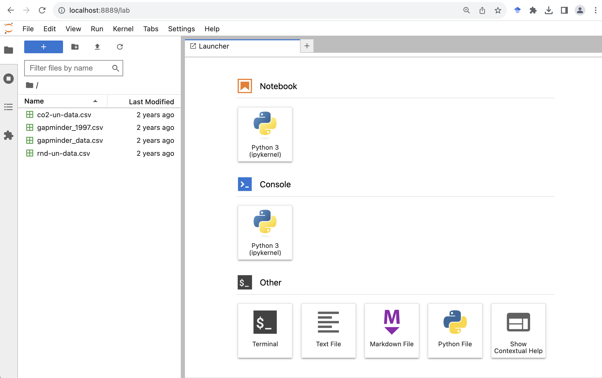
On the right side is the main work area where we can write code, see the outputs, and do other things. Now let’s create a new Jupyter notebook by clicking the “Python 3” button (under the “Notebook” category) on the “Launcher” tab .
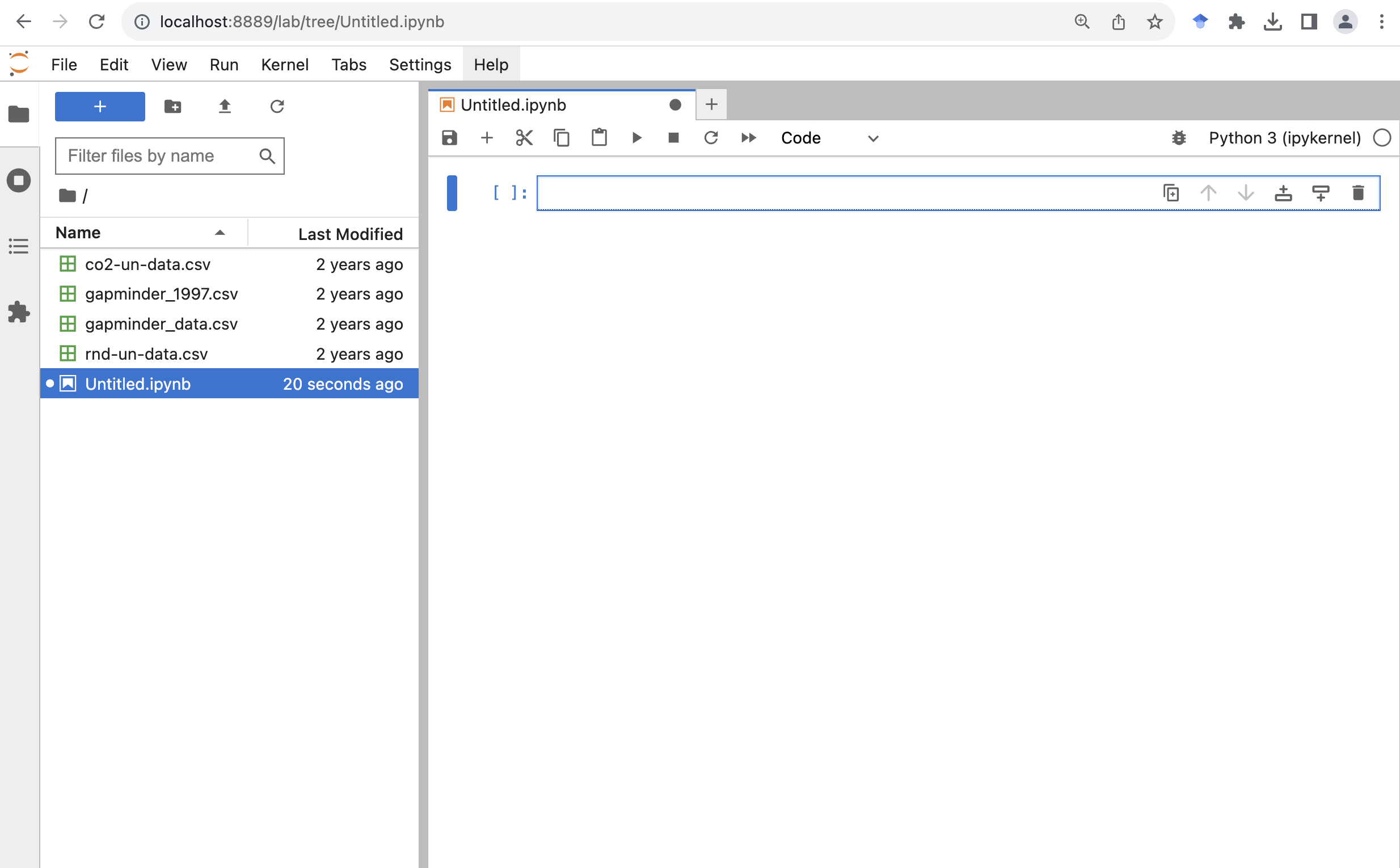
Now we have created a new Jupyter notebook called Untitled.ipynb.
The file name extension ipynb indicates it’s a notebook file.
In case you are interested, it stands for “IPython Notebook”, which is the former name for Jupyter Notebook.
Let’s give it a more meaningful file name called gdp_population.ipynb
To rename a file we can right click it from the file browser, and then click “Rename”.
A notebook is composed of “cells”. You can add more cells by clicking the plus “+” button from the toolbar at the top of the notebook.
Python basics
Arithmetic operators
At a minimum, we can use Python as a calculator.
If we type the following into a cell, and click the run button (the triangle-shaped button that looks like a play button), we will see the output under the cell.
Another quicker way to run the code in the selected cell is by pressing on your keyboard Ctrl+Enter (for Windows) or Command+Return (for MacOS).
Addition
2 + 3
5
Subtraction
2 - 3
-1
Multiplication
2 * 3
6
Division
2 / 3
0.6666666666666666
Exponentiation
One thing that you might need to be a little careful about is the exponentiation.
If you have used Microsoft Excel, MATLAB, R, or some other programming languages,
the operator for exponentiation is the caret ^ symbol.
Let’s take a look at if that works in Python.
2 ^ 3
1
Hmm. That’s not what we expected. It turns out in Python (and a few other languages), the caret symbol is used for another operation called bitwise exclusive OR.
In Python we use double asterisks ** for exponentiation.
2 ** 3
8
Order of operations
We can also use parentheses to specify what operations should be resolved first. For example, to convert 60 degrees Fahrenheit to Celsius, we can do:
5 / 9 * (60 - 32)
15.555555555555555
Assignment operator
In Python we can use a = symbol, which is called the assignment operator, to assign values on the right to objects on the left.
Let’s assign a number to a variable called “age”.
When we run the cell, it seems nothing happened.
But that’s only because we didn’t ask Python to display anything in the output after the assignment operation.
We can call the Python built-in function print() to display information in the output.
We can also use another Python built-in function type() to check the type of an object, in this case, the variable called “age”.
And we can see the type is “int”, standing for integers.
age = 26
print(age)
print(type(age))
26
<class 'int'>
Let’s create another variable called “pi”, and assign it with a value of 3.1415. We can see that this time the variable has a type of “float” for floating-point number, or a number with a decimal point.
pi = 3.1415
print(pi)
print(type(pi))
3.1415
<class 'float'>
We can also assign string or text values to a variable. Let’s create a variable called “name”, and assign it with a value “Ben”.
name = Ben
print(name)
NameError: name 'Ben' is not defined
We got an error message.
As it turns out, to make it work in Python we need to wrap any string values in quotation marks.
We can use either single quotes ' or double quotes ".
We just need to use the same kind of quotes at the beginning and end of the string.
You do need to use the same kind of quotes at the beginning and end of the string.
We can also see that the variable has a type of “str”, standing for strings.
name = "Ben"
print(name)
print(type(name))
Ben
<class 'str'>
Single vs Double Quotes
Python supports using either single quotes
'or double quotes"to specify strings. There’s no set rules on which one you should use.
- Some Python style guide suggests using single-quotes for shorter strings (the technical term is string literals), as they are a little easier to type and read, and using double-quotes for strings that are likely to contain single-quote characters as part of the string itself (such as strings containing natural language, e.g.
"I'll be there.").- Some other Python style guide suggests being consistent with your choice of string quote character within a file. Pick
'or"and stick with it.
Assigning values to objects
Try to assign values to some objects and observe each object after you have assigned a new value. What do you notice?
name = "Ben"
print(name)

name = "Harry Potter"
print(name)
Solution
When we assign a value to an object, the object stores that value so we can access it later. However, if we store a new value in an object we have already created (like when we stored “Harry Potter” in the
nameobject), it replaces the old value.
Guidelines on naming objects
- You want your object names to be explicit and not too long.
- They cannot start with a number (2x is not valid, but x2 is).
- Python is case sensitive, so for example, weight_kg is different from Weight_kg.
- You cannot use spaces in the name.
- There are some names that cannot be used because they are the names of fundamental functions in Python (e.g.,
if,else, `for; runhelp("keywords")for a complete list). You may also notice these keywords change to a different color once you type them (a feature called “syntax highlighting”).- It’s best to avoid dots (.) within names. Dots have a special meaning (methods) in Python and other programming languages.
- It is recommended to use nouns for object names and verbs for function names.
- Be consistent in the styling of your code, such as where you put spaces, how you name objects, etc. Using a consistent coding style makes your code clearer to read for your future self and your collaborators. The official Python naming conventions can be found here.
Bonus Exercise: Bad names for objects
Try to assign values to some new objects. What do you notice? After running all four lines of code bellow, what value do you think the object
Flowerholds?1number = 3 Flower = "marigold" flower = "rose" favorite number = 12Solution
Notice that we get an error when we try to assign values to
1numberandfavorite number. This is because we cannot start an object name with a numeral and we cannot have spaces in object names. The objectFlowerstill holds “marigold.” This is because Python is case-sensitive, so runningflower = "rose"does NOT change theFlowerobject. This can get confusing, and is why we generally avoid having objects with the same name and different capitalization.
Data structures
Python lists
Rather than storing a single value to an object, we can also store multiple values into a single object called a list. A Python list is indicated with a pair of square brackets
[], and different items are separated by a comma. For example, we can have a list of numbers, or a list of strings.squares = [1, 4, 9, 16, 25] print(squares) names = ["Sara", "Tom", "Jerry", "Emma"] print(names)We can also check the type of the object by calling the
type()function.type(names)listAn item from a list can be accessed by its position using the square bracket notation. Say if we want to get the first name, “Sara”, from the list, we can do
names[1]'Tom'That’s not what we expected. Python uses something called 0-based indexing. In other words, it starts counting from 0 rather than 1. If we want to get the first item from the list, we should use an index of 0. Let’s try that.
names[0]'Sara'Now see if you can get the last name from the list.
Solutions:
names[3]A cool thing in Python is it also supports negative indexing. If we just want the last time on a list, we can pass the index of
-1.names[-1]
Python dictionaries
Python lists allow us to organize items by their position. Sometimes we want to organize items by their “keys”. This is when a Python dictionary comes in handy.
A Python dictionary is indicated with a pair of curly brackets
{}and composed of entries of key-value pairs. The key and value are connected via a colon:, and different entries are separated by a comma,. For example, let’s create a dictionary of capitals. We can separate the entries in multiple lines to make it a little easier to read, especially when we have many entries. In Python we can break lines inside braces (e.g.,(),[],{}) without breaking the code. This is a common technique people use to avoid long lines and make their code a little more readable.capitals = {"France": "Paris", "USA": "Washington DC", "Germany": "Berlin", "Canada": "Ottawa"}We can check the type of the object by calling the
type()function.type(capitals)dictAn entry from a dictionary can be accessed by its key using the square bracket notation. Say if we want to get the capital for USA, , we can do
capitals["USA"]'Washington DC'Now see if you can get the capital from another country.
Solutions:
capitals["Canada"]'Ottawa'
Calling functions
So far we have used two Python built-in functions, print() to print some values on the screen, and type() to show the type of an object.
The way we called these functions is to first type the name of the function, followed by a pair of parenthesis.
Many functions require additional pieces of information to do their job. We call these additional values “arguments” or “parameters”.
We pass the arguments to a function by placing values in between the parenthesis.
A function takes in these arguments and does a bunch of “magic” behind the scenes to output something we’re interested in.
Do all functions need arguments? Let’s test some other functions.
It is common that we may want to use a function from a module.
In this case we will need to first import the module to our Python session.
We do that by using the import keyword followed by the module’s name.
To call a function from a module, we type the name of the imported module, followed by a dot ., followed by the name of the function that we wish to call.
Below we import the operating system module and call the function getcwd() to get the current working directory.
import os
os.getcwd()
'/Users/fredfeng/Desktop/teaching/workshops/um-carpentries/intro-curriculum-python/_episodes_ipynb'
Sometimes the function resides inside a submodule, we can specify the submodule using the dot notation.
In the example below, we call the today() function which is located in the date submodule inside the datetime module that we imported.
import datetime
datetime.date.today()
datetime.date(2023, 11, 4)
While some functions, like those above, don’t need any arguments, in other
functions we may want to use multiple arguments.
When we’re using multiple arguments, we separate the arguments with commas.
For example, we can use the print() function to print two strings:
print("My name is", name)
My name is Harry Potter
Pro-tip
Each function has a help page that documents what a function does, what arguments it expects and what it will return. You can bring up the help page a few different ways. You can type
?followed by the function name, for example,You can also place the mouse curse next to a function, and press Shift+Tab to see its help doc.
Learning more about functions
Look up the function
round(). What does it do? What will you get as output for the following lines of code?round(3.1415) round(3.1415, 3)Solution
The
round()function rounds a number to a given precision. By default, it rounds the number to an integer (in our example above, to 3). If you give it a second number, it rounds it to that number of digits (in our example above, to 3.142)Notice how in this example, we didn’t include any argument names. But you can use argument names if you want:
round(number=3.1415, ndigits=3)
Position of the arguments in functions
Which of the following lines of code will give you an output of 3.14? For the one(s) that don’t give you 3.14, what do they give you?
round(number=3.1415)
round(number=3.1415, ndigits=2)
round(ndigits=2, number=3.1415)
round(2, 3.1415)
Solution
The 2nd and 3rd lines will give you the right answer because the arguments are named, and when you use names the order doesn’t matter. The 1st line will give you 3 because the default number of digits is 0. Then 4th line will give you 2 because, since you didn’t name the arguments, x=2 and digits=3.1415.
Sometimes it is helpful - or even necessary - to include the argument name, but often we can skip the argument name, if the argument values are passed in a certain order. If all this function stuff sounds confusing, don’t worry! We’ll see a bunch of examples as we go that will make things clearer.
Comments
Sometimes we may want to write some comments in our code to help us remember what our code is doing, but we don’t want Python to think these comments are a part of the code you want to evaluate. That’s where comments come in! Anything after a
#sign in your code will be ignored by Python. For example, let’s say we wanted to make a note of what each of the functions we just used do:datetime.date.today() # returns today's dateos.getcwd() # returns our current working directorySome other time we may want to temporarily disable some code without deleting them. We can comment out lines of code by placing a
#sign at the beginning of each line.A handy keyboard shortcut for that is move the mouse cursor to the line you wish to comment out, then press Ctrl+/ (for Windows) or Command+/ (for MacOS) to toggle through comment and uncomment. If you wish to comment out multiple lines, first select all the lines, then use the same keyboard shortcut to comment or uncomment.
Loading and reviewing data
Data objects
In the above we introduced Python lists and dictionaries. There are other ways to store data in Python. Most objects have a table-like structure with rows and columns. We will refer to these objects generally as “data objects”. If you’ve used pandas before, you may be used to calling them “DataFrames”.
Understanding commands
The first thing we usually do when starting a new notebook is to import the libraries that we will need later to the python session. In general, we will need to first install a library before we can import it. If you followed the setup instruction and installed Anaconda, some common data science libraries are already installed.
Here we can go ahead and import them using the import keyword followed by the name of the library.
It’s common to give a library an alias name or nickname, so we can type less words when calling the library later.
The alias is created by using the keyword as.
By convention, numpy’s alias is np, and pandas’s alias is pd.
Technically you can give whatever the alias you want, but please don’t :)
import numpy as np
import pandas as pd
pd.read_csv()
TypeError: read_csv() missing 1 required positional argument: 'filepath_or_buffer'
We get an error message. Don’t panic! Error messages pop up all the time, and can be super helpful in debugging code.
In this case, the message tells us the function that we called is “missing 1 required positional argument: ‘filepath_or_buffer’”
If we think about it. We haven’t told the function what CSV files to read. Let’s tell the function where to find the CSV file by passing a file path to the function as a string.
gapminder_1997 = pd.read_csv("gapminder_1997.csv")

gapminder_1997
                country       pop continent  lifeExp     gdpPercap
0           Afghanistan  22227415      Asia   41.763    635.341351
1               Albania   3428038    Europe   72.950   3193.054604
2               Algeria  29072015    Africa   69.152   4797.295051
3                Angola   9875024    Africa   40.963   2277.140884
4             Argentina  36203463  Americas   73.275  10967.281950
..                  ...       ...       ...      ...           ...
137             Vietnam  76048996      Asia   70.672   1385.896769
138  West Bank and Gaza   2826046      Asia   71.096   7110.667619
139          Yemen Rep.  15826497      Asia   58.020   2117.484526
140              Zambia   9417789    Africa   40.238   1071.353818
141            Zimbabwe  11404948    Africa   46.809    792.449960

[142 rows x 5 columns]
The read_csv() function took the file path we provided, did who-knows-what behind the scenes, and then outputted a table with the data stored in that CSV file.
All that, with one short line of code!
We can check the type of the variable by calling the Python built-in function type.
type(gapminder_1997)
pandas.core.frame.DataFrame
In pandas terms, gapminder_1997 is a named DataFrame that references or stores something. In this case, gapminder_1997 stores a specific table of data.
Reading in an Excel file
Say you have an Excel file and not a CSV - how would you read that in? Hint: Use the Internet to help you figure it out!
Solution
Pandas comes with the
read_excel()function which provides the same output as the output ofread_csv().
Creating our first plot
We will mostly use the Vega-Altair (Altair for short), a popular Python data visualization library, to make our charts.
We first import the Altair module.
All charts start by calling the Altair’s Chart() function.
In a Jupyter notebook cell type the following:
import altair as alt

alt.Chart(gapminder_1997)
When we run it, we will see the following error message
SchemaValidationError: '{'data': {'name': 'data-86c7d3f994999d48e1df64fba25df47d'}}' is an invalid value.

'mark' is a required property
What we’ve done is to call the Chart() function to instantiate a Chart object and told it we will be using the data from the gapminder_1997, the DataFrame that we loaded from the CSV file.
So we’ve made a Chart object, now we need to start telling it what we actually want to draw in this chart.
The geometric objects in a chart, such as bars, lines, points, are called marks in Altair.
For those of you who used ggplot in R, it’s the “geoms”.
Now we need to specify the marks in the chart.
We will talk about a few different marks today,
but for our first plot, let’s draw our data using the “circle” mark for each value in the data set.
To do this, we apply the mark_circle() method to the chart.
alt.Chart(gapminder_1997).mark_circle()

The geometric objects of a chart, such as circles, bars, have a bunch of visual properties such as an x and y position, size, color, etc. When creating a data visualization, we map a variable in our dataset to a visual property in our chart.
To create our chart, we need to map variables from our data gapminder_1997 to
the visual properties using the Chart() function.
Since we have already told Chart that we are using the data in the gapminder_1997, we can access the columns of gapminder_1997 using the data frame’s column names.
(Remember, Python is case-sensitive, so we have to be careful to match the column names exactly!)
We are interested in whether there is a relationship between GDP and life expectancy, so let’s start by telling our plot object that we want to map the GDP values to the x axis.
alt.Chart(gapminder_1997).mark_point().encode(
    x='gdpPercap',
)

We see a sometimes called dot plot, where the GDP values are encoded on the x axis. Now let’s add the life expectancy to the y axis of the plot.
alt.Chart(gapminder_1997).mark_circle().encode(
    x='gdpPercap',
    y='lifeExp',
)

Excellent. We’ve now told our plot where the x and y values are coming from and what they stand for. But we haven’t told our plot how we want it to draw the data.

What we just did is to pass the name of the two columns to the x and y inside the encode method.
This offers a quick and concise way to generate a chart if we just want to quickly explore the data and don’t mind using the default settings.
For example, you may notice the labels of the x and y axis are using the column names from the dataframe.
If we want to customize the chart, for example, using a different axis label or axis range, Altair offers a different way to specify the channel encoding options.
We can add labels for the axes and title by applying the label() method to our plot.
alt.Chart(gapminder_1997).mark_circle().encode(
    x=alt.X('gdpPercap', title='GDP Per Capita'),
    y='lifeExp',
)

Give the y axis a nice label.
Solution
alt.Chart(gapminder_1997).mark_circle().encode(
    x=alt.X('gdpPercap', title='GDP Per Capita'),
    y=alt.Y('lifeExp', title='Life Expectancy'),
)

Now it finally looks like a proper plot!
We can now see a trend in the data.
It looks like countries with a larger GDP tend to have a higher life expectancy.
Let’s add a title to our plot to make that clearer.
We can specify that using the same label() method, but this time we will use the title argument.
alt.Chart(gapminder_1997).mark_circle().encode(
    x=alt.X('gdpPercap', title='GDP Per Capita'),
    y=alt.Y('lifeExp', title='Life Expectancy'),
).properties(
    title='Do people in wealthy countries live longer?',
)

No one can deny we’ve made a very handsome plot!
But now looking at the data, we might be curious about learning more about the points that are the extremes of the data.
We know that we have two more pieces of data in the gapminder_1997 that we haven’t used yet.
Maybe we are curious if the different continents show different patterns in GDP and life expectancy.
One thing we could do is use a different color for each of the continents.
It is possible to map data values to various graphical properties.
In this case let’s map the continent to the color property.
The quickest way to do this is to set color='continent' inside the encode.
alt.Chart(gapminder_1997).mark_circle().encode(
    x=alt.X('gdpPercap', title='GDP Per Capita'),
    y=alt.Y('lifeExp', title='Life Expectancy'),
    color='continent',
).properties(
    title='Do people in wealthy countries live longer?',
)

But here we wish to customize this chart later. So let’s use the syntax that allow us to customize the settings later.
alt.Chart(gapminder_1997).mark_circle().encode(
    x=alt.X('gdpPercap', title='GDP Per Capita'),
    y=alt.Y('lifeExp', title='Life Expectancy'),
    color=alt.Color('continent'),
).properties(
    title='Do people in wealthy countries live longer?',
)
Here we can see that in 1997 the African countries had much lower life expectancy than many other continents.
Notice that when we add a mapping for color, Altair automatically provides a legend for us.
It took care of assigning different colors to each of our unique values of the continent variable.
The colors that Altair uses are determined by the color scheme.
If needed, we can change the default color scheme.
Let’s change the colors to make them a bit prettier.
The code below allows us to select a color palette. Altair is built based on the vega project and supports all the color schemes from the vega color schemes.
We can change the color scheme by applying the scale() method to the to the color schema wrapper alt.Color.
The scale() method specifies how the data should be mapped to visual properties, and in this case, how the categorical variable “continent” should be mapped to different colors of the point marks.
alt.Chart(gapminder_1997).mark_circle().encode(
    x=alt.X('gdpPercap', title='GDP Per Capita'),
    y=alt.Y('lifeExp', title='Life Expectancy'),
    color=alt.Color('continent').scale(scheme='set1'),
).properties(
    title='Do people in wealthy countries live longer?',
)

Since we have the data for the population of each country, we might be curious what effect population might have on life expectancy and GDP per capita.
Do you think larger countries will have a longer or shorter life expectancy?
Let’s find out by mapping the population of each country to another visual property: the size of the point marks.
Again, for a quick plot, we can just add size='pop' to the encoding.
But we will use the syntax that supports customization, and add a title to it, so it shows the word “Population” rather than the column name “pop” in the legend.
alt.Chart(gapminder_1997).mark_circle().encode(
    x=alt.X('gdpPercap', title='GDP Per Capita'),
    y=alt.Y('lifeExp', title='Life Expectancy'),
    color=alt.Color('continent').scale(scheme='set1'),
    size=alt.Size('pop', title='Population'),
).properties(
    title='Do people in wealthy countries live longer?',
)

We got another legend here for size which is nice, but the values look a bit ugly with very long digits.
Let’s assign a new column in our data called pop_million by dividing the population by 1,000,000 and label it “Population (in millions)”
Note for large numbers such as 1000000, it’s easy to mis-count the number of digits when typing or reading it.
Another way to write it is 1e6 which means 10 raised to the 6th power.
alt.Chart(gapminder_1997).mark_circle().encode(
    x=alt.X('gdpPercap', title='GDP Per Capita'),
    y=alt.Y('lifeExp', title='Life Expectancy'),
    color=alt.Color('continent').scale(scheme='set1'),
    size=alt.Size('pop', title='Population (in millions)'),
).transform_calculate(
    pop='datum.pop/1000000'
).properties(
    title='Do people in wealthy countries live longer?',
)

Plotting for data exploration
Many datasets are much more complex than the example we used for the first plot. How can we find meaningful insights in complex data and create visualizations to convey those insights?
Importing datasets
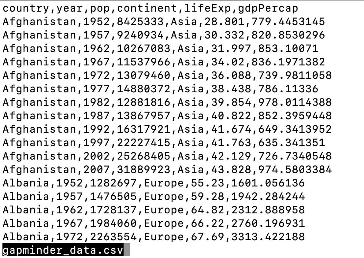
In the first plot, we looked at a smaller slice of a large dataset. To gain a better understanding of the kinds of patterns we might observe in our own data, we will now use the full dataset, which is stored in a file called “gapminder_data.csv”.
To start, we will read in the data to a pandas DataFrame.
Read in your own data
What argument should be provided in the below code to read in the full dataset?
gapminder_data = pd.read_csv()Solution
gapminder_data = pd.read_csv("gapminder_data.csv")
Let’s take a look at the full dataset.
Pandas offers a way to select the top few rows of a data frame by applying the head() method to the data frame. Try it out!
gapminder_data.head()
       country  year         pop continent  lifeExp   gdpPercap
0  Afghanistan  1952   8425333.0      Asia   28.801  779.445314
1  Afghanistan  1957   9240934.0      Asia   30.332  820.853030
2  Afghanistan  1962  10267083.0      Asia   31.997  853.100710
3  Afghanistan  1967  11537966.0      Asia   34.020  836.197138
4  Afghanistan  1972  13079460.0      Asia   36.088  739.981106
Notice that this dataset has an additional column “year” compared to the smaller dataset we started with.
Predicting Altair outputs
Now that we have the full dataset read into our Python session, let’s plot the data placing our new “year” variable on the x axis and life expectancy on the y axis. We’ve provided the code below. Notice that we’ve left off the labels so there’s not as much code to work with. Before running the code, read through it and see if you can predict what the plot output will look like. Then run the code and check to see if you were right!
alt.Chart(gapminder).mark_circle().encode(
    x='year:O',
    y='lifeExp',
    color='continent',
)

Hmm, the plot we created in the last exercise isn’t very clear. What’s going on? Since the dataset is more complex, the plotting options we used for the smaller dataset aren’t as useful for interpreting these data. Luckily, we can add additional attributes to our plots that will make patterns more apparent. For example, we can generate a different type of plot - perhaps a line plot - and assign attributes for columns where we might expect to see patterns.
Let’s review the columns and the types of data stored in our dataset to decide how we should group things together.
We can apply the pandas method info to get the summary information of the data frame.
gapminder.info()
<class 'pandas.core.frame.DataFrame'>
RangeIndex: 1704 entries, 0 to 1703
Data columns (total 6 columns):
 #   Column     Non-Null Count  Dtype
---  ------     --------------  -----
 0   country    1704 non-null   object
 1   year       1704 non-null   int64
 2   pop        1704 non-null   float64
 3   continent  1704 non-null   object
 4   lifeExp    1704 non-null   float64
 5   gdpPercap  1704 non-null   float64
dtypes: float64(3), int64(1), object(2)
memory usage: 80.0+ KB
So, what do we see? The data frame has 1,704 entries (rows) and 6 columns. The “Dtype” shows the data type of each column.
What kind of data do we see?
- “int64”: Integer (or whole number)
- “float64”: Numeric (or non-whole number)
- “object”: String or mixed data type
Our plot has a lot of points in columns which makes it hard to see trends over time. A better way to view the data showing changes over time is to use lines. Let’s try changing the mark from dot to line and see what happens.
alt.Chart(gapminder).mark_line().encode(
    x='year:O',
    y='lifeExp',
    color='continent',
)

Hmm. This doesn’t look right.
By setting the color value, we got a line for each continent,
but we really wanted a line for each country.
We need to tell Altair that we want to connect the values for each country value instead.
To do this, we need to specify the detail argument of the encode method.
alt.Chart(gapminder).mark_line().encode(
    x='year:O',
    y='lifeExp',
    color='continent',
    detail='country',
)

Sometimes plots like this are called “spaghetti plots” because all the lines look like a bunch of wet noodles.
Bonus Exercise: More line plots
Now create your own line plot comparing population and life expectancy! Looking at your plot, can you guess which two countries have experienced massive change in population from 1952-2007?
Solution
alt.Chart(gapminder).mark_line().encode(
    x='pop',
    y='lifeExp',
    color='continent',
    detail='country',
)
(China and India are the two Asian countries that have experienced massive population growth from 1952-2007.)
Categorical Plots
So far we’ve looked at plots with both the x and y values being numerical values in a continuous scale (e.g., life expectancy, GDP per capita, year, population, etc.) But sometimes we may want to visualize categorical data (e.g., continents).
We’ve previously used the categorical values of the continent column to color in our points and lines. But now let’s try moving that variable to the x axis.
Let’s say we are curious about comparing the distribution of the life expectancy values for each of the different continents for the gapminder_1997 data.
Let’s map the continent to the x axis and the life expectancy to the y axis. Let’s use the dot marks to represent the data.
(
    so.Plot(gapminder_1997,
            x='continent',
            y='lifeExp')
    .add(so.Dot())
)

We see that there is some overplotting as countries from the same continents are aligned vertically like a strip of kebab, making it hard to see the dots in some dense areas. The seaborn objects interface leaves it to us to specify who we would like the overplotting to be handled. A common treatment is to spread (or “jitter”) the dots within each group by adding a little random displacement along the categorical axis. The result is sometimes called a “jitter plot”.
Here we can simply add so.Jitter().
(
    so.Plot(gapminder_1997,
            x='continent',
            y='lifeExp')
    .add(so.Dot(), so.Jitter())
)

We can control the amount of jitter by setting the width argument.
Let’s also change the size and opacity of the dots.
(
    so.Plot(gapminder_1997,
            x='continent',
            y='lifeExp')
    .add(so.Dot(pointsize=10, alpha=.5), so.Jitter(width=.8))
)

Lastly, let’s further map the continents to the color of the dots.
(
    so.Plot(gapminder_1997,
            x='continent',
            y='lifeExp',
            color='continent')
    .add(so.Dot(pointsize=10, alpha=.5), so.Jitter(width=.8))
)

This type of visualization makes it easy to compare the distribution (e.g., range, spread) of values across groups.
Bonus Exercise: Other categorical plots
Let’s plot the range of the life expectancy for each continent in terms of its mean plus/minus one standard deviation.
Example solution
(
    so.Plot(gapminder_1997,
            x='continent',
            y='lifeExp',
            color='continent')
    .add(so.Range(), so.Est(func='mean', errorbar='sd'))
    .add(so.Dot(), so.Agg())
)

Univariate Plots
We jumped right into making plots with multiple columns.
But what if we wanted to take a look at just one column?
In that case, we only need to specify a mapping for x and choose an appropriate mark.
Let’s start with a histogram to see the range and spread of life expectancy.
(
    so.Plot(data=gapminder_1997,
            x='lifeExp')
    .add(so.Bars(), so.Hist())
)

Histograms can look very different depending on the number of bins you decide to draw.
The default is 10.
Let’s try setting a different value by explicitly passing a bins argument to Hist.
(
    so.Plot(data=gapminder_1997,
            x='lifeExp')
    .add(so.Bars(), so.Hist(bins=20))
)

You can try different values like 5 or 50 to see how the plot changes.
Sometimes we don’t really care about the total number of bins, but rather the bin width and end points.
For example, we may want the bins at 40-42, 42-44, 44-46, and so on.
In this case, we can set the binwidth and binrange arguments to the Hist.
(
    so.Plot(data=gapminder_1997,
            x='lifeExp')
    .add(so.Bars(), so.Hist(binwidth=5, binrange=(0, 100)))
)

Changing the aggregate statistics
By default the y axis shows the number of observations in each bin, that is,
stat='count'. Sometimes we are more interested in other aggregate statistics rather than count, such as the percentage of the observations in each bin. Check the documentation ofso.Histand see what other aggregate statistics are offered, and change the histogram to show the percentages instead.Solution
(
    so.Plot(data=gapminder_1997,
            x='lifeExp')
    .add(so.Bars(), so.Hist(stat='percent', binwidth=5, binrange=(0, 100)))
)

If we want to see a break-down of the life expectancy distribution by each continent, we can add the continent to the color property.
(
    so.Plot(data=gapminder_1997,
            x='lifeExp',
            color='continent')
    .add(so.Bars(), so.Hist(stat='percent', binwidth=5, binrange=(0, 100)))
)

Hmm, it looks like the bins for each continent are on top of each other.
It’s not very easy to see the distributions.
Again, we can tell seaborn how overplotting should be handled.
In this case we can use so.Stack() to stack the bins.
This type of chart is often called a “stacked bar chart”.
(
    so.Plot(data=gapminder_1997,
            x='lifeExp',
            color='continent')
    .add(so.Bars(), so.Hist(stat='percent', binwidth=5, binrange=(0, 100)), so.Stack())
)

Other than the histogram, we can also usekernel density estimation, a smoothing technique that captures the general shape of the distribution of a continuous variable.
We can add a line so.Line() that represents the kernel density estimates so.KDE().
(
    so.Plot(data=gapminder_1997,
            x='lifeExp')
    .add(so.Line(), so.KDE())
)

Alternatively, we can also add an area so.Area() that represents the kernel density estimates so.KDE().
(
    so.Plot(data=gapminder_1997,
            x='lifeExp')
    .add(so.Area(), so.KDE())
)

If we want to see the kernel density estimates for each continent, we can map continents to the color in the plot function.
(
    so.Plot(data=gapminder_1997,
            x='lifeExp',
            color='continent')
    .add(so.Area(), so.KDE())
)

We can overlay multiple visualization layers to the same plot.
Here let’s combine the histogram and the kernel density estimate.
Note we will need to change the stat argument of the so.Hist() to density, so that the y axis values of the histogram are comparable with the kernel density.
(
    so.Plot(data=gapminder_1997,
            x='lifeExp')
    .add(so.Bars(), so.Hist(stat='density', binwidth=5, binrange=(0, 100)))
    .add(so.Line(), so.KDE())
)

Lastly, we can make a few further improvements to the plot.
- Specify the
labelparameter for the two data layers (i.e., the lines starts with.add()), so they will show up in a “layer legend”. - Change the line color, width, and opacity.
- Add x and y axis labels.
- Change the size of the plot by calling the
layout()method.
(
    so.Plot(data=gapminder_1997,
            x='lifeExp')
    .add(so.Bars(), so.Hist(stat='density', binwidth=5, binrange=(0, 100)), label='Histogram')
    .add(so.Line(color='red', linewidth=4, alpha=.7), so.KDE(), label='Kernel density')
    .label(x="Life expectancy", y="Density")
    .layout(size=(9, 4))
)

Facets
If you have a lot of different columns to try to plot or have distinguishable subgroups in your data, a powerful plotting technique called faceting might come in handy. When you facet your plot, you basically make a bunch of smaller plots and combine them together into a single image. Luckily, seaborn makes this very easy. Let’s start with the “spaghetti plot” that we made earlier.
(
    so.Plot(data=gapminder,
            x='year',
            y='lifeExp',
            group='country',
            color='continent')
    .add(so.Line())
)
Rather than having all the countries in a single plot, this time let’s draw a separate box (a “subplot”) for countries in each continent.
We can do this by applying the facet() method to the plot.
(
    so.Plot(data=gapminder,
            x='year',
            y='lifeExp',
            group='country',
            color='continent')
    .add(so.Line())
    .facet('continent')
)

Note now we have a separate subplot for countries in each continent. This type of faceted plots are sometimes called small multiples.
Note all five subplots are in one row. If we want, we can “wrap” the subplots across a two-dimentional grid. For example, if we want the subplots to have a maximum of 3 columns, we can do the following.
    so.Plot(data=gapminder,
            x='year',
            y='lifeExp',
            group='country',
            color='continent')
    .add(so.Line())
    .facet('continent', wrap=3)

By default, the facet() method will place the subplots along the columns of the grid.
If we want to place the subplots along the rows (it’s probably not a good idea in this example as we want to compare the life expectancies), we can set row='continent' when applying facet to the plot.
(
    so.Plot(data=gapminder,
            x='year',
            y='lifeExp',
            group='country',
            color='continent')
    .add(so.Line())
    .facet(row='continent')
)

Saving plots
We’ve made a bunch of plots today, but we never talked about how to share them with our friends who aren’t running Python! It’s wise to keep all the code we used to draw the plot, but sometimes we need to make a PNG or PDF version of the plot so we can share it with our colleagues or post it to our Instagram story.
We can save a plot by applying the save() method to the plot.
(
    so.Plot(data=gapminder,
            x='year',
            y='lifeExp',
            group='country',
            color='continent')
    .add(so.Line())
    .facet('continent', wrap=3)
    .save("awesome_plot.png", bbox_inches='tight', dpi=200)
)
Saving a plot
Try rerunning one of your plots and then saving it using
save. Find and open the plot to see if it worked!Example solution
(
    so.Plot(data=gapminder_1997,
            x='lifeExp')
    .add(so.Bars(), so.Hist(stat='density', binwidth=5, binrange=(0, 100)), label='Histogram')
    .add(so.Line(color='red', linewidth=4, alpha=.7), so.KDE(), label='Kernal density')
    .label(x="Life expectency", y="Density")
    .layout(size=(9, 4))
    .save("another_awesome_plot.png", bbox_inches='tight', dpi=200)
)
Check your current working directory to find the plot!
We also might want to just temporarily save a plot while we’re using Python, so that you can come back to it later.
Luckily, a plot is just an object, like any other object we’ve been working with!
Let’s try storing our histogram from earlier in an object called hist_plot.
hist_plot = (
    so.Plot(data=gapminder_1997,
            x='lifeExp')
    .add(so.Bars(), so.Hist(stat='density', binwidth=5, binrange=(0, 100)))
)
Now if we want to see our plot again, we can just run:
hist_plot

We can also add changes to the plot. Let’s say we want to add another layer of the kernel density estimation.
hist_plot.add(so.Line(color='red'), so.KDE())

Watch out! Adding the theme does not change the hist_plot object!
If we want to change the object, we need to store our changes:
hist_plot = hist_plot.add(so.Line(color='red'), so.KDE())
Bonus Exercise: Create and save a plot
Now try it yourself! Create your own plot using
so.Plot(), store it in an object namedmy_plot, and save the plot using thesave()method.Example solution
(
    so.Plot(gapminder_1997,
            x='gdpPercap',
            y='lifeExp',
            color='continent')
    .add(so.Dot())
    .label(x="GDP Per Capita",
           y="Life Expectancy",
           title = "Do people in wealthy countries live longer?")
    .save("my_awesome_plot.png", bbox_inches='tight', dpi=200)
)
Bonus
Creating complex plots
Animated plots
Sometimes it can be cool (and useful) to create animated graphs, like this famous one by Hans Rosling using the Gapminder dataset that plots GDP vs. Life Expectancy over time. Let’s try to recreate this plot!
The seaborn library that we used so far does not support annimated plots. We will use a different visualization library in Python called Plotly - a popular library for making interactive visualizations.
Plotly is already pre-installed with Anaconda. All we need to do is to import the library.
import plotly.express as px

(
    px.scatter(data_frame=gapminder,
               x='gdpPercap',
               y='lifeExp',
               size='pop',
               animation_frame='year',
               hover_name='country',
               color='continent',
               height=600,
               size_max=80)
)

Awesome! This is looking sweet! Let’s make sure we understand the code above:
- The
animation_frameargument of the plotting function tells it which variable should be different in each frame of our animation: in this case, we want each frame to be a different year. - There are quite a few more parameters that we have control over the plot. Feel free to check out more options from the documentation of the
px.scatter()function.
So we’ve made this cool animated plot - how do we save it?
We can apply the write_html() method to save the plot to a standalone HTML file.
(
    px.scatter(data_frame=gapminder,
               x='gdpPercap',
               y='lifeExp',
               size='pop',
               animation_frame='year',
               hover_name='country',
               color='continent',
               height=600,
               size_max=80)
    .write_html("./hansAnimatedPlot.html")
)
Glossary of terms
- Mark: an object that is used to graphically represents data values. Examples include dots, bars, lines, areas, band, and paths. Each mark has a number of properties (e.g., color, size, opacity) that can be set to change its appearance.
- Facets: Dividing your data into groups and making a subplot for each.
- Layer: Each plot is made up of one or more layers. Each layer contains one mark.
- Scale: specifying mappings from data units to visual properties.
Key Points
Python is a free general purpose programming language used by many for reproducible data analysis.
Use Python library pandas’
read_csv()function to read tabular data.Use Python library seaborn to create and save data visualizations.
The Unix Shell
Overview
Teaching: 60 min
Exercises: 30 minQuestions
What is a command shell and why would I use one?
How can I move around on my computer?
How can I see what files and directories I have?
How can I specify the location of a file or directory on my computer?
How can I create, copy, and delete files and directories?
How can I edit files?
Objectives
Explain how the shell relates to users’ programs.
Explain when and why command-line interfaces should be used instead of graphical interfaces.
Construct absolute and relative paths that identify specific files and directories.
Demonstrate the use of tab completion and explain its advantages.
Create a directory hierarchy that matches a given diagram.
Create files in the directory hierarchy using an editor or by copying and renaming existing files.
Delete, copy, and move specified files and/or directories.
Contents
Introducing the Shell
Motivation
Usually you move around your computer and run programs through graphical user interfaces (GUIs). For example, Finder for Mac and Explorer for Windows. These GUIs are convenient because you can use your mouse to navigate to different folders and open different files. However, there are some things you simply can’t do from these GUIs.
The Unix Shell (or the command line) allows you to do everything you would do through Finder/Explorer, and a lot more. But it’s so scary! I thought so at first, too. Since then, I’ve learned that it’s just another way to navigate your computer and run programs, and it can be super useful for your work. For instance, you can use it to combine existing tools into a pipeline to automate analyses, you can write a script to do things for you and improve reproducibility, you can interact with remote machines and supercomputers that are far away from you, and sometimes it’s the only option for the program you want to run.
We’re going to use it to:
- Organize our Python code and plots from the Python plotting lesson.
- Perform version control using git during the rest of the workshop.
What the Shell looks like
When you open up the terminal for the first time, it can look pretty scary - it’s basically just a blank screen. Don’t worry - we’ll take you through how to use it step by step.
The first line of the shell shows a prompt - the shell is waiting for an input. When you’re following along in the lesson, don’t type the prompt when typing commands. To make the prompt the same for all of us, run this command:
PS1='$ '
Tree Structure
The first thing we need to learn when using the shell is how to get around our computer.
The shell folder (directory) structure is the same file structure as you’re used to.
We call the way that different directories are nested the “directory tree”.
You start at the root directory (/) and you can move “up” and “down” the tree. Here’s an example:
![]()
Now that we understand directory trees a bit, let’s check it out from the command line.
We can see where we are by using the command pwd which stands for “print working directory”, or the directory we are currently in:
pwd
/home/USERNAME/
Congrats! You just ran your first command from the command line. The output is a file path to a location (a directory) on your computer.
The output will look a little different depending on what operating system you’re using:
- Mac:
/Users/USERNAME - Linux:
/home/USERNAME - Windows:
/c/Users/USERNAME
Let’s check to see what’s in your home directory using the ls command, which lists all of the files in your working directory:
ls
Desktop     Downloads   Movies      Pictures
Documents   Library     Music       Public
You should see some files and directories you’re familiar with such as Documents and Desktop.
If you make a typo, don’t worry. If the shell can’t find a command you type, it will show you a helpful error message.
ks
ks: command not found
This error message tells us the command we tried to run, ks, is not a command that is recognized, letting us know we might have made a mistake when typing.
Man and Help
Often we’ll want to learn more about how to use a certain command such as ls. There are several different ways you can
learn more about a specific command.
Some commands have additional information that can be found by using the -h or --help
flags. This will print brief documentation for the command:
man -h
man --help
Other commands, such as ls, don’t have help flags, but have manual pages with more information. We can navigate
the manual page using the man command to view the description of a command and its options. For example,
if you want to know more about the navigation options of ls you can type man ls on the command line:
man ls
On the manual page for ls, we see a section titled options. These options, also called flags, are like arguments in Python functions, and allow us to customize how ls runs.
To get out of the man page, click q.
Sometimes, commands will have multiple flags that we want to use at the same time. For example,
ls has a flag -F that displays a slash after all directories, as well as a flag -a that
includes hidden files and directories (ones that begin with a .). There are two ways to run
ls using both of these flags:
ls -F -a
ls -Fa
Note that when we run the -a command, we see a . and a .. in the directory. The . corresponds to the current directory we are in and the .. corresponds to the directory directly above us in the directory tree. We’ll learn more about why this is useful in a bit.
Using the Manual Pages
Use
manto open the manual for the commandls.What flags would you use to…
- Print files in order of size?
- Print files in order of the last time they were edited?
- Print more information about the files?
- Print more information about the files with unit suffixes?
- Print files in order of size AND also print more information about the files?
Solution
ls -Sls -tls -lls -lhls -lS
Next, let’s move to our Desktop. To do this, we use cd to change directories.
Run the following command:
cd Desktop
Let’s see if we’re in the right place:
pwd
/home/USERNAME/Desktop
We just moved down the directory tree into the Desktop directory.
What files and directories do you have on your Desktop? How can you check?
ls
list.txt
un-report
notes.pdf
Untitled.png
Your Desktop will likely look different, but the important thing is that you see the folder we worked in for the Python plotting lesson.
Is the un-report directory listed on your Desktop?
How can we get into the un-report directory?
cd un-report
We just went down the directory tree again.
Let’s see what files are in un-report:
ls
awesome_plot.png
awesome_hist_plot.png
gapminder_1997.csv
gapminder_data.csv
gdp_population.ipynb
Is it what you expect? Are the files you made in the Python plotting lesson there?
Now let’s move back up the directory tree. First, let’s try this command:
cd Desktop
cd: Desktop: No such file or directory
This doesn’t work because the Desktop directory is not within the directory that we are currently in.
To move up the directory tree, you can use .., which is the parent of the current directory:
cd ..
pwd
/home/USERNAME/Desktop
Everything that we’ve been doing is working with file paths. We tell the computer where we want to go using cd plus the file path. We can also tell the computer what files we want to list by giving a file path to ls:
ls un-report
awesome_plot.png
awesome_hist_plot.png
gapminder_1997.csv
gapminder_data.csv
gdp_population.ipynb
ls ..
list.txt
un-report
notes.pdf
Untitled.png
What happens if you just type cd without a file path?
cd
pwd
/home/USERNAME
It takes you back to your home directory!
To get back to your projects directory you can use the following command:
cd Desktop/un-report
We have been using relative paths, meaning you use your current working directory to get to where you want to go.
You can also use the absolute path, or the entire path from the root directory. What’s listed when you use the pwd command is the absolute path:
pwd
You can also use ~ for the path to your home directory:
cd ~
pwd
/home/USERNAME
Absolute vs Relative Paths
Starting from
/Users/amanda/data, which of the following commands could Amanda use to navigate to her home directory, which is/Users/amanda?
cd .cd /cd /home/amandacd ../..cd ~cd homecd ~/data/..cdcd ..Solution
- No:
.stands for the current directory.- No:
/stands for the root directory.- No: Amanda’s home directory is
/Users/amanda.- No: this goes up two levels, i.e. ends in
/Users.- Yes:
~stands for the user’s home directory, in this case/Users/amanda.- No: this would navigate into a directory
homein the current directory if it exists.- Yes: unnecessarily complicated, but correct.
- Yes: shortcut to go back to the user’s home directory.
- Yes: goes up one level.
Working with files and directories
Now that we know how to move around your computer using the command line, our next step is to organize the project that we started in the Python plotting lesson You might ask: why would I use the command line when I could just use the GUI? My best response is that if you ever need to use a high-performance computing cluster (such as Great Lakes at the University of Michigan), you’ll have no other option. You might also come to like it more than clicking around to get places once you get comfortable, because it’s a lot faster!
First, let’s make sure we’re in the right directory (the un-reports directory):
pwd
/home/USERNAME/Desktop/un-reports
If you’re not there, cd to the correct place.
Next, let’s remind ourselves what files are in this directory:
ls
awesome_plot.png
awesome_hist_plot.png
gapminder_1997.csv
gapminder_data.csv
gdp_population.ipynb
TODO: update listing output
You can see that right now all of our files are in our main directory. However, it can start to get crazy if you have too many different files of different types all in one place! We’re going to create a better project directory structure that will help us organize our files. This is really important, particularly for larger projects. If you’re interested in learning more about structuring computational biology projects in particular, here is a useful article.
What do you think good would be a good way to organize our files?
One way is the following:
.
├── code
│   └── gdp_population.ipynb
├── data
│   ├── gapminder_1997.csv
    └── gapminder_data.csv
└── figures
    ├── awesome_plot.png
    └── awesome_hist_plot.png
The Jupyter notebook goes in the code directory, the gapminder datasets go in the data directory, and the figures go in the figures directory. This way, all of the files are organized into a clearer overall structure.
A few notes about naming files and directories:
- Don’t use white spaces because they’re used to break arguments on the command line, so it makes things like moving and viewing files more complicated.
Instead you can use a dash (
-) or an underscore (_). - Don’t start names with a dash (
-) because the shell will interpret it incorrectly. - Stick with letters, numbers, periods, dashes, and underscores, because other symbols (e.g.
^,&) have special meanings. - If you have to refer to names of files or directories with whitespace or other special characters, use double quotes. For example, if you wanted to change into a directory called
My Code, you will want to typecd "My Code", notcd My Code.
So how do we make our directory structure look like this?
First, we need to make a new directory. Let’s start with the code directory. To do this, we use the command mkdir plus the name of the directory we want to make:
mkdir code
Now, let’s see if that directory exists now:
ls
awesome_plot.png
awesome_hist_plot.png
code
gapminder_1997.csv
gapminder_data.csv
How can we check to see if there’s anything in the code directory?
ls code
Nothing in there yet, which is expected since we just made the directory.
The next step is to move the gdp_population.ipynb file into the code directory. To do this, we use the mv command. The first argument after mv is the file you want to move, and the second argument is the place you want to move it:
mv gdp_population.ipynb code
Okay, let’s see what’s in our current directory now:
ls
awesome_plot.png
awesome_hist_plot.png
code
gapminder_1997.csv
gapminder_data.csv
gdp_population.ipynb is no longer there! Where did it go? Let’s check the code directory, where we moved it to:
ls code
gdp_population.ipynb
There it is!
Creating directories and moving files
Create a
datadirectory and movegapminder_data.csvandgapminder_1997.csvinto the newly createddatadirectory.Solution
From the
un-reportdirectory:mkdir data mv gapminder_data.csv data mv gapminder_1997.csv data
Okay, now we have the code and data in the right place. But we have several figures that should still be in their own directory.
First, let’s make a figures directory:
mkdir figures
Next, we have to move the figures. But we have so many figures! It’d be annoying to move them one at a time. Thankfully, we can use a wildcard to move them all at once. Wildcards are used to match files and directories to patterns.
One example of a wildcard is the asterisk, *. This special character is interpreted as “multiple characters of any kind”.
Let’s see how we can use a wildcard to list only files with the extension .png:
ls *png
awesome_plot.png
awesome_hist_plot.png
See how only the files ending in .png were listed? The shell expands the wildcard to create a list of matching file names before running the commands. Can you guess how we move all of these files at once to the figures directory?
mv *png figures
We can also use the wildcard to list all of the files in all of the directories:
ls *
code:
gdp_population.ipynb

data:
gapminder_1997.csv  gapminder_data.csv

figures:
awesome_plot.png    awesome_hist_plot.png
This output shows each directory name, followed by its contents on the next line. As you can see, all of the files are now in the right place!
Working with Wildcards
Suppose we are in a directory containing the following files:
cubane.pdb
ethane.pdb
methane.pdb
octane.pdb
pentane.pdb
propane.pdb
README.md
What would be the output of the following commands?
ls *ls *.pdbls *ethane.pdbls *anels p*Solution
cubane.pdb ethane.pdb methane.pdb octane.pdb pentane.pdb propane.pdb README.mdcubane.pdb ethane.pdb methane.pdb octane.pdb pentane.pdb propane.pdbethane.pdb methane.pdb- None. None of the files end in only
ane. This would have listed files ifls *ane*were used instead.pentane.pdb propane.pdb
Viewing Files
To view and navigate the contents of a file we can use the command less. This will open a full screen view of the file.
For instance, we can run the command less on our gapminder_data.csv file:
less data/gapminder_data.csv
To navigate, press spacebar to scroll to the next page and b to scroll up to the previous page. You can also use the up and down arrows to scroll line-by-line. Note that less defaults to line wrapping, meaning that any lines longer than the width of the screen will be wrapped to the next line. To exit less, press the letter q.
One particularly useful flag for less is -S which cuts off really long lines (rather than having the text wrap around):
less -S data/gapminder_data.csv
To navigate, press spacebar to scroll to the next page and b to scroll up to the previous page. You can also use the up and down arrows to scroll line-by-line. Note that less defaults to line wrapping, meaning that any lines longer than the width of the screen will be wrapped to the next line, (to disable this use the option -S when running less, ex less -S file.txt). To exit less, press the letter q.
Note that not all file types can be viewed with less. While we can open PDFs and excel spreadsheets easily with programs on our computer, less doesn’t render them well on the command line. For example, if we try to less a .pdf file we will see a warning.
less figures/awesome_plot.png
figures/awesome_plot.png may be a binary file. See it anyway?
If we say “yes”, less will render the file but it will appear as a seemingly random display of characters that won’t make much sense to us.
Glossary of terms
- root: the very top of the file system tree
- absolute path: the location of a specific file or directory starting from the root of the file system tree
-
relative path: the location of a specific file or directory starting from where you currently are in the file system tree
pwd: Print working directory - prints the absolute path from the root directory to the directory where you currently are.ls: List files - lists files in the current directory. You can provide a path to list files to another directory as well (ls [path]).cd [path]: Change directories - move to another folder.mkdir: Make directory - creates a new directory..: This will move you up one level in the file system treemv: Move - move a file to a new location (mv [file] [/path/to/new/location]) OR remaning a file (mv [oldfilename] [newfilename])less: - quick way to view a document without using a full text editorman: Manual - allows you to view the bash manual for another command (e.g.man ls)-h/--help: Help - argument that pulls up the help manual for a programnano: a user-friendly text editor*: Wildcard - matches zero of more characters in a filename
Key Points
A shell is a program whose primary purpose is to read commands and run other programs.
Tab completion can help you save a lot of time and frustration.
The shell’s main advantages are its support for automating repetitive tasks and its capacity to access network machines.
Information is stored in files, which are stored in directories (folders).
Directories nested in other directories for a directory tree.
cd [path]changes the current working directory.
ls [path]prints a listing of a specific file or directory.
lslists the current working directory.
pwdprints the user’s current working directory.
/is the root directory of the whole file system.A relative path specifies a location starting from the current location.
An absolute path specifies a location from the root of the file system.
Directory names in a path are separated with
/on Unix, but\on Windows.
..means ‘the directory above the current one’;.on its own means ‘the current directory’.
cp [old] [new]copies a file.
mkdir [path]creates a new directory.
mv [old] [new]moves (renames) a file or directory.
rm [path]removes (deletes) a file.
*matches zero or more characters in a filename.The shell does not have a trash bin — once something is deleted, it’s really gone.
Intro to Git & GitHub
Overview
Teaching: 90 min
Exercises: 60 minQuestions
What is version control and why should I use it?
How do I get set up to use Git?
How do I share my changes with others on the web?
How can I use version control to collaborate with other people?
Objectives
Explain what version control is and why it’s useful.
Configure
gitthe first time it is used on a computer.Learn the basic git workflow.
Push, pull, or clone a remote repository.
Describe the basic collaborative workflow with GitHub.
Contents
- Background
- Setting up git
- Creating a Repository
- Tracking Changes
- Intro to GitHub
- Collaborating with GitHub
- BONUS
Background
We’ll start by exploring how version control can be used to keep track of what one person did and when. Even if you aren’t collaborating with other people, automated version control is much better than this situation:

“Piled Higher and Deeper” by Jorge Cham, http://www.phdcomics.com
We’ve all been in this situation before: it seems ridiculous to have multiple nearly-identical versions of the same document. Some word processors let us deal with this a little better, such as Microsoft Word’s Track Changes, Google Docs’ version history, or LibreOffice’s Recording and Displaying Changes.
Version control systems start with a base version of the document and then record changes you make each step of the way. You can think of it as a recording of your progress: you can rewind to start at the base document and play back each change you made, eventually arriving at your more recent version.

Once you think of changes as separate from the document itself, you can then think about “playing back” different sets of changes on the base document, ultimately resulting in different versions of that document. For example, two users can make independent sets of changes on the same document.

Unless multiple users make changes to the same section of the document - a conflict - you can incorporate two sets of changes into the same base document.

A version control system is a tool that keeps track of these changes for us, effectively creating different versions of our files. It allows us to decide which changes will be made to the next version (each record of these changes is called a commit), and keeps useful metadata about them. The complete history of commits for a particular project and their metadata make up a repository. Repositories can be kept in sync across different computers, facilitating collaboration among different people.
Paper Writing
Imagine you drafted an excellent paragraph for a paper you are writing, but later ruin it. How would you retrieve the excellent version of your conclusion? Is it even possible?
Imagine you have 5 co-authors. How would you manage the changes and comments they make to your paper? If you use LibreOffice Writer or Microsoft Word, what happens if you accept changes made using the
Track Changesoption? Do you have a history of those changes?Solution
Recovering the excellent version is only possible if you created a copy of the old version of the paper. The danger of losing good versions often leads to the problematic workflow illustrated in the PhD Comics cartoon at the top of this page.
Collaborative writing with traditional word processors is cumbersome. Either every collaborator has to work on a document sequentially (slowing down the process of writing), or you have to send out a version to all collaborators and manually merge their comments into your document. The ‘track changes’ or ‘record changes’ option can highlight changes for you and simplifies merging, but as soon as you accept changes you will lose their history. You will then no longer know who suggested that change, why it was suggested, or when it was merged into the rest of the document. Even online word processors like Google Docs or Microsoft Office Online do not fully resolve these problems.
Setting up Git
When we use Git on a new computer for the first time, we need to configure a few things. Below are a few examples of configurations we will set as we get started with Git:
- our name and email address,
- what our preferred text editor is,
- and that we want to use these settings globally (i.e. for every project).
On a command line, Git commands are written as git verb options,
where verb is what we actually want to do and options is additional optional information which may be needed for the verb. So here is how
Riley sets up their new laptop:
$ git config --global user.name "Riley Shor"
$ git config --global user.email "Riley.Shor@fake.email.address"
Please use your own name and email address instead of Riley’s. This user name and email will be associated with your subsequent Git activity, which means that any changes pushed to GitHub, BitBucket, GitLab or another Git host server in a later lesson will include this information.
For these lessons, we will be interacting with GitHub and so the email address used should be the same as the one used when setting up your GitHub account. If you are concerned about privacy, please review GitHub’s instructions for keeping your email address private.
GitHub, GitLab, & BitBucket
GitHub, GitLab, & BitBucket are websites where you can store your git repositories, share them with the world, and collaborate with others. You can think of them like email applications. You may have a gmail address, and you can choose to manage your email through one of many services such as the Gmail app, Microsoft Outlook, Apple’s Mail app, etc. They have different interfaces and features, but all of them allow you to manage your email. Similarly, GitHub, GitLab, & BitBucket have different interfaces and features, but they all allow you to store, share, and collaborate with others on your git repos.
Line Endings
As with other keys, when you hit Return on your keyboard, your computer encodes this input as a character. Different operating systems use different character(s) to represent the end of a line. (You may also hear these referred to as newlines or line breaks.) Because Git uses these characters to compare files, it may cause unexpected issues when editing a file on different machines. Though it is beyond the scope of this lesson, you can read more about this issue in the Pro Git book.
You can change the way Git recognizes and encodes line endings using the
core.autocrlfcommand togit config. The following settings are recommended:On macOS and Linux:
$ git config --global core.autocrlf inputAnd on Windows:
$ git config --global core.autocrlf true
Editing Files
TODO: Merge in this content from the shell lesson
Beyond viewing the content of files, we may want to be able to edit or write files on the command line. There are many different text editors you can use to edit files on the command line, but we will talk about nano since it is a bit easier to learn. To edit a file with nano type nano file.txt. If the file exists, it will open the file in a nano window, if the file does not exist it will be created. One nice feature of nano is that it has a cheat sheet along the bottom with some common commands you’ll need. When you are ready to save (write) your file, you type Ctrl+O. Along the bottom will appear a prompt for the file name to write to. The current name of the file will appear here, to keep the name as it is hit enter otherwise you can change the name of the file then hit enter. To exit nano, press Ctrl+X. If you forget to save before exiting, no worries, nano will prompt you to first save the file.
Riley also has to set their favorite text editor, nano.
$ git config --global core.editor "nano -w"
If you have a different preferred text editor, it is possible to reconfigure the text editor for Git to other editors whenever you want to change it. Vim is the default editor. If you did not change your editor and are stuck in Vim, the following instructions will help you exit.
Exiting Vim
Note that Vim is the default editor for many programs. If you haven’t used Vim before and wish to exit a session without saving your changes, press Esc then type
:q!and hit Return. If you want to save your changes and quit, press Esc then type:wqand hit Return.
The four commands we just ran above only need to be run once: the flag --global tells Git
to use the settings for every project, in your user account, on this computer.
You can check your settings at any time:
$ git config --list
You can change your configuration as many times as you want: use the same commands to choose another editor or update your email address.
Proxy
In some networks you need to use a proxy. If this is the case, you may also need to tell Git about the proxy:
$ git config --global http.proxy proxy-url
$ git config --global https.proxy proxy-url
To disable the proxy, use
$ git config --global --unset http.proxy
$ git config --global --unset https.proxy
Git Help and Manual
Always remember that if you forget a
gitcommand, you can access the list of commands by using-hand access the Git manual by using--help:$ git config -h $ git config --helpWhile viewing the manual, remember the
:is a prompt waiting for commands and you can press Q to exit the manual.
Creating a Repository
Once Git is configured, we can start using it.
First, let’s make sure we are in our un-report directory, if not we need to move into that directory:
$ pwd
$ /home/USERNAME/Desktop/un-report
To get back to your
un-reportdirectory you can use the following command:Mac/git-bash:
cd ~/Desktop/un-reportOn Windows’ Unix subsystem for Linux:
cd c/USERNAME/Desktop/un-report
What is currently in our directory?
$ ls
code data figures
Now we tell Git to make un-report a repository
– a place where Git can store versions of our files:
$ git init
It is important to note that git init will create a repository that
includes subdirectories and their files—there is no need to create
separate repositories nested within the un-report repository, whether
subdirectories are present from the beginning or added later. Also, note
that the creation of the un-report directory and its initialization as a
repository are completely separate processes.
If we use ls to show the directory’s contents,
it appears that nothing has changed:
$ ls
But if we add the -a flag to show everything,
we can see that Git has created a hidden directory within un-report called .git:
$ ls -a
. .. .git code data figures
Git uses this special subdirectory to store all the information about the project,
including all files and sub-directories located within the project’s directory.
If we ever delete the .git subdirectory,
we will lose the project’s history.
We can check that everything is set up correctly by asking Git to tell us the status of our project:
$ git status
On branch main

No commits yet

Untracked files:
  (use "git add <file>..." to include in what will be committed)

nothing added to commit but untracked files present (use "git add" to track)
If you are using a different version of git, the exact
wording of the output might be slightly different.
Places to Create Git Repositories
Along with tracking information about un-report (the project we have already created), Riley would also like to track information about countries. Despite our concerns, Riley creates a
countriesproject inside theirun-reportproject with the following sequence of commands:$ cd ~/Desktop # return to Desktop directory $ cd un-report # go into un-report directory, which is already a Git repository $ ls -a # ensure the .git subdirectory is still present in the un-report directory $ mkdir countries # make a subdirectory un-report/countries $ cd countries # go into countries subdirectory $ git init # make the countries subdirectory a Git repository $ ls -a # ensure the .git subdirectory is present indicating we have created a new Git repositoryIs the
git initcommand, run inside thecountriessubdirectory, required for tracking files stored in thecountriessubdirectory?Solution
No. Riley does not need to make the
countriessubdirectory a Git repository because theun-reportrepository will track all files, sub-directories, and subdirectory files under theun-reportdirectory. Thus, in order to track all information about countries, Riley only needed to add thecountriessubdirectory to theun-reportdirectory.Additionally, Git repositories can interfere with each other if they are “nested”: the outer repository will try to version-control the inner repository. Therefore, it’s best to create each new Git repository in a separate directory. To be sure that there is no conflicting repository in the directory, check the output of
git status. If it looks like the following, you are good to go to create a new repository as shown above:$ git statusfatal: Not a git repository (or any of the parent directories): .git
Correcting
git initMistakesWe explain to Riley how a nested repository is redundant and may cause confusion down the road. Riley would like to remove the nested repository. How can Riley undo his last
git initin thecountriessubdirectory?Solution – USE WITH CAUTION!
Background
Removing files from a git repository needs to be done with caution. To remove files from the working tree and not from your working directory, use
$ rm filenameThe file being removed has to be in sync with the branch head with no updates. If there are updates, the file can be removed by force by using the
-foption. Similarly a directory can be removed from git usingrm -r dirnameorrm -rf dirname.Solution
Git keeps all of its files in the
.gitdirectory. To recover from this little mistake, Riley can just remove the.gitfolder in the countries subdirectory by running the following command from inside theun-reportdirectory:$ rm -rf countries/.gitBut be careful! Running this command in the wrong directory, will remove the entire Git history of a project you might want to keep. Therefore, always check your current directory using the command
pwd.
Tracking Changes
Let’s make sure we’re still in the right directory.
You should be in the un-report directory.
$ cd ~/Desktop/un-report
Let’s create a file called notes.txt. We’ll write some notes about the plot we
have made so far – later we’ll add more details about the project. We’ll use
nano to edit the file; you can use whatever text editor you like.
$ nano notes.txt
Type the text below into the notes.txt file:
We plotted life expectancy over time.
Let’s first verify that the file was properly created by running the list command (ls):
$ ls
notes.txt
notes.txt contains a single line, which we can see by running:
$ cat notes.txt
We plotted life expectancy over time.
If we check the status of our project again, Git tells us that it’s noticed the new file:
$ git status
On branch main

No commits yet

Untracked files:
   (use "git add <file>..." to include in what will be committed)

	notes.txt

nothing added to commit but untracked files present (use "git add" to track)
The “untracked files” message means that there’s a file in the directory
that Git isn’t keeping track of.
We can tell Git to track a file using git add:
$ git add notes.txt
and then check that the right thing happened:
$ git status
On branch main

No commits yet

Changes to be committed:
  (use "git rm --cached <file>..." to unstage)

	new file:   notes.txt
Git now knows that it’s supposed to keep track of notes.txt,
but it hasn’t recorded these changes as a commit yet.
To get it to do that,
we need to run one more command:
$ git commit -m "Start notes on analysis"
[main (root-commit) f22b25e] Start notes on analysis
 1 file changed, 1 insertion(+)
 create mode 100644 notes.txt
When we run git commit,
Git takes everything we have told it to save by using git add
and stores a copy permanently inside the special .git directory.
This permanent copy is called a commit
(or revision) and its short identifier is f22b25e. Your commit may have another identifier.
We use the -m flag (for “message”)
to record a short, descriptive, and specific comment that will help us remember later on what we did and why.
If we just run git commit without the -m option,
Git will launch nano (or whatever other editor we configured as core.editor)
so that we can write a longer message.
Good commit messages start with a brief (<50 characters) statement about the
changes made in the commit. Generally, the message should complete the sentence “If applied, this commit will”
If we run git status now:
$ git status
On branch main
nothing to commit, working directory clean
it tells us everything is up to date.
If we want to know what we’ve done recently,
we can ask Git to show us the project’s history using git log:
$ git log
commit f22b25e3233b4645dabd0d81e651fe074bd8e73b
Author: Riley Shor <Riley.Shor@fake.email.address>
Date:   Thu Aug 22 09:51:46 2020 -0400

    Start notes on analysis
git log lists all commits made to a repository in reverse chronological order.
The listing for each commit includes
the commit’s full identifier
(which starts with the same characters as
the short identifier printed by the git commit command earlier),
the commit’s author,
when it was created,
and the log message Git was given when the commit was created.
Where Are My Changes?
If we run
lsat this point, we will still see just one file callednotes.txt. That’s because Git saves information about files’ history in the special.gitdirectory mentioned earlier so that our filesystem doesn’t become cluttered (and so that we can’t accidentally edit or delete an old version).
Now suppose Riley adds more information to the file.
(Again, we’ll edit with nano and then cat the file to show its contents;
you may use a different editor, and don’t need to cat.)
$ nano notes.txt
$ cat notes.txt
We plotted life expectancy over time.
Each point represents a country.
When we run git status now,
it tells us that a file it already knows about has been modified:
$ git status
On branch main
Changes not staged for commit:
  (use "git add <file>..." to update what will be committed)
  (use "git checkout -- <file>..." to discard changes in working directory)

	modified:   notes.txt

no changes added to commit (use "git add" and/or "git commit -a")
The last line is the key phrase:
“no changes added to commit”.
We have changed this file,
but we haven’t told Git we will want to save those changes
(which we do with git add)
nor have we saved them (which we do with git commit).
So let’s do that now. It is good practice to always review
our changes before saving them. We do this using git diff.
This shows us the differences between the current state
of the file and the most recently saved version:
$ git diff
diff --git a/notes.txt b/notes.txt
index df0654a..315bf3a 100644
--- a/notes.txt
+++ b/notes.txt
@@ -1 +1,2 @@
 We plotted life expectancy over time.
+Each point represents a country.
The output is cryptic because
it is actually a series of commands for tools like editors and patch
telling them how to reconstruct one file given the other.
If we break it down into pieces:
- The first line tells us that Git is producing output similar to the Unix
diffcommand comparing the old and new versions of the file. - The second line tells exactly which versions of the file
Git is comparing;
df0654aand315bf3aare unique computer-generated labels for those versions. - The third and fourth lines once again show the name of the file being changed.
- The remaining lines are the most interesting, they show us the actual differences
and the lines on which they occur.
In particular,
the
+marker in the first column shows where we added a line.
After reviewing our change, it’s time to commit it:
$ git commit -m "Add information on points"
$ git status
On branch main
Changes not staged for commit:
  (use "git add <file>..." to update what will be committed)
  (use "git checkout -- <file>..." to discard changes in working directory)

	modified:   notes.txt

no changes added to commit (use "git add" and/or "git commit -a")
Whoops:
Git won’t commit because we didn’t use git add first.
Let’s fix that:
$ git add notes.txt
$ git commit -m "Add information on points"
[main 34961b1] Add information on points
 1 file changed, 1 insertion(+)
Git insists that we add files to the set we want to commit before actually committing anything. This allows us to commit our changes in stages and capture changes in logical portions rather than only large batches. For example, suppose we’re adding a few citations to relevant research to our thesis. We might want to commit those additions, and the corresponding bibliography entries, but not commit some of our work drafting the conclusion (which we haven’t finished yet).
To allow for this, Git has a special staging area where it keeps track of things that have been added to the current changeset but not yet committed.
Staging Area
If you think of Git as taking snapshots of changes over the life of a project,
git addspecifies what will go in a snapshot (putting things in the staging area), andgit committhen actually takes the snapshot, and makes a permanent record of it (as a commit). If you don’t have anything staged when you typegit commit, Git will prompt you to usegit commit -aorgit commit --all, which is kind of like gathering everyone to take a group photo! However, it’s almost always better to explicitly add things to the staging area, because you might commit changes you forgot you made. (Going back to the group photo simile, you might get an extra with incomplete makeup walking on the stage for the picture because you used-a!) Try to stage things manually, or you might find yourself searching for “how to undo a commit” more than you would like! We’ll show you how to do this a little later in this lesson.

Let’s watch as our changes to a file move from our editor to the staging area and into long-term storage. First, we’ll add another line to the file:
$ nano notes.txt
$ cat notes.txt
We plotted life expectancy over time.
Each point represents a country.
Continents are grouped by color.
$ git diff
diff --git a/notes.txt b/notes.txt
index 315bf3a..b36abfd 100644
--- a/notes.txt
+++ b/notes.txt
@@ -1,2 +1,3 @@
 We plotted life expectancy over time.
 Each point represents a country.
+Continents are grouped by color.
So far, so good:
we’ve added one line to the end of the file
(shown with a + in the first column).
Now let’s put that change in the staging area
and see what git diff reports:
$ git add notes.txt
$ git diff
There is no output: as far as Git can tell, there’s no difference between what it’s been asked to save permanently and what’s currently in the directory. However, if we do this:
$ git diff --staged
diff --git a/notes.txt b/notes.txt
index 315bf3a..b36abfd 100644
--- a/notes.txt
+++ b/notes.txt
@@ -1,2 +1,3 @@
 We plotted life expectancy over time.
 Each point represents a country.
+Continents are grouped by color.
it shows us the difference between the last committed change and what’s in the staging area. Let’s save our changes:
$ git commit -m "Add note about point color"
[main 005937f] Add note about point color
 1 file changed, 1 insertion(+)
check our status:
$ git status
On branch main
nothing to commit, working directory clean
and look at the history of what we’ve done so far:
$ git log
commit 005937fbe2a98fb83f0ade869025dc2636b4dad5
Author: Riley Shor <Riley.Shor@fake.email.address>
Date:   Thu Aug 22 10:14:07 2020 -0400

    Add note about point color

commit 34961b159c27df3b475cfe4415d94a6d1fcd064d
Author: Riley Shor <Riley.Shor@fake.email.address>
Date:   Thu Aug 22 10:07:21 2020 -0400

    Add information on points

commit f22b25e3233b4645dabd0d81e651fe074bd8e73b
Author: Riley Shor <Riley.Shor@fake.email.address>
Date:   Thu Aug 22 09:51:46 2020 -0400

    Start notes on analysis
Word-based diffing
Sometimes, e.g. in the case of the text documents a line-wise diff is too coarse. That is where the
--color-wordsoption ofgit diffcomes in very useful as it highlights the changed words using colors.
Paging the Log
When the output of
git logis too long to fit in your screen,gituses a program to split it into pages of the size of your screen. When this “pager” is called, you will notice that the last line in your screen is a:, instead of your usual prompt.
- To get out of the pager, press Q.
- To move to the next page, press Spacebar.
- To search for
some_wordin all pages, press / and typesome_word. Navigate through matches pressing N.
Limit Log Size
To avoid having
git logcover your entire terminal screen, you can limit the number of commits that Git lists by using-N, whereNis the number of commits that you want to view. For example, if you only want information from the last commit you can use:$ git log -1commit 005937fbe2a98fb83f0ade869025dc2636b4dad5 Author: Riley Shor <Riley.Shor@fake.email.address> Date: Thu Aug 22 10:14:07 2020 -0400 Add note about point colorYou can also reduce the quantity of information using the
--onelineoption:$ git log --oneline005937f Add note about point color 34961b1 Add information on points f22b25e Start notes on analysisYou can also combine the
--onelineoption with others. One useful combination adds--graphto display the commit history as a text-based graph and to indicate which commits are associated with the currentHEAD, the current branchmain, or other Git references:$ git log --oneline --graph* 005937f (HEAD -> main) Add note about point color * 34961b1 Add information on points * f22b25e Start notes on analysis
Directories
Two important facts you should know about directories in Git.
Git does not track directories on their own, only files within them. Try it for yourself:
$ mkdir analysis
$ git status
$ git add analysis
$ git status
Note, our newly created empty directory
analysisdoes not appear in the list of untracked files even if we explicitly add it (viagit add) to our repository. This is the reason why you will sometimes see.gitkeepfiles in otherwise empty directories. Unlike.gitignore, these files are not special and their sole purpose is to populate a directory so that Git adds it to the repository. In fact, you can name such files anything you like.If you create a directory in your Git repository and populate it with files, you can add all files in the directory at once by:
git add <directory-with-files>Try it for yourself:
$ touch analysis/file-1.txt analysis/file-2.txt
$ git status
$ git add analysis
$ git status
Note: the
touchcommand creates blank text files that you can later edit with your preferred text editor.Before moving on, we will commit these changes.
$ git commit -m "Create blank text files"
To recap, when we want to add changes to our repository,
we first need to add the changed files to the staging area
(git add) and then commit the staged changes to the
repository (git commit):

Choosing a Commit Message
Which of the following commit messages would be most appropriate for the last commit made to
notes.txt?
- “Changes”
- “Added line ‘Continents are grouped by color.’ to notes.txt”
- “Describe grouping”
Solution
Answer 1 is not descriptive enough, and the purpose of the commit is unclear; and answer 2 is redundant to using “git diff” to see what changed in this commit; but answer 3 is good: short, descriptive, and imperative.
Committing Changes to Git
Which command(s) below would save the changes of
myfile.txtto my local Git repository?
$ git commit -m "my recent changes"$ git init myfile.txt $ git commit -m "my recent changes"$ git add myfile.txt $ git commit -m "my recent changes"$ git commit -m myfile.txt "my recent changes"Solution
- Would only create a commit if files have already been staged.
- Would try to create a new repository.
- Is correct: first add the file to the staging area, then commit.
- Would try to commit a file “my recent changes” with the message myfile.txt.
Committing Multiple Files
The staging area can hold changes from any number of files that you want to commit as a single snapshot.
- Add some text to
notes.txtnoting your decision to consider writing a manuscript.- Create a new file
manuscript.txtwith your initial thoughts.- Add changes from both files to the staging area, and commit those changes.
Solution
First we make our changes to the
notes.txtandmanuscript.txtfiles:$ nano notes.txt $ cat notes.txtMaybe I should start with a draft manuscript.$ nano manuscript.txt $ cat manuscript.txtThis is where I will write an awesome manuscript.Now you can add both files to the staging area. We can do that in one line:
$ git add notes.txt manuscript.txtOr with multiple commands:
$ git add notes.txt $ git add manuscript.txtNow the files are ready to commit. You can check that using
git status. If you are ready to commit use:$ git commit -m "Note plans to start a draft manuscript"[main cc127c2] Note plans to start a draft manuscript 2 files changed, 2 insertions(+) create mode 100644 manuscript.txt
workshopRepository
- Create a new Git repository on your computer called
workshop.- Write three lines about what you have learned about Python and bash a file called
notes.txt, commit your changes- Modify one line, add a fourth line
- Display the differences between its updated state and its original state.
Solution
If needed, move out of the
un-reportfolder:$ cd ..Create a new folder called
workshopand ‘move’ into it:$ mkdir workshop $ cd workshopInitialise git:
$ git initCreate your file
notes.txtusingnanoor another text editor. Once in place, add and commit it to the repository:$ git add notes.txt $ git commit -m "Add notes file"Modify the file as described (modify one line, add a fourth line). To display the differences between its updated state and its original state, use
git diff:$ git diff notes.txt
Intro to GitHub
Now that you’ve created a git repo and gotten the hang of the basic git workflow, it’s time to share your repo with the world. Systems like Git allow us to move work between any two repositories. In practice, though, it’s easiest to use one copy as a central hub, and to keep it on the web rather than on someone’s laptop. Most programmers use hosting services like GitHub, Bitbucket or GitLab to hold those main copies.
Let’s start by sharing the changes we’ve made to our current project with the
world. Log in to GitHub, then click on the icon in the top right corner to
create a new repository called un-report.
Name your repository un-report and then click Create Repository.
Important options
Since this repository will be connected to a local repository, it needs to be empty. Leave “Initialize this repository with a README” unchecked, and keep “None” as options for both “Add .gitignore” and “Add a license.” See the “GitHub License and README files” exercise below for a full explanation of why the repository needs to be empty.
In the screenshots below, the Owner is ‘mkuzak’ and the Repository name is ‘planets’.
You should instead see your own username for the Owner and you should name the
repository un-report.
As soon as the repository is created, GitHub displays a page with a URL and some information on how to configure your local repository:
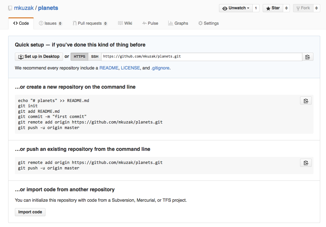
This effectively does the following on GitHub’s servers:
$ mkdir un-report
$ cd un-report
$ git init
If you remember back to when we added and committed our earlier work on
notes.txt, we had a diagram of the local repository which looked like this:
Now that we have two repositories, we need a diagram like this:

Note that our local repository still contains our earlier work on notes.txt, but the
remote repository on GitHub appears empty as it doesn’t contain any files yet.
Linking a local repository to GitHub
The next step is to connect the two repositories. We do this by making the GitHub repository a remote for the local repository. The home page of the repository on GitHub includes the string we need to identify it:
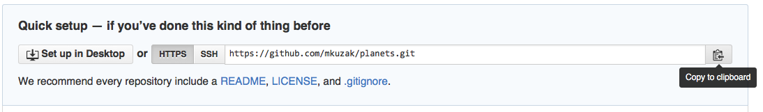
Copy that URL from the browser, go into the local un-report repository, and run
this command:
$ git remote add origin https://github.com/USERNAME/un-report.git
Make sure to replace USERNAME with your actual GitHub username so it will use
the correct URL for your repository; that should be the only difference.
origin is a local name used to refer to the remote repository. It could be called
anything, but origin is a convention that is often used by default in git
and GitHub, so it’s helpful to stick with this unless there’s a reason not to.
We can check that the command has worked by running git remote -v:
$ git remote -v
origin https://github.com/USERNAME/un-report.git (push)
origin https://github.com/USERNAME/un-report.git (fetch)
Now we want to send our local git information to GitHub. While the default for code you put on GitHub is that anyone can view or make copies of your code, in order to make changes to your repository, you need to be able to log in so GitHub can recognize you as someone who is authorized to make changes.
Setting up your GitHub Personal Access Token (PAT)
When you use the GitHub website, you need to login with a username and password. By default, only you will be able to make any changes to the repositories you create. In order to perform git commands on your own computer that interact with GitHub, we need a way to tell GitHub who you are. Rather than requiring you to type your password every time, you can create identify yourself with a personal access token (PAT). Let’s first tell git that we would like it to remember our credentials so we don’t have to constantly retype them. At the command line type:
git config --global credential.helper store
Like the previous git config commands we ran before, this tells git to store our account information so it doesn’t have to ask us for it every time we use git on the command line.
The information git stores is your personal access token (PAT). These tokens are basically a secret word that only you know that allows you to access all your stuff. Think of these tokens like a key to your house. You never want to hand over the keys to your house to someone you don’t trust. But as long as you hang on to that key, you are free to access all your stuff.
What’s the difference between passwords and PATs?
You might be wondering why we can’t just type a password to login and need to use a PAT instead. There are a few reasons:
- Human created passwords maybe be easy to guess and are often reused across many sites. You don’t want to make it easy for someone to copy your keys nor is it safe just to have one key that can unlock everything you own (your house, your car, your secret money vault, etc)
- PATs are generated by computers, for computers. The PATs are much longer than most human created passwords and have random combinations of letters and characters that are very difficult to guess
- A user can generate multiple PATs for the same account for different uses with different permissions
- Github now requires the use of PATs when using HTTPS (so we don’t really have a choice) Overall PATs are more secure if you also keep them private.
To create a PAT, you’ll need to be logged into to GitHub. Click your profile icon on the top left and choose “Setting” from the dropdown. On the main settings page there is a long list of options on the left. Scroll down till you find “Developer Settings”. Next you should see three options: “GitHub Apps”, “OAuth Apps”, and “Personal access tokens”. We want to create a token so click on the last link. You should now see a link to “ Generate a personal access token”. Click that. (You should now be at https://github.com/settings/tokens/new)
On the “New personal access token” form, the first field you see is for “Note.” You can actually create multiple tokens. This note field helps you remember what the token was for. It’s a good idea to create one per computer you use so the note field would be something like “work-laptop”, “home-macbook”, or “greatlakes-project”. Next you will see an option for “Expiration.” Since your tokens are like the keys to your house, it might be a good idea that if you forgot about your tokens, they just stop working after a while so no one else can misuse them. When your tokens expire, you can just generate a new one. GitHub recommends you choose an expiration date so we can just choose “90 days” or whatever is appropriate for you. (Note: You will have to repeat this processes of generating a new PAT when an existing PAT expires.)
Finally we must choose the “scopes” associated with this token. Just like you may have different keys on your key chain to different rooms, you can choose which of the GitHub “doors” your token can unlock. For now, choose the checkboxes next to “repo” and “user” (each of these main checkboxes will also select multiple sub-checkboxes which is what we want). In the future if you need a token with more access to GitHub features, you can create a new one. It’s best to choose the minimum set of permissions you need just in case anyone else were to get ahold of your token.
Finally, press the “Generate” button on the bottom. You will see your token in a green box on that page. It will be a long string of numbers and letters starting with “gph_”. There is an icon at the end of the token that will copy that special value to your clipboard. We will use this as your password when logging in during the next step.
Pushing changes to github
Now that we’ve set up the remote server information and have generated a personal access token, we are ready to send our data to GitHub. This command will push the changes from our local repository to the repository on GitHub:
$ git push origin main
When it asks you for your username, use your GitHub username, and when it asks you for a password, paste in the token that we just created. Then you should see something like the following output:
Enumerating objects: 16, done.
Counting objects: 100% (16/16), done.
Delta compression using up to 8 threads.
Compressing objects: 100% (11/11), done.
Writing objects: 100% (16/16), 1.45 KiB | 372.00 KiB/s, done.
Total 16 (delta 2), reused 0 (delta 0)
remote: Resolving deltas: 100% (2/2), done.
To https://github.com/USERNAME/un-report.git
* [new branch] main -> main
Our local and remote repositories are now in this state:

The ‘-u’ Flag
You may see a
-uoption used withgit pushin some documentation. This option is synonymous with the--set-upstream-tooption for thegit branchcommand, and is used to associate the current branch with a remote branch so that thegit pullcommand can be used without any arguments. To do this, simply usegit push -u origin mainonce the remote has been set up.
We can pull changes from the remote repository to the local one as well:
$ git pull origin main
From https://github.com/USERNAME/un-report
* branch main -> FETCH_HEAD
Already up-to-date.
Pulling has no effect in this case because the two repositories are already synchronized. If someone else had pushed some changes to the repository on GitHub, though, this command would download them to our local repository.
GitHub GUI
Browse to your
un-reportrepository on GitHub. Under the Code tab, find and click on the text that says “XX commits” (where “XX” is some number). Hover over, and click on, the three buttons to the right of each commit. What information can you gather/explore from these buttons? How would you get that same information in the shell?Solution
The left-most button (with the picture of a clipboard) copies the full identifier of the commit to the clipboard. In the shell,
git logwill show you the full commit identifier for each commit.When you click on the middle button, you’ll see all of the changes that were made in that particular commit. Green shaded lines indicate additions and red ones removals. In the shell we can do the same thing with
git diff. In particular,git diff ID1..ID2where ID1 and ID2 are commit identifiers (e.g.git diff a3bf1e5..041e637) will show the differences between those two commits.The right-most button lets you view all of the files in the repository at the time of that commit. To do this in the shell, we’d need to checkout the repository at that particular time. We can do this with
git checkout IDwhere ID is the identifier of the commit we want to look at. If we do this, we need to remember to put the repository back to the right state afterwards!
Uploading files directly in GitHub browser
Github also allows you to skip the command line and upload files directly to your repository without having to leave the browser. There are two options. First you can click the “Upload files” button in the toolbar at the top of the file tree. Or, you can drag and drop files from your desktop onto the file tree. You can read more about this on this GitHub page
Push vs. Commit
In this lesson, we introduced the “git push” command. How is “git push” different from “git commit”?
Solution
When we push changes, we’re interacting with a remote repository to update it with the changes we’ve made locally (often this corresponds to sharing the changes we’ve made with others). Commit only updates your local repository.
GitHub License and README files
In this section we learned about creating a remote repository on GitHub, but when you initialized your GitHub repo, you didn’t add a readme or a license file. If you had, what do you think would have happened when you tried to link your local and remote repositories?
Solution
In this case, we’d see a merge conflict due to unrelated histories. When GitHub creates a readme file, it performs a commit in the remote repository. When you try to pull the remote repository to your local repository, Git detects that they have histories that do not share a common origin and refuses to merge.
$ git pull origin mainwarning: no common commits remote: Enumerating objects: 3, done. remote: Counting objects: 100% (3/3), done. remote: Total 3 (delta 0), reused 0 (delta 0), pack-reused 0 Unpacking objects: 100% (3/3), done. From https://github.com/USERNAME/un-report * branch main -> FETCH_HEAD * [new branch] main -> origin/main fatal: refusing to merge unrelated historiesYou can force git to merge the two repositories with the option
--allow-unrelated-histories. Be careful when you use this option and carefully examine the contents of local and remote repositories before merging.$ git pull --allow-unrelated-histories origin mainFrom https://github.com/USERNAME/un-report * branch main -> FETCH_HEAD Merge made by the 'recursive' strategy. notes.txt | 1 + 1 file changed, 1 insertion(+) create mode 100644 notes.txt
Collaborating with GitHub
For the next step, get into pairs. One person will be the “Owner” and the other will be the “Collaborator”. The goal is that the Collaborator add changes into the Owner’s repository. We will switch roles at the end, so both persons will play Owner and Collaborator.
Practicing By Yourself
If you’re working through this lesson on your own, you can carry on by opening a second terminal window. This window will represent your partner, working on another computer. You won’t need to give anyone access on GitHub, because both ‘partners’ are you.
The Owner needs to give the Collaborator access. On GitHub, click the settings button on the right, select Manage access, click Invite a collaborator, and then enter your partner’s username.
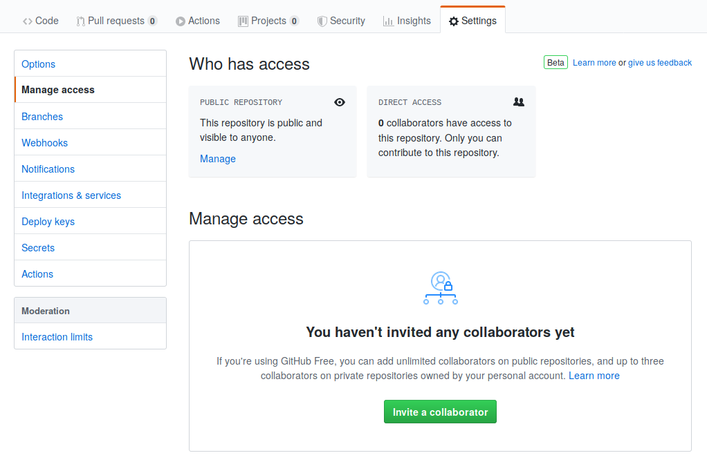
To accept access to the Owner’s repo, the Collaborator needs to go to https://github.com/notifications. Once there they can accept access to the Owner’s repo.
Next, the Collaborator needs to download a copy of the Owner’s repository to her
machine. This is called “cloning a repo”. To clone the Owner’s repo into
her Desktop folder, the Collaborator enters:
$ git clone https://github.com/USERNAME/un-report.git ~/Desktop/USERNAME-un-report
Replace USERNAME with the Owner’s username.
The Collaborator can now make a change in their clone of the Owner’s repository, exactly the same way as we’ve been doing before:
$ cd ~/Desktop/USERNAME-un-report
$ nano notes.txt
$ cat notes.txt
You can write anything you like. Now might be a good time to list the dependencies of the project – the tools and packages that are needed to run the code.
Dependencies:
- R >= 4.0
- tidyverse
$ git add notes.txt
$ git commit -m "List dependencies"
 1 file changed, 1 insertion(+)
 create mode 100644 notes.txt
Then push the change to the Owner’s repository on GitHub:
$ git push origin main
Enumerating objects: 4, done.
Counting objects: 4, done.
Delta compression using up to 4 threads.
Compressing objects: 100% (2/2), done.
Writing objects: 100% (3/3), 306 bytes, done.
Total 3 (delta 0), reused 0 (delta 0)
To https://github.com/USERNAME/un-report.git
   9272da5..29aba7c  main -> main
Note that we didn’t have to create a remote called origin: Git uses this
name by default when we clone a repository. (This is why origin was a
sensible choice earlier when we were setting up remotes by hand.)
Take a look at the Owner’s repository on its GitHub website now (you may need to refresh your browser.) You should be able to see the new commit made by the Collaborator.
To download the Collaborator’s changes from GitHub, the Owner now enters:
$ git pull origin main
remote: Enumerating objects: 4, done.
remote: Counting objects: 100% (4/4), done.
remote: Compressing objects: 100% (2/2), done.
remote: Total 3 (delta 0), reused 3 (delta 0), pack-reused 0
Unpacking objects: 100% (3/3), done.
From https://github.com/USERNAME/un-report
 * branch            main     -> FETCH_HEAD
   9272da5..29aba7c  main     -> origin/main
Updating 9272da5..29aba7c
Fast-forward
 notes.txt | 1 +
 1 file changed, 1 insertion(+)
 create mode 100644 notes.txt
Now the three repositories (Owner’s local, Collaborator’s local, and Owner’s on GitHub) are back in sync!
A Basic Collaborative Workflow
In practice, it is good to be sure that you have an updated version of the repository you are collaborating on, so you should
git pullbefore making your changes. The basic collaborative workflow would be:
- update your local repo with
git pull,- make your changes and stage them with
git add,- commit your changes with
git commit -m, and- upload the changes to GitHub with
git pushIt is better to make many commits with smaller changes rather than one commit with massive changes: small commits are easier to read and review.
Switch Roles and Repeat
Switch roles and repeat the whole process.
Review Changes
The Owner pushed commits to the repository without giving any information to the Collaborator. How can the Collaborator find out what has changed on GitHub?
Solution
On GitHub, the Collaborator can go to the repository and click on “commits” to view the most recent commits pushed to the repository.
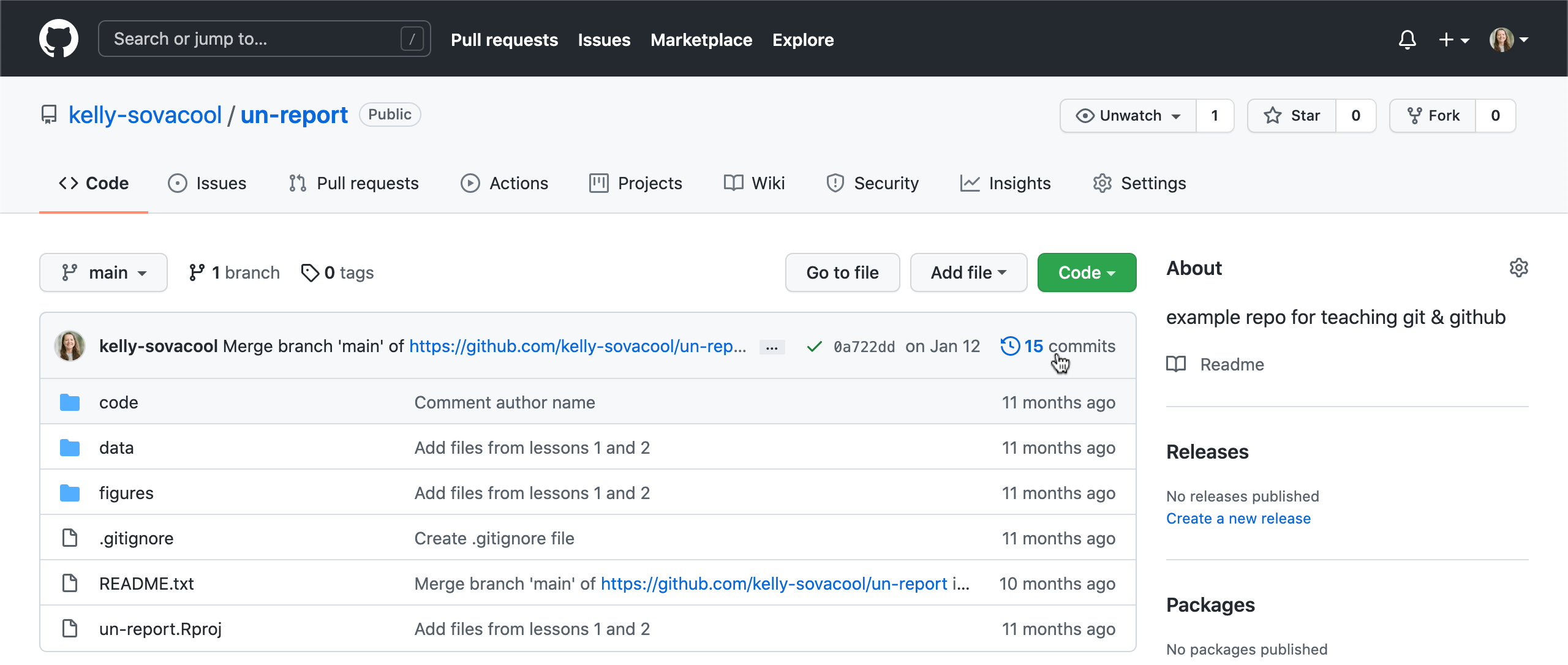
Comment Changes in GitHub
The Collaborator has some questions about one line change made by the Owner and has some suggestions to propose.
With GitHub, it is possible to comment the diff of a commit. From the main repository page, click on “commits”, and click on a recent commit. Hover your mouse over a line of code, and a blue plus icon will appear to open a comment window.
The Collaborator posts comments and suggestions using the GitHub interface.
Version History, Backup, and Version Control
Some backup software (e.g. Time Machine on macOS, Google Drive) can keep a history of the versions of your files. They also allow you to recover specific versions. How is this functionality different from version control? What are some of the benefits of using version control, Git and GitHub?
Solution
Automated backup software gives you less control over how often backups are created and it is often difficult to compare changes between backups. However, Git has a steeper learning curve than backup software. Advantages of using Git and GitHub for version control include:
- Great control over which files to include in commits and when to make commits.
- Very popular way to collaborate on code and analysis projects among programmers, data scientists, and researchers.
- Free and open source.
- GitHub allows you to share your project with the world and accept contributions from outside collaborators.
Some more about remotes
In this episode and the previous one, our local repository has had a single “remote”, called
origin. A remote is a copy of the repository that is hosted somewhere else, that we can push to and pull from, and there’s no reason that you have to work with only one. For example, on some large projects you might have your own copy in your own GitHub account (you’d probably call thisorigin) and also the main “upstream” project repository (let’s call thisupstreamfor the sake of examples). You would pull fromupstreamfrom time to time to get the latest updates that other people have committed.Remember that the name you give to a remote only exists locally. It’s an alias that you choose - whether
origin, orupstream, orfred- and not something intrinstic to the remote repository.The
git remotefamily of commands is used to set up and alter the remotes associated with a repository. Here are some of the most useful ones:
git remote -vlists all the remotes that are configured (we already used this in the last episode)git remote add [name] [url]is used to add a new remotegit remote remove [name]removes a remote. Note that it doesn’t affect the remote repository at all - it just removes the link to it from the local repo.git remote set-url [name] [newurl]changes the URL that is associated with the remote. This is useful if it has moved, e.g. to a different GitHub account, or from GitHub to a different hosting service. Or, if we made a typo when adding it!git remote rename [oldname] [newname]changes the local alias by which a remote is known - its name. For example, one could use this to changeupstreamtofred.
Bonus
Exploring history
We can refer to commits by their identifiers shown in log. You can also refer
to the most recent commit of the working directory by using the identifier
HEAD.
We’ve been adding one line at a time to notes.txt, so it’s easy to track our
progress by looking, so let’s do that using our HEADs. Before we start,
let’s make a change to notes.txt, adding yet another line.
$ nano notes.txt
$ cat notes.txt
We plotted life expectancy over time.
Each point represents a country.
Continents are grouped by color.
An ill-considered change.
Now, let’s see what we get.
$ git diff HEAD notes.txt
diff --git a/notes.txt b/notes.txt
index b36abfd..0848c8d 100644
--- a/notes.txt
+++ b/notes.txt
@@ -1,3 +1,4 @@
 We plotted life expectancy over time.
 Each point represents a country.
 Continents are grouped by color.
+An ill-considered change.
which is the same as what you would get if you leave out HEAD (try it). The
real goodness in all this is when you can refer to previous commits. We do
that by adding ~1
(where “~” is “tilde”, pronounced [til-duh])
to refer to the commit one before HEAD.
$ git diff HEAD~1 notes.txt
If we want to see the differences between older commits we can use git diff
again, but with the notation HEAD~1, HEAD~2, and so on, to refer to them:
$ git diff HEAD~3 notes.txt
diff --git a/notes.txt b/notes.txt
index df0654a..b36abfd 100644
--- a/notes.txt
+++ b/notes.txt
@@ -1 +1,4 @@
 We plotted life expectancy over time.
+Each point represents a country.
+Continents are grouped by color.
+An ill-considered change
We could also use git show which shows us what changes we made at an older commit as
well as the commit message, rather than the differences between a commit and our
working directory that we see by using git diff.
$ git show HEAD~3 notes.txt
commit f22b25e3233b4645dabd0d81e651fe074bd8e73b
Author: Riley Shor <Riley.Shor@fake.email.address>
Date:   Thu Aug 22 09:51:46 2020 -0400

    Make a change that I'll regret later

diff --git a/notes.txt b/notes.txt
new file mode 100644
index 0000000..df0654a
--- /dev/null
+++ b/notes.txt
@@ -0,0 +1 @@
+We plotted life expectancy over time.
In this way,
we can build up a chain of commits.
The most recent end of the chain is referred to as HEAD;
we can refer to previous commits using the ~ notation,
so HEAD~1
means “the previous commit”,
while HEAD~123 goes back 123 commits from where we are now.
We can also refer to commits using
those long strings of digits and letters
that git log displays.
These are unique IDs for the changes,
and “unique” really does mean unique:
every change to any set of files on any computer
has a unique 40-character identifier.
Our first commit was given the ID
f22b25e3233b4645dabd0d81e651fe074bd8e73b,
so let’s try this:
$ git diff f22b25e3233b4645dabd0d81e651fe074bd8e73b notes.txt
diff --git a/notes.txt b/notes.txt
index df0654a..93a3e13 100644
--- a/notes.txt
+++ b/notes.txt
@@ -1 +1,4 @@
 We plotted life expectancy over time.
+Each point represents a country.
+Continents are grouped by color.
+An ill-considered change
That’s the right answer, but typing out random 40-character strings is annoying, so Git lets us use just the first few characters (typically seven for normal size projects):
$ git diff f22b25e notes.txt
diff --git a/notes.txt b/notes.txt
index df0654a..93a3e13 100644
--- a/notes.txt
+++ b/notes.txt
@@ -1 +1,4 @@
 We plotted life expectancy over time.
+Each point represents a country.
+Continents are grouped by color.
+An ill-considered change
All right! So
we can save changes to files and see what we’ve changed. Now, how
can we restore older versions of things?
Let’s suppose we change our mind about the last update to
notes.txt (the “ill-considered change”).
git status now tells us that the file has been changed,
but those changes haven’t been staged:
$ git status
On branch main
Changes not staged for commit:
  (use "git add <file>..." to update what will be committed)
  (use "git checkout -- <file>..." to discard changes in working directory)

    modified:   notes.txt

no changes added to commit (use "git add" and/or "git commit -a")
We can put things back the way they were
by using git checkout:
$ git checkout HEAD notes.txt
$ cat notes.txt
We plotted life expectancy over time.
Each point represents a country.
Continents are grouped by color.
As you might guess from its name,
git checkout checks out (i.e., restores) an old version of a file.
In this case,
we’re telling Git that we want to recover the version of the file recorded in HEAD,
which is the last saved commit.
If we want to go back even further,
we can use a commit identifier instead:
$ git checkout f22b25e notes.txt
$ cat notes.txt
We plotted life expectancy over time.
$ git status
On branch main
Changes to be committed:
  (use "git reset HEAD <file>..." to unstage)

    modified:   notes.txt
Notice that the changes are currently in the staging area.
Again, we can put things back the way they were
by using git checkout:
$ git checkout HEAD notes.txt
Don’t Lose Your HEAD
Above we used
$ git checkout f22b25e notes.txtto revert
notes.txtto its state after the commitf22b25e. But be careful! The commandcheckouthas other important functionalities and Git will misunderstand your intentions if you are not accurate with the typing. For example, if you forgetnotes.txtin the previous command.$ git checkout f22b25eNote: checking out 'f22b25e'. You are in 'detached HEAD' state. You can look around, make experimental changes and commit them, and you can discard any commits you make in this state without impacting any branches by performing another checkout. If you want to create a new branch to retain commits you create, you may do so (now or later) by using -b with the checkout command again. Example: git checkout -b <new-branch-name> HEAD is now at f22b25e Make a change that I'll regret laterThe “detached HEAD” is like “look, but don’t touch” here, so you shouldn’t make any changes in this state. After investigating your repo’s past state, reattach your
HEADwithgit checkout main.
It’s important to remember that
we must use the commit number that identifies the state of the repository
before the change we’re trying to undo.
A common mistake is to use the number of
the commit in which we made the change we’re trying to discard.
In the example below, we want to retrieve the state from before the most
recent commit (HEAD~1), which is commit f22b25e:

We have now reverted our current file and commit to the latest version without the bug. But we have kept the commit and history from the commit that had the error.
Simplifying the Common Case
If you read the output of
git statuscarefully, you’ll see that it includes this hint:(use "git checkout -- <file>..." to discard changes in working directory)As it says,
git checkoutwithout a version identifier restores files to the state saved inHEAD. The double dash--is needed to separate the names of the files being recovered from the command itself: without it, Git would try to use the name of the file as the commit identifier.
The fact that files can be reverted one by one tends to change the way people organize their work. If everything is in one large document, it’s hard (but not impossible) to undo changes to the introduction without also undoing changes made later to the conclusion. If the introduction and conclusion are stored in separate files, on the other hand, moving backward and forward in time becomes much easier.
Recovering Older Versions of a File
Jennifer has made changes to the Python script that she has been working on for weeks, and the modifications she made this morning “broke” the script and it no longer runs. She has spent ~ 1hr trying to fix it, with no luck…
Luckily, she has been keeping track of her project’s versions using Git! Which commands below will let her recover the last committed version of her Python script called
data_cruncher.py?
$ git checkout HEAD
$ git checkout HEAD data_cruncher.py
$ git checkout HEAD~1 data_cruncher.py
$ git checkout <unique ID of last commit> data_cruncher.pyBoth 2 and 4
Solution
The answer is (5)-Both 2 and 4.
The
checkoutcommand restores files from the repository, overwriting the files in your working directory. Answers 2 and 4 both restore the latest version in the repository of the filedata_cruncher.py. Answer 2 usesHEADto indicate the latest, whereas answer 4 uses the unique ID of the last commit, which is whatHEADmeans.Answer 3 gets the version of
data_cruncher.pyfrom the commit beforeHEAD, which is NOT what we wanted.Answer 1 can be dangerous! Without a filename,
git checkoutwill restore all files in the current directory (and all directories below it) to their state at the commit specified. This command will restoredata_cruncher.pyto the latest commit version, but it will also restore any other files that are changed to that version, erasing any changes you may have made to those files! As discussed above, you are left in a detachedHEADstate, and you don’t want to be there.
Undoing changes
Reverting a Commit
Jennifer is collaborating on her Python script with her colleagues and realizes her last commit to the project’s repository contained an error and she wants to undo it.
git revert [erroneous commit ID]will create a new commit that reverses Jennifer’s erroneous commit. Thereforegit revertis different togit checkout [commit ID]becausegit checkoutreturns the files within the local repository to a previous state, whereasgit revertreverses changes committed to the local and project repositories.
Below are the right steps and explanations for Jennifer to usegit revert, what is the missing command in step 1 below?
________ # Look at the git history of the project to find the commit IDCopy the ID (the first few characters of the ID, e.g. 0b1d055).
git revert [commit ID]Type in the new commit message.
Save and close
Solution
Use
git logto look at the git history to find the commit ID.
Understanding Workflow and History
What is the output of the last command in
$ echo "Here are my notes from the workshop." > notes.txt
$ git add notes.txt
$ echo "I learned the unix shell, git & github, and the Python programming language." >> notes.txt
$ git commit -m "Create workshop notes"
$ git checkout HEAD notes.txt
$ cat notes.txt #this will print the contents of notes.txt to the screen
I learned the unix shell, git & github, and the Python programming language.Here are my notes from the workshop.Here are my notes from the workshop. I learned the unix shell, git & github, and the Python programming language.Error because you have changed notes.txt without committing the changesSolution
The answer is 2.
The command
git add notes.txtplaces the current version ofnotes.txtinto the staging area. The changes to the file from the secondechocommand are only applied to the working copy, not the version in the staging area.So, when
git commit -m "Create workshop notes"is executed, the version ofnotes.txtcommitted to the repository is the one from the staging area and has only one line.At this time, the working copy still has the second line (and
git statuswill show that the file is modified). However,git checkout HEAD notes.txtreplaces the working copy with the most recently committed version ofnotes.txt.So,
cat notes.txtwill outputHere are my notes from the workshop..
Checking Understanding of
git diffConsider this command:
git diff HEAD~3 notes.txt. What do you predict this command will do if you execute it? What happens when you do execute it? Why?Solution
The diff will show the difference between the current version of notes.txt and the version that existed 3 commits ago.
Try another command,
git diff [ID] notes.txt, where [ID] is replaced with the unique identifier for your most recent commit. What do you think will happen, and what does happen?Solution
The diff will show the difference between the current version of notes.txt and the version that exited in the commit from [ID].
Getting Rid of Staged Changes
git checkoutcan be used to restore a previous commit when unstaged changes have been made, but will it also work for changes that have been staged but not committed? Make a change tonotes.txt, add that change, and usegit checkoutto see if you can remove your change.Solution
git checkout notes.txtdoes not work for this purpose. Instead, use the restore command with the staged flag:git restore --staged notes.txt
Explore and Summarize Histories
Exploring history is an important part of Git, and often it is a challenge to find the right commit ID, especially if the commit is from several months ago.
Imagine the
analysisproject has more than 50 files. You would like to find a commit that modifies some specific text innotes.txt. When you typegit log, a very long list appeared. How can you narrow down the search?Recall that the
git diffcommand allows us to explore one specific file, e.g.,git diff notes.txt. We can apply a similar idea here.$ git log notes.txtUnfortunately some of these commit messages are very ambiguous, e.g.,
update files. How can you search through these files?Both
git diffandgit logare very useful and they summarize a different part of the history for you. Is it possible to combine both? Let’s try the following:$ git log --patch notes.txtYou should get a long list of output, and you should be able to see both commit messages and the difference between each commit.
Question: What does the following command do?
$ git log --patch HEAD~9 *.txt
Key Points
Version control is like an unlimited ‘undo’.
Version control also allows many people to work in parallel.
Python for Data Analysis
Overview
Teaching: 150 min
Exercises: 30 minQuestions
How can I summarize my data in Python?
How can Python help make my research more reproducible?
How can I combine two datasets from different sources?
How can data tidying facilitate answering analysis questions?
Objectives
To become familiar with the common methods of the Python pandas library.
To be able to use pandas to prepare data for analysis.
To be able to combine two different data sources using joins.
To be able to create plots and summary tables to answer analysis questions.
Contents
- Getting started
- An introduction to data analysis with pandas
- Cleaning up data
- Joining data frames
- Analyzing combined data
- Finishing with Git and GitHub
- Bonus exercises
Getting Started
Yesterday we spent a lot of time making plots in Python using the seaborn library. Visualizing data using plots is a very powerful skill in Python, but what if we would like to work with only a subset of our data? Or clean up messy data, calculate summary statistics, create a new variable, or join two datasets together? There are several different methods for doing this in Python, and we will touch on a few today using the fast and powerful pandas library.
- First, navigate to the
un-reportsdirectory in your Command Line Interface (i.e., Anaconda Prompt for Windows and Terminal for MacOS and Linux) -
Launch JupyterLab.
jupyter lab - Once JupyterLab is opened in your web browser, you can check you are at the correct directory by seeing if the JupyterLab File Browser (located on the left side panel) shows the folders and files inside the
un-reportsdirectory. - Create a new Jupyter notebook file for our work.
- Make sure you are at the
un-reportshome directory. - On the Launcher tab (the main window on the right) click “Python 3” under the Notebook category.
- Make sure you are at the
- Then you should see a new file named
Untitled.ipynbbeen created on the File Browser. Left-click the file on the File Browser and rename it togapminder_data_analysis.ipynb.
Reading in the data
We will start by reading in the complete gapminder dataset that we used yesterday into our fresh new Jupyter notebook.
Let’s type the code into a cell: gapminder = pd.read_csv("./data/gapminder_data.csv")
Exercise
If we look in the console now, we’ll see we’ve received an error message saying that “name ‘pd’ is not defined”. Hint: Libraries…
Solution
What this means is that Python did not recognize the
pdpart of the code and thus cannot find theread_csv()function we are trying to call. The reason for this usually is that we are trying to run a function from a library that we have not yet imported. This is a very common error message that you will probably see again when using Python. It’s important to remember that you will need to import any libraries you want to use into Python each time you start a new notebook. Theread_csvfunction comes from the pandas library so we will just import the pandas library and run the code again.
Now that we know what’s wrong, We will use the read_csv() function from the pandas library.
Import the pandas library (along with another common library numpy) and read in the gapminder dataset using the code below.
import numpy as np
import pandas as pd

gapminder = pd.read_csv("./data/gapminder_data.csv")
gapminder     # this line is just to show the data in the Jupyter notebook output
          country  year         pop continent  lifeExp   gdpPercap
0     Afghanistan  1952   8425333.0      Asia   28.801  779.445314
1     Afghanistan  1957   9240934.0      Asia   30.332  820.853030
2     Afghanistan  1962  10267083.0      Asia   31.997  853.100710
3     Afghanistan  1967  11537966.0      Asia   34.020  836.197138
4     Afghanistan  1972  13079460.0      Asia   36.088  739.981106
...           ...   ...         ...       ...      ...         ...
1699     Zimbabwe  1987   9216418.0    Africa   62.351  706.157306
1700     Zimbabwe  1992  10704340.0    Africa   60.377  693.420786
1701     Zimbabwe  1997  11404948.0    Africa   46.809  792.449960
1702     Zimbabwe  2002  11926563.0    Africa   39.989  672.038623
1703     Zimbabwe  2007  12311143.0    Africa   43.487  469.709298

[1704 rows x 6 columns]
The output above gives us an overview of the data with its first and last few rows, the names of the columns, and the numbers of rows and columns.
If we want more information, we can apply the info() method to a data frame to print some basic information about it.
In Python we use the dot notation to apply a method to an object.
Note: When applying a method, we always need to follow the method name by a pair of parentheses, even if we are not passing any arguments to the method.
gapminder.info()
<class 'pandas.core.frame.DataFrame'>
RangeIndex: 1704 entries, 0 to 1703
Data columns (total 6 columns):
 #   Column     Non-Null Count  Dtype
---  ------     --------------  -----
 0   country    1704 non-null   object
 1   year       1704 non-null   int64
 2   pop        1704 non-null   float64
 3   continent  1704 non-null   object
 4   lifeExp    1704 non-null   float64
 5   gdpPercap  1704 non-null   float64
dtypes: float64(3), int64(1), object(2)
memory usage: 80.0+ KB
- The first line in the output indicates
gapminder, the output from thepd.read_csv()function that we called earlier, is a pandas DataFrame. A pandas DataFrame is a two-dimensional rectangular table of data with rows and columns. It is the main data structure that we will be dealing with when working with pandas. - The information also shows the data type (“Dtype”) of each column.
- Not surprisingly, the
yearcolumn has an integer data type (“int64”). - A few other columns have the data type of floating number (“float64”).
- The
countrycolumn has a data type of “object”, indicating the data is a string or mixed type.
- Not surprisingly, the
Sometimes (especially when our data has many rows) we just want to take a look at the first few rows of the data. We can apply the head() method to select the first few rows of a data frame.
gapminder.head()
       country  year         pop continent  lifeExp   gdpPercap
0  Afghanistan  1952   8425333.0      Asia   28.801  779.445314
1  Afghanistan  1957   9240934.0      Asia   30.332  820.853030
2  Afghanistan  1962  10267083.0      Asia   31.997  853.100710
3  Afghanistan  1967  11537966.0      Asia   34.020  836.197138
4  Afghanistan  1972  13079460.0      Asia   36.088  739.981106
By default, the head() method selects the first 5 rows of the data frame. You can change the number of rows by passing a number as an argument to the method.
For example, we can use the code below to select the first 3 rows.
gapminder.head(3)
       country  year         pop continent  lifeExp   gdpPercap
0  Afghanistan  1952   8425333.0      Asia   28.801  779.445314
1  Afghanistan  1957   9240934.0      Asia   30.332  820.853030
2  Afghanistan  1962  10267083.0      Asia   31.997  853.100710
Similarly, we can apply the tail() method to select the last few rows of a data frame.
gapminder.tail()
       country  year         pop continent  lifeExp   gdpPercap
1699  Zimbabwe  1987   9216418.0    Africa   62.351  706.157306
1700  Zimbabwe  1992  10704340.0    Africa   60.377  693.420786
1701  Zimbabwe  1997  11404948.0    Africa   46.809  792.449960
1702  Zimbabwe  2002  11926563.0    Africa   39.989  672.038623
1703  Zimbabwe  2007  12311143.0    Africa   43.487  469.709298
Now we have the tools necessary to work through this lesson.
An introduction to data analysis with pandas
Get stats fast with describe()
Pandas has a handy method describe() that will generate the summary statistics of the data.
gapminder.describe()
             year           pop      lifeExp      gdpPercap
count  1704.00000  1.704000e+03  1704.000000    1704.000000
mean   1979.50000  2.960121e+07    59.474439    7215.327081
std      17.26533  1.061579e+08    12.917107    9857.454543
min    1952.00000  6.001100e+04    23.599000     241.165876
25%    1965.75000  2.793664e+06    48.198000    1202.060309
50%    1979.50000  7.023596e+06    60.712500    3531.846988
75%    1993.25000  1.958522e+07    70.845500    9325.462346
max    2007.00000  1.318683e+09    82.603000  113523.132900
The output above shows the summary (or descriptive) statistics for the four numerical columns in our data.
If we are interested in specific columns with specific statistics, we can also apply the agg() method to aggregate a column based on some aggregation functions.
Let’s say we would like to know what is the mean life expectancy in the dataset.
(
    gapminder
    .agg({'lifeExp' : 'mean'})
)
lifeExp    59.474439
dtype: float64
Other aggregation functions for common descriptive statistics include median, min, max, std (for standard deviation), and var (for variance).
Narrow down rows with query()
Let’s take a look at the value we just calculated, which tells us the mean life expectancy for all rows in the data was 59.47. That seems a bit low, doesn’t it? What’s going on?
Well, remember the dataset contains rows from many different years and many different countries. It’s likely that life expectancy has increased overtime, so it may not make sense to average over all the years at the same time.
Use the max() method to find the most recent year in the data set.
Practice getting descriptive statistics
Find the most recent year in the dataset.
Solution:
(
    gapminder['year']
    .max()
)
2007
So we see that the most recent year in the dataset is 2007.
Let’s calculate the life expectancy for all countries for only that year.
To do that, we will apply the query() method to only use the rows for that year before calculating the mean life expectancy.
(
    gapminder
    .query("year == 2007")
    .agg({'lifeExp' : 'mean'})
)
lifeExp    67.007423
dtype: float64
Querying the dataset
What is the mean GDP per capita for the first year in the dataset? Hint: The data frame has a column called “gdpPercap”.
Solution
Identify the earliest year in our dataset by applying the
aggmethod.( gapminder .agg({'year' : 'min'}) )year 1952 dtype: int64We see here that the first year in the dataset is 1952. Query the data to only include year 1952, and determine the mean GDP per capita.
(
    gapminder
    .query("year == 1952")
    .agg({'gdpPercap' : 'mean'})
)
gdpPercap 3725.276046 dtype: float64By chaining the two methods
query()andagg()we were able to calculate the mean GDP per capita in the year 1952.
Notice how the method chaining allows us to combine these two simple steps into a more complicated data extraction?
We took the data, queried the year column, selected the gdpPercap columns, then took its mean value.
The string argument we passed to query() needs to be an expression that will return TRUE or FALSE for each row.
We use == (double equals) when evaluating if two values are equal, and we use = (single equal) when assigning values.
Try changing the code above to use query("year = 2007") and see what happens.
Other common Python comparison operators
>greater than<less than>=greater than or equal to<=less than or equal to==equal!=not equal
We can also use the operator == to evaluate if two strings are the same.
For example, the code below returns all the rows from the United States.
(
    gapminder
    .query("country == 'United States'")
)
            country  year          pop continent  lifeExp    gdpPercap
1608  United States  1952  157553000.0  Americas   68.440  13990.48208
1609  United States  1957  171984000.0  Americas   69.490  14847.12712
1610  United States  1962  186538000.0  Americas   70.210  16173.14586
1611  United States  1967  198712000.0  Americas   70.760  19530.36557
1612  United States  1972  209896000.0  Americas   71.340  21806.03594
1613  United States  1977  220239000.0  Americas   73.380  24072.63213
1614  United States  1982  232187835.0  Americas   74.650  25009.55914
1615  United States  1987  242803533.0  Americas   75.020  29884.35041
1616  United States  1992  256894189.0  Americas   76.090  32003.93224
1617  United States  1997  272911760.0  Americas   76.810  35767.43303
1618  United States  2002  287675526.0  Americas   77.310  39097.09955
1619  United States  2007  301139947.0  Americas   78.242  42951.65309
Note: In a
query()expression, any string values (e.g., United States in the code above) need to be wrapped with quotation marks.
Note: In a
query()expression, any column names that does not include any special characters (e.g., a white space) do not need to be wrapped with anything. However, if a column name does include special characters, the name needs to be wrapped with a pair of backticks``(the key above the Tab key on your keyboard).
Oftentimes we may wish to query the data based on more than a single criterion.
In a query() expression we can combine multiple criteria with Python logical operators and or or.
For example, the code below returns all the rows that are from the United States and after 2000.
(
    gapminder
    .query("country == 'United States' and year > 2000")
)
            country  year          pop continent  lifeExp    gdpPercap
1618  United States  2002  287675526.0  Americas   77.310  39097.09955
1619  United States  2007  301139947.0  Americas   78.242  42951.65309
Note if the logical operators are all and, we can also separate them by chaining multiple query() methods.
The code below generates the same results as above.
(
    gapminder
    .query("country == 'United States'")
    .query("year > 2000")
)
Sometimes we may wish to query the data based on whether a value is from a list or not.
In a query() expression we can use the Python membership operator in to achieve that.
For example, the code below returns all the rows from a list of countries (the United States and Canada).
(
    gapminder
    .query("country in ['United States', 'Canada']")
)
            country  year          pop continent  lifeExp    gdpPercap
240          Canada  1952   14785584.0  Americas   68.750  11367.16112
241          Canada  1957   17010154.0  Americas   69.960  12489.95006
242          Canada  1962   18985849.0  Americas   71.300  13462.48555
243          Canada  1967   20819767.0  Americas   72.130  16076.58803
244          Canada  1972   22284500.0  Americas   72.880  18970.57086
245          Canada  1977   23796400.0  Americas   74.210  22090.88306
246          Canada  1982   25201900.0  Americas   75.760  22898.79214
247          Canada  1987   26549700.0  Americas   76.860  26626.51503
248          Canada  1992   28523502.0  Americas   77.950  26342.88426
249          Canada  1997   30305843.0  Americas   78.610  28954.92589
250          Canada  2002   31902268.0  Americas   79.770  33328.96507
251          Canada  2007   33390141.0  Americas   80.653  36319.23501
1608  United States  1952  157553000.0  Americas   68.440  13990.48208
1609  United States  1957  171984000.0  Americas   69.490  14847.12712
1610  United States  1962  186538000.0  Americas   70.210  16173.14586
1611  United States  1967  198712000.0  Americas   70.760  19530.36557
1612  United States  1972  209896000.0  Americas   71.340  21806.03594
1613  United States  1977  220239000.0  Americas   73.380  24072.63213
1614  United States  1982  232187835.0  Americas   74.650  25009.55914
1615  United States  1987  242803533.0  Americas   75.020  29884.35041
1616  United States  1992  256894189.0  Americas   76.090  32003.93224
1617  United States  1997  272911760.0  Americas   76.810  35767.43303
1618  United States  2002  287675526.0  Americas   77.310  39097.09955
1619  United States  2007  301139947.0  Americas   78.242  42951.65309
In a query() expression we can refer to variables in the environment by prefixing them with an ‘@’ character. For example, the code below generates the same results as above.
country_list = ['United States', 'Canada']

(
    gapminder
    .query("country in @country_list")
)
Lastly, we can use the not in operator to evaluate if a value is not in a list.
For example, the code below returns all the rows for 2007 in the Americas except for the United States and Canada.
(
    gapminder
    .query("year == 2007")
    .query("continent == 'Americas'")
    .query("country not in ['United States', 'Canada']")
)
                  country  year          pop continent  lifeExp     gdpPercap
59              Argentina  2007   40301927.0  Americas   75.320  12779.379640
143               Bolivia  2007    9119152.0  Americas   65.554   3822.137084
179                Brazil  2007  190010647.0  Americas   72.390   9065.800825
287                 Chile  2007   16284741.0  Americas   78.553  13171.638850
311              Colombia  2007   44227550.0  Americas   72.889   7006.580419
359            Costa Rica  2007    4133884.0  Americas   78.782   9645.061420
395                  Cuba  2007   11416987.0  Americas   78.273   8948.102923
443    Dominican Republic  2007    9319622.0  Americas   72.235   6025.374752
455               Ecuador  2007   13755680.0  Americas   74.994   6873.262326
479           El Salvador  2007    6939688.0  Americas   71.878   5728.353514
611             Guatemala  2007   12572928.0  Americas   70.259   5186.050003
647                 Haiti  2007    8502814.0  Americas   60.916   1201.637154
659              Honduras  2007    7483763.0  Americas   70.198   3548.330846
791               Jamaica  2007    2780132.0  Americas   72.567   7320.880262
995                Mexico  2007  108700891.0  Americas   76.195  11977.574960
1115            Nicaragua  2007    5675356.0  Americas   72.899   2749.320965
1187               Panama  2007    3242173.0  Americas   75.537   9809.185636
1199             Paraguay  2007    6667147.0  Americas   71.752   4172.838464
1211                 Peru  2007   28674757.0  Americas   71.421   7408.905561
1259          Puerto Rico  2007    3942491.0  Americas   78.746  19328.709010
1559  Trinidad and Tobago  2007    1056608.0  Americas   69.819  18008.509240
1631              Uruguay  2007    3447496.0  Americas   76.384  10611.462990
1643            Venezuela  2007   26084662.0  Americas   73.747  11415.805690
Grouping rows using groupby()
We see that the life expectancy in 2007 is much larger than the value we got using all of the rows.
It seems life expectancy is increasing which is good news.
But now we might be interested in calculating the mean for each year.
Rather than doing a bunch of different query()’s for each year, we can instead use the groupby() method.
This method allows us to tell the code to treat the rows in logical groups, so rather than aggregating over all the rows, we will get one summary value for each group.
“Group by” is often often referred to as split-apply-combine.
(
    gapminder
    .groupby('year')
)
<pandas.core.groupby.generic.DataFrameGroupBy object at 0x157f8d2b0>
If we just apply the groupby() method to our data frame, we would only get a data object called “DataFrameGroupBy”.
This is because this method only group the data based on our specification, in this case, by year.
We have not specify what kind of the aggregation functions that we wish to apply to each of the groups.
We can take a closer look at the data object after the groupby() by its indices property.
(
    gapminder
    .groupby('year')
    .indices
)
{1952: array([   0,   12,   24,   36,   48,   60,   72,   84,   96,  108,  120,
         132,  144,  156,  168,  180,  192,  204,  216,  228,  240,  252,
         264,  276,  288,  300,  312,  324,  336,  348,  360,  372,  384,
         396,  408,  420,  432,  444,  456,  468,  480,  492,  504,  516,
         528,  540,  552,  564,  576,  588,  600,  612,  624,  636,  648,
         660,  672,  684,  696,  708,  720,  732,  744,  756,  768,  780,
         792,  804,  816,  828,  840,  852,  864,  876,  888,  900,  912,
         924,  936,  948,  960,  972,  984,  996, 1008, 1020, 1032, 1044,
        1056, 1068, 1080, 1092, 1104, 1116, 1128, 1140, 1152, 1164, 1176,
        1188, 1200, 1212, 1224, 1236, 1248, 1260, 1272, 1284, 1296, 1308,
        1320, 1332, 1344, 1356, 1368, 1380, 1392, 1404, 1416, 1428, 1440,
        1452, 1464, 1476, 1488, 1500, 1512, 1524, 1536, 1548, 1560, 1572,
        1584, 1596, 1608, 1620, 1632, 1644, 1656, 1668, 1680, 1692]),
...
2007: array([  11,   23,   35,   47,   59,   71,   83,   95,  107,  119,  131,
         143,  155,  167,  179,  191,  203,  215,  227,  239,  251,  263,
         275,  287,  299,  311,  323,  335,  347,  359,  371,  383,  395,
         407,  419,  431,  443,  455,  467,  479,  491,  503,  515,  527,
         539,  551,  563,  575,  587,  599,  611,  623,  635,  647,  659,
         671,  683,  695,  707,  719,  731,  743,  755,  767,  779,  791,
         803,  815,  827,  839,  851,  863,  875,  887,  899,  911,  923,
         935,  947,  959,  971,  983,  995, 1007, 1019, 1031, 1043, 1055,
        1067, 1079, 1091, 1103, 1115, 1127, 1139, 1151, 1163, 1175, 1187,
        1199, 1211, 1223, 1235, 1247, 1259, 1271, 1283, 1295, 1307, 1319,
        1331, 1343, 1355, 1367, 1379, 1391, 1403, 1415, 1427, 1439, 1451,
        1463, 1475, 1487, 1499, 1511, 1523, 1535, 1547, 1559, 1571, 1583,
        1595, 1607, 1619, 1631, 1643, 1655, 1667, 1679, 1691, 1703])}
It shows the indices of each group (i.e., each year in this case).
We can double-check the indices of the first group by manually querying the data for year 1952. The first column in the output shows the indices.
(
    gapminder
    .query("year == 1952")
)
                 country  year         pop continent  lifeExp    gdpPercap
0            Afghanistan  1952   8425333.0      Asia   28.801   779.445314
12               Albania  1952   1282697.0    Europe   55.230  1601.056136
24               Algeria  1952   9279525.0    Africa   43.077  2449.008185
36                Angola  1952   4232095.0    Africa   30.015  3520.610273
48             Argentina  1952  17876956.0  Americas   62.485  5911.315053
...                  ...   ...         ...       ...      ...          ...
1644             Vietnam  1952  26246839.0      Asia   40.412   605.066492
1656  West Bank and Gaza  1952   1030585.0      Asia   43.160  1515.592329
1668          Yemen Rep.  1952   4963829.0      Asia   32.548   781.717576
1680              Zambia  1952   2672000.0    Africa   42.038  1147.388831
1692            Zimbabwe  1952   3080907.0    Africa   48.451   406.884115
In practice, we will just trust the groupby() method will do its job, and just apply aggregation functions of our interest by calling the aggregation method agg() after the groupby().
(
    gapminder
    .groupby('year')
    .agg({'lifeExp' : 'mean'})
)
        lifeExp
year
1952  49.057620
1957  51.507401
1962  53.609249
1967  55.678290
1972  57.647386
1977  59.570157
1982  61.533197
1987  63.212613
1992  64.160338
1997  65.014676
2002  65.694923
2007  67.007423
The groupby() method expects you to pass in the name of a column (or a list of columns) in your data.
Grouping the data
Try calculating the mean life expectancy by continent.
Solution
(
    gapminder
    .groupby('continent')
    .agg({'lifeExp' : 'mean'})
)
lifeExp continent Africa 48.865330 Americas 64.658737 Asia 60.064903 Europe 71.903686 Oceania 74.326208By chaining the two methods
groupby()andagg()we are able to calculate the mean life expectancy by continent.
Sometimes we may wish to apply more than one aggregation method.
For example, we may want to know the mean and minimum life expectancy by continents.
To do so, we can use the aggregation method called agg() and pass it a list of aggregation methods.
(
    gapminder
    .groupby('continent')
    .agg({'lifeExp' : ['mean', 'min']})
)
             lifeExp
                mean     min
continent
Africa     48.865330  23.599
Americas   64.658737  37.579
Asia       60.064903  28.801
Europe     71.903686  43.585
Oceania    74.326208  69.120
Sort data with sort_values()
The sort_values() method allows us to sort our data by some value.
Let’s use the full gapminder data.
We will take the mean value for each continent in 2007 and then sort it so the continents with the longest life expectancy are on top.
Which continent might you guess has be the highest life expectancy before running the code?
(
    gapminder
    .query("year == 2007")
    .groupby('continent')
    .agg({'lifeExp' : 'mean'})
    .sort_values('lifeExp', ascending=False)
)
             lifeExp
continent
Oceania    80.719500
Europe     77.648600
Americas   73.608120
Asia       70.728485
Africa     54.806038
Notice we passed the argument ascending=False to the sort_values() method to sort the values in a descending order so the largest values are on top.
The default is to put the smallest values on top.
Make new variables with assign()
Sometimes we want to create a new column in our data.
We can use the pandas assign() method to assign new columns to a data frame.
We have a column for the population and the GDP per capita. If we wanted to get the total GDP, we could multiply the per capita GDP values by the total population. Below is what the code would look like:
Here we use the lambda function.
(
    gapminder
    .assign(gdp=lambda df: df['pop'] * df['gdpPercap'])
)
          country  year         pop continent  lifeExp   gdpPercap           gdp
0     Afghanistan  1952   8425333.0      Asia   28.801  779.445314  6.567086e+09
1     Afghanistan  1957   9240934.0      Asia   30.332  820.853030  7.585449e+09
2     Afghanistan  1962  10267083.0      Asia   31.997  853.100710  8.758856e+09
3     Afghanistan  1967  11537966.0      Asia   34.020  836.197138  9.648014e+09
4     Afghanistan  1972  13079460.0      Asia   36.088  739.981106  9.678553e+09
...           ...   ...         ...       ...      ...         ...           ...
1699     Zimbabwe  1987   9216418.0    Africa   62.351  706.157306  6.508241e+09
1700     Zimbabwe  1992  10704340.0    Africa   60.377  693.420786  7.422612e+09
1701     Zimbabwe  1997  11404948.0    Africa   46.809  792.449960  9.037851e+09
1702     Zimbabwe  2002  11926563.0    Africa   39.989  672.038623  8.015111e+09
1703     Zimbabwe  2007  12311143.0    Africa   43.487  469.709298  5.782658e+09

[1704 rows x 7 columns]
This will add a new column called “gdp” to our data. We use the column names as if they were regular values that we want to perform mathematical operations on and provide the name in front of an equals sign.
Assigning multiple columns
We can also assign multiple columns by separating them with a comma inside
assign(). Try making a new column for this data frame called popInMillions that is the population in million.Solution:
(
    gapminder
    .assign(gdp=lambda df: df['pop'] * df['gdpPercap'],
            popInMillions=lambda df: df['pop'] / 1_000_000)
)
country year pop continent lifeExp gdpPercap gdp popInMillions 0 Afghanistan 1952 8425333.0 Asia 28.801 779.445314 6.567086e+09 8.425333 1 Afghanistan 1957 9240934.0 Asia 30.332 820.853030 7.585449e+09 9.240934 2 Afghanistan 1962 10267083.0 Asia 31.997 853.100710 8.758856e+09 10.267083 3 Afghanistan 1967 11537966.0 Asia 34.020 836.197138 9.648014e+09 11.537966 4 Afghanistan 1972 13079460.0 Asia 36.088 739.981106 9.678553e+09 13.079460 ... ... ... ... ... ... ... ... ... 1699 Zimbabwe 1987 9216418.0 Africa 62.351 706.157306 6.508241e+09 9.216418 1700 Zimbabwe 1992 10704340.0 Africa 60.377 693.420786 7.422612e+09 10.704340 1701 Zimbabwe 1997 11404948.0 Africa 46.809 792.449960 9.037851e+09 11.404948 1702 Zimbabwe 2002 11926563.0 Africa 39.989 672.038623 8.015111e+09 11.926563 1703 Zimbabwe 2007 12311143.0 Africa 43.487 469.709298 5.782658e+09 12.311143 [1704 rows x 8 columns]
Subset columns
Sometimes we may want to select a subset of columns from our data based on the column names.
If we want to select a single column, we can use the square bracket [] notation.
For example, if we want to select the population column from our data, we can do:
gapminder['pop']
0        8425333.0
1        9240934.0
2       10267083.0
3       11537966.0
4       13079460.0
           ...
1699     9216418.0
1700    10704340.0
1701    11404948.0
1702    11926563.0
1703    12311143.0
Name: pop, Length: 1704, dtype: float64
If we want to select multiple columns, we can pass a list of column names into (another) pair of square brackets.
gapminder[['pop', 'year']]
             pop  year
0      8425333.0  1952
1      9240934.0  1957
2     10267083.0  1962
3     11537966.0  1967
4     13079460.0  1972
...          ...   ...
1699   9216418.0  1987
1700  10704340.0  1992
1701  11404948.0  1997
1702  11926563.0  2002
1703  12311143.0  2007

[1704 rows x 2 columns]
Note: There are two nested pairs of square brackets in the code above. The outer square brackets is the notation for selecting columns from a data frame by name. The inner square brackets define a Python list that contains the column names. Try removing one pair of brackets and see what happens.
Another way to select columns is to use the filter() method.
The code below gives the same output as the above.
(
    gapminder
    .filter(['pop', 'year'])
)
We can also apply the drop() method to drop/remove particular columns.
For example, if we want everything but the continent and population columns, we can do:
(
    gapminder
    .drop(columns=['continent', 'pop'])
)
          country  year  lifeExp   gdpPercap
0     Afghanistan  1952   28.801  779.445314
1     Afghanistan  1957   30.332  820.853030
2     Afghanistan  1962   31.997  853.100710
3     Afghanistan  1967   34.020  836.197138
4     Afghanistan  1972   36.088  739.981106
...           ...   ...      ...         ...
1699     Zimbabwe  1987   62.351  706.157306
1700     Zimbabwe  1992   60.377  693.420786
1701     Zimbabwe  1997   46.809  792.449960
1702     Zimbabwe  2002   39.989  672.038623
1703     Zimbabwe  2007   43.487  469.709298

[1704 rows x 4 columns]
selecting columns
Create a data frame with only the
country,continent,year, andlifeExpcolumns.Solution:
There are multiple ways to do this exercise. Here are two different possibilities.
(
    gapminder
    .filter(['country', 'continent', 'year', 'lifeExp'])
)
country continent year lifeExp 0 Afghanistan Asia 1952 28.801 1 Afghanistan Asia 1957 30.332 2 Afghanistan Asia 1962 31.997 3 Afghanistan Asia 1967 34.020 4 Afghanistan Asia 1972 36.088 ... ... ... ... ... 1699 Zimbabwe Africa 1987 62.351 1700 Zimbabwe Africa 1992 60.377 1701 Zimbabwe Africa 1997 46.809 1702 Zimbabwe Africa 2002 39.989 1703 Zimbabwe Africa 2007 43.487 [1704 rows x 4 columns]( gapminder .drop(columns=['pop', 'gdpPercap']) )country year continent lifeExp 0 Afghanistan 1952 Asia 28.801 1 Afghanistan 1957 Asia 30.332 2 Afghanistan 1962 Asia 31.997 3 Afghanistan 1967 Asia 34.020 4 Afghanistan 1972 Asia 36.088 ... ... ... ... ... 1699 Zimbabwe 1987 Africa 62.351 1700 Zimbabwe 1992 Africa 60.377 1701 Zimbabwe 1997 Africa 46.809 1702 Zimbabwe 2002 Africa 39.989 1703 Zimbabwe 2007 Africa 43.487 [1704 rows x 4 columns]
Bonus: Additional features of the
filter()methodThe
filter()method can be used to filter columns by their names. It may become handy if you are working with a dataset that has a lot of columns. For example, let’s say we wanted to select the year column and all the columns that contain the letter “e”. You can do that with:( gapminder .filter(like='e') )year continent lifeExp gdpPercap 0 1952 Asia 28.801 779.445314 1 1957 Asia 30.332 820.853030 2 1962 Asia 31.997 853.100710 3 1967 Asia 34.020 836.197138 4 1972 Asia 36.088 739.981106 ... ... ... ... ... 1699 1987 Africa 62.351 706.157306 1700 1992 Africa 60.377 693.420786 1701 1997 Africa 46.809 792.449960 1702 2002 Africa 39.989 672.038623 1703 2007 Africa 43.487 469.709298 [1704 rows x 4 columns]This returns the four columns we are interested in.
Applying
filter()with regular expressionFor those of you who know regular expression (pattern matching in text), the
filter()method also supports it. For example, let’s say we want to select all the columns that start with the letter “c”. We can do that with:Solution
( gapminder .filter(regex='^c') )country continent 0 Afghanistan Asia 1 Afghanistan Asia 2 Afghanistan Asia 3 Afghanistan Asia 4 Afghanistan Asia ... ... ... 1699 Zimbabwe Africa 1700 Zimbabwe Africa 1701 Zimbabwe Africa 1702 Zimbabwe Africa 1703 Zimbabwe Africa [1704 rows x 2 columns]Similarly, if we want to select all the columns that end with the letter “p”. We can do that with:
Solution
( gapminder .filter(regex='p$') )pop lifeExp gdpPercap 0 8425333.0 28.801 779.445314 1 9240934.0 30.332 820.853030 2 10267083.0 31.997 853.100710 3 11537966.0 34.020 836.197138 4 13079460.0 36.088 739.981106 ... ... ... ... 1699 9216418.0 62.351 706.157306 1700 10704340.0 60.377 693.420786 1701 11404948.0 46.809 792.449960 1702 11926563.0 39.989 672.038623 1703 12311143.0 43.487 469.709298 [1704 rows x 3 columns]
Changing the shape of the data
Data comes in many shapes and sizes, and one way we classify data is either “wide” or “long.” Data that is “long” has one row per observation. The gapminder data is in a long format. We have one row for each country for each year and each different measurement for that country is in a different column. We might describe this data as “tidy” because it makes it easy to work with pandas and seaborn. As tidy as it may be, sometimes we may want our data in a “wide” format. Typically in “wide” format each row represents a group of observations and each value is placed in a different column rather than a different row. For example maybe we want only one row per country and want to spread the life expectancy values into different columns (one for each year).
The pandas methods pivot() and melt() make it easy to switch between the two formats.
(
gapminder
.filter(['country', 'continent', 'year', 'lifeExp'])
.pivot(columns='year',
index=['country', 'continent'],
values='lifeExp')
)
year 1952 1957 1962 1967 1972 1977 1982 1987 1992 1997 2002 2007
country continent
Afghanistan Asia 28.801 30.332 31.997 34.020 36.088 38.438 39.854 40.822 41.674 41.763 42.129 43.828
Albania Europe 55.230 59.280 64.820 66.220 67.690 68.930 70.420 72.000 71.581 72.950 75.651 76.423
Algeria Africa 43.077 45.685 48.303 51.407 54.518 58.014 61.368 65.799 67.744 69.152 70.994 72.301
Angola Africa 30.015 31.999 34.000 35.985 37.928 39.483 39.942 39.906 40.647 40.963 41.003 42.731
Argentina Americas 62.485 64.399 65.142 65.634 67.065 68.481 69.942 70.774 71.868 73.275 74.340 75.320
... ... ... ... ... ... ... ... ... ... ... ... ...
Vietnam Asia 40.412 42.887 45.363 47.838 50.254 55.764 58.816 62.820 67.662 70.672 73.017 74.249
West Bank and Gaza Asia 43.160 45.671 48.127 51.631 56.532 60.765 64.406 67.046 69.718 71.096 72.370 73.422
Yemen Rep. Asia 32.548 33.970 35.180 36.984 39.848 44.175 49.113 52.922 55.599 58.020 60.308 62.698
Zambia Africa 42.038 44.077 46.023 47.768 50.107 51.386 51.821 50.821 46.100 40.238 39.193 42.384
Zimbabwe Africa 48.451 50.469 52.358 53.995 55.635 57.674 60.363 62.351 60.377 46.809 39.989 43.487
[142 rows x 12 columns]
Notice here that we tell pivot() which columns to pull the names we wish our new columns to be named from the year variable,
and the values to populate those columns from the lifeExp variable.
We see that the resulting table has new columns by year, and the values populate it with country and continent dictating the rows.
The pandas melt() method allows us to “melt” a table from wide format to long format.
The code below converts our wide table back to the long format.
(
gapminder
.filter(['country', 'continent', 'year', 'lifeExp'])
.pivot(columns='year',
index=['country', 'continent'],
values='lifeExp')
.reset_index()
.melt(id_vars=['country', 'continent'],
value_name='lifeExp')
)
country continent year lifeExp
0 Afghanistan Asia 1952 28.801
1 Albania Europe 1952 55.230
2 Algeria Africa 1952 43.077
3 Angola Africa 1952 30.015
4 Argentina Americas 1952 62.485
... ... ... ... ...
1699 Vietnam Asia 2007 74.249
1700 West Bank and Gaza Asia 2007 73.422
1701 Yemen Rep. Asia 2007 62.698
1702 Zambia Africa 2007 42.384
1703 Zimbabwe Africa 2007 43.487
[1704 rows x 4 columns]
Before we move on to more data cleaning, let’s create the final gapminder data frame we will be working with for the rest of the lesson!
Final Americas 2007 gapminder dataset
- Read in the
gapminder_data.csvfile.- Filter out the year 2007 and the continent “Americas”.
- Drop the
yearandcontinentcolumns from the data frame.- Save the new data frame into a variable called
gapminder_2007.Solution:
gapminder_2007 = ( gapminder .query("year == 2007 and continent == 'Americas'") .drop(columns=['year', 'continent']) )country pop lifeExp gdpPercap 59 Argentina 40301927.0 75.320 12779.379640 143 Bolivia 9119152.0 65.554 3822.137084 179 Brazil 190010647.0 72.390 9065.800825 251 Canada 33390141.0 80.653 36319.235010 287 Chile 16284741.0 78.553 13171.638850 311 Colombia 44227550.0 72.889 7006.580419 359 Costa Rica 4133884.0 78.782 9645.061420 395 Cuba 11416987.0 78.273 8948.102923 443 Dominican Republic 9319622.0 72.235 6025.374752 455 Ecuador 13755680.0 74.994 6873.262326 479 El Salvador 6939688.0 71.878 5728.353514 611 Guatemala 12572928.0 70.259 5186.050003 647 Haiti 8502814.0 60.916 1201.637154 659 Honduras 7483763.0 70.198 3548.330846 791 Jamaica 2780132.0 72.567 7320.880262 995 Mexico 108700891.0 76.195 11977.574960 1115 Nicaragua 5675356.0 72.899 2749.320965 1187 Panama 3242173.0 75.537 9809.185636 1199 Paraguay 6667147.0 71.752 4172.838464 1211 Peru 28674757.0 71.421 7408.905561 1259 Puerto Rico 3942491.0 78.746 19328.709010 1559 Trinidad and Tobago 1056608.0 69.819 18008.509240 1619 United States 301139947.0 78.242 42951.653090 1631 Uruguay 3447496.0 76.384 10611.462990 1643 Venezuela 26084662.0 73.747 11415.805690
Awesome! This is the data frame we will be using later on in this lesson.
Reviewing Git and GitHub
Now that we have our gapminder data prepared, let’s use what we learned about git and GitHub in the previous lesson to add, commit, and push our changes.
Open Terminal/Git Bash, if you do not have it open already. First we’ll need to navigate to our un-report directory.
Let’s start by printing our current working directory and listing the items in the directory, to see where we are.
pwd
ls
Now, we’ll navigate to the un-report directory.
cd ~/Desktop/un-report
ls
To start, let’s pull to make sure our local repository is up to date.
git status
git pull
Not let’s add and commit our changes.
git status
git add
git status "gapminder_data_analysis.ipynb"
git commit -m "Create data analysis file"
Finally, let’s check our commits and then push the commits to GitHub.
git status
git log --online
git push
git status
Cleaning up data
Researchers are often pulling data from several sources, and the process of making data compatible with one another and prepared for analysis can be a large undertaking. Luckily, there are many functions that allow us to do this with pandas. We’ve been working with the gapminder dataset, which contains population and GDP data by year. In this section, we practice cleaning and preparing a second dataset containing CO2 emissions data by country and year, sourced from the UN.
It’s always good to go into data cleaning with a clear goal in mind.
Here, we’d like to prepare the CO2 UN data to be compatible with our gapminder data so we can directly compare GDP to CO2 emissions.
To make this work, we’d like a data frame that contains a column with the country name, and columns for different ways of measuring CO2 emissions.
We will also want the data to be collected as close to 2007 as possible (the last year we have data for in gapminder).
Let’s start with reading the data using pandas’s read_csv() function.
pd.read_csv("./data/co2-un-data.csv")
T24 CO2 emission estimates Unnamed: 2 Unnamed: 3 Unnamed: 4 Unnamed: 5 \
0 Region/Country/Area NaN Year Series Value Footnotes
1 8 Albania 1975 Emissions (thousand metric tons of carbon diox... 4338.3340 NaN
2 8 Albania 1985 Emissions (thousand metric tons of carbon diox... 6929.9260 NaN
3 8 Albania 1995 Emissions (thousand metric tons of carbon diox... 1848.5490 NaN
4 8 Albania 2005 Emissions (thousand metric tons of carbon diox... 3825.1840 NaN
... ... ... ... ... ... ...
2128 716 Zimbabwe 2005 Emissions per capita (metric tons of carbon di... 0.7940 NaN
2129 716 Zimbabwe 2010 Emissions per capita (metric tons of carbon di... 0.6720 NaN
2130 716 Zimbabwe 2015 Emissions per capita (metric tons of carbon di... 0.7490 NaN
2131 716 Zimbabwe 2016 Emissions per capita (metric tons of carbon di... 0.6420 NaN
2132 716 Zimbabwe 2017 Emissions per capita (metric tons of carbon di... 0.5880 NaN
Unnamed: 6
0 Source
1 International Energy Agency, IEA World Energy ...
2 International Energy Agency, IEA World Energy ...
3 International Energy Agency, IEA World Energy ...
4 International Energy Agency, IEA World Energy ...
... ...
2128 International Energy Agency, IEA World Energy ...
2129 International Energy Agency, IEA World Energy ...
2130 International Energy Agency, IEA World Energy ...
2131 International Energy Agency, IEA World Energy ...
2132 International Energy Agency, IEA World Energy ...
[2133 rows x 7 columns]
Looking at the table that is outputted above we can see that there appear to be two rows at the top of the file that contain information about the data in the table.
The first is a header that tells us the table number and its name.
Ideally, we’d skip that. We can do this using the skiprows argument in read_csv() by giving it a number of rows to skip.
pd.read_csv("./data/co2-un-data.csv", skiprows=1)
Region/Country/Area Unnamed: 1 Year Series Value Footnotes \
0 8 Albania 1975 Emissions (thousand metric tons of carbon diox... 4338.334 NaN
1 8 Albania 1985 Emissions (thousand metric tons of carbon diox... 6929.926 NaN
2 8 Albania 1995 Emissions (thousand metric tons of carbon diox... 1848.549 NaN
3 8 Albania 2005 Emissions (thousand metric tons of carbon diox... 3825.184 NaN
4 8 Albania 2010 Emissions (thousand metric tons of carbon diox... 3930.295 NaN
... ... ... ... ... ... ...
2127 716 Zimbabwe 2005 Emissions per capita (metric tons of carbon di... 0.794 NaN
2128 716 Zimbabwe 2010 Emissions per capita (metric tons of carbon di... 0.672 NaN
2129 716 Zimbabwe 2015 Emissions per capita (metric tons of carbon di... 0.749 NaN
2130 716 Zimbabwe 2016 Emissions per capita (metric tons of carbon di... 0.642 NaN
2131 716 Zimbabwe 2017 Emissions per capita (metric tons of carbon di... 0.588 NaN
Source
0 International Energy Agency, IEA World Energy ...
1 International Energy Agency, IEA World Energy ...
2 International Energy Agency, IEA World Energy ...
3 International Energy Agency, IEA World Energy ...
4 International Energy Agency, IEA World Energy ...
... ...
2127 International Energy Agency, IEA World Energy ...
2128 International Energy Agency, IEA World Energy ...
2129 International Energy Agency, IEA World Energy ...
2130 International Energy Agency, IEA World Energy ...
2131 International Energy Agency, IEA World Energy ...
[2132 rows x 7 columns]
Now the output table looks better.
Another thing we can do is to tell the read_csv() function what the column names should be with the names argument where we give it the column names we want as a Python list.
If we do this, then we need to skip 2 rows including the original column headings.
Let’s also save this data frame to co2_emissions_dirty so that we don’t have to read it every time we want to clean it even more.
co2_emissions_dirty = (
pd.read_csv("./data/co2-un-data.csv", skiprows=2,
names=['region', 'country', 'year', 'series', 'value', 'footnotes', 'source'])
)
co2_emissions_dirty
region country year series value footnotes \
0 8 Albania 1975 Emissions (thousand metric tons of carbon diox... 4338.334 NaN
1 8 Albania 1985 Emissions (thousand metric tons of carbon diox... 6929.926 NaN
2 8 Albania 1995 Emissions (thousand metric tons of carbon diox... 1848.549 NaN
3 8 Albania 2005 Emissions (thousand metric tons of carbon diox... 3825.184 NaN
4 8 Albania 2010 Emissions (thousand metric tons of carbon diox... 3930.295 NaN
... ... ... ... ... ... ...
2127 716 Zimbabwe 2005 Emissions per capita (metric tons of carbon di... 0.794 NaN
2128 716 Zimbabwe 2010 Emissions per capita (metric tons of carbon di... 0.672 NaN
2129 716 Zimbabwe 2015 Emissions per capita (metric tons of carbon di... 0.749 NaN
2130 716 Zimbabwe 2016 Emissions per capita (metric tons of carbon di... 0.642 NaN
2131 716 Zimbabwe 2017 Emissions per capita (metric tons of carbon di... 0.588 NaN
source
0 International Energy Agency, IEA World Energy ...
1 International Energy Agency, IEA World Energy ...
2 International Energy Agency, IEA World Energy ...
3 International Energy Agency, IEA World Energy ...
4 International Energy Agency, IEA World Energy ...
... ...
2127 International Energy Agency, IEA World Energy ...
2128 International Energy Agency, IEA World Energy ...
2129 International Energy Agency, IEA World Energy ...
2130 International Energy Agency, IEA World Energy ...
2131 International Energy Agency, IEA World Energy ...
[2132 rows x 7 columns]
Bonus: Another way to deal with the column names
Many data analysts prefer to have their column names be in all lower case. We can apply the
rename()method to set all of the column names to lower case.( pd.read_csv("./data/co2-un-data.csv", skiprows=1) .rename(columns=str.lower) )region/country/area unnamed: 1 year series value footnotes \ 0 8 Albania 1975 Emissions (thousand metric tons of carbon diox... 4338.334 NaN 1 8 Albania 1985 Emissions (thousand metric tons of carbon diox... 6929.926 NaN 2 8 Albania 1995 Emissions (thousand metric tons of carbon diox... 1848.549 NaN 3 8 Albania 2005 Emissions (thousand metric tons of carbon diox... 3825.184 NaN 4 8 Albania 2010 Emissions (thousand metric tons of carbon diox... 3930.295 NaN ... ... ... ... ... ... ... 2127 716 Zimbabwe 2005 Emissions per capita (metric tons of carbon di... 0.794 NaN 2128 716 Zimbabwe 2010 Emissions per capita (metric tons of carbon di... 0.672 NaN 2129 716 Zimbabwe 2015 Emissions per capita (metric tons of carbon di... 0.749 NaN 2130 716 Zimbabwe 2016 Emissions per capita (metric tons of carbon di... 0.642 NaN 2131 716 Zimbabwe 2017 Emissions per capita (metric tons of carbon di... 0.588 NaN source 0 International Energy Agency, IEA World Energy ... 1 International Energy Agency, IEA World Energy ... 2 International Energy Agency, IEA World Energy ... 3 International Energy Agency, IEA World Energy ... 4 International Energy Agency, IEA World Energy ... ... ... 2127 International Energy Agency, IEA World Energy ... 2128 International Energy Agency, IEA World Energy ... 2129 International Energy Agency, IEA World Energy ... 2130 International Energy Agency, IEA World Energy ... 2131 International Energy Agency, IEA World Energy ... [2132 rows x 7 columns]
We previously saw how we can subset columns from a data frame using the select function. There are a lot of columns with extraneous information in this dataset, let’s subset out the columns we are interested in.
Reviewing selecting columns
Select the country, year, series, and value columns from our dataset.
Solution:
( co2_emissions_dirty .filter(['country', 'year', 'series', 'value']) )country year series value 0 Albania 1975 Emissions (thousand metric tons of carbon diox... 4338.334 1 Albania 1985 Emissions (thousand metric tons of carbon diox... 6929.926 2 Albania 1995 Emissions (thousand metric tons of carbon diox... 1848.549 3 Albania 2005 Emissions (thousand metric tons of carbon diox... 3825.184 4 Albania 2010 Emissions (thousand metric tons of carbon diox... 3930.295 ... ... ... ... ... 2127 Zimbabwe 2005 Emissions per capita (metric tons of carbon di... 0.794 2128 Zimbabwe 2010 Emissions per capita (metric tons of carbon di... 0.672 2129 Zimbabwe 2015 Emissions per capita (metric tons of carbon di... 0.749 2130 Zimbabwe 2016 Emissions per capita (metric tons of carbon di... 0.642 2131 Zimbabwe 2017 Emissions per capita (metric tons of carbon di... 0.588 [2132 rows x 4 columns]
The series column has two methods of quantifying CO2 emissions - “Emissions (thousand metric tons of carbon dioxide)” and “Emissions per capita (metric tons of carbon dioxide)”.
Those are long titles that we’d like to shorten to make them easier to work with.
We can shorten them to “emissions_total” and “emissions_percap” using the recode function.
We can achieve this by applying the pandas replace() method to replace the values.
When using the replace() method we need to tell it which column we want to replace values with and then what is the old value (e.g. “Emissions (thousand metric tons of carbon dioxide)”) and new values (e.g. “emissions_total”).
(
co2_emissions_dirty
.filter(['country', 'year', 'series', 'value'])
.replace({'series': {"Emissions (thousand metric tons of carbon dioxide)":"emissions_total",
"Emissions per capita (metric tons of carbon dioxide)":"emissions_percap"},
})
)
country year series value
0 Albania 1975 emissions_total 4338.334
1 Albania 1985 emissions_total 6929.926
2 Albania 1995 emissions_total 1848.549
3 Albania 2005 emissions_total 3825.184
4 Albania 2010 emissions_total 3930.295
... ... ... ... ...
2127 Zimbabwe 2005 emissions_percap 0.794
2128 Zimbabwe 2010 emissions_percap 0.672
2129 Zimbabwe 2015 emissions_percap 0.749
2130 Zimbabwe 2016 emissions_percap 0.642
2131 Zimbabwe 2017 emissions_percap 0.588
[2132 rows x 4 columns]
Recall that we’d like to have separate columns for the two ways that we CO2 emissions data.
To achieve this, we’ll apply the pivot method that we used previously.
The columns we want to spread out are “series” (i.e. the columns argument) and “value” (i.e. the value argument).
(
co2_emissions_dirty
.filter(['country', 'year', 'series', 'value'])
.replace({'series': {"Emissions (thousand metric tons of carbon dioxide)":"emissions_total",
"Emissions per capita (metric tons of carbon dioxide)":"emissions_percap"},
})
.pivot(index=['country', 'year'], columns='series', values='value')
.reset_index()
)
series country year emissions_percap emissions_total
0 Albania 1975 1.804 4338.334
1 Albania 1985 2.337 6929.926
2 Albania 1995 0.580 1848.549
3 Albania 2005 1.270 3825.184
4 Albania 2010 1.349 3930.295
... ... ... ... ...
1061 Zimbabwe 2005 0.794 10272.774
1062 Zimbabwe 2010 0.672 9464.714
1063 Zimbabwe 2015 0.749 11822.362
1064 Zimbabwe 2016 0.642 10368.900
1065 Zimbabwe 2017 0.588 9714.938
[1066 rows x 4 columns]
Excellent! The last step before we can join this data frame is to get the most data that is for the year closest to 2007 so we can make a more direct comparison to the most recent data we have from gapminder. For the sake of time, we’ll just tell you that we want data from 2005.
Bonus: How did we determine that 2005 is the closest year to 2007?
We want to make sure we pick a year that is close to 2005, but also a year that has a decent amount of data to work with. One useful tool is the
value_counts()method, which will tell us how many times a value is repeated in a column of a data frame. Let’s use this function on the year column to see which years we have data for and to tell us whether we have a good number of countries represented in that year.( co2_emissions_dirty .filter(['country', 'year', 'series', 'value']) .replace({'series': {"Emissions (thousand metric tons of carbon dioxide)> ":"emissions_total", "Emissions per capita (metric tons of carbon dioxide)> ":"emissions_percap"}, }) .pivot(index=['country', 'year'], columns='series', values='value') .reset_index() .value_counts(['year']) .sort_index() )year 1975 111 1985 113 1995 136 2005 140 2010 140 2015 142 2016 142 2017 142 Name: count, dtype: int64It looks like we have data for 140 countries in 2005 and 2010. We chose 2005 because it is closer to 2007.
Filtering rows and removing columns
Filter out data from 2005 and then drop the year column. (Since we will have only data from one year, it is now irrelevant.)
Solution:
( co2_emissions_dirty .filter(['country', 'year', 'series', 'value']) .replace({'series': {"Emissions (thousand metric tons of carbon dioxide)> > ":"emissions_total", "Emissions per capita (metric tons of carbon dioxide)> > ":"emissions_percap"}, }) .pivot(index=['country', 'year'], columns='series', values='value') .reset_index() .query("year == 2005") .drop(columns='year') )series country emissions_percap emissions_total 3 Albania 1.270 3825.184 11 Algeria 2.327 77474.130 19 Angola 0.314 6146.691 27 Argentina 3.819 149476.040 33 Armenia 1.385 4129.845 ... ... ... ... 1029 Venezuela (Boliv. Rep. of) 5.141 137701.548 1037 Viet Nam 0.940 79230.185 1045 Yemen 0.915 18836.222 1053 Zambia 0.176 2120.692 1061 Zimbabwe 0.794 10272.774 [140 rows x 3 columns]
Finally, let’s go ahead and assign the output of this code chunk, which is the cleaned data frame, to a variable name:
co2_emissions = (
co2_emissions_dirty
.filter(['country', 'year', 'series', 'value'])
.replace({'series': {'Emissions (thousand metric tons of carbon dioxide)':'emissions_total',
'Emissions per capita (metric tons of carbon dioxide)':'emissions_percap'},
})
.pivot(index=['country', 'year'], columns='series', values='value')
.reset_index()
.query("year == 2005")
.drop(columns='year')
)
Joining data frames
Now we’re ready to join our CO2 emissions data to the gapminder data. Previously we saw that we could read in and query the gapminder data like this to get the data from the Americas for 2007 so we can create a new data frame with our filtered data:
gapminder_2007 = (
gapminder
.query("year == 2007 and continent == 'Americas'")
.drop(columns=['year', 'continent'])
)
Look at the data in co2_emissions and gapminder_data_2007.
If you had to merge these two data frames together, which column would you use to merge them together?
If you said “country” - good job!
We’ll call country our “key”. Now, when we join them together, can you think of any problems we might run into when we merge things? We might not have CO2 emissions data for all of the countries in the gapminder dataset and vice versa. Also, a country might be represented in both data frames but not by the same name in both places. As an example, write down the name of the country that the University of Michigan is in - we’ll come back to your answer shortly!
pandas has a number of tools for joining data frames together depending on what we want to do with the rows of the data of countries that are not represented in both data frames. Here we’ll be using “inner join” and “outer join”.
In an “inner join”, the new data frame only has those rows where the same key is found in both data frames. This is a very commonly used join.

Bonus: Other pandas join methods
There are other types of join too. For a left join, if the key is present in the left hand data frame, it will appear in the output, even if it is not found in the the right hand data frame. For a right join, the opposite is true. For a outer (or full) join, all possible keys are included in the output data frame.

Let’s give the merge() method a try.
(
gapminder_2007
.merge(co2_emissions, how='inner', on='country')
)
country pop lifeExp gdpPercap emissions_percap emissions_total
0 Argentina 40301927.0 75.320 12779.379640 3.819 149476.040
1 Brazil 190010647.0 72.390 9065.800825 1.667 311623.799
2 Canada 33390141.0 80.653 36319.235010 16.762 540431.495
3 Chile 16284741.0 78.553 13171.638850 3.343 54434.634
4 Colombia 44227550.0 72.889 7006.580419 1.238 53585.300
5 Costa Rica 4133884.0 78.782 9645.061420 1.286 5463.059
6 Cuba 11416987.0 78.273 8948.102923 2.220 25051.431
7 Dominican Republic 9319622.0 72.235 6025.374752 1.897 17522.139
8 Ecuador 13755680.0 74.994 6873.262326 1.742 23926.725
9 El Salvador 6939688.0 71.878 5728.353514 1.037 6252.815
10 Guatemala 12572928.0 70.259 5186.050003 0.811 10621.597
11 Haiti 8502814.0 60.916 1201.637154 0.214 1980.992
12 Honduras 7483763.0 70.198 3548.330846 0.976 7192.737
13 Jamaica 2780132.0 72.567 7320.880262 3.746 10281.648
14 Mexico 108700891.0 76.195 11977.574960 3.854 412385.135
15 Nicaragua 5675356.0 72.899 2749.320965 0.750 4032.083
16 Panama 3242173.0 75.537 9809.185636 2.035 6776.118
17 Paraguay 6667147.0 71.752 4172.838464 0.599 3472.665
18 Peru 28674757.0 71.421 7408.905561 1.037 28632.888
19 Trinidad and Tobago 1056608.0 69.819 18008.509240 13.243 17175.823
20 Uruguay 3447496.0 76.384 10611.462990 1.549 5151.871
Do you see that we now have data from both data frames joined together?
One thing to notice is that gapminder data had 25 rows, but the output of our join only had 21. Let’s investigate. It appears that there must have been countries in the gapminder data that did not appear in our CO2 emission data.
Let’s do another merge for this, this time with an outer join.
If we set the indicator argument to True, it will add a new column called _merge to the merged data, and the value indicates whether a particular record appeared at left_only, right_only, or both.
Then we can do a query to show the data for the keys on the left that are missing from the data frame on the right.
(
gapminder_2007
.merge(co2_emissions, how='outer', on='country', indicator=True)
.query("_merge == 'left_only'")
)
country pop lifeExp gdpPercap emissions_percap emissions_total _merge
1 Bolivia 9119152.0 65.554 3822.137084 NaN NaN left_only
20 Puerto Rico 3942491.0 78.746 19328.709010 NaN NaN left_only
22 United States 301139947.0 78.242 42951.653090 NaN NaN left_only
24 Venezuela 26084662.0 73.747 11415.805690 NaN NaN left_only
We can see that the CO2 emission data were missing for Bolivia, Puerto Rico, United States, and Venezuela.
We can query the CO2 emission data to check if there are records containing these names.
Note we can split a long string by adding a backslash \ (it’s called a line continuation character) at the end of each line.
The string will continue on the next line as if it were a single line.
(
co2_emissions
.query("country.str.contains('Bolivia') or \
country.str.contains('Puerto Rico') or \
country.str.contains('United States') or \
country.str.contains('Venezuela')")
)
series country emissions_percap emissions_total
101 Bolivia (Plurin. State of) 0.984 8975.809
1007 United States of America 19.268 5703220.175
1029 Venezuela (Boliv. Rep. of) 5.141 137701.548
From the outputs above we can see that Bolivia, the United States, and Venezuela are called different things in the CO2 emission data.
Puerto Rico isn’t a country; it’s part of the United States.
We can apply the replace() method to these country names in the CO2 emission data so that the country names for Bolivia, United States, and Venezuela, match those in the gapminder data.
(
co2_emissions
.replace({'country':{'Bolivia (Plurin. State of)':'Bolivia',
'United States of America':'United States',
'Venezuela (Boliv. Rep. of)':'Venezuela'}
})
)
series country emissions_percap emissions_total
3 Albania 1.270 3825.184
11 Algeria 2.327 77474.130
19 Angola 0.314 6146.691
27 Argentina 3.819 149476.040
33 Armenia 1.385 4129.845
... ... ... ...
1029 Venezuela 5.141 137701.548
1037 Viet Nam 0.940 79230.185
1045 Yemen 0.915 18836.222
1053 Zambia 0.176 2120.692
1061 Zimbabwe 0.794 10272.774
[140 rows x 3 columns]
(
gapminder_2007
.merge(co2_emissions.replace({'country':{'Bolivia (Plurin. State of)':'Bolivia',
'United States of America':'United States',
'Venezuela (Boliv. Rep. of)':'Venezuela'}
}),
how='outer', on='country', indicator=True)
.query("_merge == 'left_only'")
)
country pop lifeExp gdpPercap emissions_percap emissions_total _merge
20 Puerto Rico 3942491.0 78.746 19328.70901 NaN NaN left_only
Now we see that the replacement of the country names enabled the join for all countries in the gapminder, and we are left with Puerto Rico.
In the next exercise, let’s replace the name Puerto Rico to the United States in the gapminder data and then use the groupby() method to aggregate the data.
We’ll use the population data to weight the life expectancy and GDP values.
In the gapminder data, let’s first replace the name Puerto Rico to the United States.
(
gapminder_2007
.replace({'country':{'Puerto Rico':'United States'}})
)
country pop lifeExp gdpPercap
59 Argentina 40301927.0 75.320 12779.379640
143 Bolivia 9119152.0 65.554 3822.137084
179 Brazil 190010647.0 72.390 9065.800825
251 Canada 33390141.0 80.653 36319.235010
287 Chile 16284741.0 78.553 13171.638850
311 Colombia 44227550.0 72.889 7006.580419
359 Costa Rica 4133884.0 78.782 9645.061420
395 Cuba 11416987.0 78.273 8948.102923
443 Dominican Republic 9319622.0 72.235 6025.374752
455 Ecuador 13755680.0 74.994 6873.262326
479 El Salvador 6939688.0 71.878 5728.353514
611 Guatemala 12572928.0 70.259 5186.050003
647 Haiti 8502814.0 60.916 1201.637154
659 Honduras 7483763.0 70.198 3548.330846
791 Jamaica 2780132.0 72.567 7320.880262
995 Mexico 108700891.0 76.195 11977.574960
1115 Nicaragua 5675356.0 72.899 2749.320965
1187 Panama 3242173.0 75.537 9809.185636
1199 Paraguay 6667147.0 71.752 4172.838464
1211 Peru 28674757.0 71.421 7408.905561
1259 United States 3942491.0 78.746 19328.709010
1559 Trinidad and Tobago 1056608.0 69.819 18008.509240
1619 United States 301139947.0 78.242 42951.653090
1631 Uruguay 3447496.0 76.384 10611.462990
1643 Venezuela 26084662.0 73.747 11415.805690
Now we have to group Puerto Rico and the US together, aggregating and calculating the data for all of the other columns. This is a little tricky - we will need a populated-weighted mean of lifeExp and gdpPercap.
(
gapminder_2007
.replace({'country':{'Puerto Rico':'United States'}})
.groupby('country')
.apply(lambda df: pd.Series({'pop': np.sum(df['pop']),
'gdpPercap': np.sum(df['gdpPercap'] * df['pop']) / np.sum(df['pop']),
'lifeExp': np.sum(df['lifeExp'] * df['pop']) / np.sum(df['pop']),
}))
)
pop gdpPercap lifeExp
country
Argentina 40301927.0 12779.379640 75.320000
Bolivia 9119152.0 3822.137084 65.554000
Brazil 190010647.0 9065.800825 72.390000
Canada 33390141.0 36319.235010 80.653000
Chile 16284741.0 13171.638850 78.553000
Colombia 44227550.0 7006.580419 72.889000
Costa Rica 4133884.0 9645.061420 78.782000
Cuba 11416987.0 8948.102923 78.273000
Dominican Republic 9319622.0 6025.374752 72.235000
Ecuador 13755680.0 6873.262326 74.994000
El Salvador 6939688.0 5728.353514 71.878000
Guatemala 12572928.0 5186.050003 70.259000
Haiti 8502814.0 1201.637154 60.916000
Honduras 7483763.0 3548.330846 70.198000
Jamaica 2780132.0 7320.880262 72.567000
Mexico 108700891.0 11977.574960 76.195000
Nicaragua 5675356.0 2749.320965 72.899000
Panama 3242173.0 9809.185636 75.537000
Paraguay 6667147.0 4172.838464 71.752000
Peru 28674757.0 7408.905561 71.421000
Trinidad and Tobago 1056608.0 18008.509240 69.819000
United States 305082438.0 42646.380702 78.248513
Uruguay 3447496.0 10611.462990 76.384000
Venezuela 26084662.0 11415.805690 73.747000
Let’s check to see if it worked!
(
gapminder_2007
.replace({'country':{'Puerto Rico': 'United States'}})
.groupby('country')
.apply(lambda df: pd.Series({'pop': np.sum(df['pop']),
'gdpPercap': np.sum(df['gdpPercap'] * df['pop']) / np.sum(df['pop']),
'lifeExp': np.sum(df['lifeExp'] * df['pop']) / np.sum(df['pop']),
}))
.merge(co2_emissions.replace({'country': {"Bolivia (Plurin. State of)":"Bolivia",
"United States of America":"United States",
"Venezuela (Boliv. Rep. of)":"Venezuela"}}),
how='outer', on='country', indicator=True)
.query("_merge == 'left_only'")
)
Empty DataFrame
Columns: [country, pop, gdpPercap, lifeExp, emissions_percap, emissions_total, _merge]
Index: []
Now the output above returns an empty data frame, which tells us that we have reconciled all of the keys from the gapminder data with the data in the CO2 emission data.
Finally, let’s merge the data with inner join to create a new data frame.
gapminder_co2 = (
gapminder_2007
.replace({'country':{'Puerto Rico': 'United States'}})
.groupby('country')
.apply(lambda df: pd.Series({'pop': np.sum(df['pop']),
'gdpPercap': np.sum(df['gdpPercap'] * df['pop']) / np.sum(df['pop']),
'lifeExp': np.sum(df['lifeExp'] * df['pop']) / np.sum(df['pop']),
}))
.merge(co2_emissions.replace({'country': {"Bolivia (Plurin. State of)":"Bolivia",
"United States of America":"United States",
"Venezuela (Boliv. Rep. of)":"Venezuela"}}),
how='inner', on='country')
)
One last thing! What if we’re interested in distinguishing between countries in North America and South America? We want to create two groups - Canada, the United States, and Mexico in one and the other countries in another.
We can apply the assign() method to add a new column and use the numpy function np.where() to help us define the region.
(
gapminder_co2
.assign(region=lambda df: np.where(df['country'].isin(['Canada', 'United States', 'Mexico']), 'north', 'south'))
)
country pop gdpPercap lifeExp emissions_percap emissions_total region
0 Argentina 40301927.0 12779.379640 75.320000 3.819 149476.040 south
1 Bolivia 9119152.0 3822.137084 65.554000 0.984 8975.809 south
2 Brazil 190010647.0 9065.800825 72.390000 1.667 311623.799 south
3 Canada 33390141.0 36319.235010 80.653000 16.762 540431.495 north
4 Chile 16284741.0 13171.638850 78.553000 3.343 54434.634 south
5 Colombia 44227550.0 7006.580419 72.889000 1.238 53585.300 south
6 Costa Rica 4133884.0 9645.061420 78.782000 1.286 5463.059 south
7 Cuba 11416987.0 8948.102923 78.273000 2.220 25051.431 south
8 Dominican Republic 9319622.0 6025.374752 72.235000 1.897 17522.139 south
9 Ecuador 13755680.0 6873.262326 74.994000 1.742 23926.725 south
10 El Salvador 6939688.0 5728.353514 71.878000 1.037 6252.815 south
11 Guatemala 12572928.0 5186.050003 70.259000 0.811 10621.597 south
12 Haiti 8502814.0 1201.637154 60.916000 0.214 1980.992 south
13 Honduras 7483763.0 3548.330846 70.198000 0.976 7192.737 south
14 Jamaica 2780132.0 7320.880262 72.567000 3.746 10281.648 south
15 Mexico 108700891.0 11977.574960 76.195000 3.854 412385.135 north
16 Nicaragua 5675356.0 2749.320965 72.899000 0.750 4032.083 south
17 Panama 3242173.0 9809.185636 75.537000 2.035 6776.118 south
18 Paraguay 6667147.0 4172.838464 71.752000 0.599 3472.665 south
19 Peru 28674757.0 7408.905561 71.421000 1.037 28632.888 south
20 Trinidad and Tobago 1056608.0 18008.509240 69.819000 13.243 17175.823 south
21 United States 305082438.0 42646.380702 78.248513 19.268 5703220.175 north
22 Uruguay 3447496.0 10611.462990 76.384000 1.549 5151.871 south
23 Venezuela 26084662.0 11415.805690 73.747000 5.141 137701.548 south
Let’s look at the output - see how the Canada, US, and Mexico rows are all labeled as “north” and everything else is labeled as “south”.
We have reached our data cleaning goals!
One of the best aspects of doing all of these steps coded in Python is that our efforts are reproducible, and the raw data is maintained.
With good documentation of data cleaning and analysis steps, we could easily share our work with another researcher who would be able to repeat what we’ve done.
However, it’s also nice to have a saved csv copy of our clean data.
That way we can access it later without needing to redo our data cleaning,
and we can also share the cleaned data with collaborators.
We can apply the to_csv method to a data frame to save it to a CSV file.
(
gapminder_co2
.assign(region=lambda df: np.where(df['country'].isin(['Canada', 'United States', 'Mexico']), 'north', 'south'))
.to_csv("./data/gapminder_co2.csv")
)
Great - Now we can move on to the analysis!
Analyzing combined data
For our analysis, we have two questions we’d like to answer. First, is there a relationship between the GDP of a country and the amount of CO2 emitted (per capita)? Second, Canada, the United States, and Mexico account for nearly half of the population of the Americas. What percent of the total CO2 production do they account for?
To answer the first question, we’ll plot the CO2 emitted (on a per capita basis) against the GDP (on a per capita basis) using a scatter plot:
import seaborn.objects as so
(
so.Plot(gapminder_co2, x='gdpPercap', y='emissions_percap')
.add(so.Dot())
.label(x="GDP (per capita)",
y="CO2 emitted (per capita)",
title="There is a strong association between a nation's GDP \nand the amount of CO2 it produces")
)

Tip: Notice we used the \n in our title to get a new line to prevent it from getting cut off.
To help clarify the association, we can add a fitted line representing a 3rd order polynomial regression model.
(
so.Plot(gapminder_co2, x='gdpPercap', y='emissions_percap')
.add(so.Dot(), label='data')
.add(so.Line(color='red'), so.PolyFit(order=3), label='model')
.label(x="GDP (per capita)",
y="CO2 emitted (per capita)",
title="There is a strong association between a nation's GDP \nand the amount of CO2 it produces")
)

We can force the line to be straight using order=1 as an argument to so.PolyFit.
(
so.Plot(gapminder_co2, x='gdpPercap', y='emissions_percap')
.add(so.Dot(), label='data')
.add(so.Line(color='red'), so.PolyFit(order=1), label='model')
.label(x="GDP (per capita)",
y="CO2 emitted (per capita)",
title="There is a strong association between a nation's GDP \nand the amount of CO2 it produces")
)

In addition, we see that only two or three countries have very high GDP/emissions, while the rest of the countries are cluttered in the lower ranges of the axes. To make it easier to see the relationship we can set the x and y axis to a logarithmic scale. Lastly, we can also add a text layer that displays the country names next to the markers.
(
so.Plot(gapminder_co2, x='gdpPercap', y='emissions_percap', text='country')
.add(so.Dot(alpha=.8, pointsize=8))
.add(so.Text(color='gray', valign='bottom', fontsize=10))
.scale(x='log', y='log')
.label(x="GDP (per capita)",
y="CO2 emitted (per capita)",
title="There is a strong association between a nation's GDP \nand the amount of CO2 it produces")
.limit(x=(None, 70_000), y=(None, 30))
)

To answer our first question, as the title of our plot indicates there is indeed a strong association between a nation’s GDP and the amount of CO2 it produces.
For the second question, we want to create two groups - Canada, the United States, and Mexico in one and the other countries in another.
(
gapminder_co2
.assign(region=lambda df: np.where(df['country'].isin(['Canada', 'United States', 'Mexico']), 'north', 'south'))
)
country pop gdpPercap lifeExp emissions_percap emissions_total region
0 Argentina 40301927.0 12779.379640 75.320000 3.819 149476.040 south
1 Bolivia 9119152.0 3822.137084 65.554000 0.984 8975.809 south
2 Brazil 190010647.0 9065.800825 72.390000 1.667 311623.799 south
3 Canada 33390141.0 36319.235010 80.653000 16.762 540431.495 north
4 Chile 16284741.0 13171.638850 78.553000 3.343 54434.634 south
5 Colombia 44227550.0 7006.580419 72.889000 1.238 53585.300 south
6 Costa Rica 4133884.0 9645.061420 78.782000 1.286 5463.059 south
7 Cuba 11416987.0 8948.102923 78.273000 2.220 25051.431 south
8 Dominican Republic 9319622.0 6025.374752 72.235000 1.897 17522.139 south
9 Ecuador 13755680.0 6873.262326 74.994000 1.742 23926.725 south
10 El Salvador 6939688.0 5728.353514 71.878000 1.037 6252.815 south
11 Guatemala 12572928.0 5186.050003 70.259000 0.811 10621.597 south
12 Haiti 8502814.0 1201.637154 60.916000 0.214 1980.992 south
13 Honduras 7483763.0 3548.330846 70.198000 0.976 7192.737 south
14 Jamaica 2780132.0 7320.880262 72.567000 3.746 10281.648 south
15 Mexico 108700891.0 11977.574960 76.195000 3.854 412385.135 north
16 Nicaragua 5675356.0 2749.320965 72.899000 0.750 4032.083 south
17 Panama 3242173.0 9809.185636 75.537000 2.035 6776.118 south
18 Paraguay 6667147.0 4172.838464 71.752000 0.599 3472.665 south
19 Peru 28674757.0 7408.905561 71.421000 1.037 28632.888 south
20 Trinidad and Tobago 1056608.0 18008.509240 69.819000 13.243 17175.823 south
21 United States 305082438.0 42646.380702 78.248513 19.268 5703220.175 north
22 Uruguay 3447496.0 10611.462990 76.384000 1.549 5151.871 south
23 Venezuela 26084662.0 11415.805690 73.747000 5.141 137701.548 south
Now we can use this column to repeat our groupby() method.
(
gapminder_co2
.assign(region=lambda df: np.where(df['country'].isin(['Canada', 'United States', 'Mexico']), 'north', 'south'))
.groupby('region')[["emissions_total", "pop"]]
.sum()
)
emissions_total pop
region
north 6656036.805 447173470.0
south 889331.721 451697714.0
We see that although Canada, the United States, and Mexico account for close to half the population of the Americas, they account for 88% of the CO2 emitted. We just did this math quickly by plugging the numbers from our table into the console to get the percentages. Can we make that a little more reproducible by calculating percentages for population and total emissions into our data before summarizing?
Map plots
The plotly library also has useful functions to draw your data on a map. There are lots of different ways to draw maps but here’s a quick example of making a choropleth map using the gapminder data. Here we will plot each country with a color indicating the life expectancy in 1997.
In order for the map function px.choropleth() to understand the countries in the gapminder data,
we need to first convert the country names to standard 3-letter country codes.
NOTE: we haven’t learned how to modify the data in this way yet, but we’ll learn about that in the next lesson. Just take for granted that it works for now :)
(
gapminder_1997
.replace({'country' : {'United States' : 'United States of America',
'United Kingdom' : 'United Kingdom of Great Britain and Northern Ireland',
}})
.merge(pd.read_csv("./data/country-iso.csv")
.rename(columns={'name' : 'country'}),
on='country', how='inner')
.pipe(px.choropleth,
locations='alpha-3',
color='lifeExp',
hover_name='country',
hover_data=['lifeExp', 'pop'])
)

Notice that this map helps to show that we actually have some gaps in the data. We are missing observations for countries like Russia and many countries in central Africa. Thus, it’s important to acknowledge that any patterns or trends we see in the data might not apply to those regions.
Finishing with Git and GitHub
Awesome work! Let’s make sure it doesn’t go to waste. Time to add, commit, and push our changes to GitHub again - do you remember how?
changing directories
Print your current working directory and list the items in the directory to check where you are. If you are not in the un-report directory, navigate there.
Solution:
pwd ls cd ~/Desktop/un-report ls
reviewing git and GitHub
Pull to make sure our local repository is up to date. Then add, commit, and push your commits to GitHub. Don’t forget to check your git status periodically to make sure everything is going as expected!
Solution:
git status git pull git status git add "gapminder_data_analysis.ipynb" git status git commit -m "Create data analysis file" git status git log --online git push git status
Bonus exercises
Calculating percent
What percentage of the population and CO2 emissions in the Americas does the United States make up? What percentage of the population and CO2 emission does North America make up?
Solution
Create a new variable using
assign()that calculates percentages for the pop and total variables.( gapminder_co2 .assign(region=lambda df: np.where(df['country'].isin(['Canada', 'United States', 'Mexico']), 'north', 'south'), emissions_total_perc=lambda df: df['emissions_total']/df['emissions_total'].sum()*100, pop_perc=lambda df: df['pop']/df['pop'].sum()*100) )country pop gdpPercap lifeExp emissions_percap emissions_total region emissions_total_perc pop_perc 0 Argentina 40301927.0 12779.379640 75.320000 3.819 149476.040 south 1.981030 4.483615 1 Bolivia 9119152.0 3822.137084 65.554000 0.984 8975.809 south 0.118958 1.014512 2 Brazil 190010647.0 9065.800825 72.390000 1.667 311623.799 south 4.130001 21.138807 3 Canada 33390141.0 36319.235010 80.653000 16.762 540431.495 north 7.162427 3.714675 4 Chile 16284741.0 13171.638850 78.553000 3.343 54434.634 south 0.721431 1.811688 5 Colombia 44227550.0 7006.580419 72.889000 1.238 53585.300 south 0.710175 4.920344 6 Costa Rica 4133884.0 9645.061420 78.782000 1.286 5463.059 south 0.072403 0.459897 7 Cuba 11416987.0 8948.102923 78.273000 2.220 25051.431 south 0.332011 1.270147 8 Dominican Republic 9319622.0 6025.374752 72.235000 1.897 17522.139 south 0.232224 1.036814 9 Ecuador 13755680.0 6873.262326 74.994000 1.742 23926.725 south 0.317105 1.530328 10 El Salvador 6939688.0 5728.353514 71.878000 1.037 6252.815 south 0.082870 0.772045 11 Guatemala 12572928.0 5186.050003 70.259000 0.811 10621.597 south 0.140770 1.398746 12 Haiti 8502814.0 1201.637154 60.916000 0.214 1980.992 south 0.026254 0.945944 13 Honduras 7483763.0 3548.330846 70.198000 0.976 7192.737 south 0.095327 0.832573 14 Jamaica 2780132.0 7320.880262 72.567000 3.746 10281.648 south 0.136264 0.309291 15 Mexico 108700891.0 11977.574960 76.195000 3.854 412385.135 north 5.465407 12.093044 16 Nicaragua 5675356.0 2749.320965 72.899000 0.750 4032.083 south 0.053438 0.631387 17 Panama 3242173.0 9809.185636 75.537000 2.035 6776.118 south 0.089805 0.360694 18 Paraguay 6667147.0 4172.838464 71.752000 0.599 3472.665 south 0.046024 0.741724 19 Peru 28674757.0 7408.905561 71.421000 1.037 28632.888 south 0.379476 3.190085 20 Trinidad and Tobago 1056608.0 18008.509240 69.819000 13.243 17175.823 south 0.227634 0.117548 21 United States 305082438.0 42646.380702 78.248513 19.268 5703220.175 north 75.585707 33.940618 22 Uruguay 3447496.0 10611.462990 76.384000 1.549 5151.871 south 0.068279 0.383536 23 Venezuela 26084662.0 11415.805690 73.747000 5.141 137701.548 south 1.824981 2.901936This table shows that the United states makes up 33% of the population of the Americas, but accounts for 76% of total emissions. Now let’s take a look at population and emission for the two different continents:
( gapminder_co2 .assign(region=lambda df: np.where(df['country'].isin(['Canada', 'United > > States', 'Mexico']), 'north', 'south'), emissions_total_perc=lambda df: df['emissions_total']/df> > ['emissions_total'].sum()*100, pop_perc=lambda df: df['pop']/df['pop'].sum()*100) .groupby('region') .agg({'emissions_total_perc' : 'sum', 'pop_perc' : 'sum'}) )emissions_total_perc pop_perc region north 88.213542 49.748337 south 11.786458 50.251663
CO2 bar plot
Create a bar plot of the percent of emissions for each country, colored by north and south America.
Solution
( gapminder_co2 .assign(region=lambda df: np.where(df['country'].isin(['Canada', 'United > > States', 'Mexico']), 'north', 'south'), emissions_total_perc=lambda df: df['emissions_total']/df> > ['emissions_total'].sum()*100, pop_perc=lambda df: df['pop']/df['pop'].sum()*100) .pipe(so.Plot, x='country', y='emissions_total_perc', color='region') .add(so.Bar()) )
Now switch the x and y axis to make the country names more readable.
Solution
( gapminder_co2 .assign(region=lambda df: np.where(df['country'].isin(['Canada', 'United > > States', 'Mexico']), 'north', 'south'), emissions_total_perc=lambda df: df['emissions_total']/df> > ['emissions_total'].sum()*100, pop_perc=lambda df: df['pop']/df['pop'].sum()*100) .pipe(so.Plot, x='emissions_total_perc', y='country', color='region') .add(so.Bar()) )
Reorder the bars in descending order. Hint: what method we used earlier to sort data values?
Solution
( gapminder_co2 .assign(region=lambda df: np.where(df['country'].isin(['Canada', 'United > > States', 'Mexico']), 'north', 'south'), emissions_total_perc=lambda df: df['emissions_total']/df> > ['emissions_total'].sum()*100, pop_perc=lambda df: df['pop']/df['pop'].sum()*100) .sort_values('emissions_total_perc', ascending=False) .pipe(so.Plot, x='emissions_total_perc', y='country', color='region') .add(so.Bar()) )
Practice making it look pretty!


low emissions
Find the 3 countries with lowest per capita emissions.
Solution
( gapminder_co2 .assign(region=lambda df: np.where(df['country'].isin(['Canada', 'United States', 'Mexico']), 'north', 'south'), emissions_total_perc=lambda df: df['emissions_total']/df['emissions_total'].sum()*100, pop_perc=lambda df: df['pop']/df['pop'].sum()*100,) .sort_values('emissions_percap', ascending=True)[['country', 'emissions_percap']] .head(3) )country emissions_percap 12 Haiti 0.214 18 Paraguay 0.599 16 Nicaragua 0.750Create a bar chart for the per capita emissions for just those three countries.
Solution
( gapminder_co2 .assign(region=lambda df: np.where(df['country'].isin(['Canada', 'United States', 'Mexico']), 'north', 'south'), emissions_total_perc=lambda df: df['emissions_total']/df['emissions_total'].sum()*100, pop_perc=lambda df: df['pop']/df['pop'].sum()*100,) .query("country in ['Haiti', 'Paraguay', 'Nicaragua']") .pipe(so.Plot, x='country', y='emissions_percap') .add(so.Bar()) )
Reorder them in descending order.
Solution
( gapminder_co2 .assign(region=lambda df: np.where(df['country'].isin(['Canada', 'United States', 'Mexico']), 'north', 'south'), emissions_total_perc=lambda df: df['emissions_total']/df['emissions_total'].sum()*100, pop_perc=lambda df: df['pop']/df['pop'].sum()*100) .query("country in ['Haiti', 'Paraguay', 'Nicaragua']") .sort_values('emissions_percap', ascending=False) .pipe(so.Plot, x='country', y='emissions_percap') .add(so.Bar()) )


Key Points
Library importing is an important first step in preparing a Python environment.
Data analysis in Python facilitates reproducible research.
There are many useful methods in the pandas library that can aid in data analysis.
Assessing data source and structure is an important first step in analysis.
Preparing data for analysis can take significant effort and planning.
Jupyter Notebook and Markdown
Overview
Teaching: 45 min
Exercises: 30 minQuestions
How can I make reproducible reports using Jupyter notebook?
How do I format the notebook using Markdown?
Objectives
To create a Jupyter Notebook that combines text, code, and figures.
To use Markdown to format our notebook.
To be aware of the various report formats that can be rendered from Jupyter Notebook.
To practice using the Unix Shell, GitHub, and Python through paired programming exercises.
Contents
- Why use Jupyter Notebook?
- Creating a notebook directory
- Basic components of a Jupyter Notebook
- Exporting Jupyter notebook
- Beyond JupyterLab and Jupyter notebook
- Integrating it all together: Paired exercise
Recall that our goal is to generate a report to the United Nations on how a country’s life expectancy is related to GDP.
Discussion
How do you usually share data analyses with your collaborators? Many people share them through a Word or PDF document, a spreadsheet, slides, a graphic, etc.
Why use Jupyter Notebook?
In Jupyter Notebook, you can incorporate ordinary text (ex. experimental methods, analysis and discussion of results) alongside code and figures! This is useful for writing reproducible reports and publications and sharing work with collaborators. Because the code is embedded in the notebook, the tables and figures are reproducible. Anyone can run the code and get the same results. If you find an error or want to add more to the report, you can just re-run the document and you’ll have updated tables and figures! This concept of combining text and code is called literate programming. To do this we use Jupyter Notebook, which combines Markdown (renders plain text) with Python. A Jupyter Notebook can be exported as an HTML, PDF, or other document formats that we can share with others.
Creating a notebook directory
To get started, let’s use the Unix Shell to create a directory within un-report called notebooks where we will write our notebooks to the UN.
First, open the Unix Shell and cd to un-report:
pwd
mkdir notebooks
/home/USERNAME/Desktop/un-report/notebooks/
Basic components of a Jupyter notebook
Creating a Jupyter Notebook
Now that we have a better understanding of what we can use jupyter notebooks for, let’s start writing a notebook!
We can create a Jupyter notebook in the same way that we did in the previous lessons. To create a Jupyter notebook file:
- Launch JupyterLab in your browser
- In the Launcher tab, click the “Python 3” button (under the “Notebook” category)
A Jupyter notebook is composed of cells. So far we have only used “code” cells, which is the default cell type for us to write and execute codes. In addition to code cells, Jupyter notebook also supports “Markdown” cells for us to include texts, images, tables, and other things as part of a notebook.
Introduction to Markdown
Markdown is a simple way for creating formatted text.
Let’s convert the first cell in the notebook from a code cell to a markdown cell using the dropdown menu located at the tool bar near the top of the notebook.
We can create headers and subheaders using one or more pound signs # followed by a whitespace.
For example we can add the following headers.
We can run the Markdown cell the same way as running a code cell to see a rendered (formatted) version of the Markdown text we just typed in.
# UM Carpentries Workshop - Python
## Day 2: Jupyter Notebook and Markdown
### 2023-12-12
OK, now that we know how to make headers, let’s practice some more Markdown syntax.
In JupyterLab click the Help menu, then click Markdown Reference, read through the Markdown syntax. Go through the “10 minute Markdown tutorial”.
Exporting Jupyter notebook
We can export a notebook to other formats by clicking the File menu, then Save and Export Notebook As….
We can save a notebook as an HTML file if we want to publish it on a web. We can even export it as presentation slides. When doing so, we can first click the right sidebar (the button icon with two gears). Then assign a “Slide Type” for each cell, which allow us to control whether and how a cell should be included in the slides.
Beyond JupyterLab and Jupyter notebook
Jupyter Notebook is a great and popular tool for learning programming, exploratory data analysis, among other things. However, there are some drawbacks of Jupyter Notebooks that may or may not be important to you.
Google Colab
Google Colaboratory, or Colab for short, is an online Jupyter Notebook service that requires no setup to use on your own computer, and it allows co-editing by multiple people on the same notebook. Think of it as a Google Docs but for Jupyter notebooks. Note it does require you to sign in to your Google account to use it.
Python’s .py file
Currently it is not easy to do version control with Jupyter Notebooks, as a notebook raw file is in JSON with many details that is not easy for humans to read (e.g., when checking the differences of two versions.)
The good news that is we can also directly write and run Python files which have a file extension .py.
The Python file is a plain text file that is straight forward to do version control.
For example, we can create a Python file from the Launcher tab by clicking the button Python File.
Then we can copy and paste our code to the Python file.
We can run a Python file by going to our terminals (also available inside JupyterLab from the Launcher tab), and then type python followed by the name of the Python file that we wish to run, for example, python abc.py.
ProTip: In JupyterLab we can drag the terminal to the bottom of the main work area, so that we can see both our python file and the terminal.

Integrating it all together: Paired exercise
You’ve learned so much in the past two days - how to use the Unix Shell to move around your computer, how to use git for version control and GitHub for collaborating with others on code, how to make pretty plots and do data analysis in Python, and how to incorporate it all into a Jupyter Notebook. Now, you’re going to work in pairs to practice everything you learned. Ideally, you’ll have the same pair as for the git/GitHub lesson. Don’t worry - if you have questions, the instructor and helpers are here to help you out!
Only one of the people in your pair is going to create the Jupyter Notebook file. The other person is going to collaborate with that person using GitHub. So the first step is to choose one person in your pair to create/host the Jupyter Notebook file.
For the person who is going to host the new Jupyter Notebook file:
- Make a new Jupyter Notebook file in the
notebooksdirectory - Give it an informative title.
For the person who is going to collaborate with the host of the Jupyter Notebook file:
If you don’t already have your partner’s GitHub repo cloned from the git/GitHub lesson, clone their repo to your Desktop under the name USERNAME-un-report.
If you don’t remember how to do this, you can review the git lesson.
The way you will collaborate with each other is as follows:
- For each exercise, both people will be thinking about how to answer the question, but only one person will be writing the code. This is called paired programming.
- Once you have completed 3 exercises, the person working on the exercises will add, commit, and push the changes to GitHub.
- Then the other person will pull the changes from GitHub.
- The person who pulled changes will code for the next exercise.
- Repeat the process for as many exercises as you can finish in the remaining time.
Don’t worry if you don’t finish all of the exercises, and it’s not a race between groups! This is just a way for you to practice what you’ve learned. Also, you can switch off more or less frequently depending on how much you want to practice pushing and pulling to/from GitHub.
One note: It may be helpful to copy and paste the questions into the Jupyter Notebook file as you go.
Exercises using the gapminder data
First we’re going to start out with a few questions about the gapminder dataset.
[1] The very first step is to read in the gapminder dataset, so do that first!
Solution
import numpy as np import pandas as pd gapminder = pd.read_csv("./data/gapminder_data.csv") print(gapminder.head())country year pop continent lifeExp gdpPercap 0 Afghanistan 1952 8425333.0 Asia 28.801 779.445314 1 Afghanistan 1957 9240934.0 Asia 30.332 820.853030 2 Afghanistan 1962 10267083.0 Asia 31.997 853.100710 3 Afghanistan 1967 11537966.0 Asia 34.020 836.197138 4 Afghanistan 1972 13079460.0 Asia 36.088 739.981106
Investigating population over time.
[2] Make a scatter plot of year vs. population, separated into a plot for each continent.
Hint: you can apply the facet() method to the plot to separate it into multiple plots.
Solution
import seaborn.objects as so ( so.Plot(gapminder, x='year', y='pop') .add(so.Dot()) .facet('continent', wrap=3) )

[3] It seems like there are 2 outliers - which countries are those?
Solution
( gapminder .query("pop > 1e9") ['country'] .unique() )array(['China', 'India'], dtype=object)
[4] Plot year vs. population separated into a plot for each continent but excluding the 2 outlier countries.
Solution
( gapminder .query("country not in ['China', 'India']") .pipe(so.Plot, x='year', y='pop') .add(so.Dot()) .facet('continent', wrap=3) )

Bonus questions: come back to these if you have time at the end
[5] It’s hard to see which country is which here. Can you change the scatter plot to a line plot so we can get a better sense of trends over time? Hint: This website has more information: https://www.r-graph-gallery.com/line-chart-several-groups-ggplot2.html
Solution
( gapminder .query("country not in ['China', 'India']") .pipe(so.Plot, x='year', y='pop', group='country') .add(so.Line()) .facet('continent', wrap=3) .save("../fig/python-markdown/06-unnamed-3.png", bbox_inches='tight', dpi=300) )

Looking into life expectancy a bit more.
[6] What country had the highest life expectancy in 1982? Hint: You can apply the max() method to a column when setting up your query.
Solution
( gapminder .query("year == 1982") .query("lifeExp == lifeExp.max()") )country year pop continent lifeExp gdpPercap 798 Japan 1982 118454974.0 Asia 77.11 19384.10571
[7] Now, do the same thing but for all years!
Hint: You can use the groupby() method and then apply a custom function using the apply() method.
You can apply the idxmax() method to a column to find the index that has the maximum value.
Solution
( gapminder .groupby('year') .apply(lambda x: x.loc[x['lifeExp'].idxmax()]) )country year pop continent lifeExp gdpPercap year 1952 Norway 1952 3327728.0 Europe 72.670 10095.421720 1957 Iceland 1957 165110.0 Europe 73.470 9244.001412 1962 Iceland 1962 182053.0 Europe 73.680 10350.159060 1967 Sweden 1967 7867931.0 Europe 74.160 15258.296970 1972 Sweden 1972 8122293.0 Europe 74.720 17832.024640 1977 Iceland 1977 221823.0 Europe 76.110 19654.962470 1982 Japan 1982 118454974.0 Asia 77.110 19384.105710 1987 Japan 1987 122091325.0 Asia 78.670 22375.941890 1992 Japan 1992 124329269.0 Asia 79.360 26824.895110 1997 Japan 1997 125956499.0 Asia 80.690 28816.584990 2002 Japan 2002 127065841.0 Asia 82.000 28604.591900 2007 Japan 2007 127467972.0 Asia 82.603 31656.068060
[8] Make a jitter plot for the life expectancies of the countries in Asia for each year (year is the x axis, life expectancy is the y axis). Also fix the x and y axis labels.
Solution
( gapminder .query("continent == 'Asia'") .pipe(so.Plot, x='year', y='lifeExp') .add(so.Dot(alpha=.7), so.Jitter(.5)) )

Bonus questions: come back to these if you have time at the end
[9] What are the outliers in life expectancy in Asia for each year (lower life expectancy)?
Solution
( gapminder .query("continent == 'Asia'") .groupby('year') .apply(lambda x: x.loc[x['lifeExp'].idxmin()]) )country year pop continent lifeExp gdpPercap year 1952 Afghanistan 1952 8425333.0 Asia 28.801 779.445314 1957 Afghanistan 1957 9240934.0 Asia 30.332 820.853030 1962 Afghanistan 1962 10267083.0 Asia 31.997 853.100710 1967 Afghanistan 1967 11537966.0 Asia 34.020 836.197138 1972 Afghanistan 1972 13079460.0 Asia 36.088 739.981106 1977 Cambodia 1977 6978607.0 Asia 31.220 524.972183 1982 Afghanistan 1982 12881816.0 Asia 39.854 978.011439 1987 Afghanistan 1987 13867957.0 Asia 40.822 852.395945 1992 Afghanistan 1992 16317921.0 Asia 41.674 649.341395 1997 Afghanistan 1997 22227415.0 Asia 41.763 635.341351 2002 Afghanistan 2002 25268405.0 Asia 42.129 726.734055 2007 Afghanistan 2007 31889923.0 Asia 43.828 974.580338
[10] Make a plot that shows the range (i.e., mean plus/minus standard deviation) for the life expectancies of the countries over time for each continent. Try to fix the x and y axis labels and text, too. Feel free to change the theme if you’d like.
Solution
( gapminder .pipe(so.Plot, x='year', y='lifeExp') .add(so.Range(), so.Est(func='mean', errorbar='sd')) .add(so.Dot(), so.Agg()) .facet('continent', wrap=3) )

[11] Which country has had the greatest increase in life expectancy from 1952 to 2007? Hint: You might want to use the pivot() method to get your data in a format with columns for: country, 1952 life expectancy, 2007 life expectancy, and the difference between 2007 and 1992 life expectancy.
Solution
( gapminder .query("year in [1952, 2007]") .pivot(index='country', columns='year', values='lifeExp') .assign(diff=lambda x: x[2007] - x[1952]) .query("diff == diff.max()") )year 1952 2007 diff country Oman 37.578 75.64 38.062
[12] What countries had a decrease in life expectancy from 1952 to 2007?
Solution
( gapminder .query("year in [1952, 2007]") .pivot(index='country', columns='year', values='lifeExp') .assign(diff=lambda x: x[2007] - x[1952]) .query("diff < 0") )year 1952 2007 diff country Swaziland 41.407 39.613 -1.794 Zimbabwe 48.451 43.487 -4.964
Exercises integrating a new dataset
If you finished the questions involving the gapminder dataset (bonus questions are optional), move on to these questions next. Note that we don’t expect you to finish all of these! You can also use them as practice after the workshop if you’d like.
Now that you’ve practiced what you’ve learned with the gapminder data, you’re going to try using what we’ve learned to explore a new dataset.
Preview of the data
This dataset has information on the gross domestic expenditure on research and development (R&D) for different countries. We’re going to use it to practice the data analysis workflow that you learned over the course of the workshop.
Data: Gross domestic expenditure on research and development (R & D)
Data source: UN data, under “Science and technology”
Data path: data/rnd-un-data.csv
Raw CSV file:
T27,Gross domestic expenditure on research and development (R&D),,,,,
Region/Country/Area,,Year,Series,Value,Footnotes,Source
8,Albania,2008,Gross domestic expenditure on R & D: as a percentage of GDP (%),0.1541,Partial data.,"United Nations Educational, Scientific and Cultural Organization (UNESCO), Montreal, the UNESCO Institute for Statistics (UIS) statistics database, last accessed June 2020."
8,Albania,2008,Gross domestic expenditure on R & D: Business enterprises (%),3.2603,Partial data.,"United Nations Educational, Scientific and Cultural Organization (UNESCO), Montreal, the UNESCO Institute for Statistics (UIS) statistics database, last accessed June 2020."
...
Reading in and cleaning the data
[1] First, read in the data. Note that you need to skip the first line of the file because that’s just a title for the whole dataset (see above). Also rename the columns to something more informative (as you learned, there are lots of ways to do this, and different preferences - feel free to use whichever method you want!).
Solution
( pd.read_csv("./data/rnd-un-data.csv", skiprows=1) .rename(columns={'Unnamed: 1' : 'country'}) .rename(columns=str.lower) )region/country/area country year series value footnotes \ 0 8 Albania 2008 Gross domestic expenditure on R & D: as a perc... 0.1541 Partial data. 1 8 Albania 2008 Gross domestic expenditure on R & D: Business ... 3.2603 Partial data. 2 8 Albania 2008 Gross domestic expenditure on R & D: Governmen... 80.8046 Partial data. 3 8 Albania 2008 Gross domestic expenditure on R & D: Higher ed... 8.5680 Partial data. 4 8 Albania 2008 Gross domestic expenditure on R & D: Funds fro... 7.3672 Partial data. ... ... ... ... ... ... ... 2415 894 Zambia 2008 Gross domestic expenditure on R & D: as a perc... 0.2782 Break in the time series. 2416 894 Zambia 2008 Gross domestic expenditure on R & D: Business ... 3.2277 Break in the time series. 2417 894 Zambia 2008 Gross domestic expenditure on R & D: Governmen... 94.8311 Break in the time series. 2418 894 Zambia 2008 Gross domestic expenditure on R & D: Private n... 0.3226 Break in the time series. 2419 894 Zambia 2008 Gross domestic expenditure on R & D: Funds fro... 1.6187 Break in the time series. source 0 United Nations Educational, Scientific and Cul... 1 United Nations Educational, Scientific and Cul... 2 United Nations Educational, Scientific and Cul... 3 United Nations Educational, Scientific and Cul... 4 United Nations Educational, Scientific and Cul... ... ... 2415 United Nations Educational, Scientific and Cul... 2416 United Nations Educational, Scientific and Cul... 2417 United Nations Educational, Scientific and Cul... 2418 United Nations Educational, Scientific and Cul... 2419 United Nations Educational, Scientific and Cul... [2420 rows x 7 columns]
[2] Next, take a look at the “series” column (or whatever you renamed it to), and make the titles shorter and with no spaces to make them easier to work with.
Solution
First let’s take a look at what unique values this column contains.
( pd.read_csv("./data/rnd-un-data.csv", skiprows=1) .rename(columns={'Unnamed: 1' : 'country'}) .rename(columns=str.lower) ['series'].unique() )['Gross domestic expenditure on R & D: as a percentage of GDP (%)' 'Gross domestic expenditure on R & D: Business enterprises (%)' 'Gross domestic expenditure on R & D: Government (%)' 'Gross domestic expenditure on R & D: Higher education (%)' 'Gross domestic expenditure on R & D: Funds from abroad (%)' 'Gross domestic expenditure on R & D: Not distributed (%)' 'Gross domestic expenditure on R & D: Private non-profit (%)']Now let’s replace them with shorter values, and assign the result to a data frame called
rnd.rnd = ( pd.read_csv("./data/rnd-un-data.csv", skiprows=1) .rename(columns={'Unnamed: 1' : 'country'}) .rename(columns=str.lower) .replace({'series' : {'Gross domestic expenditure on R & D: as a percentage of GDP (%)' : 'gdp_pct', 'Gross domestic expenditure on R & D: Business enterprises (%)' : 'business', 'Gross domestic expenditure on R & D: Government (%)' : 'government', 'Gross domestic expenditure on R & D: Higher education (%)' : 'higher_ed', 'Gross domestic expenditure on R & D: Funds from abroad (%)' : 'abroad', 'Gross domestic expenditure on R & D: Not distributed (%)' : 'not_distributed', 'Gross domestic expenditure on R & D: Private non-profit (%)' : 'non_profit',}}) ) print(rnd)region/country/area country year series value footnotes source 0 8 Albania 2008 gdp_pct 0.1541 Partial data. United Nations Educational, Scientific and Cul... 1 8 Albania 2008 business 3.2603 Partial data. United Nations Educational, Scientific and Cul... 2 8 Albania 2008 government 80.8046 Partial data. United Nations Educational, Scientific and Cul... 3 8 Albania 2008 higher_ed 8.5680 Partial data. United Nations Educational, Scientific and Cul... 4 8 Albania 2008 abroad 7.3672 Partial data. United Nations Educational, Scientific and Cul... ... ... ... ... ... ... ... ... 2415 894 Zambia 2008 gdp_pct 0.2782 Break in the time series. United Nations Educational, Scientific and Cul... 2416 894 Zambia 2008 business 3.2277 Break in the time series. United Nations Educational, Scientific and Cul... 2417 894 Zambia 2008 government 94.8311 Break in the time series. United Nations Educational, Scientific and Cul... 2418 894 Zambia 2008 non_profit 0.3226 Break in the time series. United Nations Educational, Scientific and Cul... 2419 894 Zambia 2008 abroad 1.6187 Break in the time series. United Nations Educational, Scientific and Cul... [2420 rows x 7 columns]
[3] Next, make a column for each of the data types in the “series” column (or whatever you renamed it to). This should give you the following columns: country name, year, expenditure in general, % of funds from business, % of funds from government, % of funds from higher ed, % of funds from non-profit, % of funds from abroad, % of funds from non-specified sources.
Solution
( rnd .pivot(columns='series', values='value', index=['country', 'year']) .reset_index() )series country year abroad business gdp_pct government higher_ed non_profit not_distributed 0 Albania 2008 7.3672 3.2603 0.1541 80.8046 8.568 NaN NaN 1 Algeria 2005 NaN NaN 0.0660 NaN NaN NaN NaN 2 Algeria 2017 0.0246 6.7441 0.5424 93.1311 NaN NaN 0.0312 3 American Samoa 2005 NaN NaN 0.3647 NaN NaN NaN NaN 4 American Samoa 2006 NaN NaN 0.3931 NaN NaN NaN NaN .. ... ... ... ... ... ... ... ... ... 543 Viet Nam 2002 6.3300 18.0600 0.1927 74.1100 NaN NaN 0.8400 544 Viet Nam 2015 2.8893 58.0950 0.4411 33.0259 NaN NaN 5.0416 545 Viet Nam 2017 4.4946 64.1201 0.5267 26.9304 NaN NaN 3.0523 546 Zambia 2005 NaN NaN 0.0249 NaN NaN NaN NaN 547 Zambia 2008 1.6187 3.2277 0.2782 94.8311 NaN 0.3226 NaN [548 rows x 9 columns]
Note that there is a lot of missing data.
Now we have our data set up in a way that makes it easier to work with. Feel free to clean up the data more before moving on to the next step if you’d like.
Plotting with the R & D dataset
[4] Plot the distribution of percent expenditure using a histogram.
Solution
import seaborn.objects as so ( rnd .pivot(columns='series', values='value', index=['country', 'year']) .reset_index() .pipe(so.Plot, x='gdp_pct') .add(so.Bars(), so.Hist(bins=30)) )

[5] Plot the R&D expenditure by year (discrete x vs continuous y) using a scatter plot. Feel free to try to make the plot more legible if you want.
Solution
( rnd .pivot(columns='series', values='value', index=['country', 'year']) .reset_index() .pipe(so.Plot, x='year', y='gdp_pct') .add(so.Dot(alpha=.5)) )

[6] Plot the R&D expenditure by year (discrete x vs continuous y) using a jitter plot.
Solution
( rnd .pivot(columns='series', values='value', index=['country', 'year']) .reset_index() .pipe(so.Plot, x='year', y='gdp_pct') .add(so.Dot(alpha=.5), so.Jitter(.5)) )

Combining the CO2 and R&D datasets
Now we’re going to work with the CO2 and R&D datasets together.
Unfortunately, we don’t have the exact same dates for all of them.
[7] First, read in the CO2 dataset. You can use the code from the Python for data analysis lesson to clean the CO2 data.
Solution
# read in and clean CO2 data co2 = ( pd.read_csv("./data/co2-un-data.csv", skiprows=2, names=['region', 'country', 'year', 'series', 'value', 'footnotes', 'source']) .filter(['country', 'year', 'series', 'value']) .replace({'series': {"Emissions (thousand metric tons of carbon dioxide)":"emissions_total", "Emissions per capita (metric tons of carbon dioxide)":"emissions_percap"}, }) .pivot(index=['country', 'year'], columns='series', values='value') .reset_index() ) print(co2)series country year emissions_percap emissions_total 0 Albania 1975 1.804 4338.334 1 Albania 1985 2.337 6929.926 2 Albania 1995 0.580 1848.549 3 Albania 2005 1.270 3825.184 4 Albania 2010 1.349 3930.295 ... ... ... ... ... 1061 Zimbabwe 2005 0.794 10272.774 1062 Zimbabwe 2010 0.672 9464.714 1063 Zimbabwe 2015 0.749 11822.362 1064 Zimbabwe 2016 0.642 10368.900 1065 Zimbabwe 2017 0.588 9714.938 [1066 rows x 4 columns]
[8] Merge the CO2 dataset and the R&D dataset together. Keep only the following columns: country, year, total CO2 emissions, CO2 emissions per capita, and percent of GDP used for R&D.
Solution
( co2 .merge(rnd, how='outer', on=['country', 'year']) .filter(['country', 'year', 'emissions_total', 'emissions_percap', 'gdp_pct']) )country year emissions_total emissions_percap gdp_pct 0 Albania 1975 4338.334 1.804 NaN 1 Albania 1985 6929.926 2.337 NaN 2 Albania 1995 1848.549 0.580 NaN 3 Albania 2005 3825.184 1.270 NaN 4 Albania 2010 3930.295 1.349 NaN ... ... ... ... ... ... 1276 Uruguay 2011 NaN NaN 0.3487 1277 Uzbekistan 2018 NaN NaN 0.1298 1278 Venezuela (Boliv. Rep. of) 2014 NaN NaN 0.3371 1279 Viet Nam 2002 NaN NaN 0.1927 1280 Zambia 2008 NaN NaN 0.2782 [1281 rows x 5 columns]
[9] BONUS: After merging the data sets, there is some missing data.
How many NANs are present in each data column for the R&D data set?
Solution
( co2 .merge(rnd, how='outer', on=['country', 'year']) .filter(['country', 'year', 'emissions_total', 'emissions_percap', 'gdp_pct']) .isnull().sum() )country 0 year 0 emissions_total 215 emissions_percap 215 gdp_pct 737 dtype: int64
[10] You might have noticed that we don’t have both CO2 data and R&D data for all years.
Drop the rows in the merged dataset for which the CO2 or R&D values are missing.
Save the result to a data frame called co2rnd.
HINT: Search the internet for the use of the pandas method dropna() to help you here.
Solution
co2_rnd = ( co2 .merge(rnd, how='outer', on=['country', 'year']) .filter(['country', 'year', 'emissions_total', 'emissions_percap', 'gdp_pct']) .dropna() ) print(co2_rnd)country year emissions_total emissions_percap gdp_pct 11 Algeria 2005 77474.130 2.327 0.0660 15 Algeria 2017 130493.653 3.158 0.5424 22 Angola 2016 21458.342 0.745 0.0323 27 Argentina 2005 149476.040 3.819 0.4207 28 Argentina 2010 173768.538 4.215 0.5610 ... ... ... ... ... ... 1029 Venezuela (Boliv. Rep. of) 2005 137701.548 5.141 0.1891 1030 Venezuela (Boliv. Rep. of) 2010 171468.892 5.907 0.1882 1039 Viet Nam 2015 182588.799 1.951 0.4411 1041 Viet Nam 2017 191243.601 2.002 0.5267 1053 Zambia 2005 2120.692 0.176 0.0249 [331 rows x 5 columns]
[11] How many countries by year do you have after dropping the rows with missing values?
HINT: You can use the groupby() method to help you out.
Solution
( co2_rnd .groupby('year') .agg({'country' : 'count'}) )country year 2005 83 2010 86 2015 94 2016 11 2017 57
Plotting with the CO2 and R&D datasets together
[12] Plot R&D expenditure vs. CO2 emission per capita for each country using a scatter plot.
Solution
( so.Plot(co2_rnd, x='gdp_pct', y='emissions_percap') .add(so.Dots()) )

[13] Next, facet the above plot by year.
Solution
( so.Plot(co2_rnd, x='gdp_pct', y='emissions_percap') .add(so.Dots()) .facet('year', wrap=3) )
[14] Identify the countries that have five years of records for both C02 emissions and R&D.
Solution
print( co2_rnd .groupby('country') .agg({'year' : 'count'}) .query('year == 5') )year country Azerbaijan 5 Cuba 5 Panama 5
BONUS
[14] For the countries you identified, plot the Percent of GDP spent on R&D and the per-capita CO2 emissions over time on the same plot. Color the two different values differently.
Solution
( co2_rnd .query("country in ['Azerbaijan','Cuba','Panama']") .pipe(so.Plot, x='year') .add(so.Line(color='red', marker='o'), y='emissions_percap', label='CO2 per capita') .add(so.Line(marker='o'), y='gdp_pct', label='GDP %') .facet('country') .label(x="", y="Value") )

Bonus questions
[15] For the R&D dataset, each country can have data for one or multiple years. What is the range of the numbers of yearly records for each country?
Solution
( rnd .groupby('country') .agg(year_count=('year', 'count')) .agg(['min', 'max']) )year_count min 1 max 8
[16] Continue with the previous question, how many countries are there for each value within the range? (e.g., 10 countries have two different years and 20 have five different years)
Solution
( rnd .groupby('country') .agg(year_count=('year', 'count')) .groupby('year_count') .agg(country_count=('year_count', 'count')) )country_count year_count 1 22 2 16 3 19 4 39 5 37 6 10 7 4 8 1
[17] Create a Jupyter Notebook with some of the information from these exercises. Decide exactly what you want to focus your notebook on, and then also perform additional analyses to include in your notebook. Also make sure your plots are legible and understandable!
Solution
Use the info from the Jupyter Notebook lesson to create a pretty notebook.
Key Points
Jupyter Notebook is an easy way to create a report that integrates text, code, and figures.
A Jupyter Notebook can be exported to HTML, PDF, and other formats.
Conclusion
Overview
Teaching: 15 min
Exercises: minQuestions
What do I do after the workshop to apply what I learned and keep learning more?
Where can I learn more coding skills?
How do I deal with coding errors (i.e. debug)?
What resources are there at the University of Michigan?
What other coding concepts should I learn?
Objectives
Learn how to get help with code via the Internet and at the University of Michigan.
Learn about other coding concepts that would be good to learn in the future.
Where to go from here?: Departing on your own coding journey
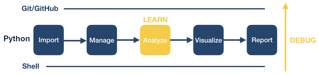
We have come to the end of this workshop. You learned some basic procedures for importing, managing, visualizing and reporting your data.
As you continue on your coding journey, two things will happen:
- You will encounter bugs and need to figure out how to solve them (“debugging”), and
- You will want to learn new data processing and analysis techniques.
As we complete the course, we want to share with you some tips and tricks that have helped us on our own programming journeys.
Writing code at the University of Michigan
There are many local opportunities at the University of Michigan or around the Ann Arbor campus to find coding support, learn new programming skills, and connect with other users.
Get help and connect
- Software Carpentry Workshops
- We’re always looking for more helpers & instructors!
- CoderSpaces
- Data Analysis Networking Group (DANG!)
- CSCAR consulting and workshops
- Local meetup groups
Dealing with coding errors
Even well seasoned coders run into bugs all the time. Here are some strategies of how programmers try to deal with coding errors:
- Don’t panic. Bugs are a normal part of the coding process. Think of each bug as a great opportunity for becoming better at writing code. When you’re debugging, you’re being a detective and trying to figure out what’s wrong. Think of it as a fun mystery to solve! You’ll become a better detective the more you practice.
- First, determine which type of problem you are having: either the code tries to run but returns an error message, or your code runs without error but you did not get the result you expect.
- If you are getting an error message, read the error message carefully. Unfortunately, not all error messages are well written and it may not be obvious at first what is wrong. Try to determine if you are getting a syntax error or a runtime error.
- A syntax error is when the program doesn’t understand how to run the code you provided. In Python, these error messages usually contain the word “unexpected”. Often these are because of a typo. Check that your parentheses and quotes are balanced and check that you haven’t misspelled a variable or function name. It’s difficult to identify the exact location where an error starts so you may have to look at lines before the line where the error was reported. In JupyterLab, look at the code coloring to find anything that looks off. JupyterLab will also put a red x or an yellow exclamation point to the left of lines where there is a syntax error.
- A runtime error is when the program understood all the commands you wrote, but ran into an error when trying to run them. If you are running multiple commands, try running each on its own. Before each command, check that you are passing the values you expect; and after each command, verify that the results seem sensible.
- If you have been able to find parts of your code that cause the error, take some time to review the documentation for the functions or commands you are using. Even for functions or commands you’ve used before, there may still be parts of the documentation that you just haven’t needed to use before. See if there are examples in the documentation that you can compare your own code to. Most programs make finding the documentation pretty easy.
- Python: Calling the Python built-in help function, for example,
help(print), pulls up the Python documentation for that function. This provides a function description, as well as in-depth information about each function argument including its purpose, default and other available options. - Shell: Using
man <command>or<command> --helppulls up the manual page with more information. To quit, clickq. - Git:
git helpdisplays help information about git. Read more here.
- Python: Calling the Python built-in help function, for example,
- Search online for the error message along with the function that is not working. Most likely, someone encountered this error before you and the examples online will help you figure out your own issue.
- Perform a general online search for what you are trying to do, e.g., “how to import a comma separated spreadsheet into Python”, “how to delete a directory from the command line”, “how to merge conflicts in git”. Typically, you will find step-by-step online documentation that you can adapt for your own purposes.
Debugging code
If searching for your particular code problem hasn’t turned up a solution, you may have to do a bit of debugging. Debugging is the process of finding exactly what caused your error, and changing only what is necessary to fix it. There are many strategies to debugging code. Consider checking out the following resources to learn more about it.
- “5 Essential Tips to Debug Any Piece of Code” by mayuko [video, 8min] - Good general advice for debugging.
Asking strangers for help
If you are unable to determine what’s wrong with your own code, the internet offers several possible ways to get help: asking questions on programming websites, interacting with developers on GitHub, chatting with other programmers on Slack, or reaching out on Twitter. If you’re intimidated by asking people on the internet, you can also reach out to people at the University of Michigan. You don’t have to do this all on your own. However, there are some important things to keep in mind when asking questions - whether it be to people on the internet, or to people at the university. You may want to consider these tips to help you increase your chances of getting the support you need:
- First, provide a brief summary of what you are trying to accomplish. You may have been working on the problem for a long time but the person you are asking will have no idea of your work until now. Keep it short and focus on your ultimate goal rather than just talking about your code. Sometimes there may better ways to solve the problem than the solution you’ve attempted this far.
- Then, briefly mention what you’ve tried so far. Maybe mention the search terms you used online or the specific documentation you’ve looked at. It should be clear that you’ve at least tried to solve the problem yourself first (after all, that’s the way you’re most likely to learn the most).
- Now, describe the problem you are having. Don’t just say “the code doesn’t work.” Are you getting an error? If so, what is the exact message? Are you getting unexpected results? If so, then what exactly were you expecting to happen?
- Next, include a minimal, reproducible example. This means you need to take away any parts of your code that aren’t necessary to create the error you are dealing with. Often, this may mean starting a branch with a new program just for testing. Make sure the code itself can be run by including or randomly generating some sample data. If there’s no way to copy/paste and run the code on a computer, that means the individuals you are asking for help need to run the code in their head which is a lot harder than running code on a computer. Clearly describe the desired behavior so that possible solutions can be tested and verified. In the process of creating a minimal, reproducible example, it is possible you will solve your own problem.
- Keep in mind the person helping you is unlikely to know the solution off the top of their head. Even the best programmers don’t have all the documentation memorized. But with time, programmers get better at solving problems based on their past experiences. By providing a reproducible example, you allow someone else to use their debugging skills to help you rather than making them guess what might be wrong.
- If it’s not obvious from your question, it can be very useful to include details about the operation system you are using and the versions of the programs you are currently running. Sometimes, things work differently as programs change over time and the code you found on the web may have been for a different version.
- Make it easy to reply. Try to ask one specific question. Asking a bunch of questions takes more time and energy to respond, and you want to minimize the work you create for the kind stranger who is helping you out. Also, if you include sample data with which to test possible solutions, then someone can verify their suggestion works before replying. This will help minimize back-and-forth with your helper which can take time.
- Finally, recognize that asking a good question is an art, not a science. It is something you will get better at with more time. You can also get better by trying to help other people with their questions. That way, you can see what information is necessary to really help someone. It’s a delicate balance between providing enough detail so it’s possible to intelligently respond yet keeping things short enough to not overwhelm your helper (more isn’t always better).
Learning new code
Free open-source programming languages such as Bash, Git and Python are constantly evolving. As you try out new data processing and analysis techniques, you will continue to learn new coding logic, concepts, functions, and libraries. Widely available user tools and documentation are a main benefit of free open-source software.
In the following, we list some strategies and resources we find useful. As you move forward, you are likely to identify other resources that fit your own learning style.
General
- Stack Overflow: Users post questions or errors and other users respond. (This is a great place to search for help but might not be the best place to ask a question if you are a beginner.)
- Cheat Sheets!! You can find many different cheat sheets for entire languages or specific libraries or even functions online. Just search for “
cheat sheet" to see what is available. We have listed a few below. - Study other people’s code. Increasingly, people publish their code (e.g., in a GitHub repository) to facilitate reproducible research. You can take someone else’s code as a starting point and adapt it to your own needs.
- Other people in your department or lab are also great resources for asking about specific coding problems.
Cheat Sheets
A good collection of cheat sheets to print out and hang at your desk.
Free learning platforms available at U-M
Some important advanced coding concepts that you will want to learn if you continue coding a lot
There are some coding concepts that we did not have time to cover in this workshop, but are important to learn as you continue on your journey and begin to perform more sophisticated data analysis projects. While we have not created resources for these topics, we provide some links to where you can learn more. Note that these are more advanced coding topics; you should be come comfortable with what you learned in the workshop before trying to delve deeper into these other concepts. However, you’ll likely come across situations where one of these will be useful, and that’s when you should learn it!
We’ve provided some links below, but feel free to search for other explanations and tutorials as well.
Python coding topics
Some more advanced Python coding topics include:
Domain-specific analyses
We encourage you to investigate domain-specific libraries and software that will help you perform specific tasks related to your own research.
The best way to find these libraries is to either ask other people in your field and/or search for specific tasks that you would like to perform.
If you’d like to perform the task in Python, include that in your search (e.g. “find pairwise distances for DNA sequences in Python” will help you find the Python library biopython which has a number of tools for computational molecular biology in Python.)
High-performance computing clusters
If you’re performing computationally-intensive analyses, you’ll likely want to use a high-performance computing cluster. At the University of Michigan, many of us work on Great Lakes for much of our research. It can be a bit overwhelming at first, so try to find someone to help you learn the ropes. Sometimes there are also workshops where you can learn more.
Git/GitHub
If you start using Git/GitHub more frequently, it’s useful to learn how to create branches to work on new parts of your analysis. When you’re confident that it works, you can then merge the contents of the branch back into your “main” branch.
Key Points
When it comes to trying to figure out how to code something, and debugging, Internet searching is your best friend.
There are several resources at the University of Michigan that you can take advantage of if you need help with your code.
We didn’t have time to cover all important coding concepts in this workshop, so definitely continue trying to learn more once you get comfortable with the material we covered.
There are often packages and tools that you can leverage to perform domain-specific analyses, so search for them!