Jupyter Notebook and Markdown
Overview
Teaching: 45 min
Exercises: 30 minQuestions
How can I make reproducible reports using Jupyter notebook?
How do I format the notebook using Markdown?
Objectives
To create a Jupyter Notebook that combines text, code, and figures.
To use Markdown to format our notebook.
To be aware of the various report formats that can be rendered from Jupyter Notebook.
To practice using the Unix Shell, GitHub, and Python through paired programming exercises.
Contents
- Why use Jupyter Notebook?
- Creating a notebook directory
- Basic components of a Jupyter Notebook
- Exporting Jupyter notebook
- Beyond JupyterLab and Jupyter notebook
- Integrating it all together: Paired exercise
Recall that our goal is to generate a report to the United Nations on how a country’s life expectancy is related to GDP.
Discussion
How do you usually share data analyses with your collaborators? Many people share them through a Word or PDF document, a spreadsheet, slides, a graphic, etc.
Why use Jupyter Notebook?
In Jupyter Notebook, you can incorporate ordinary text (ex. experimental methods, analysis and discussion of results) alongside code and figures! This is useful for writing reproducible reports and publications and sharing work with collaborators. Because the code is embedded in the notebook, the tables and figures are reproducible. Anyone can run the code and get the same results. If you find an error or want to add more to the report, you can just re-run the document and you’ll have updated tables and figures! This concept of combining text and code is called literate programming. To do this we use Jupyter Notebook, which combines Markdown (renders plain text) with Python. A Jupyter Notebook can be exported as an HTML, PDF, or other document formats that we can share with others.
Creating a notebook directory
To get started, let’s use the Unix Shell to create a directory within un-report called notebooks where we will write our notebooks to the UN.
First, open the Unix Shell and cd to un-report:
pwd
mkdir notebooks
/home/USERNAME/Desktop/un-report/notebooks/
Basic components of a Jupyter notebook
Creating a Jupyter Notebook
Now that we have a better understanding of what we can use jupyter notebooks for, let’s start writing a notebook!
We can create a Jupyter notebook in the same way that we did in the previous lessons. To create a Jupyter notebook file:
- Launch JupyterLab in your browser
- In the Launcher tab, click the “Python 3” button (under the “Notebook” category)
A Jupyter notebook is composed of cells. So far we have only used “code” cells, which is the default cell type for us to write and execute codes. In addition to code cells, Jupyter notebook also supports “Markdown” cells for us to include texts, images, tables, and other things as part of a notebook.
Introduction to Markdown
Markdown is a simple way for creating formatted text.
Let’s convert the first cell in the notebook from a code cell to a markdown cell using the dropdown menu located at the tool bar near the top of the notebook.
We can create headers and subheaders using one or more pound signs # followed by a whitespace.
For example we can add the following headers.
We can run the Markdown cell the same way as running a code cell to see a rendered (formatted) version of the Markdown text we just typed in.
# UM Carpentries Workshop - Python
## Day 2: Jupyter Notebook and Markdown
### 2023-12-12
OK, now that we know how to make headers, let’s practice some more Markdown syntax.
In JupyterLab click the Help menu, then click Markdown Reference, read through the Markdown syntax. Go through the “10 minute Markdown tutorial”.
Exporting Jupyter notebook
We can export a notebook to other formats by clicking the File menu, then Save and Export Notebook As….
We can save a notebook as an HTML file if we want to publish it on a web. We can even export it as presentation slides. When doing so, we can first click the right sidebar (the button icon with two gears). Then assign a “Slide Type” for each cell, which allow us to control whether and how a cell should be included in the slides.
Beyond JupyterLab and Jupyter notebook
Jupyter Notebook is a great and popular tool for learning programming, exploratory data analysis, among other things. However, there are some drawbacks of Jupyter Notebooks that may or may not be important to you.
Google Colab
Google Colaboratory, or Colab for short, is an online Jupyter Notebook service that requires no setup to use on your own computer, and it allows co-editing by multiple people on the same notebook. Think of it as a Google Docs but for Jupyter notebooks. Note it does require you to sign in to your Google account to use it.
Python’s .py file
Currently it is not easy to do version control with Jupyter Notebooks, as a notebook raw file is in JSON with many details that is not easy for humans to read (e.g., when checking the differences of two versions.)
The good news that is we can also directly write and run Python files which have a file extension .py.
The Python file is a plain text file that is straight forward to do version control.
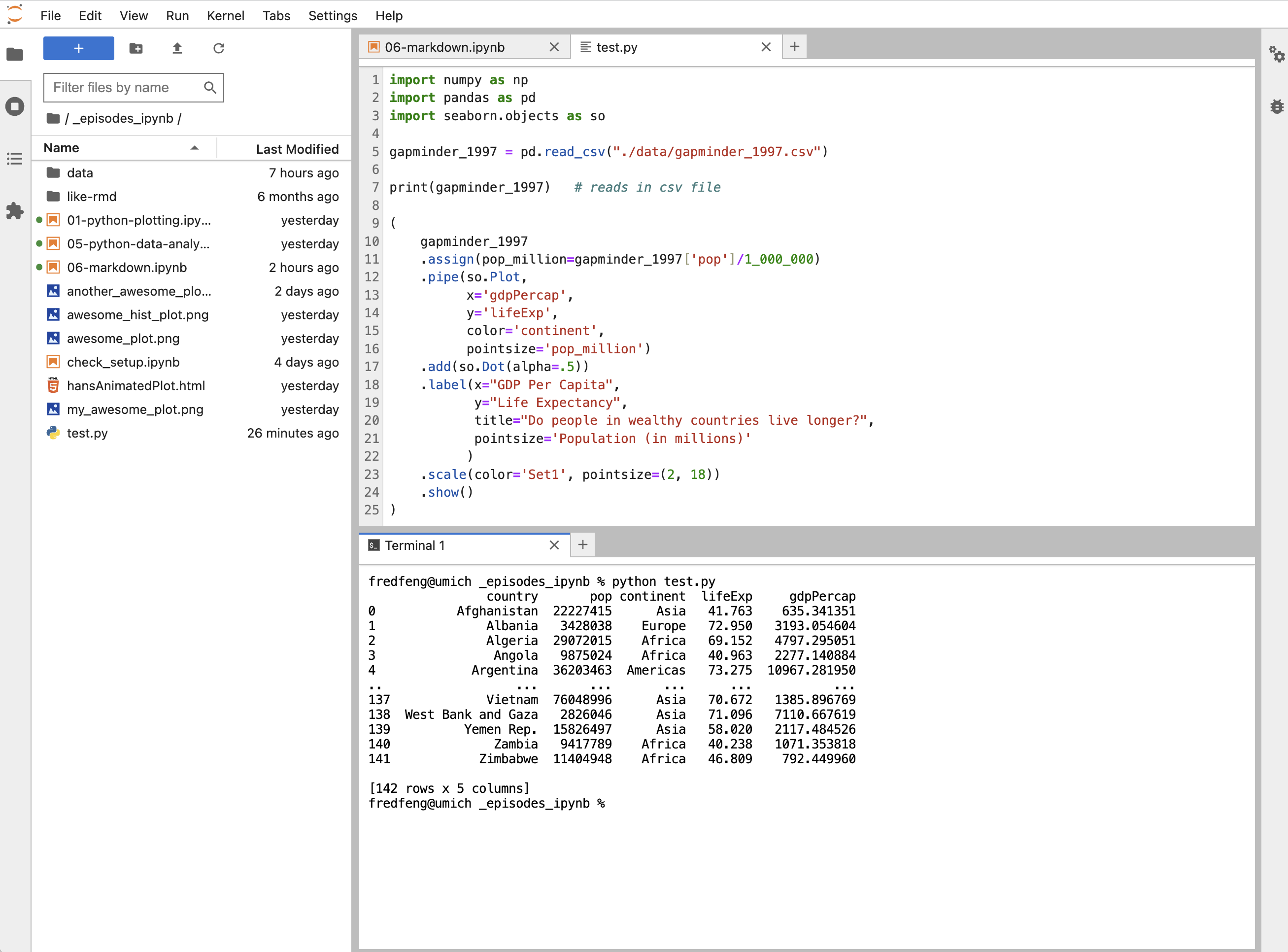
For example, we can create a Python file from the Launcher tab by clicking the button Python File.
Then we can copy and paste our code to the Python file.
We can run a Python file by going to our terminals (also available inside JupyterLab from the Launcher tab), and then type python followed by the name of the Python file that we wish to run, for example, python abc.py.
ProTip: In JupyterLab we can drag the terminal to the bottom of the main work area, so that we can see both our python file and the terminal.
Integrating it all together: Paired exercise
You’ve learned so much in the past two days - how to use the Unix Shell to move around your computer, how to use git for version control and GitHub for collaborating with others on code, how to make pretty plots and do data analysis in Python, and how to incorporate it all into a Jupyter Notebook. Now, you’re going to work in pairs to practice everything you learned. Ideally, you’ll have the same pair as for the git/GitHub lesson. Don’t worry - if you have questions, the instructor and helpers are here to help you out!
Only one of the people in your pair is going to create the Jupyter Notebook file. The other person is going to collaborate with that person using GitHub. So the first step is to choose one person in your pair to create/host the Jupyter Notebook file.
For the person who is going to host the new Jupyter Notebook file:
- Make a new Jupyter Notebook file in the
notebooksdirectory - Give it an informative title.
For the person who is going to collaborate with the host of the Jupyter Notebook file:
If you don’t already have your partner’s GitHub repo cloned from the git/GitHub lesson, clone their repo to your Desktop under the name USERNAME-un-report.
If you don’t remember how to do this, you can review the git lesson.
The way you will collaborate with each other is as follows:
- For each exercise, both people will be thinking about how to answer the question, but only one person will be writing the code. This is called paired programming.
- Once you have completed 3 exercises, the person working on the exercises will add, commit, and push the changes to GitHub.
- Then the other person will pull the changes from GitHub.
- The person who pulled changes will code for the next exercise.
- Repeat the process for as many exercises as you can finish in the remaining time.
Don’t worry if you don’t finish all of the exercises, and it’s not a race between groups! This is just a way for you to practice what you’ve learned. Also, you can switch off more or less frequently depending on how much you want to practice pushing and pulling to/from GitHub.
One note: It may be helpful to copy and paste the questions into the Jupyter Notebook file as you go.
Exercises using the gapminder data
First we’re going to start out with a few questions about the gapminder dataset.
[1] The very first step is to read in the gapminder dataset, so do that first!
Solution
import numpy as np
import pandas as pd

gapminder = pd.read_csv("./data/gapminder_data.csv")
print(gapminder.head())
country year pop continent lifeExp gdpPercap 0 Afghanistan 1952 8425333.0 Asia 28.801 779.445314 1 Afghanistan 1957 9240934.0 Asia 30.332 820.853030 2 Afghanistan 1962 10267083.0 Asia 31.997 853.100710 3 Afghanistan 1967 11537966.0 Asia 34.020 836.197138 4 Afghanistan 1972 13079460.0 Asia 36.088 739.981106
Investigating population over time.
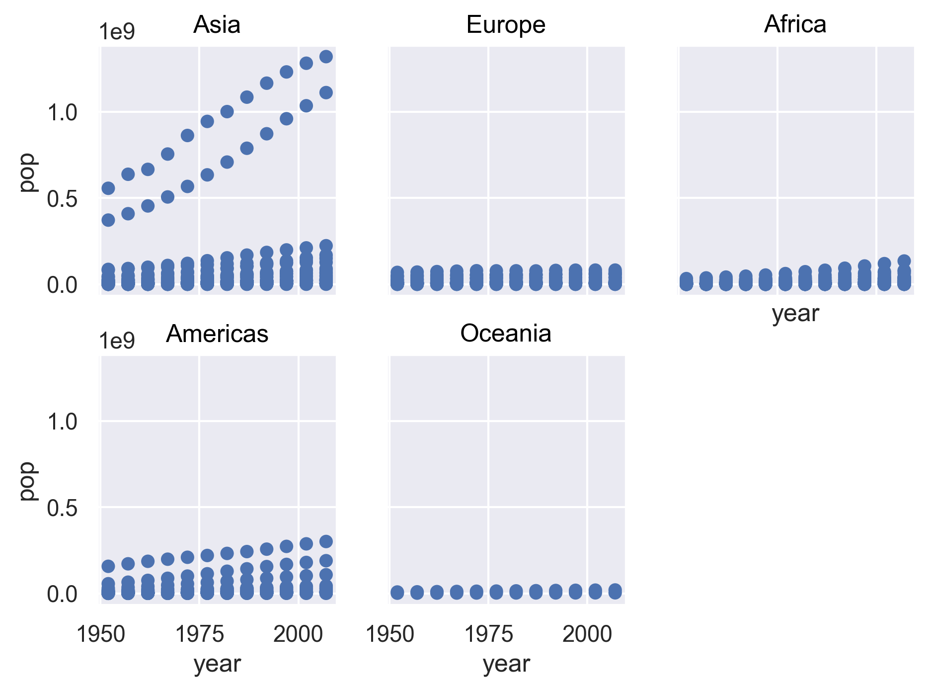
[2] Make a scatter plot of year vs. population, separated into a plot for each continent.
Hint: you can apply the facet() method to the plot to separate it into multiple plots.
Solution
import seaborn.objects as so

(
    so.Plot(gapminder, x='year', y='pop')
    .add(so.Dot())
    .facet('continent', wrap=3)
)
[3] It seems like there are 2 outliers - which countries are those?
Solution
(
    gapminder
    .query("pop > 1e9")
    ['country']
    .unique()
)
array(['China', 'India'], dtype=object)
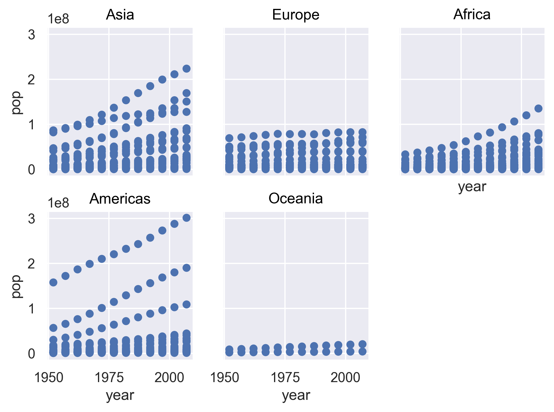
[4] Plot year vs. population separated into a plot for each continent but excluding the 2 outlier countries.
Solution
(
    gapminder
    .query("country not in ['China', 'India']")
    .pipe(so.Plot, x='year', y='pop')
    .add(so.Dot())
    .facet('continent', wrap=3)
)
Bonus questions: come back to these if you have time at the end
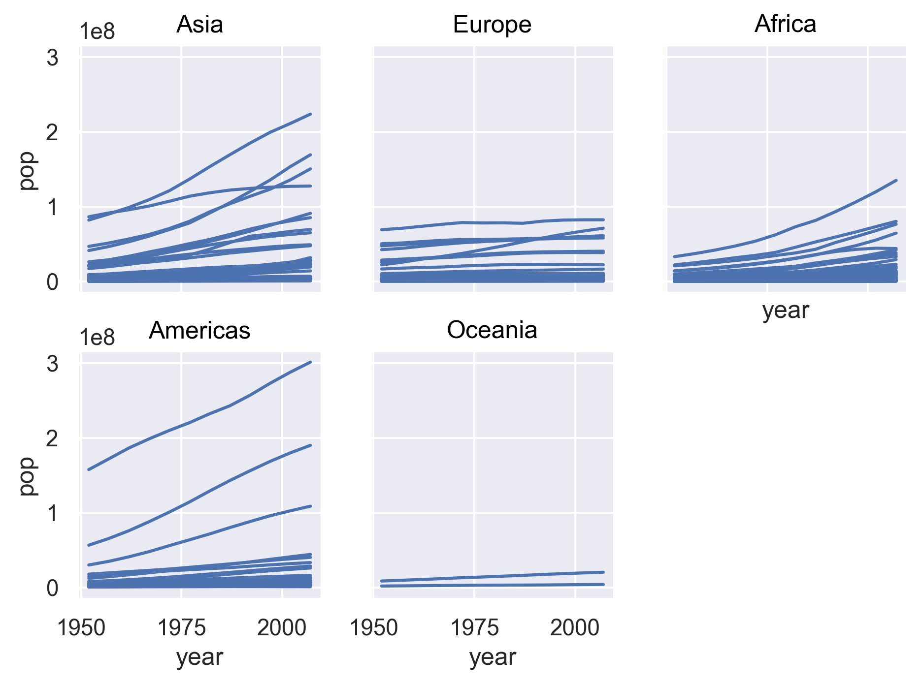
[5] It’s hard to see which country is which here. Can you change the scatter plot to a line plot so we can get a better sense of trends over time? Hint: This website has more information: https://www.r-graph-gallery.com/line-chart-several-groups-ggplot2.html
Solution
(
    gapminder
    .query("country not in ['China', 'India']")
    .pipe(so.Plot, x='year', y='pop', group='country')
    .add(so.Line())
    .facet('continent', wrap=3)
    .save("../fig/python-markdown/06-unnamed-3.png", bbox_inches='tight', dpi=300)
)
Looking into life expectancy a bit more.
[6] What country had the highest life expectancy in 1982? Hint: You can apply the max() method to a column when setting up your query.
Solution
(
    gapminder
    .query("year == 1982")
    .query("lifeExp == lifeExp.max()")
)
country year pop continent lifeExp gdpPercap 798 Japan 1982 118454974.0 Asia 77.11 19384.10571
[7] Now, do the same thing but for all years!
Hint: You can use the groupby() method and then apply a custom function using the apply() method.
You can apply the idxmax() method to a column to find the index that has the maximum value.
Solution
(
    gapminder
    .groupby('year')
    .apply(lambda x: x.loc[x['lifeExp'].idxmax()])
)
country year pop continent lifeExp gdpPercap year 1952 Norway 1952 3327728.0 Europe 72.670 10095.421720 1957 Iceland 1957 165110.0 Europe 73.470 9244.001412 1962 Iceland 1962 182053.0 Europe 73.680 10350.159060 1967 Sweden 1967 7867931.0 Europe 74.160 15258.296970 1972 Sweden 1972 8122293.0 Europe 74.720 17832.024640 1977 Iceland 1977 221823.0 Europe 76.110 19654.962470 1982 Japan 1982 118454974.0 Asia 77.110 19384.105710 1987 Japan 1987 122091325.0 Asia 78.670 22375.941890 1992 Japan 1992 124329269.0 Asia 79.360 26824.895110 1997 Japan 1997 125956499.0 Asia 80.690 28816.584990 2002 Japan 2002 127065841.0 Asia 82.000 28604.591900 2007 Japan 2007 127467972.0 Asia 82.603 31656.068060
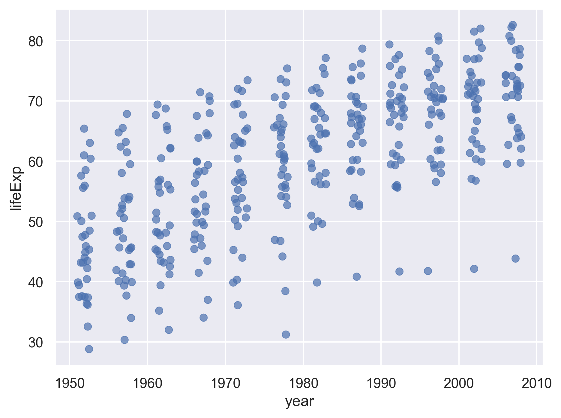
[8] Make a jitter plot for the life expectancies of the countries in Asia for each year (year is the x axis, life expectancy is the y axis). Also fix the x and y axis labels.
Solution
(
    gapminder
    .query("continent == 'Asia'")
    .pipe(so.Plot, x='year', y='lifeExp')
    .add(so.Dot(alpha=.7), so.Jitter(.5))
)
Bonus questions: come back to these if you have time at the end
[9] What are the outliers in life expectancy in Asia for each year (lower life expectancy)?
Solution
(
    gapminder
    .query("continent == 'Asia'")
    .groupby('year')
    .apply(lambda x: x.loc[x['lifeExp'].idxmin()])
)
country year pop continent lifeExp gdpPercap year 1952 Afghanistan 1952 8425333.0 Asia 28.801 779.445314 1957 Afghanistan 1957 9240934.0 Asia 30.332 820.853030 1962 Afghanistan 1962 10267083.0 Asia 31.997 853.100710 1967 Afghanistan 1967 11537966.0 Asia 34.020 836.197138 1972 Afghanistan 1972 13079460.0 Asia 36.088 739.981106 1977 Cambodia 1977 6978607.0 Asia 31.220 524.972183 1982 Afghanistan 1982 12881816.0 Asia 39.854 978.011439 1987 Afghanistan 1987 13867957.0 Asia 40.822 852.395945 1992 Afghanistan 1992 16317921.0 Asia 41.674 649.341395 1997 Afghanistan 1997 22227415.0 Asia 41.763 635.341351 2002 Afghanistan 2002 25268405.0 Asia 42.129 726.734055 2007 Afghanistan 2007 31889923.0 Asia 43.828 974.580338
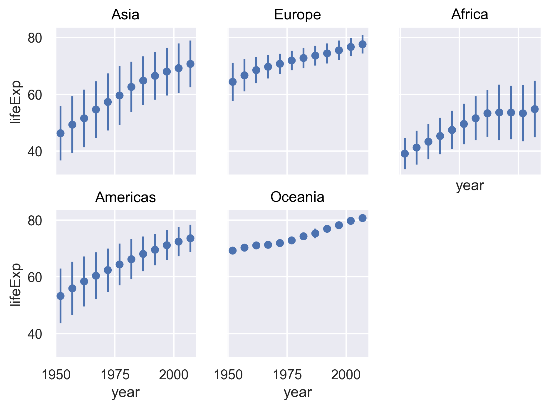
[10] Make a plot that shows the range (i.e., mean plus/minus standard deviation) for the life expectancies of the countries over time for each continent. Try to fix the x and y axis labels and text, too. Feel free to change the theme if you’d like.
Solution
(
    gapminder
    .pipe(so.Plot, x='year', y='lifeExp')
    .add(so.Range(), so.Est(func='mean', errorbar='sd'))
    .add(so.Dot(), so.Agg())
    .facet('continent', wrap=3)
)
[11] Which country has had the greatest increase in life expectancy from 1952 to 2007? Hint: You might want to use the pivot() method to get your data in a format with columns for: country, 1952 life expectancy, 2007 life expectancy, and the difference between 2007 and 1992 life expectancy.
Solution
(
    gapminder
    .query("year in [1952, 2007]")
    .pivot(index='country', columns='year', values='lifeExp')
    .assign(diff=lambda x: x[2007] - x[1952])
    .query("diff == diff.max()")
)
year 1952 2007 diff country Oman 37.578 75.64 38.062
[12] What countries had a decrease in life expectancy from 1952 to 2007?
Solution
(
    gapminder
    .query("year in [1952, 2007]")
    .pivot(index='country', columns='year', values='lifeExp')
    .assign(diff=lambda x: x[2007] - x[1952])
    .query("diff < 0")
)
year 1952 2007 diff country Swaziland 41.407 39.613 -1.794 Zimbabwe 48.451 43.487 -4.964
Exercises integrating a new dataset
If you finished the questions involving the gapminder dataset (bonus questions are optional), move on to these questions next. Note that we don’t expect you to finish all of these! You can also use them as practice after the workshop if you’d like.
Now that you’ve practiced what you’ve learned with the gapminder data, you’re going to try using what we’ve learned to explore a new dataset.
Preview of the data
This dataset has information on the gross domestic expenditure on research and development (R&D) for different countries. We’re going to use it to practice the data analysis workflow that you learned over the course of the workshop.
Data: Gross domestic expenditure on research and development (R & D)
Data source: UN data, under “Science and technology”
Data path: data/rnd-un-data.csv
Raw CSV file:
T27,Gross domestic expenditure on research and development (R&D),,,,,
Region/Country/Area,,Year,Series,Value,Footnotes,Source
8,Albania,2008,Gross domestic expenditure on R & D: as a percentage of GDP (%),0.1541,Partial data.,"United Nations Educational, Scientific and Cultural Organization (UNESCO), Montreal, the UNESCO Institute for Statistics (UIS) statistics database, last accessed June 2020."
8,Albania,2008,Gross domestic expenditure on R & D: Business enterprises (%),3.2603,Partial data.,"United Nations Educational, Scientific and Cultural Organization (UNESCO), Montreal, the UNESCO Institute for Statistics (UIS) statistics database, last accessed June 2020."
...
Reading in and cleaning the data
[1] First, read in the data. Note that you need to skip the first line of the file because that’s just a title for the whole dataset (see above). Also rename the columns to something more informative (as you learned, there are lots of ways to do this, and different preferences - feel free to use whichever method you want!).
Solution
(
    pd.read_csv("./data/rnd-un-data.csv", skiprows=1)
    .rename(columns={'Unnamed: 1' : 'country'})
    .rename(columns=str.lower)
)
region/country/area country year series value footnotes \ 0 8 Albania 2008 Gross domestic expenditure on R & D: as a perc... 0.1541 Partial data. 1 8 Albania 2008 Gross domestic expenditure on R & D: Business ... 3.2603 Partial data. 2 8 Albania 2008 Gross domestic expenditure on R & D: Governmen... 80.8046 Partial data. 3 8 Albania 2008 Gross domestic expenditure on R & D: Higher ed... 8.5680 Partial data. 4 8 Albania 2008 Gross domestic expenditure on R & D: Funds fro... 7.3672 Partial data. ... ... ... ... ... ... ... 2415 894 Zambia 2008 Gross domestic expenditure on R & D: as a perc... 0.2782 Break in the time series. 2416 894 Zambia 2008 Gross domestic expenditure on R & D: Business ... 3.2277 Break in the time series. 2417 894 Zambia 2008 Gross domestic expenditure on R & D: Governmen... 94.8311 Break in the time series. 2418 894 Zambia 2008 Gross domestic expenditure on R & D: Private n... 0.3226 Break in the time series. 2419 894 Zambia 2008 Gross domestic expenditure on R & D: Funds fro... 1.6187 Break in the time series. source 0 United Nations Educational, Scientific and Cul... 1 United Nations Educational, Scientific and Cul... 2 United Nations Educational, Scientific and Cul... 3 United Nations Educational, Scientific and Cul... 4 United Nations Educational, Scientific and Cul... ... ... 2415 United Nations Educational, Scientific and Cul... 2416 United Nations Educational, Scientific and Cul... 2417 United Nations Educational, Scientific and Cul... 2418 United Nations Educational, Scientific and Cul... 2419 United Nations Educational, Scientific and Cul... [2420 rows x 7 columns]
[2] Next, take a look at the “series” column (or whatever you renamed it to), and make the titles shorter and with no spaces to make them easier to work with.
Solution
First let’s take a look at what unique values this column contains.
(
    pd.read_csv("./data/rnd-un-data.csv", skiprows=1)
    .rename(columns={'Unnamed: 1' : 'country'})
    .rename(columns=str.lower)
    ['series'].unique()
)
['Gross domestic expenditure on R & D: as a percentage of GDP (%)' 'Gross domestic expenditure on R & D: Business enterprises (%)' 'Gross domestic expenditure on R & D: Government (%)' 'Gross domestic expenditure on R & D: Higher education (%)' 'Gross domestic expenditure on R & D: Funds from abroad (%)' 'Gross domestic expenditure on R & D: Not distributed (%)' 'Gross domestic expenditure on R & D: Private non-profit (%)']Now let’s replace them with shorter values, and assign the result to a data frame called
rnd.rnd = ( pd.read_csv("./data/rnd-un-data.csv", skiprows=1) .rename(columns={'Unnamed: 1' : 'country'}) .rename(columns=str.lower) .replace({'series' : {'Gross domestic expenditure on R & D: as a percentage of GDP (%)' : 'gdp_pct', 'Gross domestic expenditure on R & D: Business enterprises (%)' : 'business', 'Gross domestic expenditure on R & D: Government (%)' : 'government', 'Gross domestic expenditure on R & D: Higher education (%)' : 'higher_ed', 'Gross domestic expenditure on R & D: Funds from abroad (%)' : 'abroad', 'Gross domestic expenditure on R & D: Not distributed (%)' : 'not_distributed', 'Gross domestic expenditure on R & D: Private non-profit (%)' : 'non_profit',}}) ) print(rnd)region/country/area country year series value footnotes source 0 8 Albania 2008 gdp_pct 0.1541 Partial data. United Nations Educational, Scientific and Cul... 1 8 Albania 2008 business 3.2603 Partial data. United Nations Educational, Scientific and Cul... 2 8 Albania 2008 government 80.8046 Partial data. United Nations Educational, Scientific and Cul... 3 8 Albania 2008 higher_ed 8.5680 Partial data. United Nations Educational, Scientific and Cul... 4 8 Albania 2008 abroad 7.3672 Partial data. United Nations Educational, Scientific and Cul... ... ... ... ... ... ... ... ... 2415 894 Zambia 2008 gdp_pct 0.2782 Break in the time series. United Nations Educational, Scientific and Cul... 2416 894 Zambia 2008 business 3.2277 Break in the time series. United Nations Educational, Scientific and Cul... 2417 894 Zambia 2008 government 94.8311 Break in the time series. United Nations Educational, Scientific and Cul... 2418 894 Zambia 2008 non_profit 0.3226 Break in the time series. United Nations Educational, Scientific and Cul... 2419 894 Zambia 2008 abroad 1.6187 Break in the time series. United Nations Educational, Scientific and Cul... [2420 rows x 7 columns]
[3] Next, make a column for each of the data types in the “series” column (or whatever you renamed it to). This should give you the following columns: country name, year, expenditure in general, % of funds from business, % of funds from government, % of funds from higher ed, % of funds from non-profit, % of funds from abroad, % of funds from non-specified sources.
Solution
(
    rnd
    .pivot(columns='series', values='value', index=['country', 'year'])
    .reset_index()
)
series country year abroad business gdp_pct government higher_ed non_profit not_distributed 0 Albania 2008 7.3672 3.2603 0.1541 80.8046 8.568 NaN NaN 1 Algeria 2005 NaN NaN 0.0660 NaN NaN NaN NaN 2 Algeria 2017 0.0246 6.7441 0.5424 93.1311 NaN NaN 0.0312 3 American Samoa 2005 NaN NaN 0.3647 NaN NaN NaN NaN 4 American Samoa 2006 NaN NaN 0.3931 NaN NaN NaN NaN .. ... ... ... ... ... ... ... ... ... 543 Viet Nam 2002 6.3300 18.0600 0.1927 74.1100 NaN NaN 0.8400 544 Viet Nam 2015 2.8893 58.0950 0.4411 33.0259 NaN NaN 5.0416 545 Viet Nam 2017 4.4946 64.1201 0.5267 26.9304 NaN NaN 3.0523 546 Zambia 2005 NaN NaN 0.0249 NaN NaN NaN NaN 547 Zambia 2008 1.6187 3.2277 0.2782 94.8311 NaN 0.3226 NaN [548 rows x 9 columns]
Note that there is a lot of missing data.
Now we have our data set up in a way that makes it easier to work with. Feel free to clean up the data more before moving on to the next step if you’d like.
Plotting with the R & D dataset
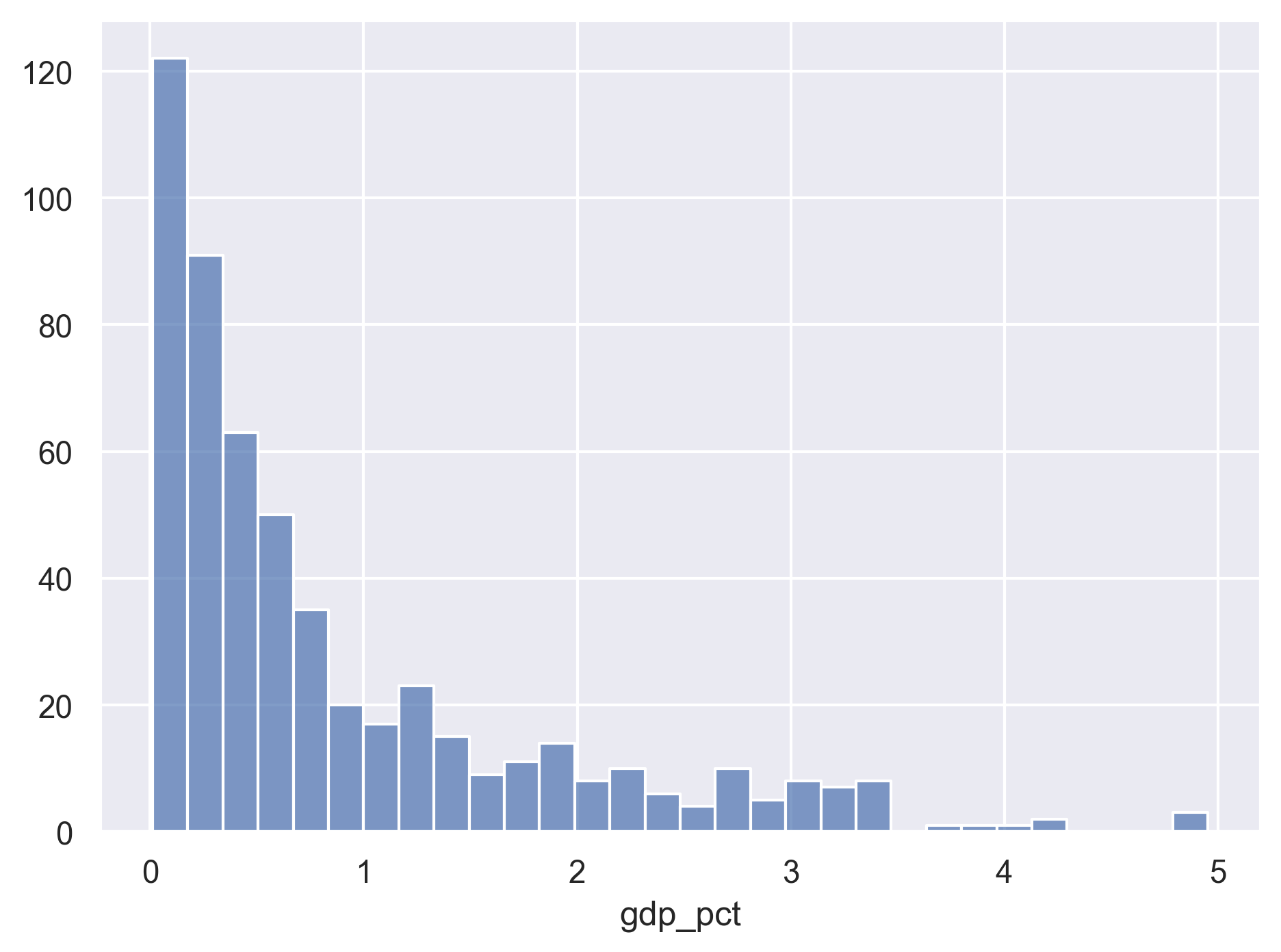
[4] Plot the distribution of percent expenditure using a histogram.
Solution
import seaborn.objects as so

(
    rnd
    .pivot(columns='series', values='value', index=['country', 'year'])
    .reset_index()
    .pipe(so.Plot, x='gdp_pct')
    .add(so.Bars(), so.Hist(bins=30))
)
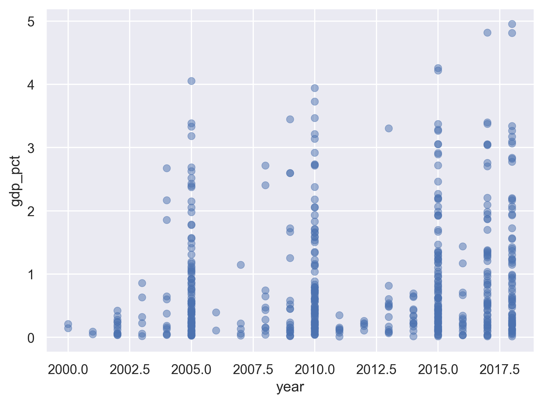
[5] Plot the R&D expenditure by year (discrete x vs continuous y) using a scatter plot. Feel free to try to make the plot more legible if you want.
Solution
(
    rnd
    .pivot(columns='series', values='value', index=['country', 'year'])
    .reset_index()
    .pipe(so.Plot, x='year', y='gdp_pct')
    .add(so.Dot(alpha=.5))
)
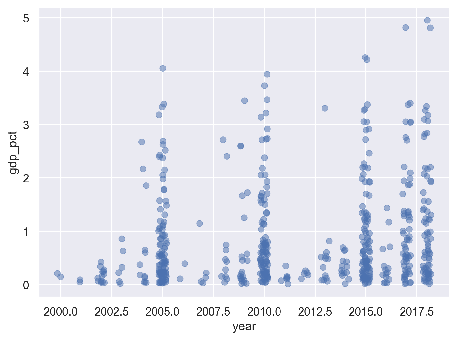
[6] Plot the R&D expenditure by year (discrete x vs continuous y) using a jitter plot.
Solution
(
    rnd
    .pivot(columns='series', values='value', index=['country', 'year'])
    .reset_index()
    .pipe(so.Plot, x='year', y='gdp_pct')
    .add(so.Dot(alpha=.5), so.Jitter(.5))
)
Combining the CO2 and R&D datasets
Now we’re going to work with the CO2 and R&D datasets together.
Unfortunately, we don’t have the exact same dates for all of them.
[7] First, read in the CO2 dataset. You can use the code from the Python for data analysis lesson to clean the CO2 data.
Solution
# read in and clean CO2 data

co2 = (
    pd.read_csv("./data/co2-un-data.csv", skiprows=2,
                names=['region', 'country', 'year', 'series', 'value', 'footnotes', 'source'])
    .filter(['country', 'year', 'series', 'value'])
    .replace({'series': {"Emissions (thousand metric tons of carbon dioxide)":"emissions_total",
                         "Emissions per capita (metric tons of carbon dioxide)":"emissions_percap"},
             })
    .pivot(index=['country', 'year'], columns='series', values='value')
    .reset_index()
)

print(co2)
series country year emissions_percap emissions_total 0 Albania 1975 1.804 4338.334 1 Albania 1985 2.337 6929.926 2 Albania 1995 0.580 1848.549 3 Albania 2005 1.270 3825.184 4 Albania 2010 1.349 3930.295 ... ... ... ... ... 1061 Zimbabwe 2005 0.794 10272.774 1062 Zimbabwe 2010 0.672 9464.714 1063 Zimbabwe 2015 0.749 11822.362 1064 Zimbabwe 2016 0.642 10368.900 1065 Zimbabwe 2017 0.588 9714.938 [1066 rows x 4 columns]
[8] Merge the CO2 dataset and the R&D dataset together. Keep only the following columns: country, year, total CO2 emissions, CO2 emissions per capita, and percent of GDP used for R&D.
Solution
(
    co2
    .merge(rnd, how='outer', on=['country', 'year'])
    .filter(['country', 'year', 'emissions_total', 'emissions_percap', 'gdp_pct'])
)
country year emissions_total emissions_percap gdp_pct 0 Albania 1975 4338.334 1.804 NaN 1 Albania 1985 6929.926 2.337 NaN 2 Albania 1995 1848.549 0.580 NaN 3 Albania 2005 3825.184 1.270 NaN 4 Albania 2010 3930.295 1.349 NaN ... ... ... ... ... ... 1276 Uruguay 2011 NaN NaN 0.3487 1277 Uzbekistan 2018 NaN NaN 0.1298 1278 Venezuela (Boliv. Rep. of) 2014 NaN NaN 0.3371 1279 Viet Nam 2002 NaN NaN 0.1927 1280 Zambia 2008 NaN NaN 0.2782 [1281 rows x 5 columns]
[9] BONUS: After merging the data sets, there is some missing data.
How many NANs are present in each data column for the R&D data set?
Solution
(
    co2
    .merge(rnd, how='outer', on=['country', 'year'])
    .filter(['country', 'year', 'emissions_total', 'emissions_percap', 'gdp_pct'])
    .isnull().sum()
)
country 0 year 0 emissions_total 215 emissions_percap 215 gdp_pct 737 dtype: int64
[10] You might have noticed that we don’t have both CO2 data and R&D data for all years.
Drop the rows in the merged dataset for which the CO2 or R&D values are missing.
Save the result to a data frame called co2rnd.
HINT: Search the internet for the use of the pandas method dropna() to help you here.
Solution
co2_rnd = (
    co2
    .merge(rnd, how='outer', on=['country', 'year'])
    .filter(['country', 'year', 'emissions_total', 'emissions_percap', 'gdp_pct'])
    .dropna()
)

print(co2_rnd)
country year emissions_total emissions_percap gdp_pct 11 Algeria 2005 77474.130 2.327 0.0660 15 Algeria 2017 130493.653 3.158 0.5424 22 Angola 2016 21458.342 0.745 0.0323 27 Argentina 2005 149476.040 3.819 0.4207 28 Argentina 2010 173768.538 4.215 0.5610 ... ... ... ... ... ... 1029 Venezuela (Boliv. Rep. of) 2005 137701.548 5.141 0.1891 1030 Venezuela (Boliv. Rep. of) 2010 171468.892 5.907 0.1882 1039 Viet Nam 2015 182588.799 1.951 0.4411 1041 Viet Nam 2017 191243.601 2.002 0.5267 1053 Zambia 2005 2120.692 0.176 0.0249 [331 rows x 5 columns]
[11] How many countries by year do you have after dropping the rows with missing values?
HINT: You can use the groupby() method to help you out.
Solution
(
    co2_rnd
    .groupby('year')
    .agg({'country' : 'count'})
)
country year 2005 83 2010 86 2015 94 2016 11 2017 57
Plotting with the CO2 and R&D datasets together
[12] Plot R&D expenditure vs. CO2 emission per capita for each country using a scatter plot.
Solution
(
    so.Plot(co2_rnd, x='gdp_pct', y='emissions_percap')
    .add(so.Dots())
)
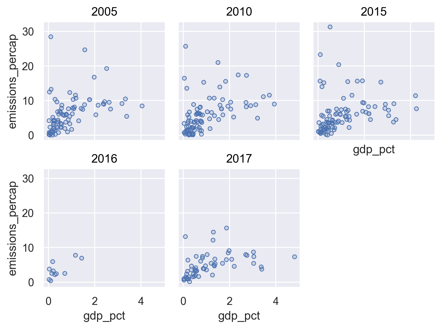
[13] Next, facet the above plot by year.
Solution
(
    so.Plot(co2_rnd, x='gdp_pct', y='emissions_percap')
    .add(so.Dots())
    .facet('year', wrap=3)
)
[14] Identify the countries that have five years of records for both C02 emissions and R&D.
Solution
print(
    co2_rnd
    .groupby('country')
    .agg({'year' : 'count'})
    .query('year == 5')
)
year country Azerbaijan 5 Cuba 5 Panama 5
BONUS
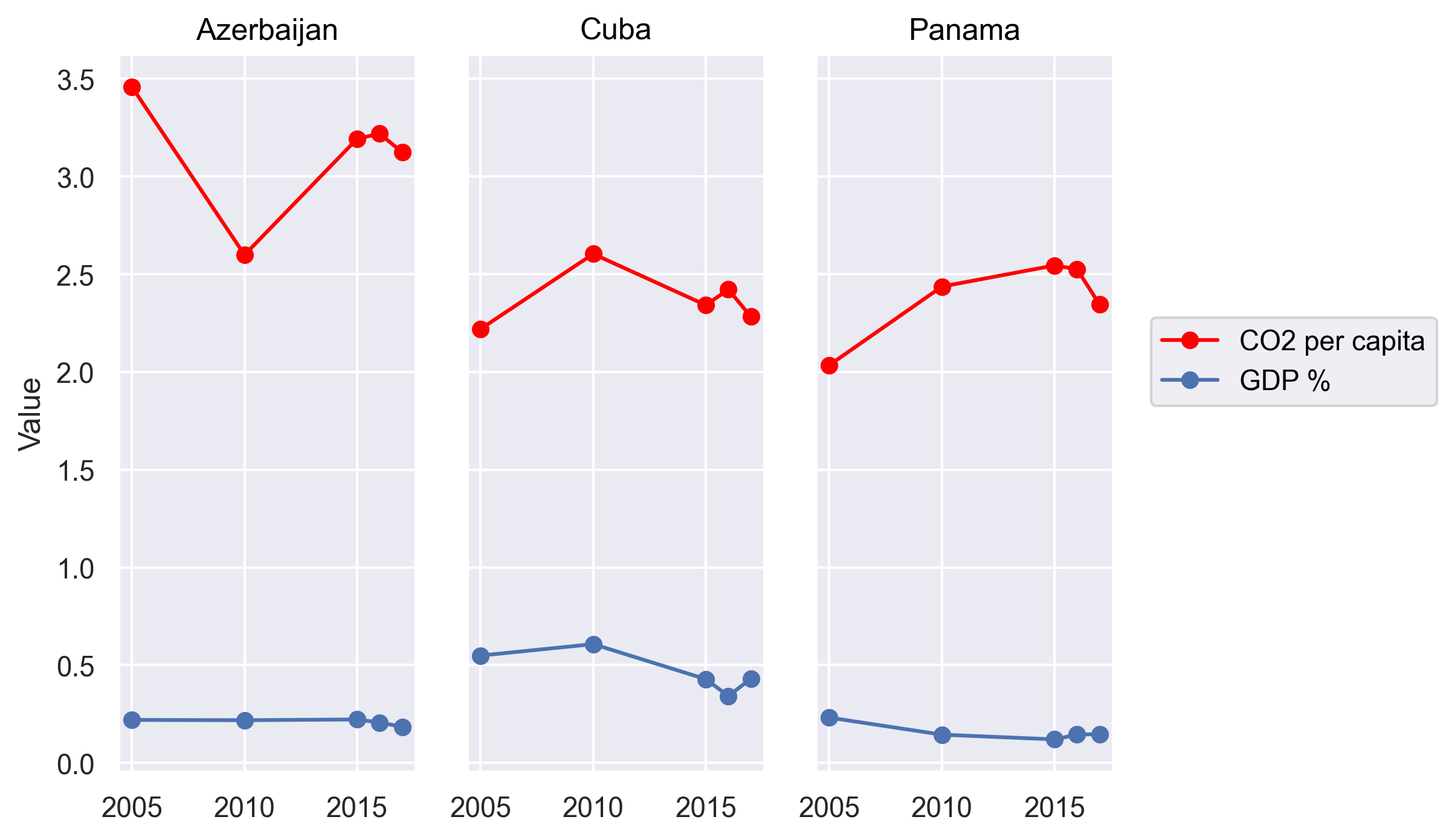
[14] For the countries you identified, plot the Percent of GDP spent on R&D and the per-capita CO2 emissions over time on the same plot. Color the two different values differently.
Solution
(
    co2_rnd
    .query("country in ['Azerbaijan','Cuba','Panama']")
    .pipe(so.Plot, x='year')
    .add(so.Line(color='red', marker='o'), y='emissions_percap', label='CO2 per capita')
    .add(so.Line(marker='o'), y='gdp_pct', label='GDP %')
    .facet('country')
    .label(x="", y="Value")
)
Bonus questions
[15] For the R&D dataset, each country can have data for one or multiple years. What is the range of the numbers of yearly records for each country?
Solution
(
    rnd
    .groupby('country')
    .agg(year_count=('year', 'count'))
    .agg(['min', 'max'])
)
year_count min 1 max 8
[16] Continue with the previous question, how many countries are there for each value within the range? (e.g., 10 countries have two different years and 20 have five different years)
Solution
(
    rnd
    .groupby('country')
    .agg(year_count=('year', 'count'))
    .groupby('year_count')
    .agg(country_count=('year_count', 'count'))
)
country_count year_count 1 22 2 16 3 19 4 39 5 37 6 10 7 4 8 1
[17] Create a Jupyter Notebook with some of the information from these exercises. Decide exactly what you want to focus your notebook on, and then also perform additional analyses to include in your notebook. Also make sure your plots are legible and understandable!
Solution
Use the info from the Jupyter Notebook lesson to create a pretty notebook.
Key Points
Jupyter Notebook is an easy way to create a report that integrates text, code, and figures.
A Jupyter Notebook can be exported to HTML, PDF, and other formats.
