Python for Plotting
Overview
Teaching: 120 min
Exercises: 30 minQuestions
What are Python and JupyterLab?
How do I read data into Python?
How can I use Python to create and save professional data visualizations?
Objectives
To become oriented with Python and JupyterLab.
To be able to read in data from csv files.
To create plots with both discrete and continuous variables.
To understand transforming and plotting data using the seaborn library.
To be able to modify a plot’s color, theme, and axis labels.
To be able to save plots to a local directory.
Contents
- Introduction to Python and JupyterLab
- Python basics
- Loading and reviewing data
- Understanding commands
- Creating our first plot
- Plotting for data exploration
- Bonus
- Glossary of terms
Bonus: why learn to program?
Share why you’re interested in learning how to code.
Solution:
There are lots of different reasons, including to perform data analysis and generate figures. I’m sure you have more specific reasons for why you’d like to learn!
Introduction to Python and JupyterLab
In this session we will be testing the hypothesis that a country’s life expectancy is related to the total value of its finished goods and services, also known as the Gross Domestic Product (GDP). To test this hypothesis, we’ll need two things: data and a platform to analyze the data.
You already downloaded the data. But what platform will we use to analyze the data? We have many options!
We could try to use a spreadsheet program like Microsoft Excel or Google sheets that have limited access, less flexibility, and don’t easily allow for things that are critical to “reproducible” research, like easily sharing the steps used to explore and make changes to the original data.
Instead, we’ll use a programming language to test our hypothesis. Today we will use Python, but we could have also used R for the same reasons we chose Python (and we teach workshops for both languages). Both Python and R are freely available, the instructions you use to do the analysis are easily shared, and by using reproducible practices, it’s straightforward to add more data or to change settings like colors or the size of a plotting symbol.
But why Python and not R?
There’s no great reason. Although there are subtle differences between the languages, it’s ultimately a matter of personal preference. Both are powerful and popular languages that have very well developed and welcoming communities of scientists that use them. As you learn more about Python, you may find things that are annoying in Python that aren’t so annoying in R; the same could be said of learning R. If the community you work in uses Python, then you’re in the right place.
To run Python, all you really need is the Python program, which is available for computers running the Windows, Mac OS X, or Linux operating systems. In this workshop, we will use Anaconda, a popular Python distribution bundled with other popular tools (e.g., many Python data science libraries). We will use JupyterLab (which comes with Anaconda) as the integrated development environment (IDE) for writing and running code, managing projects, getting help, and much more.
Bonus Exercise: Can you think of a reason you might not want to use JupyterLab?
Solution:
On some high-performance computer systems (e.g. Amazon Web Services) you typically can’t get a display like JupyterLab to open. If you’re at the University of Michigan and have access to Great Lakes, then you might want to learn more about resources to run JupyterLab on Great Lakes.
To get started, we’ll spend a little time getting familiar with the JupyterLab interface. When we start JupyterLab, on the left side there’s a collapsible sidebar that contains a file browser where we can see all the files and directories on our system.
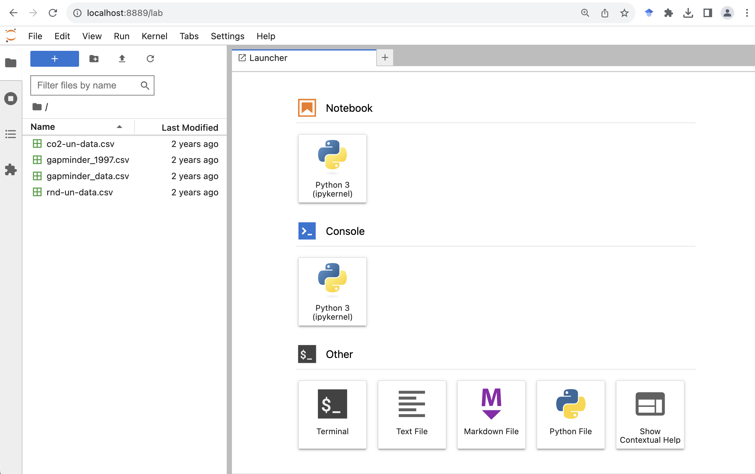
On the right side is the main work area where we can write code, see the outputs, and do other things. Now let’s create a new Jupyter notebook by clicking the “Python 3” button (under the “Notebook” category) on the “Launcher” tab .
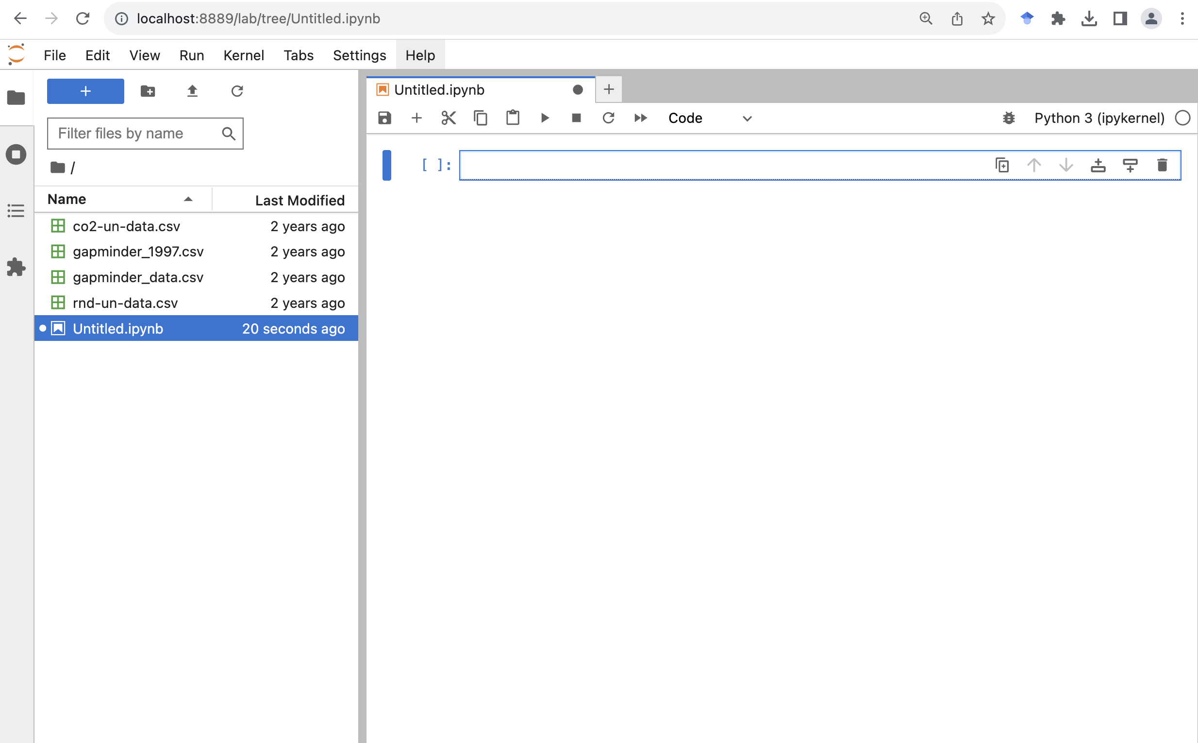
Now we have created a new Jupyter notebook called Untitled.ipynb.
The file name extension ipynb indicates it’s a notebook file.
In case you are interested, it stands for “IPython Notebook”, which is the former name for Jupyter Notebook.
Let’s give it a more meaningful file name called gdp_population.ipynb
To rename a file we can right click it from the file browser, and then click “Rename”.
A notebook is composed of “cells”. You can add more cells by clicking the plus “+” button from the toolbar at the top of the notebook.
Python basics
Arithmetic operators
At a minimum, we can use Python as a calculator.
If we type the following into a cell, and click the run button (the triangle-shaped button that looks like a play button), we will see the output under the cell.
Another quicker way to run the code in the selected cell is by pressing on your keyboard Ctrl+Enter (for Windows) or Command+Return (for MacOS).
Addition
2 + 3
5
Subtraction
2 - 3
-1
Multiplication
2 * 3
6
Division
2 / 3
0.6666666666666666
Exponentiation
One thing that you might need to be a little careful about is the exponentiation.
If you have used Microsoft Excel, MATLAB, R, or some other programming languages,
the operator for exponentiation is the caret ^ symbol.
Let’s take a look at if that works in Python.
2 ^ 3
1
Hmm. That’s not what we expected. It turns out in Python (and a few other languages), the caret symbol is used for another operation called bitwise exclusive OR.
In Python we use double asterisks ** for exponentiation.
2 ** 3
8
Order of operations
We can also use parentheses to specify what operations should be resolved first. For example, to convert 60 degrees Fahrenheit to Celsius, we can do:
5 / 9 * (60 - 32)
15.555555555555555
Assignment operator
In Python we can use a = symbol, which is called the assignment operator, to assign values on the right to objects on the left.
Let’s assign a number to a variable called “age”.
When we run the cell, it seems nothing happened.
But that’s only because we didn’t ask Python to display anything in the output after the assignment operation.
We can call the Python built-in function print() to display information in the output.
We can also use another Python built-in function type() to check the type of an object, in this case, the variable called “age”.
And we can see the type is “int”, standing for integers.
age = 26
print(age)
print(type(age))
26
<class 'int'>
Let’s create another variable called “pi”, and assign it with a value of 3.1415. We can see that this time the variable has a type of “float” for floating-point number, or a number with a decimal point.
pi = 3.1415
print(pi)
print(type(pi))
3.1415
<class 'float'>
We can also assign string or text values to a variable. Let’s create a variable called “name”, and assign it with a value “Ben”.
name = Ben
print(name)
NameError: name 'Ben' is not defined
We got an error message.
As it turns out, to make it work in Python we need to wrap any string values in quotation marks.
We can use either single quotes ' or double quotes ".
We just need to use the same kind of quotes at the beginning and end of the string.
You do need to use the same kind of quotes at the beginning and end of the string.
We can also see that the variable has a type of “str”, standing for strings.
name = "Ben"
print(name)
print(type(name))
Ben
<class 'str'>
Single vs Double Quotes
Python supports using either single quotes
'or double quotes"to specify strings. There’s no set rules on which one you should use.
- Some Python style guide suggests using single-quotes for shorter strings (the technical term is string literals), as they are a little easier to type and read, and using double-quotes for strings that are likely to contain single-quote characters as part of the string itself (such as strings containing natural language, e.g.
"I'll be there.").- Some other Python style guide suggests being consistent with your choice of string quote character within a file. Pick
'or"and stick with it.
Assigning values to objects
Try to assign values to some objects and observe each object after you have assigned a new value. What do you notice?
name = "Ben"
print(name)

name = "Harry Potter"
print(name)
Solution
When we assign a value to an object, the object stores that value so we can access it later. However, if we store a new value in an object we have already created (like when we stored “Harry Potter” in the
nameobject), it replaces the old value.
Guidelines on naming objects
- You want your object names to be explicit and not too long.
- They cannot start with a number (2x is not valid, but x2 is).
- Python is case sensitive, so for example, weight_kg is different from Weight_kg.
- You cannot use spaces in the name.
- There are some names that cannot be used because they are the names of fundamental functions in Python (e.g.,
if,else, `for; runhelp("keywords")for a complete list). You may also notice these keywords change to a different color once you type them (a feature called “syntax highlighting”).- It’s best to avoid dots (.) within names. Dots have a special meaning (methods) in Python and other programming languages.
- It is recommended to use nouns for object names and verbs for function names.
- Be consistent in the styling of your code, such as where you put spaces, how you name objects, etc. Using a consistent coding style makes your code clearer to read for your future self and your collaborators. The official Python naming conventions can be found here.
Bonus Exercise: Bad names for objects
Try to assign values to some new objects. What do you notice? After running all four lines of code bellow, what value do you think the object
Flowerholds?1number = 3 Flower = "marigold" flower = "rose" favorite number = 12Solution
Notice that we get an error when we try to assign values to
1numberandfavorite number. This is because we cannot start an object name with a numeral and we cannot have spaces in object names. The objectFlowerstill holds “marigold.” This is because Python is case-sensitive, so runningflower = "rose"does NOT change theFlowerobject. This can get confusing, and is why we generally avoid having objects with the same name and different capitalization.
Data structures
Python lists
Rather than storing a single value to an object, we can also store multiple values into a single object called a list. A Python list is indicated with a pair of square brackets
[], and different items are separated by a comma. For example, we can have a list of numbers, or a list of strings.squares = [1, 4, 9, 16, 25] print(squares) names = ["Sara", "Tom", "Jerry", "Emma"] print(names)We can also check the type of the object by calling the
type()function.type(names)listAn item from a list can be accessed by its position using the square bracket notation. Say if we want to get the first name, “Sara”, from the list, we can do
names[1]'Tom'That’s not what we expected. Python uses something called 0-based indexing. In other words, it starts counting from 0 rather than 1. If we want to get the first item from the list, we should use an index of 0. Let’s try that.
names[0]'Sara'Now see if you can get the last name from the list.
Solutions:
names[3]A cool thing in Python is it also supports negative indexing. If we just want the last time on a list, we can pass the index of
-1.names[-1]
Python dictionaries
Python lists allow us to organize items by their position. Sometimes we want to organize items by their “keys”. This is when a Python dictionary comes in handy.
A Python dictionary is indicated with a pair of curly brackets
{}and composed of entries of key-value pairs. The key and value are connected via a colon:, and different entries are separated by a comma,. For example, let’s create a dictionary of capitals. We can separate the entries in multiple lines to make it a little easier to read, especially when we have many entries. In Python we can break lines inside braces (e.g.,(),[],{}) without breaking the code. This is a common technique people use to avoid long lines and make their code a little more readable.capitals = {"France": "Paris", "USA": "Washington DC", "Germany": "Berlin", "Canada": "Ottawa"}We can check the type of the object by calling the
type()function.type(capitals)dictAn entry from a dictionary can be accessed by its key using the square bracket notation. Say if we want to get the capital for USA, , we can do
capitals["USA"]'Washington DC'Now see if you can get the capital from another country.
Solutions:
capitals["Canada"]'Ottawa'
Calling functions
So far we have used two Python built-in functions, print() to print some values on the screen, and type() to show the type of an object.
The way we called these functions is to first type the name of the function, followed by a pair of parenthesis.
Many functions require additional pieces of information to do their job. We call these additional values “arguments” or “parameters”.
We pass the arguments to a function by placing values in between the parenthesis.
A function takes in these arguments and does a bunch of “magic” behind the scenes to output something we’re interested in.
Do all functions need arguments? Let’s test some other functions.
It is common that we may want to use a function from a module.
In this case we will need to first import the module to our Python session.
We do that by using the import keyword followed by the module’s name.
To call a function from a module, we type the name of the imported module, followed by a dot ., followed by the name of the function that we wish to call.
Below we import the operating system module and call the function getcwd() to get the current working directory.
import os
os.getcwd()
'/Users/fredfeng/Desktop/teaching/workshops/um-carpentries/intro-curriculum-python/_episodes_ipynb'
Sometimes the function resides inside a submodule, we can specify the submodule using the dot notation.
In the example below, we call the today() function which is located in the date submodule inside the datetime module that we imported.
import datetime
datetime.date.today()
datetime.date(2023, 11, 4)
While some functions, like those above, don’t need any arguments, in other
functions we may want to use multiple arguments.
When we’re using multiple arguments, we separate the arguments with commas.
For example, we can use the print() function to print two strings:
print("My name is", name)
My name is Harry Potter
Pro-tip
Each function has a help page that documents what a function does, what arguments it expects and what it will return. You can bring up the help page a few different ways. You can type
?followed by the function name, for example,You can also place the mouse curse next to a function, and press Shift+Tab to see its help doc.
Learning more about functions
Look up the function
round(). What does it do? What will you get as output for the following lines of code?round(3.1415) round(3.1415, 3)Solution
The
round()function rounds a number to a given precision. By default, it rounds the number to an integer (in our example above, to 3). If you give it a second number, it rounds it to that number of digits (in our example above, to 3.142)Notice how in this example, we didn’t include any argument names. But you can use argument names if you want:
round(number=3.1415, ndigits=3)
Position of the arguments in functions
Which of the following lines of code will give you an output of 3.14? For the one(s) that don’t give you 3.14, what do they give you?
round(number=3.1415)
round(number=3.1415, ndigits=2)
round(ndigits=2, number=3.1415)
round(2, 3.1415)
Solution
The 2nd and 3rd lines will give you the right answer because the arguments are named, and when you use names the order doesn’t matter. The 1st line will give you 3 because the default number of digits is 0. Then 4th line will give you 2 because, since you didn’t name the arguments, x=2 and digits=3.1415.
Sometimes it is helpful - or even necessary - to include the argument name, but often we can skip the argument name, if the argument values are passed in a certain order. If all this function stuff sounds confusing, don’t worry! We’ll see a bunch of examples as we go that will make things clearer.
Comments
Sometimes we may want to write some comments in our code to help us remember what our code is doing, but we don’t want Python to think these comments are a part of the code you want to evaluate. That’s where comments come in! Anything after a
#sign in your code will be ignored by Python. For example, let’s say we wanted to make a note of what each of the functions we just used do:datetime.date.today() # returns today's dateos.getcwd() # returns our current working directorySome other time we may want to temporarily disable some code without deleting them. We can comment out lines of code by placing a
#sign at the beginning of each line.A handy keyboard shortcut for that is move the mouse cursor to the line you wish to comment out, then press Ctrl+/ (for Windows) or Command+/ (for MacOS) to toggle through comment and uncomment. If you wish to comment out multiple lines, first select all the lines, then use the same keyboard shortcut to comment or uncomment.
Loading and reviewing data
Data objects
In the above we introduced Python lists and dictionaries. There are other ways to store data in Python. Most objects have a table-like structure with rows and columns. We will refer to these objects generally as “data objects”. If you’ve used pandas before, you may be used to calling them “DataFrames”.
Understanding commands
The first thing we usually do when starting a new notebook is to import the libraries that we will need later to the python session. In general, we will need to first install a library before we can import it. If you followed the setup instruction and installed Anaconda, some common data science libraries are already installed.
Here we can go ahead and import them using the import keyword followed by the name of the library.
It’s common to give a library an alias name or nickname, so we can type less words when calling the library later.
The alias is created by using the keyword as.
By convention, numpy’s alias is np, and pandas’s alias is pd.
Technically you can give whatever the alias you want, but please don’t :)
import numpy as np
import pandas as pd
pd.read_csv()
TypeError: read_csv() missing 1 required positional argument: 'filepath_or_buffer'
We get an error message. Don’t panic! Error messages pop up all the time, and can be super helpful in debugging code.
In this case, the message tells us the function that we called is “missing 1 required positional argument: ‘filepath_or_buffer’”
If we think about it. We haven’t told the function what CSV files to read. Let’s tell the function where to find the CSV file by passing a file path to the function as a string.
gapminder_1997 = pd.read_csv("gapminder_1997.csv")

gapminder_1997
                country       pop continent  lifeExp     gdpPercap
0           Afghanistan  22227415      Asia   41.763    635.341351
1               Albania   3428038    Europe   72.950   3193.054604
2               Algeria  29072015    Africa   69.152   4797.295051
3                Angola   9875024    Africa   40.963   2277.140884
4             Argentina  36203463  Americas   73.275  10967.281950
..                  ...       ...       ...      ...           ...
137             Vietnam  76048996      Asia   70.672   1385.896769
138  West Bank and Gaza   2826046      Asia   71.096   7110.667619
139          Yemen Rep.  15826497      Asia   58.020   2117.484526
140              Zambia   9417789    Africa   40.238   1071.353818
141            Zimbabwe  11404948    Africa   46.809    792.449960

[142 rows x 5 columns]
The read_csv() function took the file path we provided, did who-knows-what behind the scenes, and then outputted a table with the data stored in that CSV file.
All that, with one short line of code!
We can check the type of the variable by calling the Python built-in function type.
type(gapminder_1997)
pandas.core.frame.DataFrame
In pandas terms, gapminder_1997 is a named DataFrame that references or stores something. In this case, gapminder_1997 stores a specific table of data.
Reading in an Excel file
Say you have an Excel file and not a CSV - how would you read that in? Hint: Use the Internet to help you figure it out!
Solution
Pandas comes with the
read_excel()function which provides the same output as the output ofread_csv().
Creating our first plot
We will mostly use the Vega-Altair (Altair for short), a popular Python data visualization library, to make our charts.
We first import the Altair module.
All charts start by calling the Altair’s Chart() function.
In a Jupyter notebook cell type the following:
import altair as alt

alt.Chart(gapminder_1997)
When we run it, we will see the following error message
SchemaValidationError: '{'data': {'name': 'data-86c7d3f994999d48e1df64fba25df47d'}}' is an invalid value.

'mark' is a required property
What we’ve done is to call the Chart() function to instantiate a Chart object and told it we will be using the data from the gapminder_1997, the DataFrame that we loaded from the CSV file.
So we’ve made a Chart object, now we need to start telling it what we actually want to draw in this chart.
The geometric objects in a chart, such as bars, lines, points, are called marks in Altair.
For those of you who used ggplot in R, it’s the “geoms”.
Now we need to specify the marks in the chart.
We will talk about a few different marks today,
but for our first plot, let’s draw our data using the “circle” mark for each value in the data set.
To do this, we apply the mark_circle() method to the chart.
alt.Chart(gapminder_1997).mark_circle()
The geometric objects of a chart, such as circles, bars, have a bunch of visual properties such as an x and y position, size, color, etc. When creating a data visualization, we map a variable in our dataset to a visual property in our chart.
To create our chart, we need to map variables from our data gapminder_1997 to
the visual properties using the Chart() function.
Since we have already told Chart that we are using the data in the gapminder_1997, we can access the columns of gapminder_1997 using the data frame’s column names.
(Remember, Python is case-sensitive, so we have to be careful to match the column names exactly!)
We are interested in whether there is a relationship between GDP and life expectancy, so let’s start by telling our plot object that we want to map the GDP values to the x axis.
alt.Chart(gapminder_1997).mark_point().encode(
    x='gdpPercap',
)

We see a sometimes called dot plot, where the GDP values are encoded on the x axis. Now let’s add the life expectancy to the y axis of the plot.
alt.Chart(gapminder_1997).mark_circle().encode(
    x='gdpPercap',
    y='lifeExp',
)
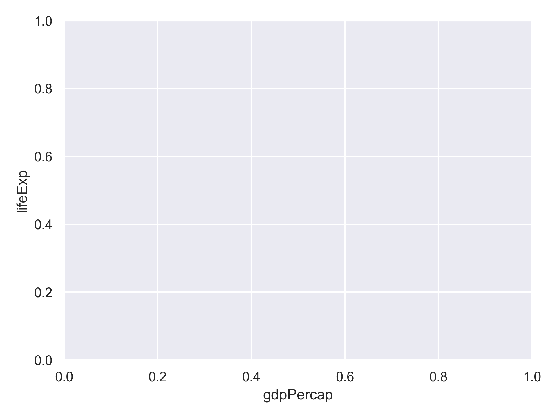
Excellent. We’ve now told our plot where the x and y values are coming from and what they stand for. But we haven’t told our plot how we want it to draw the data.
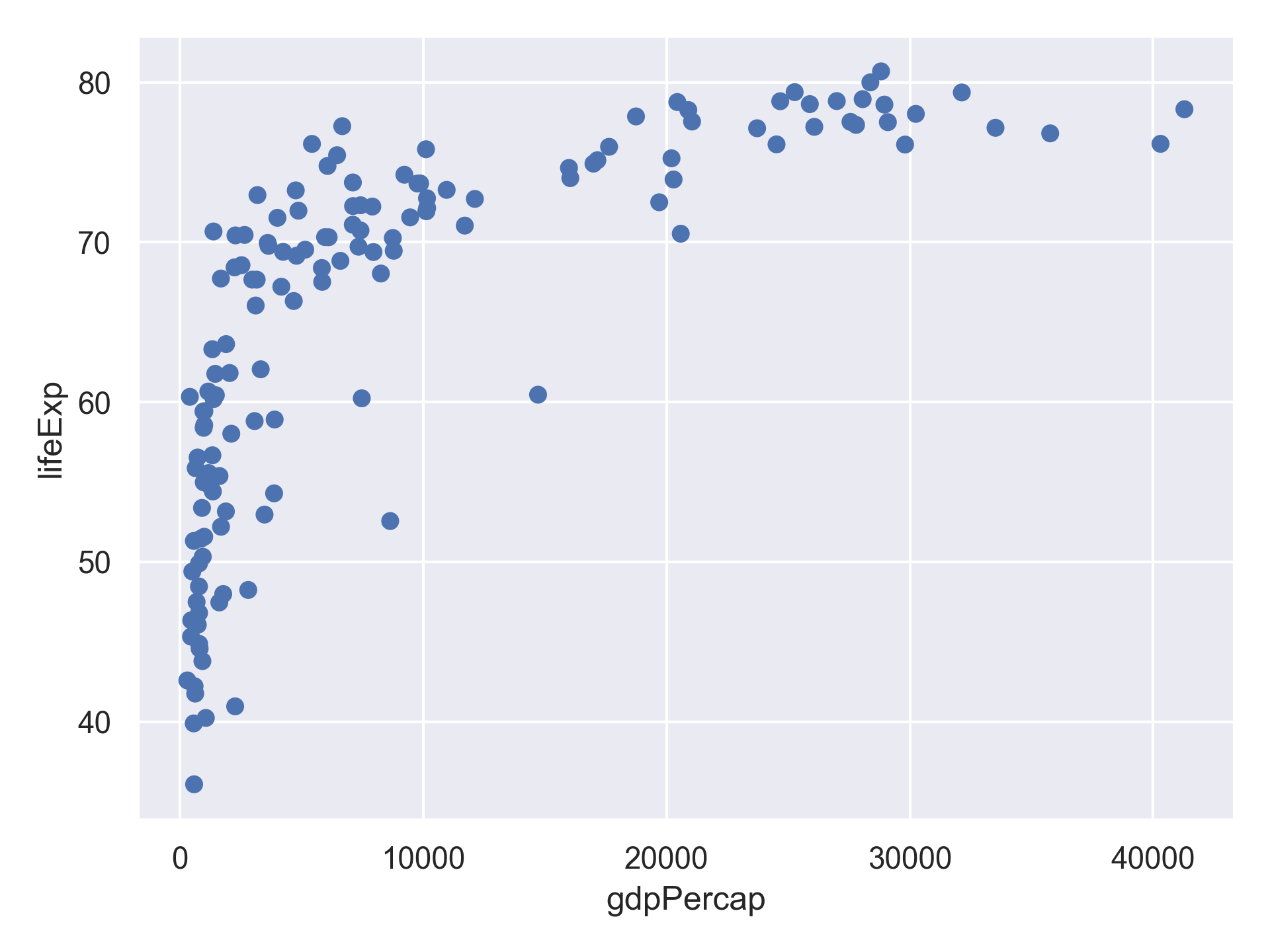
What we just did is to pass the name of the two columns to the x and y inside the encode method.
This offers a quick and concise way to generate a chart if we just want to quickly explore the data and don’t mind using the default settings.
For example, you may notice the labels of the x and y axis are using the column names from the dataframe.
If we want to customize the chart, for example, using a different axis label or axis range, Altair offers a different way to specify the channel encoding options.
We can add labels for the axes and title by applying the label() method to our plot.
alt.Chart(gapminder_1997).mark_circle().encode(
    x=alt.X('gdpPercap', title='GDP Per Capita'),
    y='lifeExp',
)

Give the y axis a nice label.
Solution
alt.Chart(gapminder_1997).mark_circle().encode(
    x=alt.X('gdpPercap', title='GDP Per Capita'),
    y=alt.Y('lifeExp', title='Life Expectancy'),
)
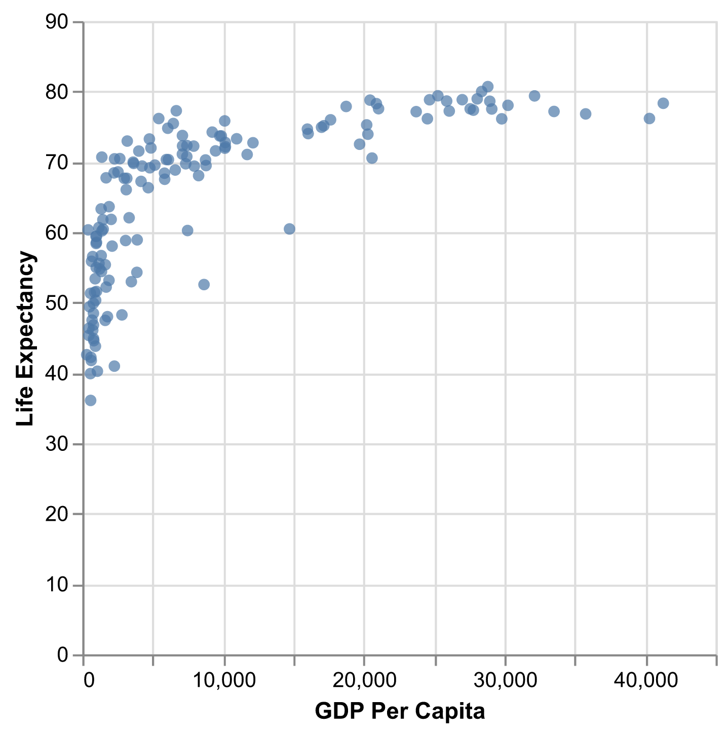
Now it finally looks like a proper plot!
We can now see a trend in the data.
It looks like countries with a larger GDP tend to have a higher life expectancy.
Let’s add a title to our plot to make that clearer.
We can specify that using the same label() method, but this time we will use the title argument.
alt.Chart(gapminder_1997).mark_circle().encode(
    x=alt.X('gdpPercap', title='GDP Per Capita'),
    y=alt.Y('lifeExp', title='Life Expectancy'),
).properties(
    title='Do people in wealthy countries live longer?',
)
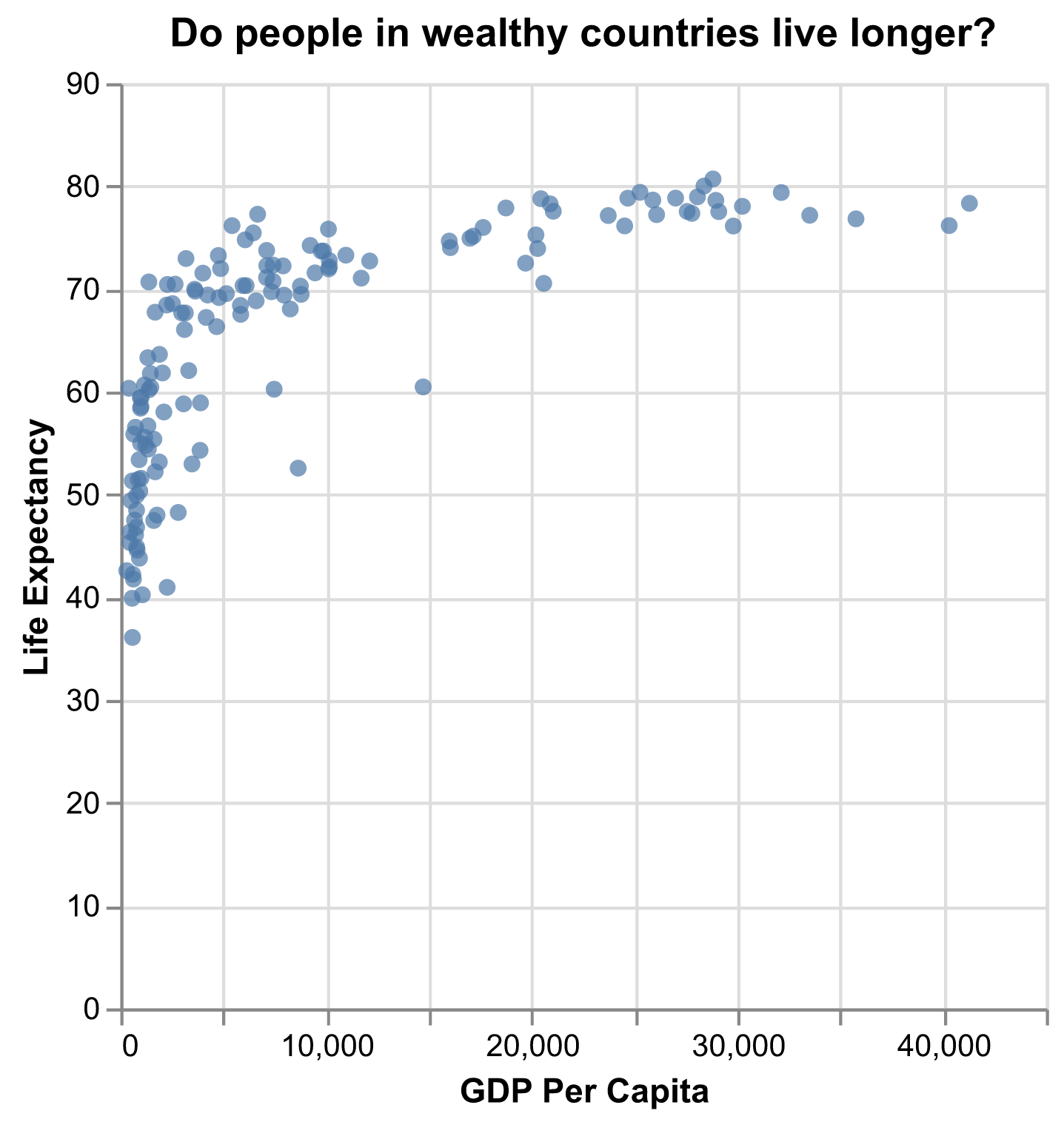
No one can deny we’ve made a very handsome plot!
But now looking at the data, we might be curious about learning more about the points that are the extremes of the data.
We know that we have two more pieces of data in the gapminder_1997 that we haven’t used yet.
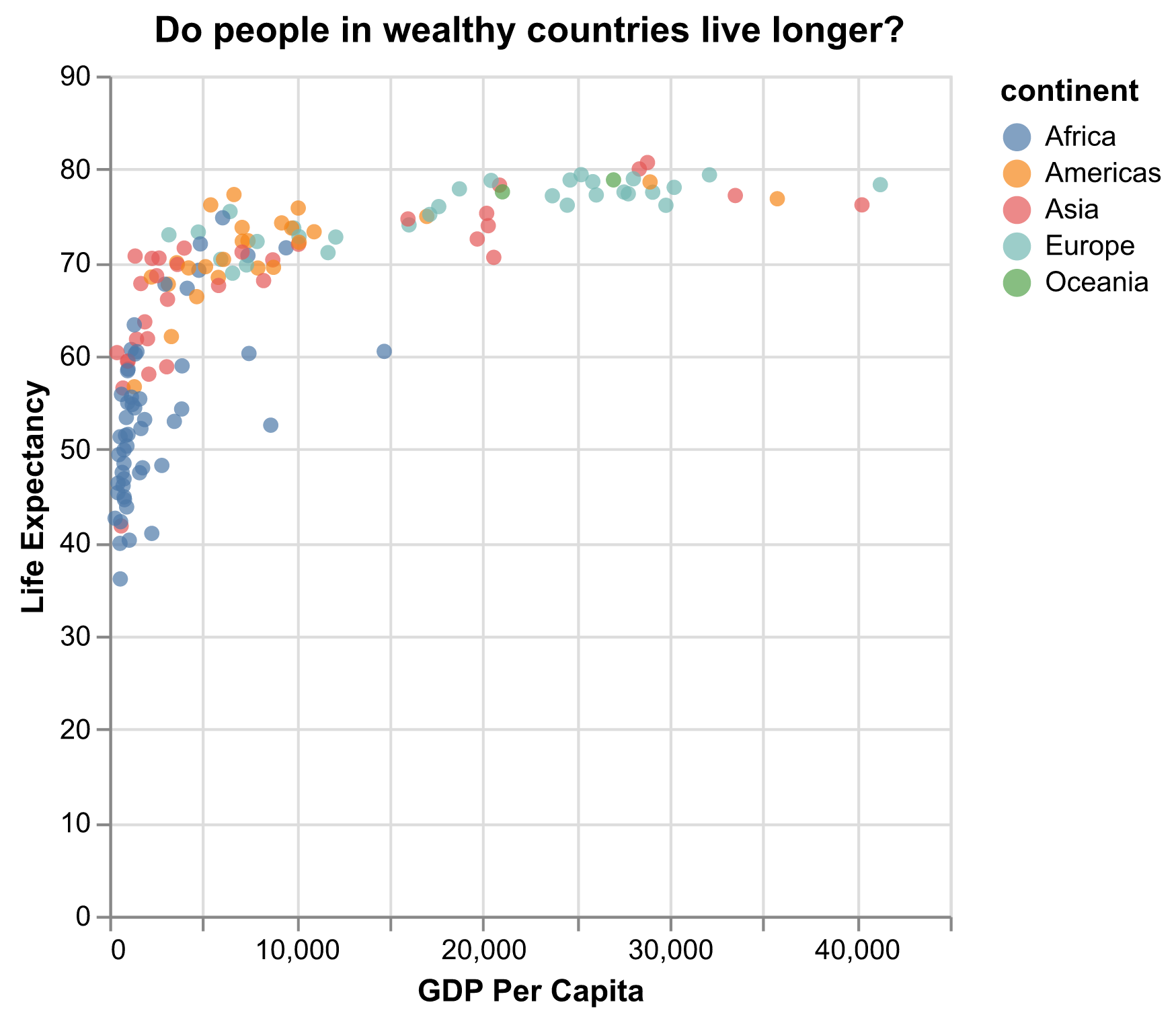
Maybe we are curious if the different continents show different patterns in GDP and life expectancy.
One thing we could do is use a different color for each of the continents.
It is possible to map data values to various graphical properties.
In this case let’s map the continent to the color property.
The quickest way to do this is to set color='continent' inside the encode.
alt.Chart(gapminder_1997).mark_circle().encode(
    x=alt.X('gdpPercap', title='GDP Per Capita'),
    y=alt.Y('lifeExp', title='Life Expectancy'),
    color='continent',
).properties(
    title='Do people in wealthy countries live longer?',
)
But here we wish to customize this chart later. So let’s use the syntax that allow us to customize the settings later.
alt.Chart(gapminder_1997).mark_circle().encode(
    x=alt.X('gdpPercap', title='GDP Per Capita'),
    y=alt.Y('lifeExp', title='Life Expectancy'),
    color=alt.Color('continent'),
).properties(
    title='Do people in wealthy countries live longer?',
)
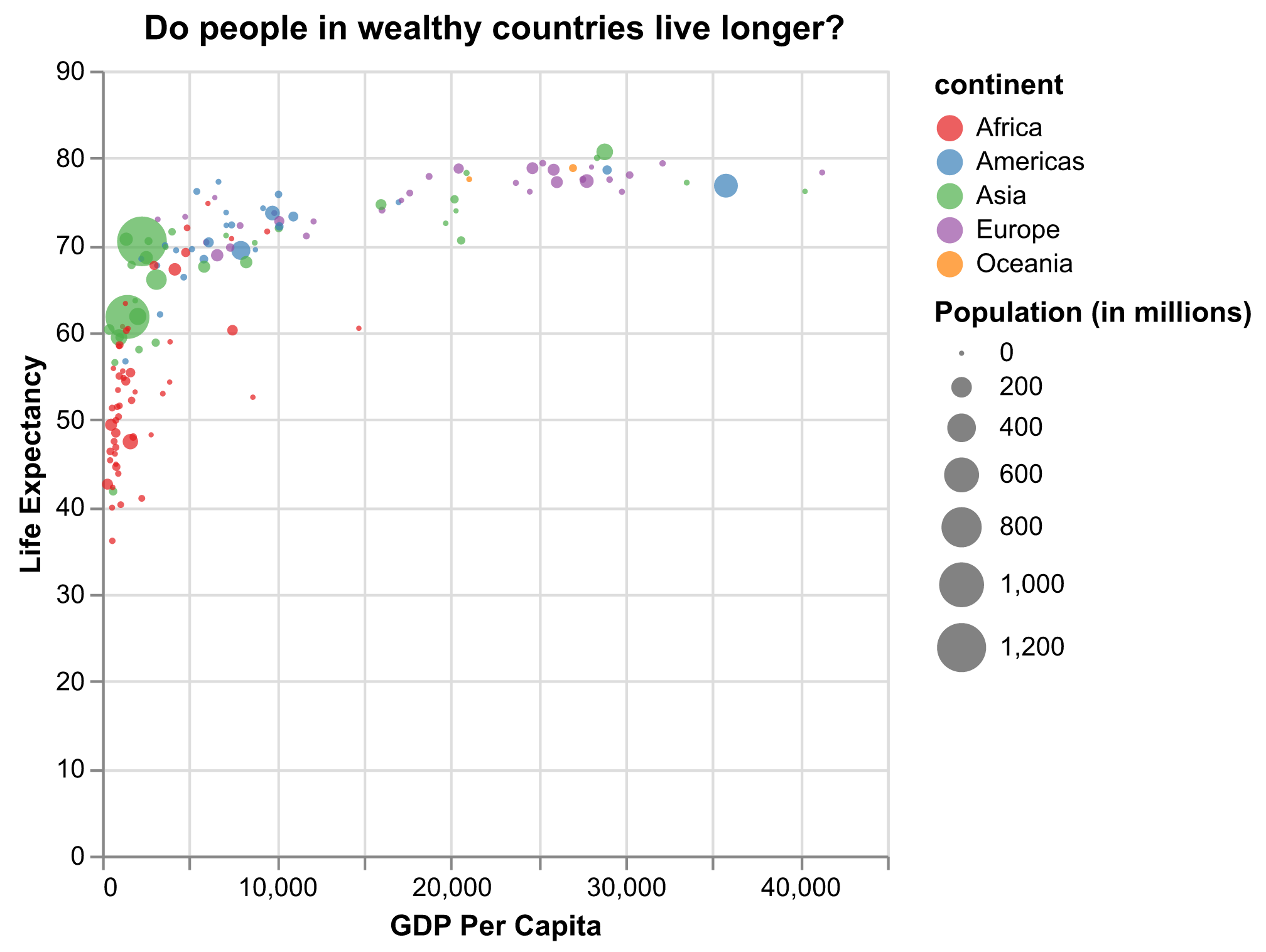
Here we can see that in 1997 the African countries had much lower life expectancy than many other continents.
Notice that when we add a mapping for color, Altair automatically provides a legend for us.
It took care of assigning different colors to each of our unique values of the continent variable.
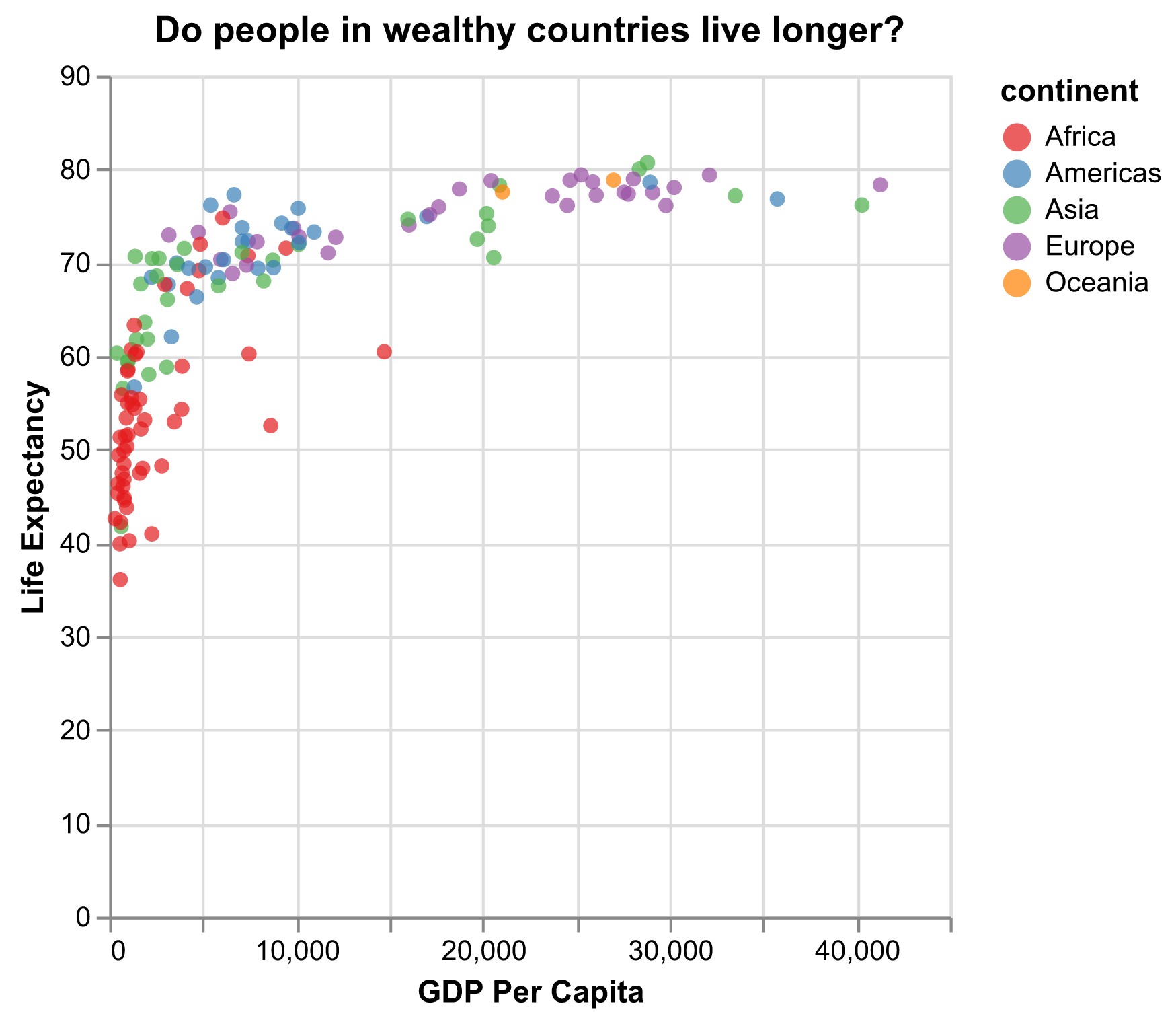
The colors that Altair uses are determined by the color scheme.
If needed, we can change the default color scheme.
Let’s change the colors to make them a bit prettier.
The code below allows us to select a color palette. Altair is built based on the vega project and supports all the color schemes from the vega color schemes.
We can change the color scheme by applying the scale() method to the to the color schema wrapper alt.Color.
The scale() method specifies how the data should be mapped to visual properties, and in this case, how the categorical variable “continent” should be mapped to different colors of the point marks.
alt.Chart(gapminder_1997).mark_circle().encode(
    x=alt.X('gdpPercap', title='GDP Per Capita'),
    y=alt.Y('lifeExp', title='Life Expectancy'),
    color=alt.Color('continent').scale(scheme='set1'),
).properties(
    title='Do people in wealthy countries live longer?',
)
Since we have the data for the population of each country, we might be curious what effect population might have on life expectancy and GDP per capita.
Do you think larger countries will have a longer or shorter life expectancy?
Let’s find out by mapping the population of each country to another visual property: the size of the point marks.
Again, for a quick plot, we can just add size='pop' to the encoding.
But we will use the syntax that supports customization, and add a title to it, so it shows the word “Population” rather than the column name “pop” in the legend.
alt.Chart(gapminder_1997).mark_circle().encode(
    x=alt.X('gdpPercap', title='GDP Per Capita'),
    y=alt.Y('lifeExp', title='Life Expectancy'),
    color=alt.Color('continent').scale(scheme='set1'),
    size=alt.Size('pop', title='Population'),
).properties(
    title='Do people in wealthy countries live longer?',
)
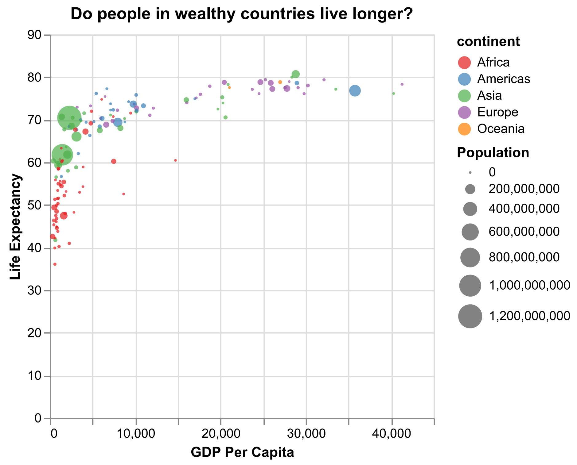
We got another legend here for size which is nice, but the values look a bit ugly with very long digits.
Let’s assign a new column in our data called pop_million by dividing the population by 1,000,000 and label it “Population (in millions)”
Note for large numbers such as 1000000, it’s easy to mis-count the number of digits when typing or reading it.
Another way to write it is 1e6 which means 10 raised to the 6th power.
alt.Chart(gapminder_1997).mark_circle().encode(
    x=alt.X('gdpPercap', title='GDP Per Capita'),
    y=alt.Y('lifeExp', title='Life Expectancy'),
    color=alt.Color('continent').scale(scheme='set1'),
    size=alt.Size('pop', title='Population (in millions)'),
).transform_calculate(
    pop='datum.pop/1000000'
).properties(
    title='Do people in wealthy countries live longer?',
)
Plotting for data exploration
Many datasets are much more complex than the example we used for the first plot. How can we find meaningful insights in complex data and create visualizations to convey those insights?
Importing datasets
In the first plot, we looked at a smaller slice of a large dataset. To gain a better understanding of the kinds of patterns we might observe in our own data, we will now use the full dataset, which is stored in a file called “gapminder_data.csv”.
To start, we will read in the data to a pandas DataFrame.
Read in your own data
What argument should be provided in the below code to read in the full dataset?
gapminder_data = pd.read_csv()Solution
gapminder_data = pd.read_csv("gapminder_data.csv")
Let’s take a look at the full dataset.
Pandas offers a way to select the top few rows of a data frame by applying the head() method to the data frame. Try it out!
gapminder_data.head()
       country  year         pop continent  lifeExp   gdpPercap
0  Afghanistan  1952   8425333.0      Asia   28.801  779.445314
1  Afghanistan  1957   9240934.0      Asia   30.332  820.853030
2  Afghanistan  1962  10267083.0      Asia   31.997  853.100710
3  Afghanistan  1967  11537966.0      Asia   34.020  836.197138
4  Afghanistan  1972  13079460.0      Asia   36.088  739.981106
Notice that this dataset has an additional column “year” compared to the smaller dataset we started with.
Predicting Altair outputs
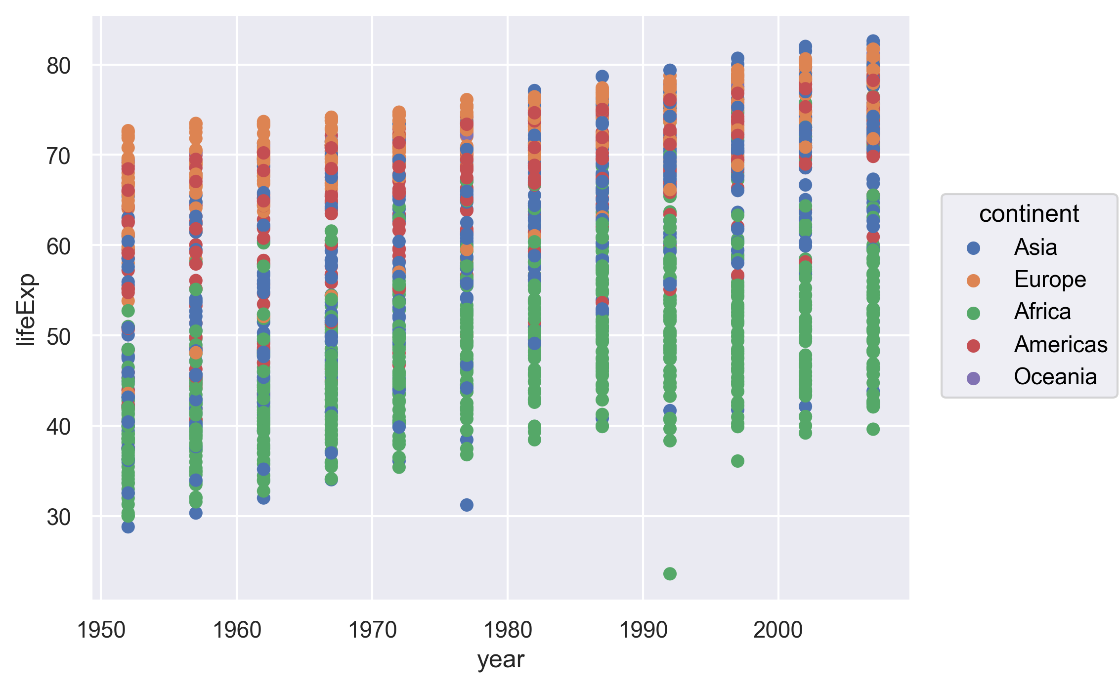
Now that we have the full dataset read into our Python session, let’s plot the data placing our new “year” variable on the x axis and life expectancy on the y axis. We’ve provided the code below. Notice that we’ve left off the labels so there’s not as much code to work with. Before running the code, read through it and see if you can predict what the plot output will look like. Then run the code and check to see if you were right!
alt.Chart(gapminder).mark_circle().encode(
    x='year:O',
    y='lifeExp',
    color='continent',
)
Hmm, the plot we created in the last exercise isn’t very clear. What’s going on? Since the dataset is more complex, the plotting options we used for the smaller dataset aren’t as useful for interpreting these data. Luckily, we can add additional attributes to our plots that will make patterns more apparent. For example, we can generate a different type of plot - perhaps a line plot - and assign attributes for columns where we might expect to see patterns.
Let’s review the columns and the types of data stored in our dataset to decide how we should group things together.
We can apply the pandas method info to get the summary information of the data frame.
gapminder.info()
<class 'pandas.core.frame.DataFrame'>
RangeIndex: 1704 entries, 0 to 1703
Data columns (total 6 columns):
 #   Column     Non-Null Count  Dtype
---  ------     --------------  -----
 0   country    1704 non-null   object
 1   year       1704 non-null   int64
 2   pop        1704 non-null   float64
 3   continent  1704 non-null   object
 4   lifeExp    1704 non-null   float64
 5   gdpPercap  1704 non-null   float64
dtypes: float64(3), int64(1), object(2)
memory usage: 80.0+ KB
So, what do we see? The data frame has 1,704 entries (rows) and 6 columns. The “Dtype” shows the data type of each column.
What kind of data do we see?
- “int64”: Integer (or whole number)
- “float64”: Numeric (or non-whole number)
- “object”: String or mixed data type
Our plot has a lot of points in columns which makes it hard to see trends over time. A better way to view the data showing changes over time is to use lines. Let’s try changing the mark from dot to line and see what happens.
alt.Chart(gapminder).mark_line().encode(
    x='year:O',
    y='lifeExp',
    color='continent',
)
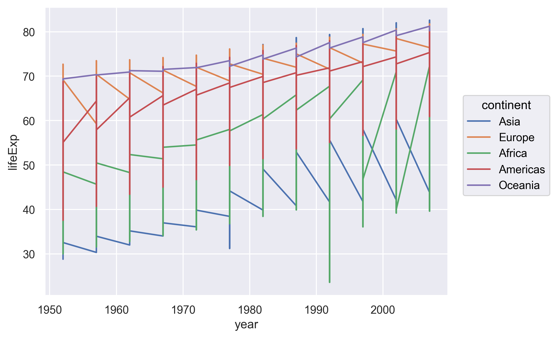
Hmm. This doesn’t look right.
By setting the color value, we got a line for each continent,
but we really wanted a line for each country.
We need to tell Altair that we want to connect the values for each country value instead.
To do this, we need to specify the detail argument of the encode method.
alt.Chart(gapminder).mark_line().encode(
    x='year:O',
    y='lifeExp',
    color='continent',
    detail='country',
)
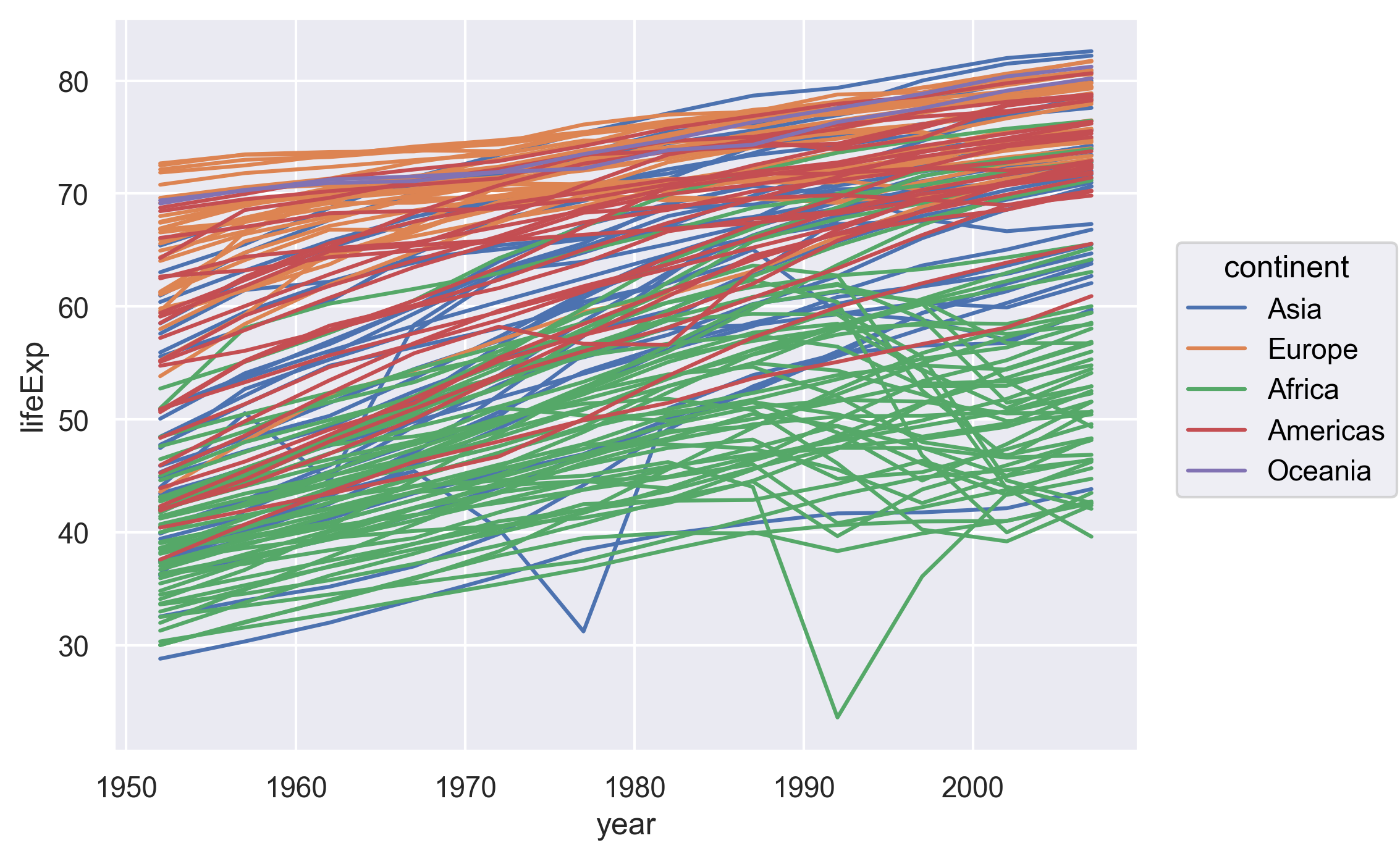
Sometimes plots like this are called “spaghetti plots” because all the lines look like a bunch of wet noodles.
Bonus Exercise: More line plots
Now create your own line plot comparing population and life expectancy! Looking at your plot, can you guess which two countries have experienced massive change in population from 1952-2007?
Solution
alt.Chart(gapminder).mark_line().encode(
    x='pop',
    y='lifeExp',
    color='continent',
    detail='country',
)
(China and India are the two Asian countries that have experienced massive population growth from 1952-2007.)
Categorical Plots
So far we’ve looked at plots with both the x and y values being numerical values in a continuous scale (e.g., life expectancy, GDP per capita, year, population, etc.) But sometimes we may want to visualize categorical data (e.g., continents).
We’ve previously used the categorical values of the continent column to color in our points and lines. But now let’s try moving that variable to the x axis.
Let’s say we are curious about comparing the distribution of the life expectancy values for each of the different continents for the gapminder_1997 data.
Let’s map the continent to the x axis and the life expectancy to the y axis. Let’s use the dot marks to represent the data.
(
    so.Plot(gapminder_1997,
            x='continent',
            y='lifeExp')
    .add(so.Dot())
)
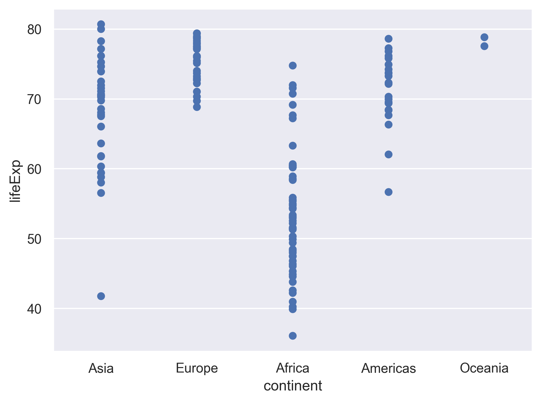
We see that there is some overplotting as countries from the same continents are aligned vertically like a strip of kebab, making it hard to see the dots in some dense areas. The seaborn objects interface leaves it to us to specify who we would like the overplotting to be handled. A common treatment is to spread (or “jitter”) the dots within each group by adding a little random displacement along the categorical axis. The result is sometimes called a “jitter plot”.
Here we can simply add so.Jitter().
(
    so.Plot(gapminder_1997,
            x='continent',
            y='lifeExp')
    .add(so.Dot(), so.Jitter())
)
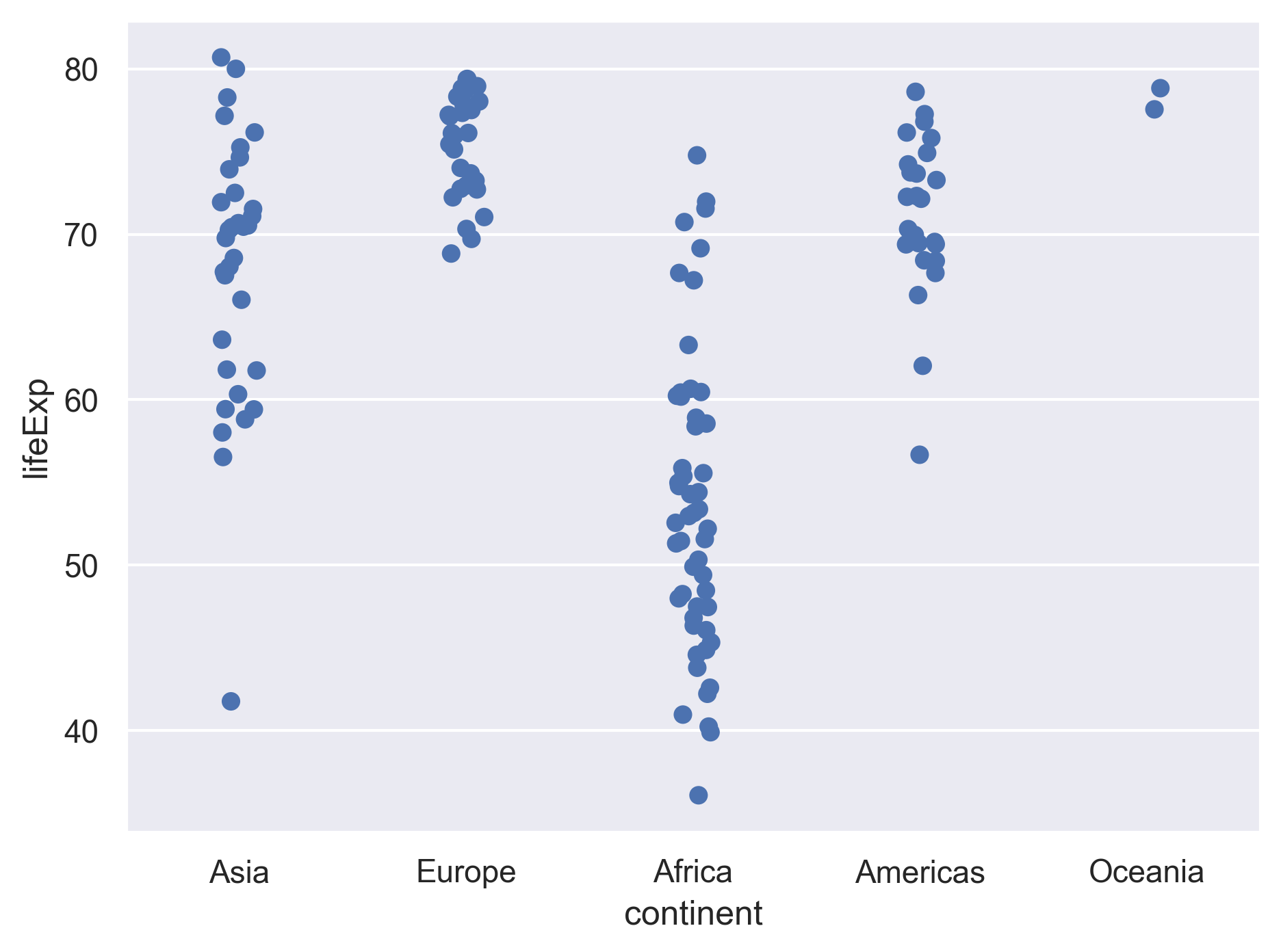
We can control the amount of jitter by setting the width argument.
Let’s also change the size and opacity of the dots.
(
    so.Plot(gapminder_1997,
            x='continent',
            y='lifeExp')
    .add(so.Dot(pointsize=10, alpha=.5), so.Jitter(width=.8))
)
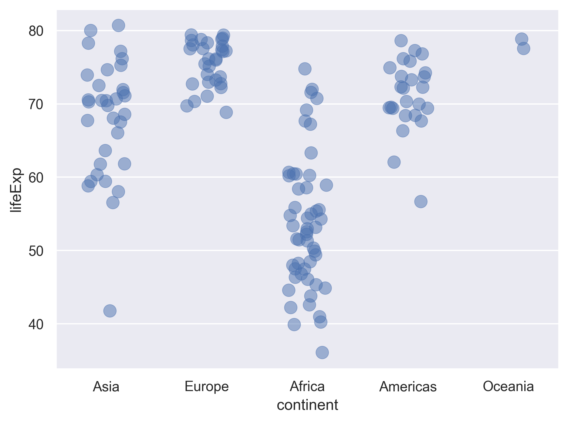
Lastly, let’s further map the continents to the color of the dots.
(
    so.Plot(gapminder_1997,
            x='continent',
            y='lifeExp',
            color='continent')
    .add(so.Dot(pointsize=10, alpha=.5), so.Jitter(width=.8))
)
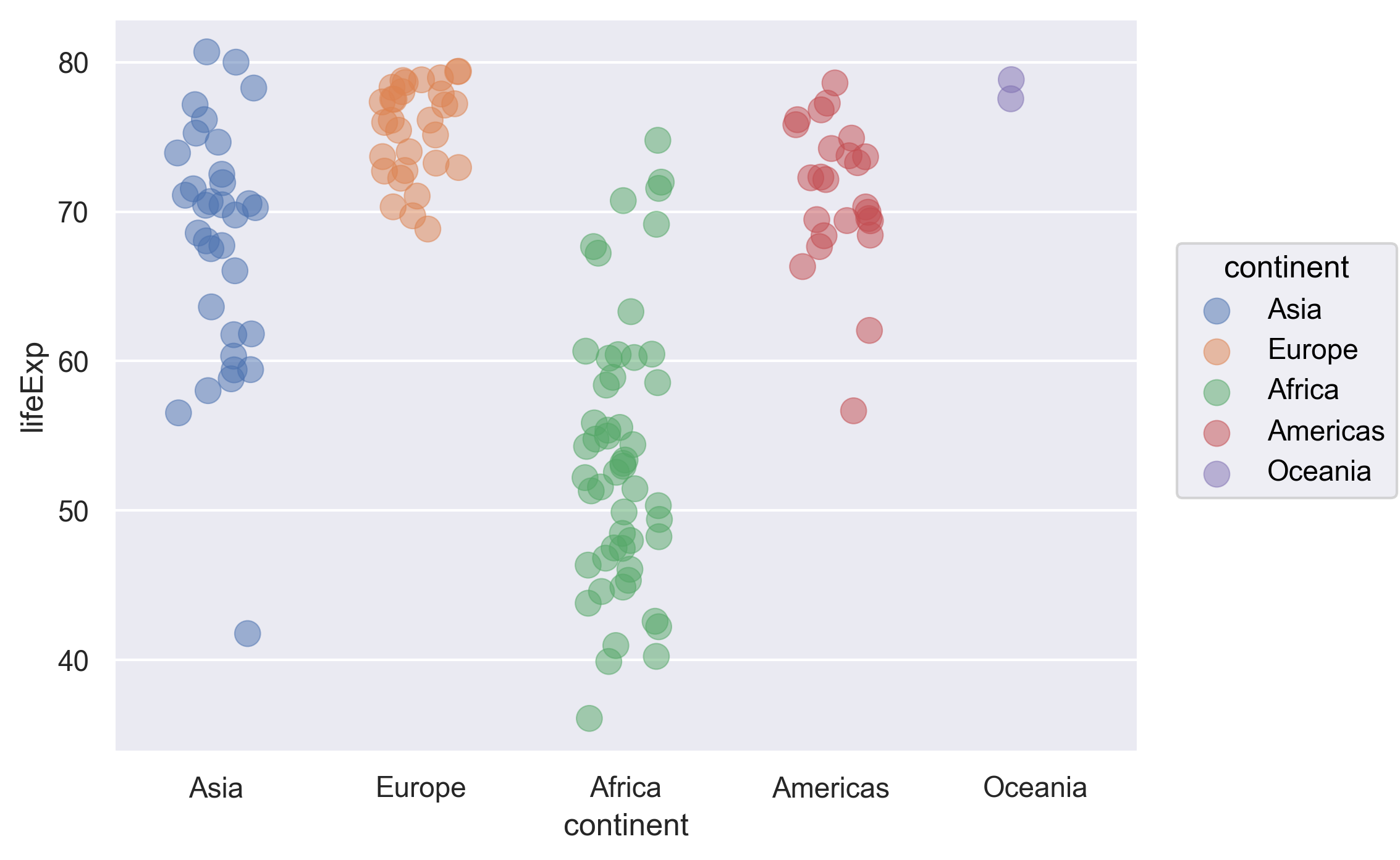
This type of visualization makes it easy to compare the distribution (e.g., range, spread) of values across groups.
Bonus Exercise: Other categorical plots
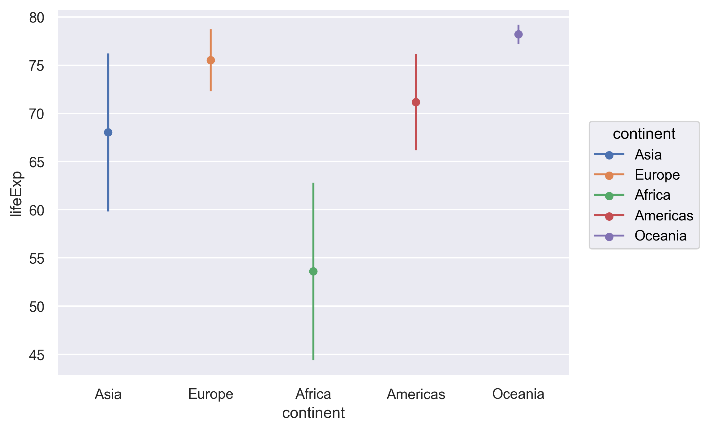
Let’s plot the range of the life expectancy for each continent in terms of its mean plus/minus one standard deviation.
Example solution
(
    so.Plot(gapminder_1997,
            x='continent',
            y='lifeExp',
            color='continent')
    .add(so.Range(), so.Est(func='mean', errorbar='sd'))
    .add(so.Dot(), so.Agg())
)
Univariate Plots
We jumped right into making plots with multiple columns.
But what if we wanted to take a look at just one column?
In that case, we only need to specify a mapping for x and choose an appropriate mark.
Let’s start with a histogram to see the range and spread of life expectancy.
(
    so.Plot(data=gapminder_1997,
            x='lifeExp')
    .add(so.Bars(), so.Hist())
)
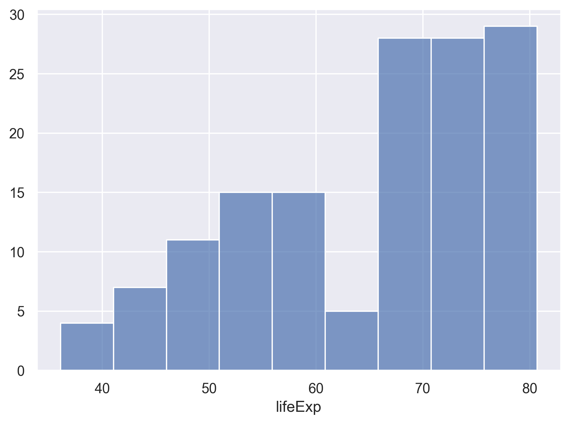
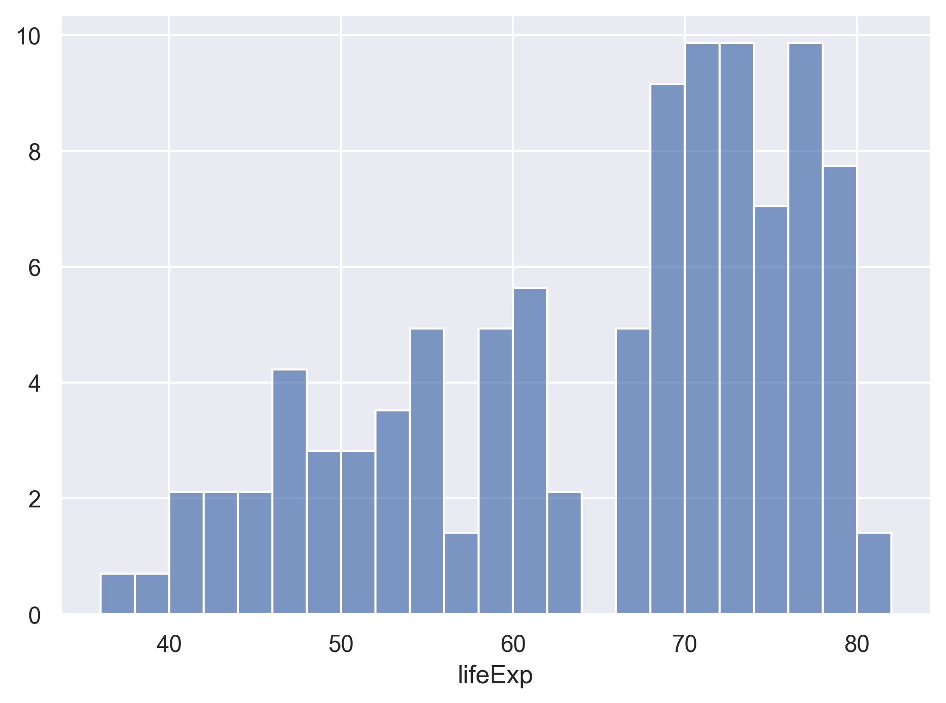
Histograms can look very different depending on the number of bins you decide to draw.
The default is 10.
Let’s try setting a different value by explicitly passing a bins argument to Hist.
(
    so.Plot(data=gapminder_1997,
            x='lifeExp')
    .add(so.Bars(), so.Hist(bins=20))
)
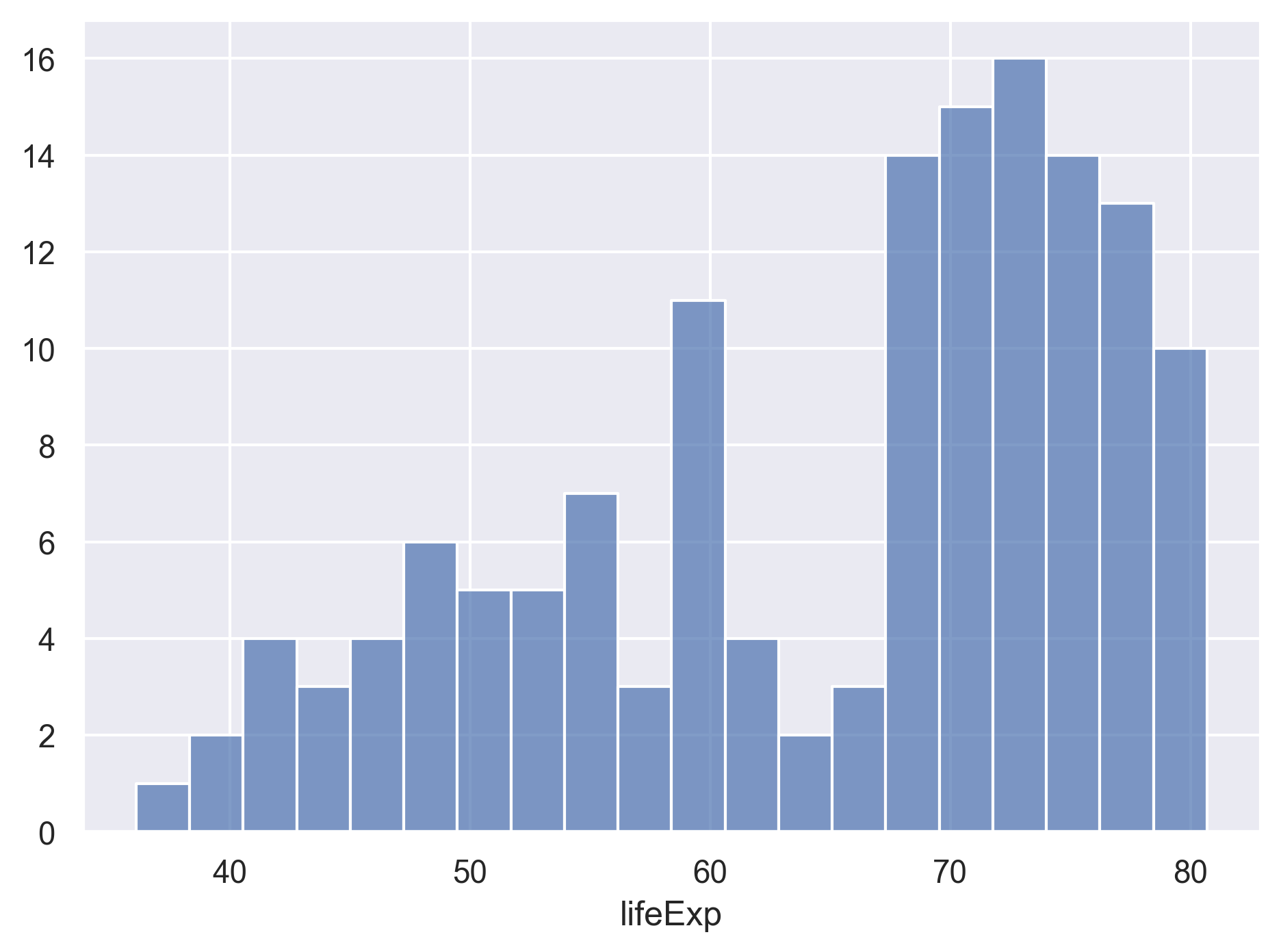
You can try different values like 5 or 50 to see how the plot changes.
Sometimes we don’t really care about the total number of bins, but rather the bin width and end points.
For example, we may want the bins at 40-42, 42-44, 44-46, and so on.
In this case, we can set the binwidth and binrange arguments to the Hist.
(
    so.Plot(data=gapminder_1997,
            x='lifeExp')
    .add(so.Bars(), so.Hist(binwidth=5, binrange=(0, 100)))
)

Changing the aggregate statistics
By default the y axis shows the number of observations in each bin, that is,
stat='count'. Sometimes we are more interested in other aggregate statistics rather than count, such as the percentage of the observations in each bin. Check the documentation ofso.Histand see what other aggregate statistics are offered, and change the histogram to show the percentages instead.Solution
(
    so.Plot(data=gapminder_1997,
            x='lifeExp')
    .add(so.Bars(), so.Hist(stat='percent', binwidth=5, binrange=(0, 100)))
)
If we want to see a break-down of the life expectancy distribution by each continent, we can add the continent to the color property.
(
    so.Plot(data=gapminder_1997,
            x='lifeExp',
            color='continent')
    .add(so.Bars(), so.Hist(stat='percent', binwidth=5, binrange=(0, 100)))
)
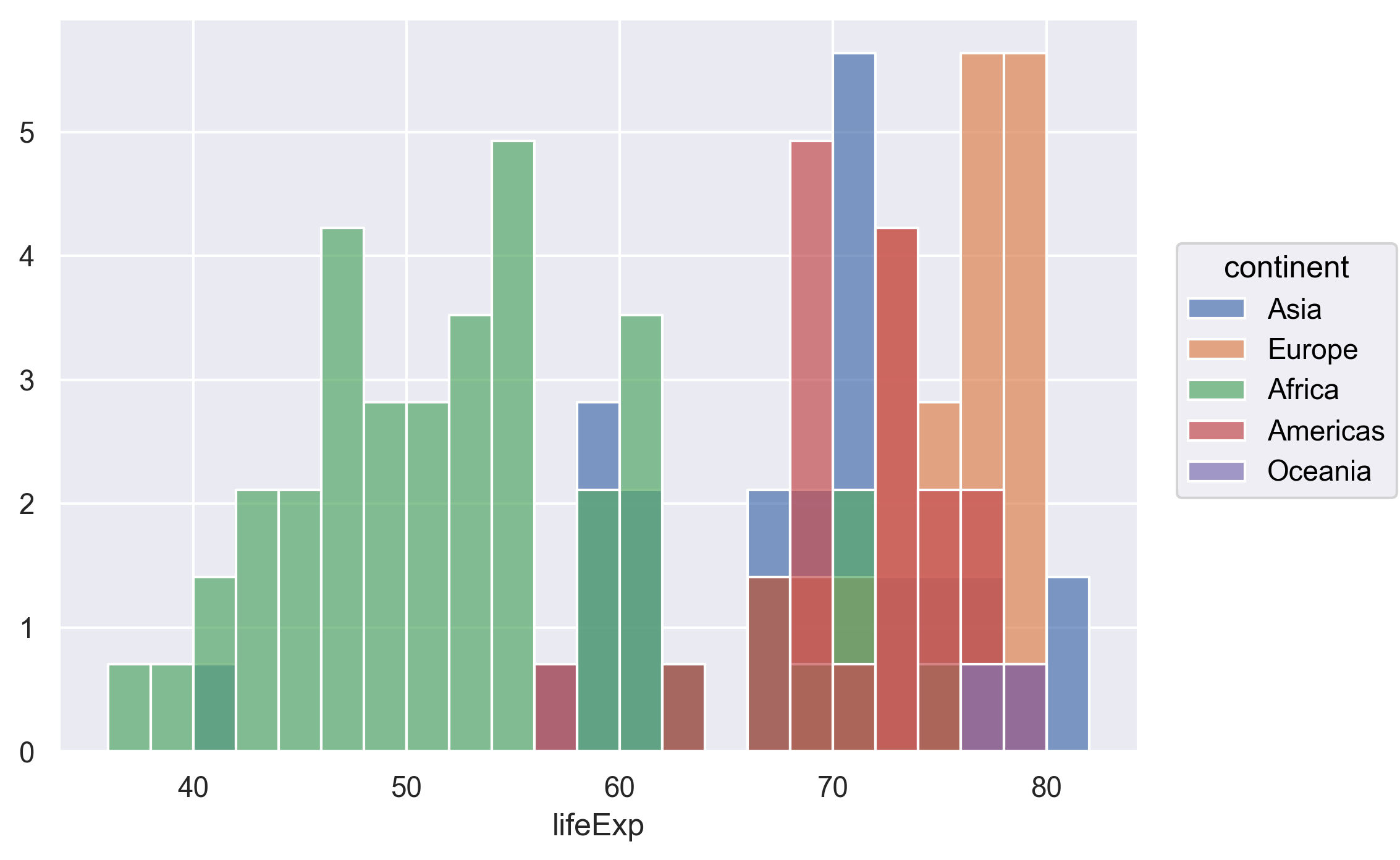
Hmm, it looks like the bins for each continent are on top of each other.
It’s not very easy to see the distributions.
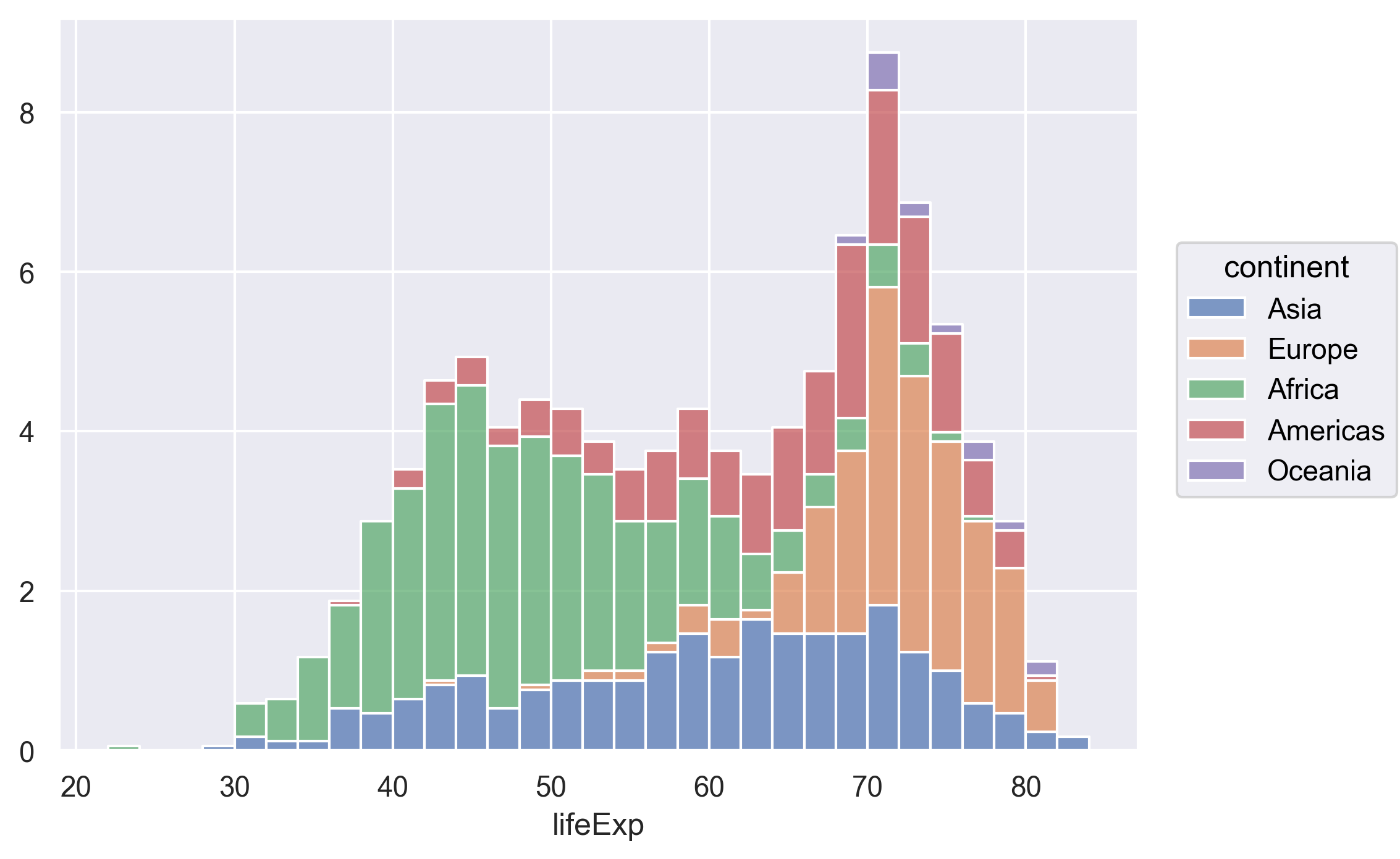
Again, we can tell seaborn how overplotting should be handled.
In this case we can use so.Stack() to stack the bins.
This type of chart is often called a “stacked bar chart”.
(
    so.Plot(data=gapminder_1997,
            x='lifeExp',
            color='continent')
    .add(so.Bars(), so.Hist(stat='percent', binwidth=5, binrange=(0, 100)), so.Stack())
)
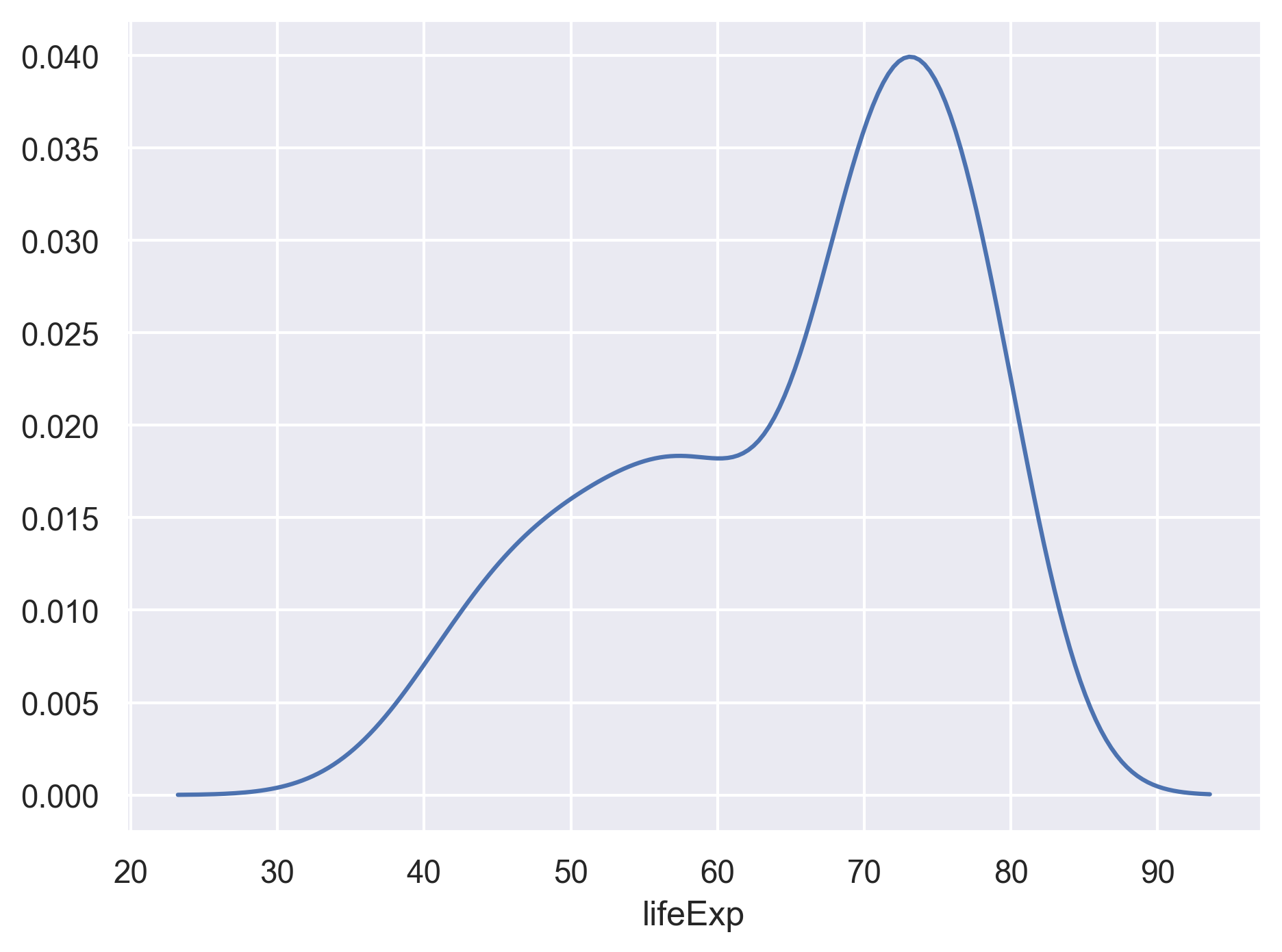
Other than the histogram, we can also usekernel density estimation, a smoothing technique that captures the general shape of the distribution of a continuous variable.
We can add a line so.Line() that represents the kernel density estimates so.KDE().
(
    so.Plot(data=gapminder_1997,
            x='lifeExp')
    .add(so.Line(), so.KDE())
)
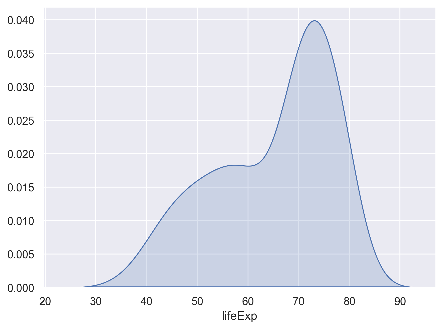
Alternatively, we can also add an area so.Area() that represents the kernel density estimates so.KDE().
(
    so.Plot(data=gapminder_1997,
            x='lifeExp')
    .add(so.Area(), so.KDE())
)
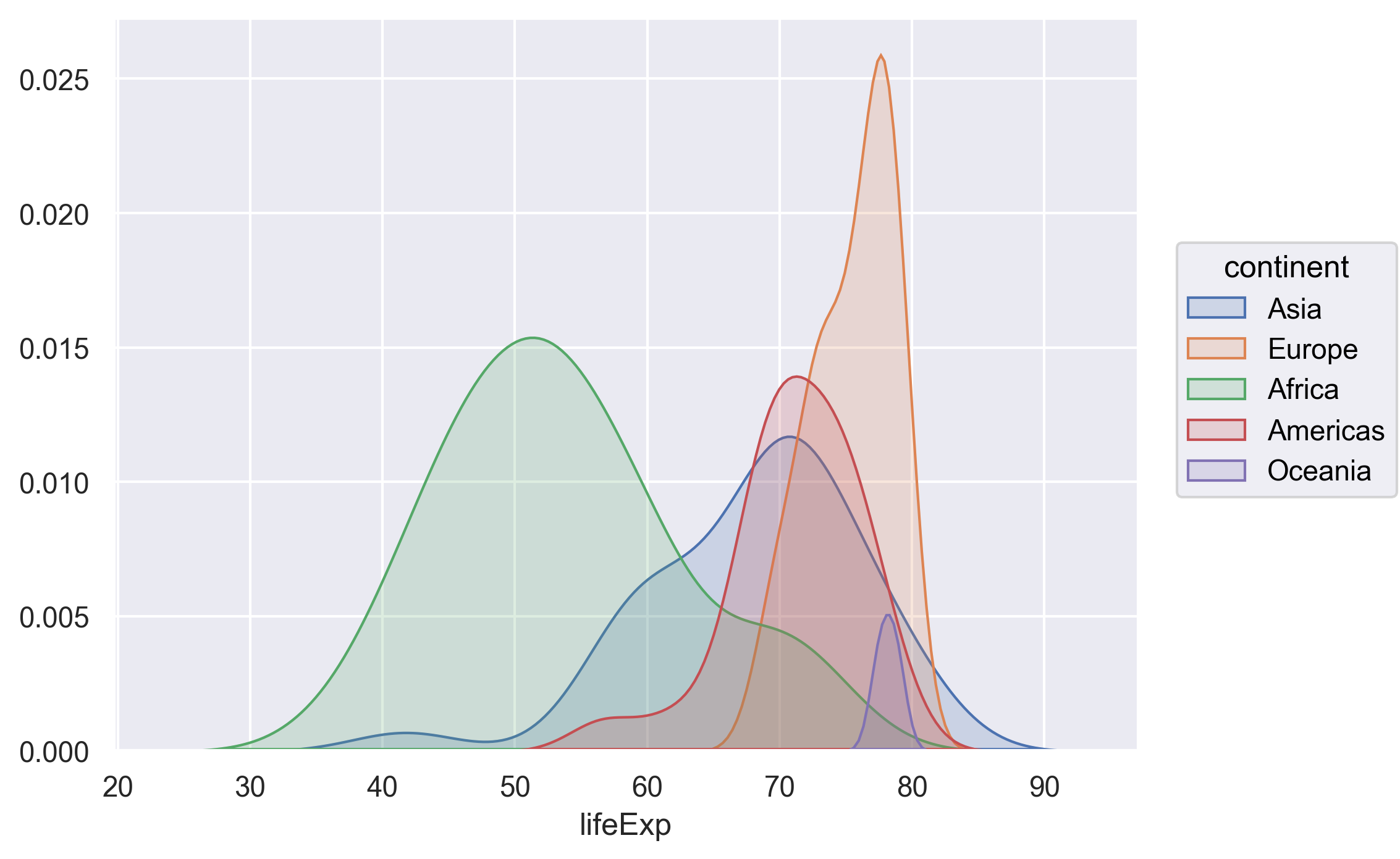
If we want to see the kernel density estimates for each continent, we can map continents to the color in the plot function.
(
    so.Plot(data=gapminder_1997,
            x='lifeExp',
            color='continent')
    .add(so.Area(), so.KDE())
)
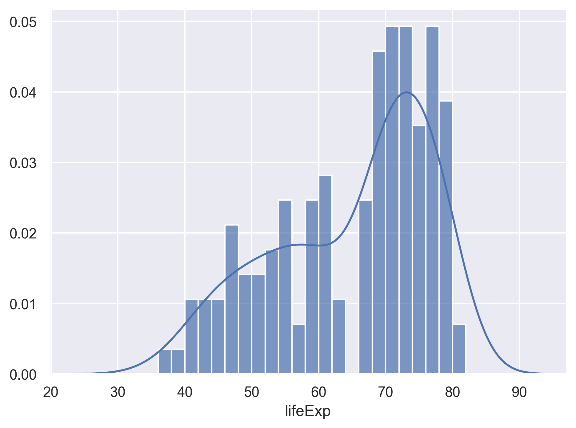
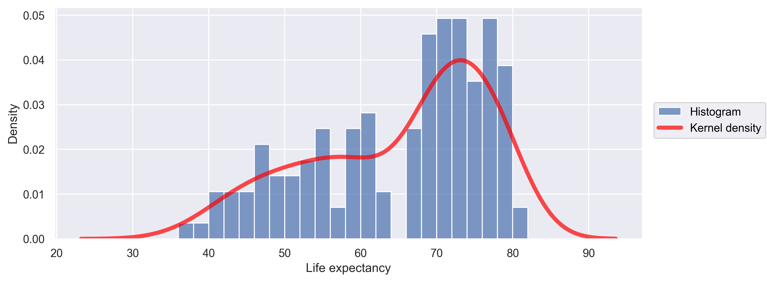
We can overlay multiple visualization layers to the same plot.
Here let’s combine the histogram and the kernel density estimate.
Note we will need to change the stat argument of the so.Hist() to density, so that the y axis values of the histogram are comparable with the kernel density.
(
    so.Plot(data=gapminder_1997,
            x='lifeExp')
    .add(so.Bars(), so.Hist(stat='density', binwidth=5, binrange=(0, 100)))
    .add(so.Line(), so.KDE())
)
Lastly, we can make a few further improvements to the plot.
- Specify the
labelparameter for the two data layers (i.e., the lines starts with.add()), so they will show up in a “layer legend”. - Change the line color, width, and opacity.
- Add x and y axis labels.
- Change the size of the plot by calling the
layout()method.
(
    so.Plot(data=gapminder_1997,
            x='lifeExp')
    .add(so.Bars(), so.Hist(stat='density', binwidth=5, binrange=(0, 100)), label='Histogram')
    .add(so.Line(color='red', linewidth=4, alpha=.7), so.KDE(), label='Kernel density')
    .label(x="Life expectancy", y="Density")
    .layout(size=(9, 4))
)
Facets
If you have a lot of different columns to try to plot or have distinguishable subgroups in your data, a powerful plotting technique called faceting might come in handy. When you facet your plot, you basically make a bunch of smaller plots and combine them together into a single image. Luckily, seaborn makes this very easy. Let’s start with the “spaghetti plot” that we made earlier.
(
    so.Plot(data=gapminder,
            x='year',
            y='lifeExp',
            group='country',
            color='continent')
    .add(so.Line())
)

Rather than having all the countries in a single plot, this time let’s draw a separate box (a “subplot”) for countries in each continent.
We can do this by applying the facet() method to the plot.
(
    so.Plot(data=gapminder,
            x='year',
            y='lifeExp',
            group='country',
            color='continent')
    .add(so.Line())
    .facet('continent')
)
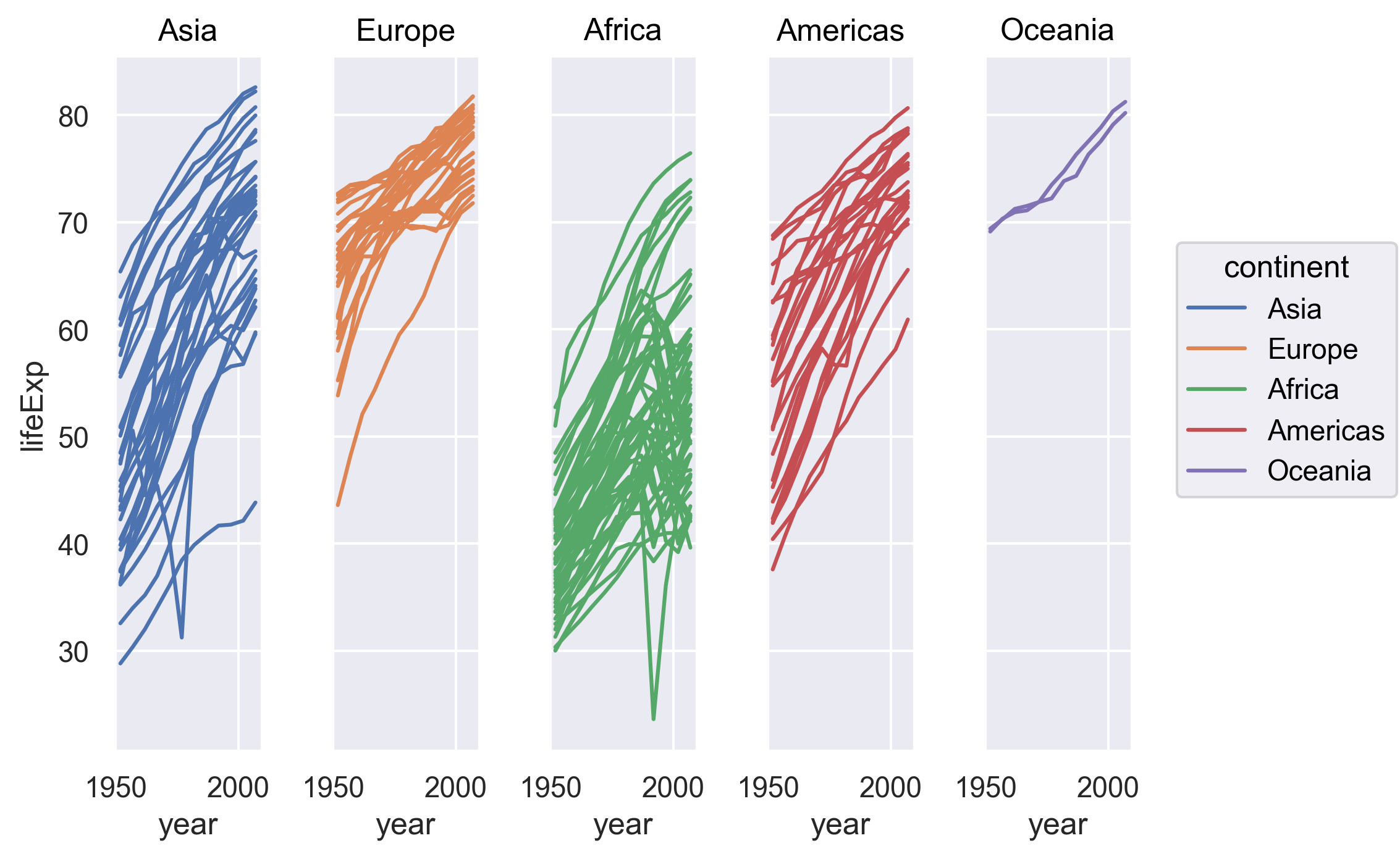
Note now we have a separate subplot for countries in each continent. This type of faceted plots are sometimes called small multiples.
Note all five subplots are in one row. If we want, we can “wrap” the subplots across a two-dimentional grid. For example, if we want the subplots to have a maximum of 3 columns, we can do the following.
    so.Plot(data=gapminder,
            x='year',
            y='lifeExp',
            group='country',
            color='continent')
    .add(so.Line())
    .facet('continent', wrap=3)
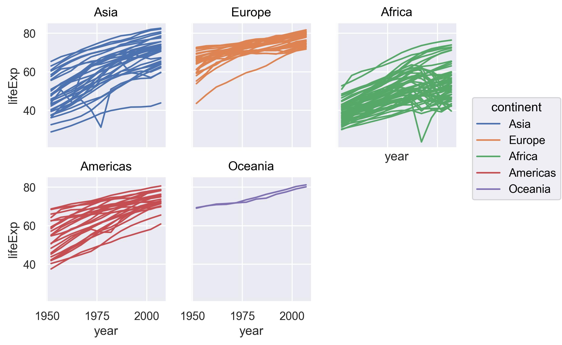
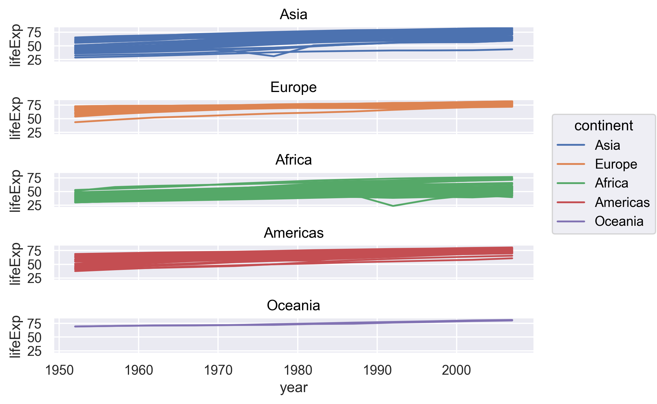
By default, the facet() method will place the subplots along the columns of the grid.
If we want to place the subplots along the rows (it’s probably not a good idea in this example as we want to compare the life expectancies), we can set row='continent' when applying facet to the plot.
(
    so.Plot(data=gapminder,
            x='year',
            y='lifeExp',
            group='country',
            color='continent')
    .add(so.Line())
    .facet(row='continent')
)
Saving plots
We’ve made a bunch of plots today, but we never talked about how to share them with our friends who aren’t running Python! It’s wise to keep all the code we used to draw the plot, but sometimes we need to make a PNG or PDF version of the plot so we can share it with our colleagues or post it to our Instagram story.
We can save a plot by applying the save() method to the plot.
(
    so.Plot(data=gapminder,
            x='year',
            y='lifeExp',
            group='country',
            color='continent')
    .add(so.Line())
    .facet('continent', wrap=3)
    .save("awesome_plot.png", bbox_inches='tight', dpi=200)
)
Saving a plot
Try rerunning one of your plots and then saving it using
save. Find and open the plot to see if it worked!Example solution
(
    so.Plot(data=gapminder_1997,
            x='lifeExp')
    .add(so.Bars(), so.Hist(stat='density', binwidth=5, binrange=(0, 100)), label='Histogram')
    .add(so.Line(color='red', linewidth=4, alpha=.7), so.KDE(), label='Kernal density')
    .label(x="Life expectency", y="Density")
    .layout(size=(9, 4))
    .save("another_awesome_plot.png", bbox_inches='tight', dpi=200)
)
Check your current working directory to find the plot!
We also might want to just temporarily save a plot while we’re using Python, so that you can come back to it later.
Luckily, a plot is just an object, like any other object we’ve been working with!
Let’s try storing our histogram from earlier in an object called hist_plot.
hist_plot = (
    so.Plot(data=gapminder_1997,
            x='lifeExp')
    .add(so.Bars(), so.Hist(stat='density', binwidth=5, binrange=(0, 100)))
)
Now if we want to see our plot again, we can just run:
hist_plot
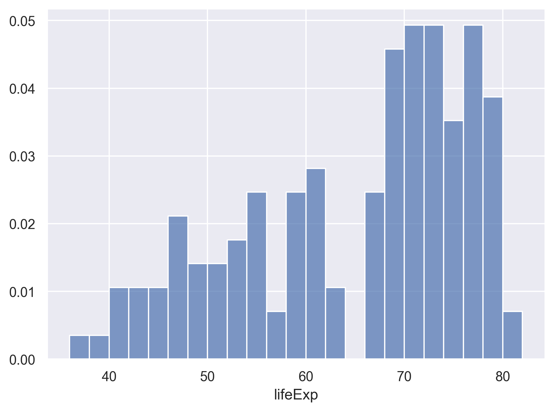
We can also add changes to the plot. Let’s say we want to add another layer of the kernel density estimation.
hist_plot.add(so.Line(color='red'), so.KDE())
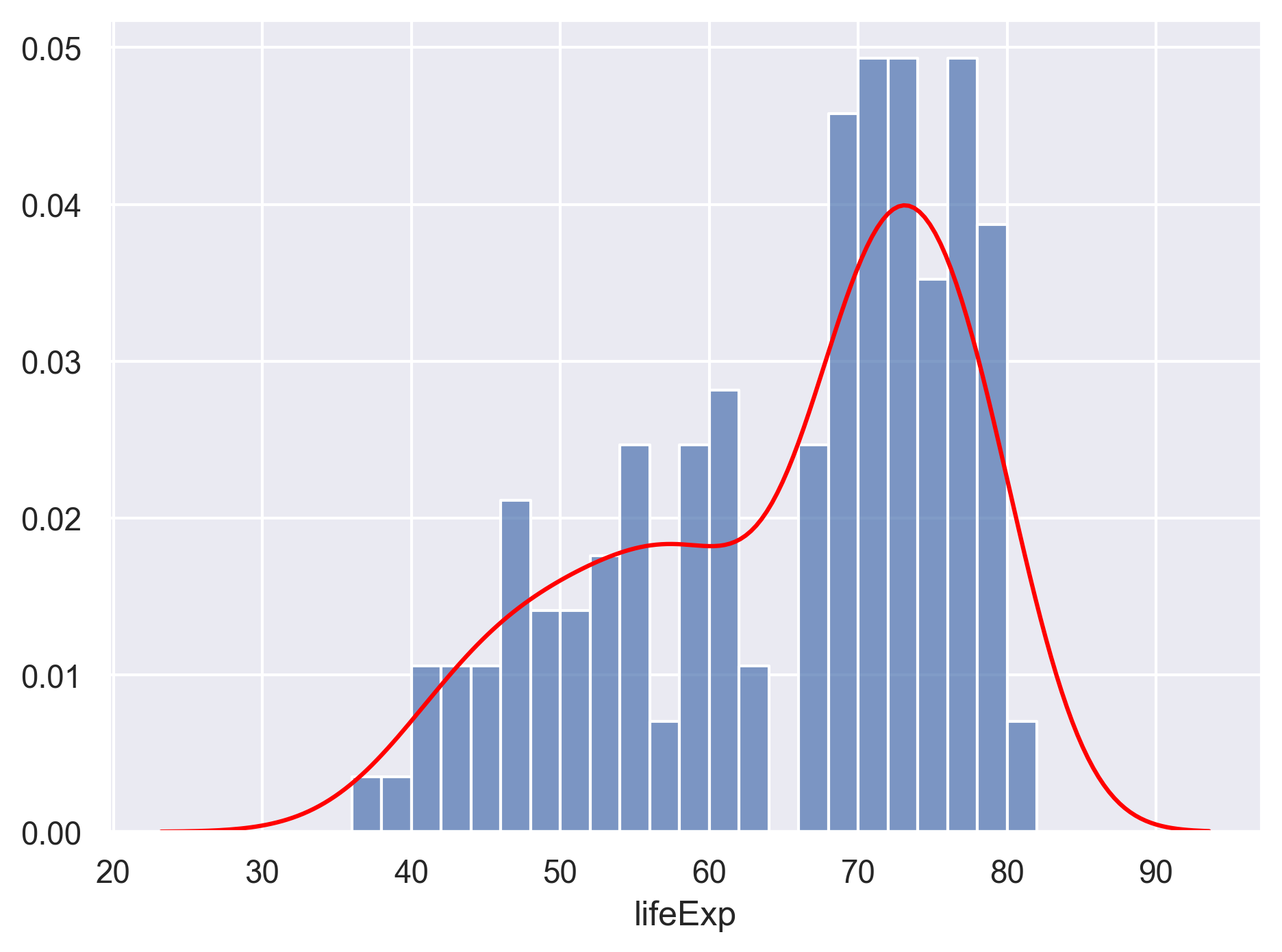
Watch out! Adding the theme does not change the hist_plot object!
If we want to change the object, we need to store our changes:
hist_plot = hist_plot.add(so.Line(color='red'), so.KDE())
Bonus Exercise: Create and save a plot
Now try it yourself! Create your own plot using
so.Plot(), store it in an object namedmy_plot, and save the plot using thesave()method.Example solution
(
    so.Plot(gapminder_1997,
            x='gdpPercap',
            y='lifeExp',
            color='continent')
    .add(so.Dot())
    .label(x="GDP Per Capita",
           y="Life Expectancy",
           title = "Do people in wealthy countries live longer?")
    .save("my_awesome_plot.png", bbox_inches='tight', dpi=200)
)
Bonus
Creating complex plots
Animated plots
Sometimes it can be cool (and useful) to create animated graphs, like this famous one by Hans Rosling using the Gapminder dataset that plots GDP vs. Life Expectancy over time. Let’s try to recreate this plot!
The seaborn library that we used so far does not support annimated plots. We will use a different visualization library in Python called Plotly - a popular library for making interactive visualizations.
Plotly is already pre-installed with Anaconda. All we need to do is to import the library.
import plotly.express as px

(
    px.scatter(data_frame=gapminder,
               x='gdpPercap',
               y='lifeExp',
               size='pop',
               animation_frame='year',
               hover_name='country',
               color='continent',
               height=600,
               size_max=80)
)
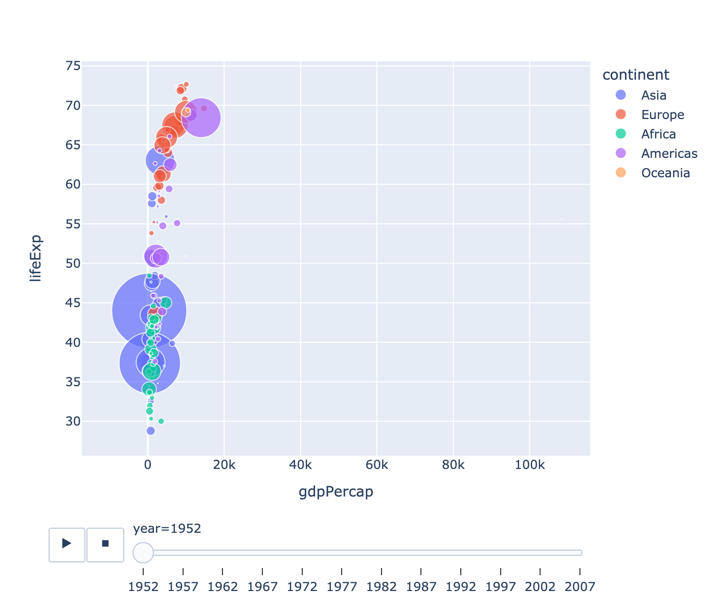
Awesome! This is looking sweet! Let’s make sure we understand the code above:
- The
animation_frameargument of the plotting function tells it which variable should be different in each frame of our animation: in this case, we want each frame to be a different year. - There are quite a few more parameters that we have control over the plot. Feel free to check out more options from the documentation of the
px.scatter()function.
So we’ve made this cool animated plot - how do we save it?
We can apply the write_html() method to save the plot to a standalone HTML file.
(
    px.scatter(data_frame=gapminder,
               x='gdpPercap',
               y='lifeExp',
               size='pop',
               animation_frame='year',
               hover_name='country',
               color='continent',
               height=600,
               size_max=80)
    .write_html("./hansAnimatedPlot.html")
)
Glossary of terms
- Mark: an object that is used to graphically represents data values. Examples include dots, bars, lines, areas, band, and paths. Each mark has a number of properties (e.g., color, size, opacity) that can be set to change its appearance.
- Facets: Dividing your data into groups and making a subplot for each.
- Layer: Each plot is made up of one or more layers. Each layer contains one mark.
- Scale: specifying mappings from data units to visual properties.
Key Points
Python is a free general purpose programming language used by many for reproducible data analysis.
Use Python library pandas’
read_csv()function to read tabular data.Use Python library seaborn to create and save data visualizations.
